Forum Replies Created
-
AuthorPosts
-
it seems enfold had set up a rule with .main-color class so try to be more specific with:
(normaly the ID should overwrite a rule with class don’t know why it does not).main_color #contactform ::placeholder { color: #fff !important; opacity: 1 } .main_color #contactform ::-webkit-input-placeholder { color: #fff !important; } .main_color #contactform ::-moz-placeholder { color: #fff !important; } .main_color #contactform :-ms-input-placeholder { color: #fff !important; } .main_color #contactform :-moz-placeholder { color: #fff !important; }it comes from Enfold Options – Main Content – Secondary font color
it is hard to help without a link
but first solution was to try get rid of doubled semicolons
second : add rule for firefox and modern browsers – you have all without :#contactform ::placeholder { color: #fff !important; opacity: 1; }the webkit rule seems to be obsolete since Safari 10
that is an additonal information and separated with a separator
it is to individualize the placeholder text
you can see here the effect: https://webers-testseite.de/kontakt/by the way:
you can change / add placeholder text (even if you have not choosen that option on enfold dialog with that here onthis is what is enough for modern browser:
::placeholder { /* Chrome, Firefox, Opera, Safari 10.1+ */ color: white !important; opacity: 1; /* Firefox */ } :-ms-input-placeholder { /* Internet Explorer 10-11 */ color: white !important; } ::-ms-input-placeholder { /* Microsoft Edge */ color: white !important; }first of all – i don’t know if two semicolons at the end will come into conflict.
try this first.second: you have no browser plattform for firefox and consorten :
and think of opacity for firefox – because it has set this to 0.8::placeholder { color: #fff !important; opacity: 1; }_______________________
by the way:
you can change / add placeholder text (even if you have not choosen that option on enfold dialog with that here on functions.php of child-theme
Change it to your page-idfunction change_placehoder_txt() { if( is_page(2604) ) { ?> <script type="text/javascript"> jQuery('#avia_1_1').attr('placeholder', ' Anything you like*'); jQuery('#avia_2_1').attr('placeholder', ' Anything you like*'); </script> <?php } } add_action('wp_footer', 'change_placehoder_txt');The easiest way to get distance to the Input field is to insert spaces on the text.
this seems to be a good plugin – even the wordpress official sites link to it:
https://de.wordpress.org/plugins/force-strong-passwords/do you have a custom header.php file in your child theme?
The first 27 lines in header.php have completely changed. So if you go with a child-theme version you have to renew your adjustments there and place a new one.And maybe another test : don’t know if thes you.tu links are wellcome use :
https://www.youtube.com/watch?v=YEmI2MDpasE?enablejsapi=1&autoplay=1&ecver=2&cc_load_policy=1&playsinline=1&rel=0&showinfo=0&color=white&iv_load_policy=3&iframe=truesee here with your video ( i just made the modal window bigger for my use) :
https://webers-testseite.de/videos-on-lightbox/yes and where on my thread is a space between those classes? https://kriesi.at/support/topic/font-css-class-not-working/#post-956107
.avia_textblock.my_custom_class h2 { font-family: "proxima_nova_rgbold"; font-size: 100px; letter-spacing: normal; text-transform: none !important; }and what does this mean: Textblock class id = my_custom_class
is it a class or an id ;)i see you got on this page a lot of videos.
so if you are working with a child theme – and if you are not willing to do this by hand
– do this to functions.php of your child-theme:function add_lightbox_option(){ if(is_page(21397)){ ?> <script> (function($){ $('a[href*="you"]').each(function(){ this.href += '?iframe=true'; }); })(jQuery); </script> <?php } } add_action('wp_footer', 'add_lightbox_option');if this does not work – than our jquery is a bit too old – and we have to find a different way.
-
This reply was modified 7 years, 11 months ago by
Guenni007.
if you haven’t changed link it makes me wonder that it has opend before in a lightbox
add behind your youtube link add ?iframe=true f.e.:https://youtu.be/YEmI2MDpasE?iframe=true
if you have more options like me it is with &iframe=true
i would prefer links with many options to avoid related videos at the end ; related videos on pause etc.
the nocookie is nice to have because of new GDPR (DSGVO on german spoken countries)https://www.youtube-nocookie.com/embed/<strong>ID</strong>?enablejsapi=1&ecver=2&cc_load_policy=1&playsinline=1&rel=0&showinfo=0&color=white&iv_load_policy=3&iframe=truei read on another thread that class avia_activate_lightbox
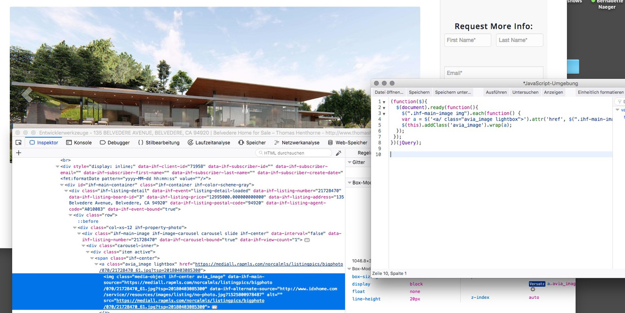
would activate the lightbox – maybe this is a nice try:function custom_lightbox_sc(){ ?> <script> (function($){ $(document).ready(function(){ $(".ihf-main-image img").each(function() { var a = $('<a/ class="avia_image lightbox-added avia_activate_lightbox">').attr('href', $(".ihf-main-image img").attr('data-ihf-main-source')); $(this).addClass('avia_image').wrap(a); }); }); })(jQuery); </script> <?php } add_action('wp_footer', 'custom_lightbox_sc');on cf7 you have that options directly preconfigured: https://contactform7.com/custom-layout-for-checkboxes-and-radio-buttons/
you only have to style it a biton that image – aren’t that checkboxes –
or does it be one big choose and you only can activate one of the three?see edited content above
is there a link to that?
what is your layout
a text-block or a h2 heading.if you have a h2 in the text block it will be:
.avia_textblock.my_custom_class h2 { … }to where should the shadow go ? outside the browser – only on top and bottom ?
you can give it an inset shadow:.color-section { box-shadow: 0px 0px 35px black inset; }or if you like the slider above:
#full_slider_1 { box-shadow: 0px 10px 15px -10px #000; }I am very sorry, but here ends my knowledge – maybe a mod (perhaps the other guenter) can help you.
and for that it would be nice if you are not minifiying the css or js – because if there was an error we can search til the end of time.
But you have the possibility to set elsewhere on that enfold installation a lightbox image.?
I don not see that the avia-snippet-lightbox.js was activated.i thought that the whole installation is yours and the caroussel images are on their server and are called via plugin (maybe a shortcode) to inject the content.
You have no influence on that domain: http://robwiley.staging.wpengine.com/ (hosted on WPengine) ?if you have please place a lightbox image elsewhere in that page.
please read the edited answer before
no that is normal link opening – not the lightbox.
can you please try to place on the bottom of that page an enfold avia Image with lightbox link. Just to see if the images of your caroussel will go to that container. The mfp-container was not generated
By the way if you are using new 4.3.1 and have performance load only used elements – than this will be one reason for it.
Set it for that moment to alway load all elements.did you switch of modal of enfold?
Try this one her maybe it is something different on firefox javascript environment
it seem that the script with src works on my end – but in your environment it does not work:
if you take this surrounded container is set each image – with correct link – but with no lightbox effectfunction custom_lightbox_sc(){ ?> <script> (function($){ $(document).ready(function(){ $(".ihf-main-image img").each(function() { var a = $('<a/ class="avia_image lightbox-added">').attr('href', $(".ihf-main-image img").attr('data-ihf-main-source')); $(this).addClass('avia_image').wrap(a); }); }); })(jQuery); </script> <?php } add_action('wp_footer', 'custom_lightbox_sc');it seem that the images in the slideshow gets in a time their src attribut.
i have to learn that data- attribute is a html5 global attribut-( and select syntax is a bit different to alt src or title)can you try this what happens:
function custom_lightbox_sc(){
?>
<script>
(function($){
    $(".ihf-main-image img").each(function() {
    var a = $('<a/>').attr('href', this.data('ihf-main-source'));
    $(this).addClass('image').wrap(a);
  });
})(jQuery);
</script>
<?php
}
add_action('wp_footer', 'custom_lightbox_sc');
or (but seems to be identically)
function custom_lightbox_sc(){ ?> <script> (function($){ $(".ihf-main-image img").each(function() { var a = $('<a/>').attr('href', this.attr('data-ihf-main-source')); $(this).addClass('image').wrap(a); }); })(jQuery); </script> <?php } add_action('wp_footer', 'custom_lightbox_sc');This will end in bland starting pages where you can not place any films or maps.
Self-hosted files you can use always, but that makes your server again lame.
5Mb movies with simultaneous access of 10 users – then the performance is in the basement.
So it’s best to start with a landing page that only contains buttons for consent and the privacy notice? These Pages than with handmade SEO etc. pp leading you to the real content start page!If id is specified, it will replace the current session id. session_id() needs to be called before session_start() for that purpose.
What is the reason to avoid session id?
if f.e. here on board the session is killed – you will be loggt off.
People use Google Adsense – Google Analytics etc. if there is a use with anonymiser than even those cookies are GDPR conform.by the way – these are three ALB Elements – i tested it – comment the whole line out like:
// if(!is_admin() && !current_theme_supports('avia_no_session_support') && !session_id()) session_start();and upload it (best to child-theme with shortcodes loading snippet)

sorry but this is absolutely not true. The PHPSESSID is something that will be always (ubiquitär) if you visit any page. It has nothing to do with Enfold. This session cookie is normal usage in internet and if ( yes there are methods ) you kill that cookie the url is used instead! This is on my point of view even more security risky than that littel cookie with a crypted ID.
A lot of browser even don’t list it because it is concerning to php usage standard behavior.
http://php.net/manual/en/function.session-id.phpthe only cookie set by enfold now is that cookie consent cookie. This cookie saves your answer if you accept or deny cookie usage.
By the way – go and deny in your browser cookie usage at all and look what happend if your start your browser?
There was a fallback solution for that etc pp.Don’t get panic with GDPR (DSGVO on Germany)
Many people now worry about the implementation of the obligation to educate on the Internet and on their websites about dataprotection.
The risk of a written warning by lawyers is only great if the privacy statement is missing or hidden only to find. This has to remain almost always visible and clickable. Many Peaople place the cookie note in such a way that it hides the link to Privacy Policy or Imprint.The point of the list of processing activities is also a big point.
You have now to have a documentation about your handling with data at your business. This list must be available at the request of the Data Protection Officer responsible for you. (Previously, anyone with legitimate interest could demand this release)-
This reply was modified 7 years, 11 months ago by
you have to adjust this to your page which it concerns
@media only screen and (max-width: 767px) { .responsive #top.page-id-32166 #wrap_all .container { width: 100%; max-width: 100%; } }this isn’t what you mean ( i take a page whis stretched layout for better seeing what happens):
what do you mean by full ? without your header/ logo / navigation – blank page as if visitors see the real source site without knowing it that they were on a different page?
it is the extra border element which overlaps the button (diagonal element)
if it has a margin-top like:.page-id-11352 .av-extra-border-element.border-extra-diagonal { margin-top: -175px !important; }normaly : the overflow: hidden would do that job – but this is for that element not possible ( because background white should stop at container border)
-
This reply was modified 7 years, 11 months ago by
-
AuthorPosts