Forum Replies Created
-
AuthorPosts
-
for outside list-style-position:
Edit : ok there was a overflow setting which is set to not visible to widget ul so to see the outside points :
ul.squarepoints { list-style: square outside; margin-left: 18px !important; width: auto !important; overflow: visible !important; }-
This reply was modified 7 years, 10 months ago by
Guenni007.
hm – there was rule in base.css :
ul {
    list-style: none outside;
    margin-left: 7px;
}
don’t know why – maybe it is forgotten to set the specified rule for widgets
maybe you set better the ul to a custom class because not to influence all ul’s of your site like:<ul class="squarepoints"> <li>sed diam nonumy eirmod tempor invidunt ut labore et dolore magna aliquyam erat,</li> <li>sed diam voluptua. At vero eos et accusam et justo duo dolores et ea rebum.</li> <li>Stet clita kasd gubergren, no sea takimata sanctus est Lorem ipsum dolor sit amet. Lorem ipsum dolor sit amet, consetetur</li> </ul>and then:
ul.squarepoints { list-style: square inside; margin-left: 7px !important; }Thanks – and if i want to debounce a function it is used in Enfold like:
win.on( 'debouncedresize', function(){ …
without parameter or can i change the trashold on this function by:win.on( 'debouncedresize', function(){ … }, 50);That is the best way to do – as i mentioned above.
Better search and replace looks similar to that search and replace ( source is Frank Bültge – who has created a lot of good tips and plugins) i mentioned above.Sehr wichtig für dich: Dein Cookie Consent Popup überlagert den Link zu den Datenschutzhinweisen. Das ist nicht zulässig.
Ich würde in dem Fall dann lieber die rechts unten Popup-Variante von Enfold ( oder was immer du nutzt ) nehmen-
This reply was modified 7 years, 10 months ago by
Wenn du das neue enfold 4.4 hast kannst du ja in den Optionen den Layerslider mal deaktivieren. Dann wieder aktivieren. Eventuell setzt sich der Link dann auf https.
maybe this is concerning to a comment i gave on a different topic:
i have uploaded the zip i got from google with a lot of font-styles in it ( 300,400,600,700 and all italic too)
but on selection there is only a 400 font-style mentioned – maybe the others are selectable too via css .i think your code is correct – anyway you can test this in your functions.php of your child-theme:
function avia_custom_mobile_logo(){
if(wp_is_mobile()){
?>
 <script>
	jQuery(".logo img").attr("src", "https://www.domain.com/wp-content/uploads/logo-for-mobile.png");
 </script>
<?php
}
}
add_action('wp_footer', 'avia_custom_mobile_logo');
or with the filter :
add_filter('avf_logo','mobile_logo_url'); function mobile_logo_url($url){ if(wp_is_mobile()){ $url = "https://www.domain.com/wp-content/uploads/logo-for-mobile.png"; } return $url; }And you really want a different logo for mobile devices ( ipad, iphone, smartphones, tabletts etc) and not a logo for smaller screens?
Gerade getestet – ohne Anpassung der Lang files wird hier ausgegeben:
Vielen Dank für Ihre Nachricht! im Betreff
und unten im Text dann auch :
Ihre Nachricht:
…Versuch mal folgendes:
Bei Einstellungen / Allgemein – Sprache der Webseite – da hast Du dein WordPress eben auf deutsch stehen. Da gibt es bei den Einstellungen auch deutsch(Sie) oder Formal genannt – von förmliche Anrede.
Dann nimmt enfold die po/mo files …formal.po / …formal.mo
leider ist diese Version nicht so vollständig übersetzt wie die informale Version. sollte also dort auch etwas anderes stehen, musst du die lang files bearbeiten und im Child-Theme ablegen – am besten auch in einem lang ordner und dann die child-theme langfiles so ersetzen:function overwrite_lang_files() { $lang = get_stylesheet_directory().'/lang'; return $lang; } add_filter('ava_theme_textdomain_path', 'overwrite_lang_files');May 29, 2018 at 12:35 am in reply to: Google Maps Button is active on standard! [av_privacy_google_maps] #963471if loading the api is against GDPR is not sure. If you declare it in your privacy policy – i think it will be ok.
May 28, 2018 at 11:23 pm in reply to: Google Maps Button is active on standard! [av_privacy_google_maps] #963458but ! – the api is loaded already – with or without that consent
zum ersten: hast du von fastest cache den cache geleert?
ok ich schreib jetzt mal in deutsch.
Ich nutze nach der Umstellung von Internetseiten von http nach https immer das Tool : Search & Replace von Inpsyde ( da ist der Bueltge mal dabei). Geniales teil, aber man kann wenn man ungeschickt sucht sich die datenbank zerhauen.
Einfache Denker würden zB nach http in der Datenbank suchen und gegen https tauschen. Das kann schon zu Problemen führen
Man geht so vor, dass man zunächst die Datenbank mit dem Tool sichert.
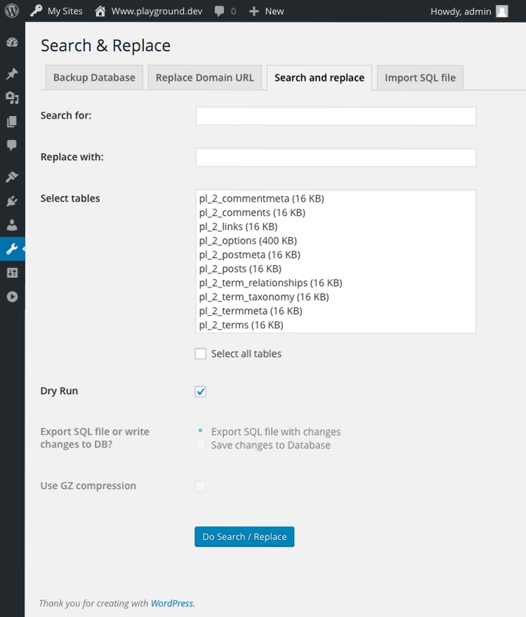
Dann kann man zB in deinem Fall nach : http://www.fitgutschein in allen Tabellen suchen lassen, und gegen https://www.fitgutschein ersetzen. Das kann man zunächst ohne Änderung im “Dry Run” machen ( schau dir die Screenshots an) in deinem Fall wird er einige Links zu Scripten und css Dateien finden die noch http sind.
Im folgenden Schritt dann select all tables and save changes to database.
Das wars. Klappt bei mir immer.what should be possible is to insert on background-video input field the nocookie link version too.
All other things can be managed this way: https://kriesi.at/support/topic/youtube-shortcode/
and the further link to my testpage: https://webers-testseite.de/youtube-shortcode-for-enfold/
it uses the enfold surrounding container so it is responsive due to enfold settings of the containersYes – but now it is a bit different:
the shrink calculation is on enfold 4.3 ff a seperated js file
so just upload a copy of that file avia-snippet-sticky-header.js to your child-theme js folderadd this to your functions.php of your child-theme:
add_action( 'wp_enqueue_scripts', 'wp_change_sticky_header_script', 100 );
function wp_change_sticky_header_script() {
   wp_deregister_script( 'avia-sticky-header' );
   wp_enqueue_script( 'avia-sticky-header-child', get_stylesheet_directory_uri().'/js/avia-snippet-sticky-header.js', array('avia-default'), $vn, true);
}
and edit then this copy as you need it.
can we please have the shortcode set to be disabled first and then enabled by active setting of the user. this will be the better solution i think!
Disable on default then the shortcode generated buttons will enable the usage of ( webfont, maps, youtube etc.)i downloaded from the google fonts helper page the open-sans with more stylings (300, 300i, 400, 400i, 600, 600i, 700, 700i) only for modern browsers (woff, woff2 files) the zip was accepted but only a 400 is shown ?
Did i do something wrong – or is my manual way then the better solution?the nocookie variants are GDPR compliant – but background video does not accept these youtube links in the input field.
This has to be changed definitly! And i hope that the 4.4 Version will have that!by the way Yigit : is there a debounce function implemented on Enfold ?
on a lot of source codes i read something like this:
win.on( 'debouncedresize', function(){ el_height = $(elements).attr('style',"").filter(':first').height(); set_height(); } );but i can not find where this is implemented
that is normal enfold behavior that it is not sticky. but that will be only pure css .
What do you mean by doesn’t work on mobile
the logos are on that case under each other . I think that looks better than two very sall logos besides each other.

by the way – you have to use the script to make it easier for you .
If you want to test these settings :
1) the first parameter after a youtube link ( after the ID) has a questionmark ?
2) all following parameters have to be added by a &so it is :
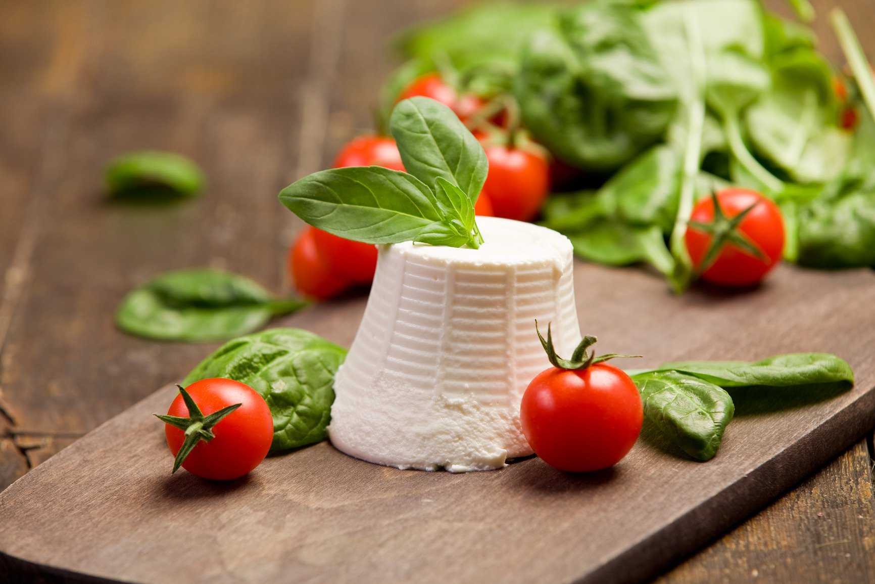
https://www.youtube-nocookie.com/watch?v=YEmI2MDpasE?ecver=2&rel=0it is in your get in touch section from the demo: https://kriesi.at/themes/enfold-health-coach/#av_section_2
the link is now: https://kriesi.at/themes/enfold-health-coach/wp-content/uploads/sites/62/2016/05/cheese.jpg
if you want to download it for your layout.it is your Book Now Section: Open this color-section and replace the background-image for it – with a new one or with the downloaded above
these links are leftovers of the pre-Https era of Enfold
hm – two logos is not so complicated i thought.
see here with a customization of shrinking . – logo in the middle goes with scroll to the left position : https://webers-testseite.de/two-logo-header/
Or here https://webers-testseite.de/cynthia/mille-deco/
because of the other logo experiments on that page it is hard to optimize it for all pages the same time :lol: https://webers-testseite.de/cynthia/logo-move/May 18, 2018 at 6:18 pm in reply to: Embedded YouTube video has wrong dimension and orientation #958758have you tested to insert that little css above in your quick css and have a look what happens.
hope you will have no performance troubles –
get familiar with debouncing ( resize case) and throttling (scroll case) functions.
but both on the same time – i would not know how to get this.you see how debounce and throttle work on this page https://css-tricks.com/debouncing-throttling-explained-examples/
All Data that goes out of your page is then under that Certificate.
But you have to differentiate between encrypted transfer and encrypted content. Only the transmission is encrypted here.
But that is why GDPR (DSGVO) wants that your site has that https.However, if you want to receive data that contains particularly sensitive data according to Art.9 DSGVO, you must encrypt the contents. Whether there is this possibility, I do not know. I would then request such data via e-mail and encrypt it with OpenPGP.
Special category data is personal data which the GDPR says is more sensitive, and so needs more protection.
In order to lawfully process special category data, you must identify both a lawful basis under Article 6 and a separate condition for processing special category data under Article 9. These do not have to be linked.
There are ten conditions for processing special category data in the GDPR itself, but the Data Protection Bill will introduce additional conditions and safeguards.
You must determine your condition for processing special category data before you begin this processing under the GDPR, and you should document it.i think if that are the results of his page basilis posted then there are no troubles at all
May 18, 2018 at 5:11 pm in reply to: Embedded YouTube video has wrong dimension and orientation #958692I have my guess. Did you update the theme via ftp? And did you do it by overwriting the existing files?
Then the reason is clear to me.May 18, 2018 at 5:08 pm in reply to: Embedded YouTube video has wrong dimension and orientation #958689sorry i thought because of a german title that you are natively spoken english.
If you do not find the reason for that – you can add that via quick css, till you find the reason for it.
try this – and see if your troubles are gone – afterwards we can see where the fault is
May 18, 2018 at 4:09 pm in reply to: Embedded YouTube video has wrong dimension and orientation #958646ich kann es so nicht nachvollziehen. Denn wenn ich es als Enfold ALB setze in zB 1/2 container und das Videoformat mit 4:3 angebe, dann wird es richtig angezeigt.
edit : Deine ganze video.css Datei wird nicht geladen:
Hast du bei performance eventuell nötige Teile abgeschaltet?
Wenn ich den Inhalt der Video.css Datei bei Dir (via browser developer tools ) virtuell hinzufüge läuft es so wie bei mir/* ====================================================================================================================================================== Video ====================================================================================================================================================== */ .avia-video, .avia-iframe-wrap{clear:both; position: relative; margin-bottom:20px; } /*responsive iframe trick*/ .avia-video iframe, .js_active .avia-iframe-wrap iframe, div .avia-video .avia-iframe-wrap{position: absolute; width:100%; height:100%; left:0; top:0; padding:0;} .avia-video-custom{height:0;} .avia-video-16-9, .js_active .avia-iframe-wrap{padding-bottom: 56.25%; height:0;} .avia-video-4-3{padding-bottom: 75%; height:0;} /*html 5 video - always has 100 width and natural height. behaves like image when it comes to aspect ratio*/ video{ width:100%; height:auto; } .mejs-layer { z-index: 1; width: 100% !important; } .mejs-layer.mejs-overlay-play{ height:100% !important; } #top .avia-video .mejs-container, #top .avia-video .mejs-container video{ height:100% !important; width: 100% !important; position: absolute; }-
This reply was modified 7 years, 10 months ago by
-
This reply was modified 7 years, 10 months ago by
-
AuthorPosts