Forum Replies Created
-
AuthorPosts
-
But this is normal content –
What page is defined as maintenance-page on your Enfold Options – Theme Options ? on : “Redirect all users to this page”
you only have to edit that page and replace the image ( that has nothing to do with the logo )
it has to be in the second column (1/2) after the 1/4 containerBy the way i would not display the bread-crumbs on that page too
https://kriesi.at/themes/enfold-medical/#av-layout-grid-3
So this is not true: you see on your example page that #av_section_2 is over #av-layout-grid-3
and this is the avia-builder-el-last elementfor your specific Page now you can manually hide the descriptions of the Masonry until a solution is found.
.page-id-11 #av-masonry-1 .av-masonry-entry-content { display: none; }i guess you are right. That seems to be a bug indeed.
You can see here on the enfold demo page a similar behavior: https://kriesi.at/themes/enfold-2017/elements/masonry/
The first masonry entries are only with title – the next on load more with description too!On the link there is a data attribut:
data-caption_elements="title excerpt"
so this has to be in our casedata-caption_elements="title"how is your maintenance-page styled. is it a page with transparency header? and your normal Pages not.?
Enfold got two logos to insert on Enfold Options – the one – major Logo and one for transparency headings.
This can be found on Header – Transparency Options.
Maybe this is the reason for.
A life link would be nice to be shurewhat you can do is to install a little plugin ( believe me manually adding custom buttons to the tinymce is hard stuff ) :
https://wordpress.org/plugins/visual-editor-custom-buttons/
you will then have the opportunity to add custom buttons to visual and text editor buttons.
you then can create a new button (if you like with an own icon)
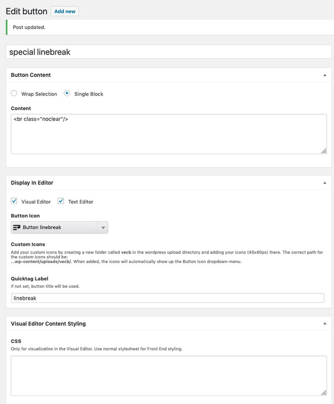
everytime you press that button you will see that a linebreak is added – and will not be replace through WPdanke – nimm den link noch hier weg: Referenzseite
February 12, 2019 at 8:49 pm in reply to: Color Section Background Video – Un Mute / Activate Sound #1066098ist there a link for your site?
an what does it mean “does not work” ?
you see the buttons – but the click event does not toggle the mute ?and you have set a custom class for that color section?
You dont need to activate the overlay function in the ALB element –
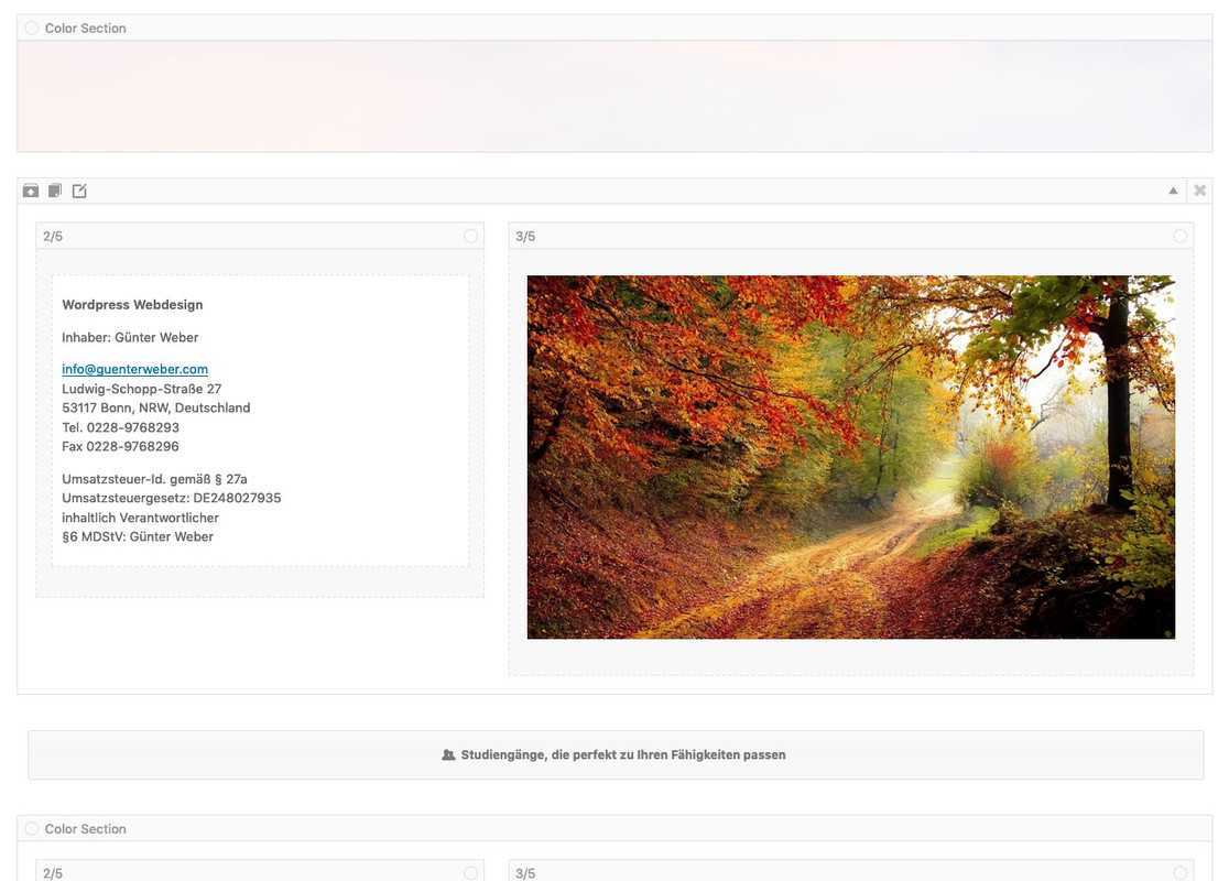
just give a custom class to the color-section: av-section-color-overlay-wrapFebruary 12, 2019 at 8:34 pm in reply to: button to slide open/hide content like a toggle but wiht a whole section #1066096hast du es so wie auf meiner Testseite beschrieben gemacht, dass du die Id als link Ziel für den Button eingegeben? also relativ nicht absolut:
also in den Button link : #studiengangmore2
- Give a unique ID to the Color-Section to toggle f.e.: toggle-color-section
- Give to the button a custom-class f.e: color-section-toggler
- the button link is the unique ID of the toggle section
ausserdem sollte dann der Teil für die Beschriftung so aussehen:
$('.avia-button-wrap.color-section-toggler span.avia_iconbox_title').text(function(i, v){ return v === 'alle Studiengänge' ? 'weniger Studiengänge' : 'alle Studiengänge' })by the way it seem that the &rel=0 works on this way to show youtube videos. Only the old parameters to hamper paused related videos does not work anymore
https://www.youtube-nocookie.com/embed/J8LfI8WEiuk?controls=1&start=0&autoplay=1&rel=0&iframe=truesee my test page – even with your controls=1 parameter it works. So – does any lightbox work on your installation?
Or did you miss to setup on Enfold – Theme Options : “Lightbox Modal Window” to mark that field ?you only want that the button opens the youtube iframe video?
like here: https://webers-testseite.de/fullwidth-button-on-slider-to-youtube/
on caption you got the possibility to attach a ( or two) button. The link must be set manually.
you can insert the iframe url form the code you get from youtube ( you even can set the start time in seconds here)
the iframe=true opens the iframehttps://www.youtube-nocookie.com/embed/_c6mLFovnqs?start=97&autoplay=1&iframe=trueby the way – all demos on enfold with sidebar header are non boxed one. Maybe this would be a nice idea for your page too
The link is gone so i can not see now what happend but i would do it this wayyes – and all your troubles gone-
maybe a bit less than 100vh to have for those pages who will fit the socket in viewportFebruary 12, 2019 at 3:58 pm in reply to: button to slide open/hide content like a toggle but wiht a whole section #1065976Ausserdem könntest du mal folgenden Code auch noch probieren; den kann ich via Developer Tools auf deiner Seite nicht simulieren.
Der soll dafür sorgen dass du nicht nur innerhalb eines Toggles immer nur einen auf hast, sondern auch in benachbarten toggles:function only_one_toggle_open_at_the_same_time(){ ?> <script> (function($){ $(window).load(function() { $('.toggler').on('click', function(){ $('.toggler').not(this).next().removeClass('active_tc'); }); $('.toggler').on('click', function(){ $('.toggler').not(this).removeClass('activeTitle'); }); }); })(jQuery); </script> <?php } add_action('wp_footer', 'only_one_toggle_open_at_the_same_time');February 12, 2019 at 3:31 pm in reply to: button to slide open/hide content like a toggle but wiht a whole section #1065968well this is something on request long time ago:
https://webers-testseite.de/colorsection-toggle/ich schreibe jetzt mal gerade deutsch, geht mir besser aus den Händen.
Eigentlich steht alles ganz gut auf der Seite.
Ich habe allerdings den Button ( full-width button) unter die Toggle Section gesetzt.
den code musst du dann deinen Wünschen entsprechend anpassen. die Button Beschriftung kannst du dann auch toggeln. Button Anfangstext und im Code sollte aber übereinstimmen!:// color-section toggle function add_custom_toggler(){ ?> <script> (function($){ $(window).load(function () { $('#toggle-color-section').addClass('notseen'); $('.avia-button-wrap.color-section-toggler').click(function () { $('#toggle-color-section').toggleClass('notseen'); $('.avia-button-wrap.color-section-toggler span.avia_iconbox_title').text(function(i, v){ return v === 'Studiengänge, die perfekt zu Ihren Fähigkeiten passen' ? 'Danke für die Info' : 'Studiengänge, die perfekt zu Ihren Fähigkeiten passen' }) }); }); })(jQuery); </script> <?php } add_action('wp_footer', 'add_custom_toggler');Wenn noch fragen sind – gerne
February 12, 2019 at 2:33 pm in reply to: Color Section Background Video – Un Mute / Activate Sound #1065946Again here is a little tut and demo – maybe you get the solution from that:
https://webers-testseite.de/mute-unmute/first of all you can avoid that menu problem on setting the z-index to 10.
second do you realy want to show always your footer half height of the screen?
or is it the fact you like to avoid on pages with less content that there is at the bottom a gap which has different color then content background?
i would get that result on giving the #main a min-height of 100vhthe linked page is from 2015 and for a layout with header on top.
you have to think of that your header takes away 300px form 100% width – and on responsive case the header width is 27% so for footer width is 73% etc pp.
So you had to calculate the max-width to 1010px ( on default it is 1310px) and the width as a difference etc. pp. –
you see that will be complicate enough.
By the way – you had to give a padding-bottom to #main to see all content under the footer.Well i knew that i can have the whole function:
if (!class_exists('avia_newsbox')) …
in my child theme – but is there a shorter form to do this in child theme?Try first the code above. But it only removes the enfold support for loading google fonts form Google Servers.
But there are a lot of Google Font GDPR conflicts – f.e. on loading a google map the Roboto Font is always loaded. So it might be good to totaly refuse Goolge Server loadingJust because you prevent Google Fonts from loading themes Internally from Google Servers doesn’t mean you can’t still use the stuff in the Enfold settings.
If your fonts are in the Enfold list – you can choose them and use them – only the loading via Google Servers are hampered by this code above.
If you have installed new fonts, you can reintegrate them according to the known method.
f.e:add_filter( 'avf_google_heading_font', 'avia_add_heading_font'); function avia_add_heading_font($fonts) { $fonts['Source Sans Pro'] = 'Source Sans Pro:300,300i,400,400i,700,700i'; return $fonts; } add_filter( 'avf_google_content_font', 'avia_add_content_font'); function avia_add_content_font($fonts) { $fonts['Source Sans Pro'] = 'Source Sans Pro:300,300i,400,400i,700,700i'; return $fonts; }and you have truely activated the fonts localy?
so here is the code to hamper loading of Google Fonts from google in Enfold
it comes to your child-theme functions.php:add_action( 'init', 'enfold_customization_switch_fonts' ); function enfold_customization_switch_fonts() { global $avia; $avia->style->print_extra_output = false; }by the way – this little plugin i got additionally loaded: remove-google-fonts-references
Allthough it is not tested for new WordPress- on my end i can say that it works for WP 5.0.3.so I have searched the internet in vain for a solution that WordPress does not automatically remove the multiple line breaks.
Perhaps it is a combination of influences from both WordPress and Enfold settings that counteracts this. Here I think a developer has to take a look; my skills aren’t enough for that anymore.
Yes – and again – your search is white color for responsive case – but then header isn*t transparent so- maybe it is better to have your default color then:
(maybe it is necessary to put it in media query for the small screen option)#menu-item-search { color: #109bc5; }To be able to help better a link to the corresponding page would be useful.
The logo you see on transparent header is the logo you set on Dashboard – Enfold (Child) – Header : Transparency Options.Yes but the links are not working – you don’t like the links to be set?
by the way: if you like to have more distance between the spans in responsive case add line-height attribut:.responsive #header_meta .phone-info span { color: #fff; margin-left: 15px; line-height: 25px; }For the logo move we should see a live link to your page. Could be everything
i would do it with this code in telephone extra input field:
<a href="https://link-to-map"><span class="map">XXX</span></a><a href="https://link-to-contact"><span class="contact">YYY</span></a><a href="tel:+492289768293"><span class="tel">ZZZ</span></a>And this would be my quick css entry for it:
.phone-info {
    float: left !important;
    position: relative;
    left: 50%;
    transform: translateX(-50%);
}

.responsive #header_meta .phone-info span {
    color: #aaa;
    margin-left: 15px;
}

.phone-info span::before {
    font-family: entypo-fontello;
    font-size: 24px;
    padding-right: 5px;
    position: relative;
    top: 4px;
}
.map::before { content: "\e842"}
.contact::before { content: "\e805"}
.tel::before { content: "\e854"}
you need to adjust that to your needs.
F.e. if you like to colorize the icons:
replace the part above with:.map::before { content: "\e842"; color: #900} .contact::before { content: "\e805"; color: #090} .tel::before { content: "\e854"; color: #009}see here example: https://webers-testseite.de/
-
This reply was modified 7 years, 2 months ago by
Guenni007.
ok – can be closed
something like this: https://webers-testseite.de/mute-unmute/
-
AuthorPosts