Forum Replies Created
-
AuthorPosts
-
But this must be definitly a transposed digits error? You mean WP 5.2.1
June 14, 2019 at 8:49 am in reply to: Can I make the lightbox auto rotate? and trigger with single link? #1110247for the second request – look into your source code and see what ID the first image got- on that page above it is : #av-masonry-1-item-125
function start_with_clicked_state(){
?>
<script>
(function($) {
$(window).load(function() {
    setTimeout(function() {
        $('#av-masonry-1-item-125').trigger('click');
     }, 1000);
 });
})(jQuery);
</script>
<?php
}
add_action('wp_footer', 'start_with_clicked_state');
see here my example page: https://webers-testseite.de/gallery/
with both codes above : after 1sec the lightbox starts – every 6sec the image will load the next one.so you do not have to do something on the starting page: http://fvs.768.myftpupload.com/kitchens/
just see the ID of the first image you have on that newly opend one (http://fvs.768.myftpupload.com/before-after-stained-kitchen-cabinets/)June 14, 2019 at 7:31 am in reply to: Can I make the lightbox auto rotate? and trigger with single link? #1110224try that code please : https://kriesi.at/support/topic/can-i-make-the-lightbox-auto-rotate-and-trigger-with-single-link/#post-1110141
and press one of your images on : http://fvs.768.myftpupload.com/before-after-stained-kitchen-cabinets/
But yor heading tells two requests – the one is the autorotation of a “lightbox slideshow”
the other is to link from your first masonry directly to the lightbox of the other page.for first see here in action: https://webers-testseite.de/gallery/
June 13, 2019 at 11:49 pm in reply to: Can I make the lightbox auto rotate? and trigger with single link? #1110141this is better:
try this in child-theme functions.php:function set_interval_for_lightbox(){ ?> <script> (function($) { setInterval(function() { if(typeof($.magnificPopup.instance) != 'undefined') { $.magnificPopup.instance.next(); } }, 6000); })(jQuery); </script> <?php } add_action('wp_footer', 'set_interval_for_lightbox');6000 is the interval in milliseconds
but i do not know (yet) how to link directly from the one gallery to a “lightbox gallery slideshow” on the other page.
The code above will work on every sub-page like: http://fvs.768.myftpupload.com/before-after-stained-kitchen-cabinets/June 13, 2019 at 11:32 pm in reply to: Can I make the lightbox auto rotate? and trigger with single link? #1110140well maybe it is possible to have that by having your own lightbox activation script:
it is loaded as avia-snippet-lightbox.js – but you can have instead an own child-theme edited script copy.
This could be done by a callback setting like:callbacks: { open: { setInterval(function() { $.magnificPopup.instance.next(); }, 5000); } }maybe a mod knows how to implement that on the script ;)
you can add the link definition as it is presented at google fonts to the head section by child-theme functions.php via:
add_action('wp_head', function() {
?>
  <link href='https://fonts.googleapis.com/css?family=Amatic+SC&display=swap' rel='stylesheet' type='text/css'>
<?php
});
PS: on GDPR (DSGVO) Reasons – i load the font localy – and this works good
you have in the content some special characters which implement a tag start < ( less than) – same happend if you are using > or [ or ] etc.
Günter here from developer team has written a little plugin to avoid that: https://kriesi.at/documentation/enfold/intro-to-layout-builder/#using-special-characters
https://kriesi.at/support/topic/enfold-image-sizes-3/#post-1109028
or let some in but redefine the width and height of them:
function custom_modified_thumb_sizes( $size ){
  $size['square'] = array('width'=>300, 'height'=>300 );
  return $size;
}
add_filter('avf_modify_thumb_size', 'custom_modified_thumb_sizes', 10, 1 );
to set the crop behavior that line looks this way:
array('width'=>300, 'height'=>300 , 'crop' => false);you can see my css here: https://kriesi.at/support/topic/change-position-of-post-nav-buttons-below-post/#post-1109098
the absolute positioning is for me the better way – the buttons are positoned left and right with no additonal css. And hovering effect etc. works as before.June 12, 2019 at 3:40 pm in reply to: Diagonal Border for color section showing thin border at bottom – Enfold Theme #1109512well ok that it is solved . But your layout is unique in the source code –
you got color-section | 1/1 container | color-section | 1/1 container
these 1/1 container have on default wrapping parent containers which have on default border-top.
The 1/1 container Border is something different.
If you do them all in color-sections you can influence that behavior – or with the code above delete the default behavior. ;)-
This reply was modified 6 years, 10 months ago by
Guenni007.
June 12, 2019 at 1:30 am in reply to: Diagonal Border for color section showing thin border at bottom – Enfold Theme #1109314this is not on the color-section with diagonal section border – it is in the container afterwards.
Because you do not use a color-section for that text-block/heading you will have to do it via css. Or just do another color-section for that 1/1 container.
There you can set on the alb element that there is no border-styling._____
or make a rule to avoid on container-wrap ( that div ID= #after_section_1 ) got a border-top style
for all :.container_wrap { border-top-style: none !important; }this is not a border – it is a box-shadow:
.av_minimal_header_shadow {
    box-shadow: none !important
}
but maybe you decide to have it on scrolled state – then only use this in your quick css:
.av_minimal_header_shadow:not(.header-scrolled) { box-shadow: none !important; }maybe you can use this function:
if ( is_user_logged_in() ) {
   // your code for logged in user
} else {
   // your code for logged out user
}
see here – Gratitude goes to Ismael: https://kriesi.at/support/topic/change-logo-for-logged-in-users/#post-251039
add_filter('avf_logo_final_output', 'avf_logged_logo_final_output');

function avf_logged_logo_final_output($logo) {
	$headline_type = "span";
	if($dimension === true) $dimension = "height='100' width='300'"; //basically just for better page speed ranking :P
	$loggedinlogo  = "<img {$dimension} src='LOGGED IN LOGO IMAGE URL HERE'>";
	$loggedoutlogo = "<img {$dimension} src='LOGGED OUT LOGO IMAGE URL HERE'>";

	if ( is_user_logged_in() ) {
    $logo = "<$headline_type class='logo bg-logo'><a href='".$link."'>".$loggedinlogo."$sub</a></$headline_type>";
	} else {
	$logo = "<$headline_type class='logo bg-logo'><a href='".$link."'>".$loggedoutlogo."$sub</a></$headline_type>";
	}

	return $logo;
}
for $headline_type you can use h1 or div or span etc.
btw. dear team : on function-set-avia-frontend.php on lines: 513ff i see that there is still a h1 tag for that. Why have all my enfold installations a span instead – what i think is better?In my opinion, the above is indeed relevant. Because to prevent the automatic generation of the image sizes you have to set this.
Your question is first about how you can delete the generated alternative images. I think, if you e.g. use this “force regenerate thumbnail” and have used that code before, the files that are no longer needed will be deleted.
There shouldn’t be any performance reasons when using a CDN, only memory space savings are achieved.did you download my files?
because i inserted:$avia_post_nav = avia_post_nav(); echo "<div class='custom-post-nav'>"; echo avia_post_nav(); echo "</div>";and did you see my comment on that post and portfolio had to be created by default editor – not alb !
and dear mods – i do not know why this happens. the post nav did work on alb generated portfolio and posts too ?is it intentional that the hamburger menu is also hidden?
you got that intention to have the mobile menu break at 1320px but the display none of
nav.main_menu {
    display: none !important;
}
hides the hamburger too:
try this instead:@media only screen and (max-width: 1320px) { #avia-menu { display: none !important; } #advanced_menu_toggle, #advanced_menu_hide { display:block !important; } }i do not know why then the hamburger is centered because on default the mobile hamburger icon goes to the right:
https://kriesi.at/themes/enfold-medical/it is because these separators are set with border-left option.
you can add this to quick css :
.av_seperator_big_border .av-main-nav > li#menu-item-1439 > a {
border-right-style: solid;
border-right-width: 1px;
}
maybe an important is necessary – but try first without.
that product table is placed in what kind of container?
if it is in a color-section – i would give that color-section a unique-ID (as mentioned above – to better select that table)
and that to quick css:.responsive #custom-ID .container { max-width: 1810px; }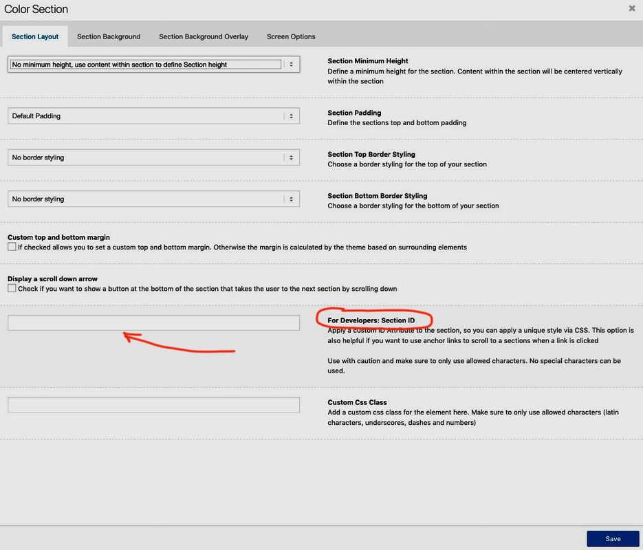
just replace #custom-ID with the ID you gave to your color-section.
thats it.i did that from ismael – you can download the files ( portfolio-single too) from pastebin. Just upload those files to your child-theme folder.
Add the css to your quick css and it will look like this here : https://webers-testseite.de/elegant/2019/06/11/neuer-post/
there is no event at the input field – so maybe the script isn’t loaded.
What do you have on Enfold (Child) – Performance ? : “Disabling of template builder elements” load all – only used or manually.
Maybe a refreshing of the merged files will do the change.First – these posts/portfolio had to build with standard editor! ??
If i use alb the navigation is gone – by that method!see here in action: https://webers-testseite.de/elegant/2019/06/11/neuer-post/
i changed a bit ismaels css code to only:
#top .custom-post-nav {
    clear: both;
    margin-bottom: 140px;
}

#top .avia-post-nav {
  position: absolute;
  margin-top: 60px;
}
the rest comes from default settings.
footer.php: https://pastebin.com/dl/NRAyDTZH
single.php: https://pastebin.com/dl/FiAHHdsS
single-portfolio.php: https://pastebin.com/dl/dLjvqBgthow to have post-navigation on alb posts/portfolios?
on enfold (child) – Blog Layout – you got this: “Single Post Navigation”
if you only want to remove it :
Select to disable or enable the post navigation that links to the next/previous post on single entries. Setting is also used for portfolio. Use filter avf_post_nav_settings to customize.
you’re not being forced to use a container. But if you only want to have that table a bit wider than the other content – you can set max-width for that color-section to a different value and use it with 1/1 container.
because i think a full-width content will not look nice – maybe you give to that ID ( give a unique custom-ID to the color-section) :
f.e. your default is 1310px and maybe for that section:.responsive #custom-ID .container { max-width: 1810px; }you can use relative values too like 80vw ( screen-width)
maybe this function can help you – but after that you had to regenerate image files – there are a lot of those tools – i guess the force regenerate thumbnails is the one which removes unneeded files too.
the first function is for not to use a srcset for images// remove "responsive images" functionality in WP 4.4 and higher add_filter('wp_get_attachment_image_attributes', function($attr) { if (isset($attr['sizes'])) unset($attr['sizes']); if (isset($attr['srcset'])) unset($attr['srcset']); return $attr; }, PHP_INT_MAX); add_filter('wp_calculate_image_sizes', '__return_false', PHP_INT_MAX); add_filter('wp_calculate_image_srcset', '__return_false', PHP_INT_MAX); remove_filter('the_content', 'wp_make_content_images_responsive'); // Disable loads of Enfold & WP image sizes upon upload // do image sizes manually, double-size with high compression for retina screens // use Photoshop to set exact double size and quality between Q30 and Q40 add_action('init', 'remove_enfold_image_sizes'); function remove_enfold_image_sizes() { // do NOT remove widget size, is used in backend portfolio items! // remove_image_size('widget'); remove_image_size('square'); remove_image_size('featured'); remove_image_size('featured_large'); remove_image_size('portfolio'); remove_image_size('portfolio_small'); remove_image_size('gallery'); remove_image_size('magazine'); remove_image_size('masonry'); remove_image_size('entry_without_sidebar'); remove_image_size('entry_with_sidebar'); remove_image_size('shop_thumbnail'); remove_image_size('shop_catalog'); remove_image_size('shop_single'); remove_image_size('shop_gallery_thumbnail'); } // Remove unneeded WP image sizes add_filter( 'intermediate_image_sizes_advanced', 'prefix_remove_default_images' ); // Remove default image sizes here. function prefix_remove_default_images( $sizes ) { // do NOT remove small and medium sizes, they are used in backend Media Library! // unset( $sizes['small']); // 150px // unset( $sizes['medium']); // 300px unset( $sizes['large']); // 1024px unset( $sizes['medium_large']); // 768px return $sizes; }test it on a testinstallation. I tested it on a wordpress playground with enfold installation without any conflict.
All Credits goes to: https://kriesi.at/support/topic/responsive-content-images-retina-screens/#post-1077293the fuctionality is that these buttons slide out on hovering – so how do you think they would react if you got them at the bottom of the screen.
And what do you mean by “the buttons are out of sight” – if you have the browser on fullscreen, the buttons are at the edge of the screen.
The edges are only not visible if you force the browser left and right wider than the screen width.
In this case, however, content and possibly the navigation and logo should already be outside too.Can you post here a link to that site?
look to functions.php of your enfold theme (parent) around line 148ff
here without the comments in it:$avia_config['imgSize']['widget'] = array('width'=>36, 'height'=>36); $avia_config['imgSize']['square'] = array('width'=>180, 'height'=>180); $avia_config['imgSize']['featured'] = array('width'=>1500, 'height'=>430 ); $avia_config['imgSize']['featured_large'] = array('width'=>1500, 'height'=>630 ); $avia_config['imgSize']['extra_large'] = array('width'=>1500, 'height'=>1500 , 'crop' => false); $avia_config['imgSize']['portfolio'] = array('width'=>495, 'height'=>400 ); $avia_config['imgSize']['portfolio_small'] = array('width'=>260, 'height'=>185 ); $avia_config['imgSize']['gallery'] = array('width'=>845, 'height'=>684 ); $avia_config['imgSize']['magazine'] = array('width'=>710, 'height'=>375 ); $avia_config['imgSize']['masonry'] = array('width'=>705, 'height'=>705 , 'crop' => false); $avia_config['imgSize']['entry_with_sidebar'] = array('width'=>845, 'height'=>321); $avia_config['imgSize']['entry_without_sidebar'] = array('width'=>1210, 'height'=>423 ); $avia_config['imgSize'] = apply_filters('avf_modify_thumb_size', $avia_config['imgSize']);filter avf_modify_thumb_size – how to use it ?
e.g:function custom_modified_thumb_sizes( $size ){ $size['square'] = array('width'=>300, 'height'=>300 ); return $size; } add_filter('avf_modify_thumb_size', 'custom_modified_thumb_sizes', 10, 1 );guess #farbe is the unique id for that section?
.page-id-502 #farbe {
background: linear-gradient(to right, red, orange, yellow, green, blue, indigo, violet) !important;
height: 2px !important;
min-height: 0
}
maybe an !important is necessary too
every .avia-section got a minimum-height of 100pxis there a link to see and to examine?
June 10, 2019 at 8:16 am in reply to: trying to change the small separator color when scrolled… #1108761i really don’t know why your code is not working.
the rule which sets the border-color is:.header_color span { border-color: #fff }aha : now i see our fault: the “av_seperator_small_border” is also a class on header and it is between header_color and header-scrolled
.header_color.av_seperator_small_border.header-scrolled .av-main-nav > li > a > span {
  border-color: #fff !important;
}
will do it –
be carefull – just copy paste it all classes are on #header so there is no space inbetween:
.header_color.av_seperator_small_border.header-scrolled-
This reply was modified 6 years, 10 months ago by
Mainly it will be that way that you want to set the link from a portfolio page ( or product page ).
As all portfolio pages, have the standard path: domain/portfolio-item/portfolio-name – why add a manual path? Why not directly transfer the portfolio name? -
This reply was modified 6 years, 10 months ago by
-
AuthorPosts