Forum Replies Created
-
AuthorPosts
-
you can take the same hook: avia_meta_header
add_action( 'avia_meta_header', 'enfold_customization_header1_widget_area' );
function enfold_customization_header1_widget_area() {
  dynamic_sidebar( 'headermeta' );
}
add a new widget named: headermeta Edit: maybe you have not read the post here well.

then some quick css – depends on your header looks like:
.av_secondary_left .sub_menu {
  width: 80%;
  display: flex;
  flex-flow: wrap row;
  width: 80%;
  display: flex;
  flex-flow: wrap row;
}

#top .sub_menu > ul {
  float: none;
}

#header_meta .widget {
  float: left;
  padding: 0;
  margin: 0;
  left: 50%;
  transform: translateX(-50%);
}

@media only screen and (min-width: 767px) {
  #header_meta .widget * {
    color: #fff !important;
  }
}
maybe you better remove the usual margins in the header_meta area – and in between 768px and 990px the header_meta widget area is on the right:
@media only screen and (min-width: 767px) and (max-width: 990px) {
  .av_secondary_left .sub_menu {
    width: 100%;
    justify-content: space-between;
    padding-right: 0;
  }

  #header_meta .widget {
    transform: none;
    float: right;
    left: auto;
    right: 0 !important;
  }
}

#header_meta .widget p {
  margin-top: 0 !important;
}

#header_meta .widget .widgettitle {
  margin-bottom: 0;
}
Result: https://webers-testseite.de/guenni/datenschutzerklaerung/
October 10, 2019 at 9:15 pm in reply to: How to make the ALB editor bar with the elements "sticky"/fixed? #1146954have you ever pressed that button.
that is an easy way to get it – and after finishing your layout – there are on the top right three buttons to close that window .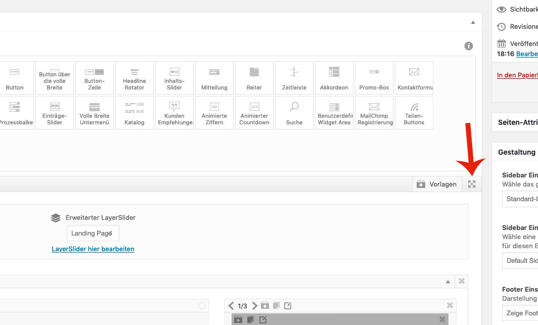 October 10, 2019 at 3:32 pm in reply to: LayerSlider 6 unable to deactivate, delete or update #1146875
it seems that the above code blocks all plugins – do not know why
if this is all your Quick CSS – then why is clear for above reasons.
there are some closing brackets missing – each opening bracket must have a closing bracket.@media only screen and (max-width: 767px) { .av_textblock_section .avia_textblock p * { font-size: 12px !important } } @media only screen and (max-width: 767px) { .responsive #scroll-top-link { display: block!important; } }
But because the media query is the same – you can combine them to:@media only screen and (max-width: 767px) { .av_textblock_section .avia_textblock p * { font-size: 12px !important } .responsive #scroll-top-link { display: block!important; } }
EditActually I think as someone who wanted to help you with the solution I have a certain right to know if and how you solved the problem.
Unfortunately the topic was already closed – but maybe you’ll come back to read this.it sound for me – as if you entered a css rule in quick css that is not well formated.
A missing closing bracket e.g. on a media-query rule could be happen easily.
If you can post your quick css – we can see what happensMy guess is based on the fact that on Enfold these setting below are just behind your quick css rules
if there is on top a missing closing bracket – every rule after that has no effect..container {width:100%;} .container .av-content-small.units {width:75%; } .responsive .boxed#top , .responsive.html_boxed.html_header_sticky #header, .responsive.html_boxed.html_header_transparency #header{ width: 1310px; max-width:90%; } .responsive .container{ max-width: 1310px; } #top #wrap_all .av-main-nav ul > li > a, #top #wrap_all .avia_mega_div, #top #wrap_all .avia_mega_div ul, #top #wrap_all .av-main-nav ul ul{color:#404040;background-color:#cfcfcf;font-size:14px;} #top #header .av-main-nav > li > a{color:#000000;} #top #header .av-main-nav > li > a .avia-menu-text, #top #header .av-main-nav > li > a .avia-menu-subtext{color: #000000;}and you see that jordans rule above is part of this enfold options css under the quick css.
if you had a top menu then the activation is done and that little snippet of avia_meta_header is unnecessary:
this you can erase :add_filter( 'avf_execute_avia_meta_header', '__return_true', 10, 1);the css will depend on the position of top menu – this here is for left position:
#header_meta .av-rotator-container { font-size: 24px !important; position: relative; left: 50%; float: left !important; transform: translateX(-50%); top: -10px; } .av_secondary_left .sub_menu { width: 80%; } #header_meta span { font-size: 30px; }there is a hook if the sub-menu is present.
– but if we don’t want sub-menu on top we can activate it nevertheless via filter:add_filter( 'avf_execute_avia_meta_header', '__return_true', 10, 1); add_action('avia_meta_header', function() { if(is_page(3)){ echo do_shortcode("[ av_headline_rotator before_rotating='' after_rotating='' interval='5' animation='' margin='' margin_sync='true' tag='h2' size='36' align='center' custom_title='' av-medium-font-size-title='' av-small-font-size-title='' av-mini-font-size-title='' alb_description='' id='' custom_class='' av_uid='av-k1gw6wo0' admin_preview_bg=''] [ av_rotator_item title='today we offer abc' link='' linktarget='' custom_title='' av_uid='av-it587'] [ av_rotator_item title='but the whole week it is' link='' linktarget='' custom_title='' av_uid='av-egknj'] [ av_rotator_item title='⇒ another line to present' link='' linktarget='' custom_title='' av_uid='av-6u493'] [ /av_headline_rotator]"); }; });a little css to position it:
#header_meta .sub_menu {
    font-size: 24px !important;
    position: relative;
    left: 50%;
    float: left !important;
    transform: translateX(-50%);
    top: 0;
}

#header_meta span {
    font-size: 30px;
}
see testpage: https://webers-testseite.de/guenni/datenschutzerklaerung/
there is a little error in the textblock.php
https://kriesi.at/support/topic/4-6-3-1-issues/#post-1144794
here is a corrected textblock.php : Link
you can close this because it seems to be better posted there – because i think borlabs – is borlabs himself ;)
https://kriesi.at/support/topic/code-block-element-doesnt-handle-shortcodes-properly/If you do that all testings : do you allways refresh all caching tools ( including autoptimizer , enfold merging etc.) ?
October 9, 2019 at 12:50 pm in reply to: Code Block Element doesn't handle shortcodes properly #1146502Issue is solved with Borlabs Cookie Version : 2.1.3
small addendum: sometimes there are other elements between the mfp wrapper and the wrap_all. So wrap_all is no longer a direct neighbour.
Therefore you should rather use this one:/* instead of the code ( direct neighbor ) */ .mfp-wrap + #wrap_all { position: fixed !important ; } /* this here ( General Sibling Selector ) */ .mfp-wrap ~ #wrap_all { position: fixed !important ; }
so it is now:.mfp-zoom-in.mfp-ready.mfp-bg, .mfp-zoom-in.mfp-ready .mfp-preloader { opacity: 0.8; } .mfp-content { position: fixed !important; top: 50%; left: 50%; transform: translate(-50% , -50%); overflow: hidden; } .mfp-arrow { position: fixed !important } .mfp-wrap ~ #wrap_all { position: fixed !important ; } img.mfp-img { max-width: 70vw; padding: 10px 0 !important; }PS : it is clear that if you put it in a media query only for screens bigger than 768px – that the code does not work below this screen-width
October 9, 2019 at 12:01 pm in reply to: Code Block Element doesn't handle shortcodes properly #1146486i tested to replace the new output in 4.6.3.1 in Enfold.php of Borlabs
:$output = "<div {$meta['custom_el_id']} class='avia-video avia-video-{$format} {$html} {$custom_class} {$av_display_classes}' {$style} {$markup} data-original_url='{$src}' >{$output}</div>";then it runs as expected
October 9, 2019 at 11:11 am in reply to: Code Block Element doesn't handle shortcodes properly #1146466on : borlabs-cookie ▸ classes ▸ Cookie ▸ Frontend in Frontend.php
if I comment out the enfold lines the function runs ! :
line 116:
// Enfold
if (function_exists('avia_register_frontend_scripts')) {
    add_action('avf_sc_video_output', [ThirdParty\Themes\Enfold::getInstance(), 'modifyVideoOutput'], 100, 6);
}
so there must be something in the Enfold.php that blocks selfhosted Videos.
borlabs-cookie ▸ classes ▸ Cookie ▸ Frontend ▸ ThirdParty ▸ Themes ▸ Enfold.phpOctober 9, 2019 at 9:50 am in reply to: Code Block Element doesn't handle shortcodes properly #1146441on Enfold 4.6.3.1 i have troubles with the self-hosted Video and new lightbox feature of Video ALB. Does it possibly have to do with this subject here?
When i deactivate the plugin, the video in lightbox works.Edit : must be Borlabs Cookie Plugin. Sorry – had never Problems so far with this nice Cookie Consent Plugin.
I check now what setting of Borlabs it is.you can see here on top the video plays – but the lightbox video on the bottom does not do it:
https://webers-testseite.de/guenni/selfhosted-video-as-background/no one hampers you to calculate other width: f.e.
for my example page:
because it is a grid-row after the slider the calculation it a bit different from color-section as follower.@media only screen and (max-width:989px) { #united_slider .avia-slideshow.av_fullscreen { width: calc(100vw - 16%) !important; height: 45vw !important; left: 50%; transform: translateX(-50%); } }this is for your problem the best construction.
Take only a fullscreen slider – set its screenoptions to display everywhere !!!:https://webers-testseite.de/slider-depending-on-screenwidth/
there is even for you a better moving script for the slider before the header container with a little performance optimizing debounce function.
Enfold itself has a debounce function included but i didn’t know how to use it for this function. October 8, 2019 at 2:44 pm in reply to: Portfolio Raster – Einzelansicht auf neuer Seite öffnen und Navigation #1146182
Well – under the Masonry there is the Grid – and that worked too.
The autop function and the removal of line breaks is a WordPress peculiarity. I’ll just show you how to get around it. That’s all.
The one with the small plugin is to be set up once, then also the one who manages to make a font bold can insert such a linebreak into the text editor, which doesn’t disappear.you can add in text modus :
<br class="noclear"/>With a little plugin you can create your own buttons on visual mode that inserted these breaks f.e.
( Visual Editor Custom Buttons)
you can have then own icons on those buttons etc.:

well i do not see your site – but if it is not to complicated – maybe only text – with links
then you can use the headline-rotator shortcode as Rikard said and maybe a hook to embed this.https://webers-testseite.de/guenni/datenschutzerklaerung/
it is simply done via child-theme functions.php and on styled before on a post or page. to get the shortcode:
here just for the page-id-3:in this manner: echo do_shortcode(“…”);
add_action('ava_main_header', function() {
if(is_page(3)){
echo do_shortcode("[ av_headline_rotator before_rotating='' after_rotating='' interval='5' animation='' margin='' margin_sync='true' tag='h2' size='36' align='center' custom_title='' av-medium-font-size-title='' av-small-font-size-title='' av-mini-font-size-title='' alb_description='' id='' custom_class='' av_uid='av-k1gw6wo0' admin_preview_bg='']
	[ av_rotator_item title='today we offer abc' link='' linktarget='' custom_title='' av_uid='av-it587']
	[ av_rotator_item title='but the whole week it is' link='' linktarget='' custom_title='' av_uid='av-egknj']
	[ av_rotator_item title='another line to present' link='' linktarget='' custom_title='' av_uid='av-6u493']
[ /av_headline_rotator]");
};
});
here is a little description on how you get this shortcode: Link
October 7, 2019 at 9:42 pm in reply to: Google Maps wird unter MacOS Safari nicht angezeigt #1145923Yes – seems to work on his site!
From Participant to Participant:
I am waiting since 47 hours now
Actually, I wanted to look at your code; but when I read something like this, I move on to the nearest problem.
Yes – but your biggest problem is the image optimization.
You can see on the F-Result for a lot of images that an optimized version is sometimes more than 40% reduction.
By the way – alot of beginners – download this presented optimized Version and upload them instead of the original.
One of the images is nearly 600kb big. thats immense for a web graphicAll you need to test is described on that page: https://webers-testseite.de/slider-depending-on-screenwidth/
If you don’t make yourself a slave to Performance Test Tools, then I think a little movement on the start page is good.
On my site I even have a small self-hosted movie running, which also works on the mobile phone!this is my function for him sofar- maybe a mod could tell me how to use the included debounce resize function on enfold for it:
( the selector has to be more specific – maybe an ID or Custom Class – but that could be done later)function slider_move(){ ?> <script> (function($){ var fullscreenSlider = $(".avia-fullscreen-slider"); fullscreenSlider.clone().detach(); $(window).on('load resize', function () { var winWidth = $(window).width(); if (winWidth < 990) { $("#main").prepend(fullscreenSlider); } else { $("#wrap_all").prepend(fullscreenSlider); } }); })(jQuery); </script> <?php } add_action('wp_footer', 'slider_move'); -
AuthorPosts