Forum Replies Created
-
AuthorPosts
-
Der Du als Standard rührt halt noch aus der Zeit her, als WP ein reines Blogger Tool war.
Bis dann.This is not in all circumstances right: Link
- …
- Please Note: Most images in the theme demo are stock photos from photodune which are not part of the theme
wenn du generell die formale Anrede nutzen möchtest, dann stell es im Dashboard bei “Einstellungen – Allgemein – Sprache der Website” ein ( Deutsch(Sie)). – Dann sollte Enfold auch die entsprechenden Sprachfiles nehmen.
December 3, 2019 at 4:25 pm in reply to: Grid row mobile responsiveness not working properly #1162261look here and tryout the responsiveness.
under the point “code” you can see how it works.
These settings had to be adjusted on each case.Wow – thats nice – one thing not to remember on updating enfold.
By the way: @doffine
it is not a bug. When that little red 1 shows up, the layerslider has updates – the only error is that this red 1 is displayed in the Plugin Tab, but there is no LayerSlider there.
I for my part am very satisfied that the Layerslider is included as a bonus in Enfold.
Or do we want to complain here until it is removed from the package?
;) https://www.youtube.com/watch?v=-2iZjxSGca8Thanks Günter – That worked right away.
______
But what I don’t understand at all, because in the original file, it is noted with “LayerSlider”. So I have it on my server too.
614 : $layerslider = str_replace( '\\', '/', get_template_directory() . '/config-layerslider/LayerSlider/layerslider.php' );In the changed config.php line 633 it now says “layerslider” – and that’s how it runs ??? allthough i got LayerSlider folder.
633: $layerslider = '/config-layerslider/layerslider/layerslider.php';it wouldn’t have bothered me personally, but there are still some customers with admin access who always believe that there is a need for action because of this little red sign.
For me it is solved now – and can be closed.
Will this be implemented in a future Enfold version? Certainly not yet into the next one, after Envato hastily announced the new version, which will be released soon.there is one thing that is not nice: the post-navigation thumbnails are replaced too – and that has to be avoided.
Hard to style in the right manner.
Maybe a short question to the plugin author could solve that issue.give that little plugin a chance.
you can embed even youtube or vimeo videos as “featured image” but think of GDPR.
big advantage of self-hosted video – if you start one in the preview – the other stops playingsee : https://webers-testseite.de/category/allgemein/
The only thing is then to get rid of “featured-image” link to the single post. That can be done by functions.php entry.Edit : on GDPR Reasons i get rid of youtube video now.
-
This reply was modified 6 years, 4 months ago by
Guenni007.
And of course – if you have declared the post as video type post. the first found video in this post will be taken on some enfold pages as featured image above – like in : https://kriesi.at/themes/enfold-2017/blog/blog-multi-author/
where is the video?
Edit : ok i had to press the load-more button.
That video is a selfhosted one – you can try the plugin above – see my test page with the post-slider on the bottom-
This reply was modified 6 years, 4 months ago by
can you show me a link to a theme where the “featured image” is a video?
I tested this a while ago : https://wordpress.org/plugins/featured-video-plus/
– alltought it is an older plugin it works on WP 5.3 and it seems to be o.k.
– but on GDPR ( DSGVO ) Reasons it is no good advice to use for that youtube or vimeo etc. hoster. ( with borlabs cookie it is ok )
– with sound – it does not stop the video when it is out of view ( f.e. post slider )see here: https://webers-testseite.de/portfolio-item/pirol-hifi/ and look to the bottom for “Projekte” the post slider.
i guess the only way to have background-video GDPR conform is to have a selfhosted video. So for server performance it would be best to have small selfhosted videos in this case.
For embedded videos there are solutions.
For links to Lightbox YouTube videos – I guess they’re fine – but for those who want it legally correct – you probably have to code a little yourself.
See f.e.: https://glas-lepper.de/vw-bus-historie/ – see the iceland videoalso the No-Cookie-Version is not conform with GDPR (DSGVO) guidelines.
by the way – even an iframe embedded youtube video is transformed from google (youtube) to the shortform of:https://youtu.be/…And even borlabs cookie does not block : background-videos
borlabs does not block the new possiblity of video alb to show on lightbox ( meant is not to block the iframe itself – but the preview image and the link to the lightbox.
That is very sad because blocking embedded videos is working good: https://webers-testseite.de/youtube-nocookie/December 1, 2019 at 8:38 pm in reply to: Fixed Frame Layout – Different Border Colours in Different Pages #1161662CSS : Cascading Style Sheet – the ids and classes that comes first in the markup are in front
the first that comes on the markup is the html – and html is not a class!
Where is your page-id ? : It is on the body tag! ( and that has the id : top and comes after html)
and that is right: those frames are childs of body – so there is a space between #top and .av-frameso :
html.html_av-framed-box #top.page-id-29 .av-frame.av-frame-vert {background: #ff6600 !important} html.html_av-framed-box #top.page-id-29 .av-frame.av-frame-bottom {background: #ff6600 !important} html.html_av-framed-box #top.page-id-29 .av-frame.av-frame-hor {background: #ff6600 !important} html.html_av-framed-box #top.page-id-29 .av-frame.av-frame-right {background: #ff6600 !important}Also ich kann hier die unterschiedlichen Farben wählen, (selbst hinter einem VPN ;) ) klappt alles wunderbar.
hi kahil – looks very nice
are the new possibilites of developer tab are included to your alb elements? Custom Class and ID etc.?hey Günter – as far i can see this is only added a condition for an existing standalone layerslider plugin – and that makes sence.
But we only want to know how to use the existing filter ( avf_show_layerslider_update_notification ) to hamper the update nag of the included layerslider.
My first thought on: Link – blocks all update nags not only the layerslider one.the code we can find here on board:
function remove_ls_update_notification() {
	return 'no';
}
add_filter('avf_show_layerslider_update_notification', 'remove_ls_update_notification');
does not work
December 1, 2019 at 12:34 am in reply to: Menu bar with dynamically changing colors referencing the background #1161520My first thought was to use the waypoints script. Enfold has on default implemented the waypoints script.
You can google to its functionality.if you have defined for the color-section background-colors. You can use it to give that color to the header_bg background-color:
see here: https://webers-testseite.de/datenschutzerklaerung/this comes to child-theme functions.php:
function header_bg_color_on_scroll() {
?>
<script>
    (function($) {
    var element_to_animate = $('.avia-section');

    element_to_animate.waypoint(function(direction) {
    if (direction === 'down') {
        var section_color = $(this.element).css('background-color');
          $('.header_bg').css('background-color', section_color);
        }
        }, {
          offset: '100px'
        });
    element_to_animate.waypoint(function(direction) {
    if (direction === 'up') {
        var section_color_prev = $(this.element).prev().css('background-color');
        $('.header_bg').css('background-color', section_color_prev);
          }
        }, {
          offset: '100px'
        });
})(jQuery);
</script>
<?php
}
add_action('wp_footer', 'header_bg_color_on_scroll', 9999);
The Offset depends on your header height in scrolled mode – so if you have a shrinking header it will be the end height after scroll.
You can test it yourselfyou mean this? :
.av-frame.av-frame-bottom.av-frame-vert {
    display: none;
}
November 30, 2019 at 9:39 am in reply to: two elements with id="avia-menu" (accessibility issue) #1161442what enfold version did you use. These duplicate id’s if you use a header layout where header_main_alternate was created is solved on newer versions. f.e. on pages with header top navigation below:
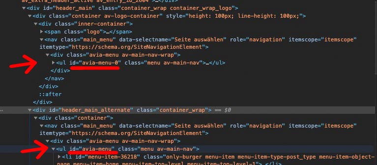
you see that the original menu ul got a different idit is not solved – but you link to the page which should pop-up ( https://www.housescape.org.uk/cgi-bin/full.pl?&pab1&&PAB1000374 ) is not helpfull.
Where is the page with the button?i mentioned it too that the message of ThemeForest ( Envato ) was a misinformation. What i try to say about the link above is that I can’t understand how to update live sites, especially those with shop systems, without having a quick rollback in the background.
With the above mentioned method this is a thing of not even 5 min to return to the old state.
Instead, we read here some abusive tirades and that the team has to do as fast as possible to fix the bugs.
If an active website is running, then there is no need to update it – if I have only such pages at the start, you should only update according to the method above.By the way – it is not the first time that Envato announces a new Version and there was still the old one – or the complete download is not updatet – but only the installable WordPress File has the new version etc. pp.: in order to save yourself unnecessary work, a quick look into the style.css would be helpful after the download.
Where did you get the wordpress from? : https://de.wordpress.org/download/
this is the whole languages folder of WordPress 5.3 German : Download
Try to replace the whole folder on your installation.on your dashboard your Settings in : Einstellungen – Allgemein ( Settings – General )
and look on your User Account too: There is a language Input Field.yes – I also wanted to test the new update directly and saw then also that it was still the old version.
I can’t understand your problems after an update. In a “non-test environment” you at least keep a rollback ready.
I posted this already in October 2018 and is still the safest method to update and come back in case of inconsistencies or bugs.
https://kriesi.at/support/topic/some-hints-and-advice-to-update-enfold/#post-1056107the site-transient-update-plugins does not work – on some places in internet i found this pre_site_transient_update_plugins
The code which i try to use to only block layerslider update notification was://Remove layerslider update nag function remove_ls_update_notification($value) { if($value) { unset($value->response['https://YOUR-DOMAIN/wp-content/themes/enfold/config-layerslider/LayerSlider/layerslider.php'] ); return $value; } } add_filter('pre_site_transient_update_plugins', 'remove_ls_update_notification');or :
function remove_ls_update_notification($value) {
	if($value) {
		unset($value->response['//'.$_SERVER['HTTP_HOST'].'/wp-content/themes/enfold/config-layerslider/LayerSlider/layerslider.php']);
		return $value;
	}
}
add_filter('pre_site_transient_update_plugins', 'remove_ls_update_notification');
but it blocks all ( don’t know why) update-notifications.
I can’t confirm that on my side too. Although the gtmetrix values are not so nice –
It loads itself everything quite quickly ( And i cleared all cachings before making the screen film ) . See film. https://webers-testseite.de/wp-content/uploads/maskenzauber.mp4
Chrome only reports mixed content when loading some fonts – see picture.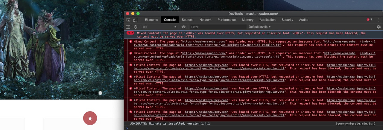
but if you see the more informative Speedtest on gtmetrix: https://gtmetrix.com/reports/maskenzauber.com/88uokIa1
you will see that what probably slows down the most are the images that have not been optimized for the output sizes.
Next thing is matomo.js could be compressed ( thats your analytics tool ? )Unfortunately, many have a wrong idea of how responsive images ( background images ) work.
Either the image reacts to the screen width, then you can see it completely across all widths. For background images this would be the contain property. – Or you can specify fixed heights or width ( this is the cover variant), then the image will be cropped at different screen widths. Of course you can compress or stretch the image, but this is not advisable for a concrete image.Well you have enough variants now – I hope you find an acceptable solution. I would prefer the two color-section solution, and give both the same class.
and what hampers you to change a littlebit the layout:

with this setup :
custom-ID of the color-section is: Pferd

see: https://webers-testseite.de/feedxl/
you can give to the 1/1 containers a fullwidth definition. – But in responsive Case the columns react normal and flow under each other.
if you have only 1/1 it will work.
The css for that example above (think to get rid or replace the custom-ID):.responsive #top #pferd .container { max-width: 100%; width: 100%; padding: 0; } .responsive body #pferd .column-top-margin { margin-top: 0; } .responsive #pferd .flex_column.av_one_full { height: 50% !important; } .responsive #top #wrap_all #pferd .flex_column { margin-bottom: 0 !important } -
AuthorPosts