Forum Replies Created
-
AuthorPosts
-
You see here the instruction : https://kriesi.at/documentation/enfold/social-share-buttons/#how-to-add-custom-social-icons-to-enfold-options
and scroll a short distance to : In case of using an image
i actually always recommend to use pictures when there are only one or two additional icons.You see at the very end of parent functions.php file :
/*
 *  register custom functions that are not related to the framework but necessary for the theme to run
 */
just after that ( but before functions-enfold.php is required ) you can add your custom snippets.
_____________
But :living the world of WordPress is so much easier if you take advantage of a child theme. So I would recommend you to set one up.
The clear advantages greatly outweigh the few disadvantages. Last but not least because of the preservation of all changes even after updates of the parent theme.
Enfold makes it quite easy for you to change even advanced installations to a child theme.March 20, 2020 at 3:36 pm in reply to: Import FontAwesome font in enfold icon import shows square in icon list in avia #1194805However, when I do the same with a fontawesome font, it shows an empty square in icon list in avia builder.
the fontawesome from fontello or where did you download it?
the logo if set is alway present : rule it via media querries as in layout.css
________Hi, I don’t see why this is only relevant for narrow transparent screen widths.
if you are below 768px (or 990px) you will generally not see the alternative logo. So why switch. For this case it would be sufficient to set only the normal logos.
So it is only relevant if you keep the transparency contrary to the default settings of Enfold.
In this case, it would be necessary to set a different alternative logo and then make the layout adjustments.But this is only relevant if you allow transparency for narrow screen widths.
This would certainly have been an important information in your introduction.On helper-main-menu.php since line 127 ( Enfold 4.7.3)
there is a condition that is bound to header_transparencyon functions-enfold.php since line 1166 :
//header class that tells us to use the alternate logo
the class : av_alternate_logo_active is set for that to #headeron layout.css there is ruled the visibility of that logo:
@media only screen and (max-width: 989px) { .responsive.html_mobile_menu_tablet #top .av_header_transparency.av_alternate_logo_active .logo a > img{opacity:1} .responsive.html_mobile_menu_tablet #top .av_header_transparency .logo img.alternate{display:none;} } @media only screen and (max-width: 767px) { .responsive #top .av_header_transparency.av_alternate_logo_active .logo a > img{opacity:1} .responsive #top .av_header_transparency .logo img.alternate{display:none;} }there is another filter that can do the job:
add_filter('avf_header_setting_filter','replace_transparent_logo_on_some_pages');
function replace_transparent_logo_on_some_pages($header){
    if( is_page(123) ){
        $header['header_replacement_logo'] = "https://url-to-the-new-logo";
    }
    return $header;
}
you can use any conditional tag wordpress offers – maybe you can use even
if (lang == 'en') {
you can use arrays :if( is_page( array( 42, 54, 6 ) ) ) {etc. ppthe logo itself is possible with this as you said allready:
add_filter('avf_logo','av_change_logo'); function av_change_logo($logo){ if( is_page(21) ) { $logo = "http://www.domain.com/wp-content/uploads/logoforpage21.jpg"; } elseif ( is_page( array( 42, 54, 6 ) ) ) { $logo = "http://www.domain.com/wp-content/uploads/logoforpage42.jpg"; } elseif ( is_page() && !is_page(1307) ) { $logo = "http://www.domain.com/wp-content/uploads/logoforpage23.jpg"; } return $logo; }It was actually quite a hard job to read myself back into it. But now it’s probably not that interesting to look at the solution anymore. Well – …
This workout i would only do if i had to add more than one icon to my enfold.
you can upload a svg file to fontello icon : http://fontello.com/
these svgs had to be monochrome – and sometimes do not work correct in fontello because of svg spezicications ( compound path etc. )
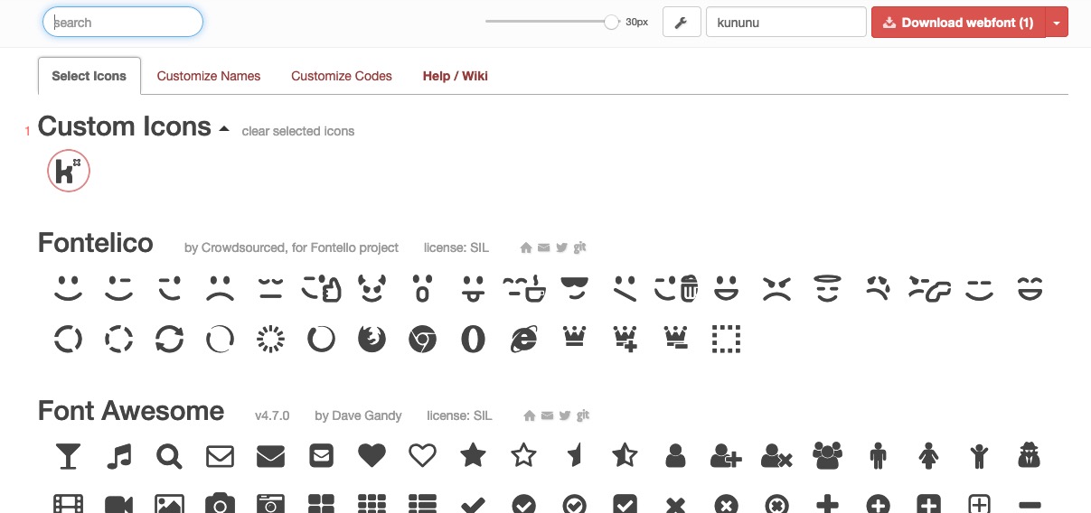
then activate these generated font-icons and name the font – then download.
here is that fontello generated zip
https://webers-testseite.de/fontello-bdbd84bd.zipgoto your Enfold-Child – Import/Export and upload that zip to your Enfold via : Icon Font Manager.
Because i named the font : kununu the font-family is then the same kununufunction avia_add_custom_social_icon($icons) { $icons['Kununu'] = 'kununu'; return $icons; } add_filter('avf_social_icons_options','avia_add_custom_social_icon', 10, 1); // Register new icon as a theme icon function avia_add_custom_icon($icons) { $icons['kununu'] = array( 'font' =>'kununu', 'icon' => 'ue800'); return $icons; } add_filter('avf_default_icons','avia_add_custom_icon', 10, 1);Styling : depends on you.
#top #wrap_all .av-social-link-kununu:hover a{ color:#fff; background-color:#99c612; }But please read carefully: if you have updated the theme to 4.7.3 ( and i see you have done that) then the code : here is obsolete. The Theme Version 4.7.3 has this allready implemented.
And you link now as described here : https://kriesi.at/support/topic/how-to-link-to-tabs/#post-1157756maybe ask Günter to look to it
or take only the white sings as png files and style the background-colors for them.
Guess normal logo color of them is: #99c612See documentation here too:
https://kriesi.at/documentation/enfold/social-share-buttons/#how-to-add-custom-social-icons-to-enfold-optionsif there are not too many individual social icons, I would recommend not to use font icons, but to use images (png’s) instead
For this you would have to find a suitable image file for the icon – e.g.:
the whole thing is possible as circle too:
To Register the new Icon on Enfold put this to your child-theme functions.php
function avia_add_custom_social_icon($icons) {
	$icons['Kununu'] = 'kununu';
    return $icons;
}
add_filter('avf_social_icons_options','avia_add_custom_social_icon', 10, 1);
Now you can add on Enfold-Child Options – Social Profiles – the new icon ( it is at the end of the list : link maybe: https://www.kununu.com/ )
to have now the image for that new icon
you had to place this to your quick css
(the image dimensions depends on your other settings for social media icons – standard seem to be 30px):#top #wrap_all .av-social-link-kununu a:before{ content: ""; width: 30px; height: 30px; float: none !important; display: inline-block !important; vertical-align: middle; background: url(PATH-TO-YOUR-IMAGE/kununu-quad.png) no-repeat center center; background-size: contain; } /**** hover style - just an example - if you make the image a bit smaller - you can style background-color ***/ #top #wrap_all .av-social-link-kununu:hover a { -webkit-filter: hue-rotate(180deg); filter: hue-rotate(180deg) }see here in my footer the example: https://webers-testseite.de/#footer
You’re so counseling-resistant.
please individual height – no equal heights – no gap –
if you don’t make it now, then my support for you ends here with my 6000th post.
Hope you can let a mod login to your backend – I’m desperate here!See with your images and text: https://webers-testseite.de/griditems/
here is the shortcode: Edit with link to your images:
[av_section min_height='' min_height_pc='25' min_height_px='500px' padding='default' custom_margin='0px' custom_margin_sync='true' color='main_color' background='bg_color' custom_bg='#78b2b6' background_gradient_color1='' background_gradient_color2='' background_gradient_direction='vertical' src='' attachment='' attachment_size='' attach='scroll' position='top left' repeat='no-repeat' video='' video_ratio='16:9' overlay_opacity='0.5' overlay_color='' overlay_pattern='' overlay_custom_pattern='' shadow='no-border-styling' bottom_border='no-border-styling' bottom_border_diagonal_color='#333333' bottom_border_diagonal_direction='' bottom_border_style='' custom_arrow_bg='' id='outlines-flex' custom_class='' aria_label='' av_element_hidden_in_editor='0' av_uid='av-zqkdpc'] [av_one_fourth first min_height='' vertical_alignment='av-align-middle' space='no_margin' row_boxshadow_color='' row_boxshadow_width='10' margin='0px' margin_sync='true' mobile_breaking='' border='' border_color='' radius='0px' radius_sync='true' padding='25px' padding_sync='true' column_boxshadow_color='' column_boxshadow_width='10' background='bg_color' background_color='' background_gradient_color1='' background_gradient_color2='' background_gradient_direction='vertical' src='' attachment='' attachment_size='' background_position='top left' background_repeat='no-repeat' highlight_size='1.1' animation='' link='' linktarget='' link_hover='' title_attr='' alt_attr='' mobile_display='' id='' custom_class='' aria_label='' av_uid='av-k7stpf2d'] [av_textblock size='' av-medium-font-size='' av-small-font-size='' av-mini-font-size='' font_color='custom' color='#ffffff' id='' custom_class='' av_uid='av-k7utm0tl' admin_preview_bg=''] <img class="aligncenter size-full wp-image-37087" src="https://californiadataprivacyact.com/wp-content/uploads/2020/03/Number-1-WHT-80x80.png" alt="" width="80" height="80" /> <h4 style="text-align: center;">California Based Professionals</h4> [/av_textblock] [/av_one_fourth][av_one_fourth min_height='' vertical_alignment='av-align-middle' space='no_margin' row_boxshadow_color='' row_boxshadow_width='10' margin='0px' margin_sync='true' mobile_breaking='' border='' border_color='' radius='0px' radius_sync='true' padding='25px' padding_sync='true' column_boxshadow_color='' column_boxshadow_width='10' background='bg_color' background_color='' background_gradient_color1='' background_gradient_color2='' background_gradient_direction='vertical' src='' attachment='' attachment_size='' background_position='top left' background_repeat='no-repeat' highlight_size='1.1' animation='' link='' linktarget='' link_hover='' title_attr='' alt_attr='' mobile_display='' id='' custom_class='' aria_label='' av_uid='av-k7stpf2d'] [av_textblock size='' av-medium-font-size='' av-small-font-size='' av-mini-font-size='' font_color='custom' color='#ffffff' id='' custom_class='' av_uid='av-k7utm0tl' admin_preview_bg=''] <img class="aligncenter wp-image-37088 size-full" src="https://californiadataprivacyact.com/wp-content/uploads/2020/03/Number-2-WHT-80x80.png" alt="" width="80" height="80" /> <h4 style="text-align: center;">Trusted by Multi-Billion Dollar Customers</h4> [/av_textblock] [/av_one_fourth][av_one_fourth min_height='' vertical_alignment='av-align-middle' space='no_margin' row_boxshadow_color='' row_boxshadow_width='10' margin='0px' margin_sync='true' mobile_breaking='' border='' border_color='' radius='0px' radius_sync='true' padding='25px' padding_sync='true' column_boxshadow_color='' column_boxshadow_width='10' background='bg_color' background_color='' background_gradient_color1='' background_gradient_color2='' background_gradient_direction='vertical' src='' attachment='' attachment_size='' background_position='top left' background_repeat='no-repeat' highlight_size='1.1' animation='' link='' linktarget='' link_hover='' title_attr='' alt_attr='' mobile_display='' id='' custom_class='' aria_label='' av_uid='av-k7stpf2d'] [av_textblock size='' av-medium-font-size='' av-small-font-size='' av-mini-font-size='' font_color='custom' color='#ffffff' id='' custom_class='' av_uid='av-k7utm0tl' admin_preview_bg=''] <img class="aligncenter wp-image-37089 size-full" src="https://californiadataprivacyact.com/wp-content/uploads/2020/03/Number-3-WHT-80x80.png" alt="" width="80" height="80" /> <h4 style="text-align: center;">Customized and Secure Intake of Consumer Requests</h4> [/av_textblock] [/av_one_fourth][av_one_fourth min_height='' vertical_alignment='av-align-middle' space='no_margin' row_boxshadow_color='' row_boxshadow_width='10' margin='0px' margin_sync='true' mobile_breaking='' border='' border_color='' radius='0px' radius_sync='true' padding='25px' padding_sync='true' column_boxshadow_color='' column_boxshadow_width='10' background='bg_color' background_color='' background_gradient_color1='' background_gradient_color2='' background_gradient_direction='vertical' src='' attachment='' attachment_size='' background_position='top left' background_repeat='no-repeat' highlight_size='1.1' animation='' link='' linktarget='' link_hover='' title_attr='' alt_attr='' mobile_display='' id='' custom_class='' aria_label='' av_uid='av-k7stpf2d'] [av_textblock size='' av-medium-font-size='' av-small-font-size='' av-mini-font-size='' font_color='custom' color='#ffffff' id='' custom_class='' av_uid='av-k7utm0tl' admin_preview_bg=''] <img class="aligncenter wp-image-37091 size-full" src="https://californiadataprivacyact.com/wp-content/uploads/2020/03/Number-4-WHT-80x80.png" alt="" width="80" height="80" /> <h4 style="text-align: center;">Responsive Customer Service</h4> [/av_textblock] [/av_one_fourth][av_one_fourth first min_height='' vertical_alignment='av-align-middle' space='no_margin' row_boxshadow_color='' row_boxshadow_width='10' margin='0px' margin_sync='true' mobile_breaking='' border='' border_color='' radius='0px' radius_sync='true' padding='25px' padding_sync='true' column_boxshadow_color='' column_boxshadow_width='10' background='bg_color' background_color='' background_gradient_color1='' background_gradient_color2='' background_gradient_direction='vertical' src='' attachment='' attachment_size='' background_position='top left' background_repeat='no-repeat' highlight_size='1.1' animation='' link='' linktarget='' link_hover='' title_attr='' alt_attr='' mobile_display='' id='' custom_class='' aria_label='' av_uid='av-k7stpf2d'] [av_textblock size='' av-medium-font-size='' av-small-font-size='' av-mini-font-size='' font_color='custom' color='#ffffff' id='' custom_class='' av_uid='av-k7utm0tl' admin_preview_bg=''] <img class="aligncenter wp-image-37091 size-full" src="https://californiadataprivacyact.com/wp-content/uploads/2020/03/Number-5-WHT-80x80.png" alt="" width="80" height="80" /> <h4 style="text-align: center;">Privacy Law Knowledge Base</h4> [/av_textblock] [/av_one_fourth][av_one_fourth min_height='' vertical_alignment='av-align-middle' space='no_margin' row_boxshadow_color='' row_boxshadow_width='10' margin='0px' margin_sync='true' mobile_breaking='' border='' border_color='' radius='0px' radius_sync='true' padding='25px' padding_sync='true' column_boxshadow_color='' column_boxshadow_width='10' background='bg_color' background_color='' background_gradient_color1='' background_gradient_color2='' background_gradient_direction='vertical' src='' attachment='' attachment_size='' background_position='top left' background_repeat='no-repeat' highlight_size='1.1' animation='' link='' linktarget='' link_hover='' title_attr='' alt_attr='' mobile_display='' id='' custom_class='' aria_label='' av_uid='av-k7stpf2d'] [av_textblock size='' av-medium-font-size='' av-small-font-size='' av-mini-font-size='' font_color='custom' color='#ffffff' id='' custom_class='' av_uid='av-k7utm0tl' admin_preview_bg=''] <img class="aligncenter wp-image-37092 size-full" src="https://californiadataprivacyact.com/wp-content/uploads/2020/03/Number-6-WHT-80x80.png" alt="" width="80" height="80" /> <h4 style="text-align: center;">Licensed in California</h4> [/av_textblock] [/av_one_fourth][av_one_fourth min_height='' vertical_alignment='av-align-middle' space='no_margin' row_boxshadow_color='' row_boxshadow_width='10' margin='0px' margin_sync='true' mobile_breaking='' border='' border_color='' radius='0px' radius_sync='true' padding='25px' padding_sync='true' column_boxshadow_color='' column_boxshadow_width='10' background='bg_color' background_color='' background_gradient_color1='' background_gradient_color2='' background_gradient_direction='vertical' src='' attachment='' attachment_size='' background_position='top left' background_repeat='no-repeat' highlight_size='1.1' animation='' link='' linktarget='' link_hover='' title_attr='' alt_attr='' mobile_display='' id='' custom_class='' aria_label='' av_uid='av-k7stpf2d'] [av_textblock size='' av-medium-font-size='' av-small-font-size='' av-mini-font-size='' font_color='custom' color='#ffffff' id='' custom_class='' av_uid='av-k7utm0tl' admin_preview_bg=''] <img class="aligncenter wp-image-37093 size-full" src="https://californiadataprivacyact.com/wp-content/uploads/2020/03/Number-7-WHT-80x80.png" alt="" width="80" height="80" /> <h4 style="text-align: center;">Trusted Privacy Partner</h4> [/av_textblock] [/av_one_fourth][av_one_fourth min_height='' vertical_alignment='av-align-middle' space='no_margin' row_boxshadow_color='' row_boxshadow_width='10' margin='0px' margin_sync='true' mobile_breaking='' border='' border_color='' radius='0px' radius_sync='true' padding='25px' padding_sync='true' column_boxshadow_color='' column_boxshadow_width='10' background='bg_color' background_color='' background_gradient_color1='' background_gradient_color2='' background_gradient_direction='vertical' src='' attachment='' attachment_size='' background_position='top left' background_repeat='no-repeat' highlight_size='1.1' animation='' link='' linktarget='' link_hover='' title_attr='' alt_attr='' mobile_display='' id='' custom_class='' aria_label='' av_uid='av-k7stpf2d'] [av_textblock size='' av-medium-font-size='' av-small-font-size='' av-mini-font-size='' font_color='custom' color='#ffffff' id='' custom_class='' av_uid='av-k7utm0tl' admin_preview_bg=''] <img class="aligncenter wp-image-37094 size-full" src="https://californiadataprivacyact.com/wp-content/uploads/2020/03/Number-8-WHT-80x80.png" alt="" width="80" height="80" /> <h4 style="text-align: center;">Ongoing New Data Privacy Law Support</h4> [/av_textblock] [/av_one_fourth] [/av_section]i guess – no chance to influence background video from iframes . A selfhosted video (html5) will work.
maybe 90px padding on top/bottom is too much – just do it to your needs
March 16, 2020 at 3:07 am in reply to: Masonry Grid – Portfolio Links Open New Window Issue #1193365you can either do it via page-id-xyz or via custom-class of your masonry
function add_custom_target(){
if(is_page(xyz)){
?>
<script>
(function($){
    $(window).load(function() {
      $('.av-masonry-container a').attr('target','_blank');
    });
})(jQuery);
</script>
<?php
}
}
add_action('wp_footer', 'add_custom_target');
or as said before with custom-class on masonry element – f.e.: masonry-blank:
function add_custom_target(){
?>
<script>
(function($){
    $(window).load(function() {
      $('.masonry-blank a').attr('target','_blank');
    });
})(jQuery);
</script>
<?php
}
add_action('wp_footer', 'add_custom_target');
last version has the advantage that you can have more than one masonry on this page – the one with class opens links blank – the other not
and if you have a masonry on a different page it will work too – if class is set.hm – first get rid of that invisible hr – you can manage that in a different way.
Because all elements in a flex container will be handled and that is an additonal container.
This color-section should have only the columns in it.then – i do not see even the first rule to set the entry-content-wrapper to display:flex – so i guess you have not regenerated the mergied files of css and js.
i see on developer tools none of my code above – these are the old merged files:
This merging of the files behaves similar to caching – so goto your Enfold Child – Performance – and mark delete old css an js files – and save all changes.
After that delete the browser cache too!See what happens to the page if i (virtually) add the code to your page:
the two images are not set as the others to align: center – that makes a difference because these have other paddings !
i deleted one thing ( all of your content is set to white color – so the one rule is obsolete) and i added only one rule to have more padding left right:
#outlines-flex .entry-content-wrapper {
  display: flex;
  flex-flow: row wrap;
  justify-content: center;
  overflow: hidden;
  align-items:  stretch;
}

/*** otherwise these "containers" will influence the flexbox ***/
#outlines-flex .entry-content-wrapper::before,
#outlines-flex .entry-content-wrapper::after {
  display: none;
}

#outlines-flex .entry-content-wrapper .flex_column {
  flex: 1 1 auto;
  outline: 1px solid #fff;
  padding: 90px 30px !important;
  margin: 0 ;
}

#outlines-flex .entry-content-wrapper .flex_column * {
  text-align: center !important;
}

@media only screen and (max-width: 989px) {
  #outlines-flex .entry-content-wrapper .flex_column {
      flex: 0 1 50%;
      outline: 1px solid #fff;
      padding: 90px 30px !important;
      margin: 0  !important
  }
}

@media only screen and (max-width: 549px) {
  #outlines-flex .entry-content-wrapper {
      justify-content: space-around;
  }
  #outlines-flex .entry-content-wrapper .flex_column {
      flex: 0 1 90%;
      outline: none !important;
      padding: 40px 30px !important;
      border: 1px solid #fff;
     margin-bottom: 20px !important
  }
}
think of your merged files !
PS: Avoid uncommon signs in css f.e. that dashed line in your quick css ? – – – – – – – – – – on top – remove this too – if you want to have comments in css just surround it by /***** xyz ****/by the way if you do not like to have these arrays with a loto of lists:
this could be an interesting link for you : https://kriesi.at/support/topic/different-header-logo-for-different-sections-of-website/#post-1065071
that is for all suppages .
On Categories there are more condition tags to include whole sets : https://codex.wordpress.org/Conditional_Tags but see difference is_category() , has_category() and in_category()you first have to read carefully – i think all my tuts are good enough to reproduce.
first take the flexbox modell !
This is a mighty way to do this.
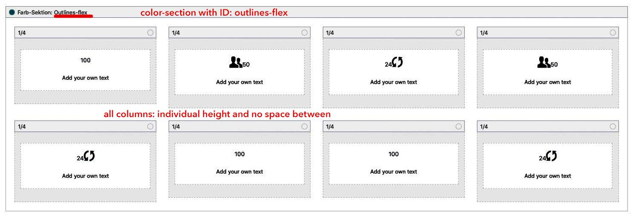
Then a lot of participants only put in the code and do not read about custom classes or ID’sthe setting was: all 8 1/4th columns in one colour section; this color-section got the ID : outlines-flex
the 1/4th columns are set to individual height and with no space between!click to enlarge:
Thats it: then try the code.: Link
March 15, 2020 at 9:15 pm in reply to: Masonry / portolio grid: How can I change the order of sort options (not abc)? #1193295on the other hand if the order option you need is a kind of system i use this in child-theme functions.php:
function avia_custom_query_extension($query, $params)
    {
        global $avia_config;
        if(!empty($avia_config['avia_custom_query_options']['order']))
        {
            $query['order'] = $avia_config['avia_custom_query_options']['order'];
        }
        if(!empty($avia_config['avia_custom_query_options']['orderby']))
        {
            $query['orderby'] = $avia_config['avia_custom_query_options']['orderby'];
        }
        unset($avia_config['avia_custom_query_options']);
        return $query;
    }

    add_filter('avia_masonry_entries_query', 'avia_custom_query_extension', 10, 2);
    add_filter('avia_post_grid_query', 'avia_custom_query_extension', 10, 2);
    add_filter('avia_post_slide_query', 'avia_custom_query_extension', 10, 2);
    add_filter('avia_blog_post_query', 'avia_custom_query_extension', 10, 2);
    add_filter('avf_magazine_entries_query', 'avia_custom_query_extension', 10, 2);
    add_filter('avf_template_builder_shortcode_elements','avia_custom_query_options', 10, 1);
    function avia_custom_query_options($elements)
    {
        $allowed_elements = array('av_blog','av_masonry_entries','av_postslider','av_portfolio','av_magazine');

        if(isset($_POST['params']['allowed']) && in_array($_POST['params']['allowed'], $allowed_elements))
        {
            $elements[] = array(
                "name" => __("Custom Query Orderby",'avia_framework' ),
                "desc" => __("Set a custom query orderby value",'avia_framework' ),
                "id"   => "orderby",
                "type"  => "select",
                "std"   => "",
                "subtype" => array(
                    __('Default Order',  'avia_framework' ) =>'',
                    __('Title',  'avia_framework' ) =>'title',
                    __('Random',  'avia_framework' ) =>'rand',
                    __('Date',  'avia_framework' ) =>'date',
                    __('Author',  'avia_framework' ) =>'author',
                    __('Name (Post Slug)',  'avia_framework' ) =>'name',
                    __('Modified',  'avia_framework' ) =>'modified',
                    __('Comment Count',  'avia_framework' ) =>'comment_count',
                    __('Page Order',  'avia_framework' ) =>'menu_order')
            );
            $elements[] = array(
                "name" => __("Custom Query Order",'avia_framework' ),
                "desc" => __("Set a custom query order",'avia_framework' ),
                "id"   => "order",
                "type"  => "select",
                "std"   => "",
                "subtype" => array(
                    __('Default Order',  'avia_framework' ) =>'',
                    __('Ascending Order',  'avia_framework' ) =>'ASC',
                    __('Descending Order',  'avia_framework' ) =>'DESC'));
        }
        return $elements;
    }

    add_filter('avf_template_builder_shortcode_meta', 'avia_custom_query_add_query_params_to_config', 10, 4);
    function avia_custom_query_add_query_params_to_config($meta, $atts, $content, $shortcodename)
    {
        global $avia_config;
        if(empty($avia_config['avia_custom_query_options'])) $avia_config['avia_custom_query_options'] = array();

        if(!empty($atts['order']))
        {
            $avia_config['avia_custom_query_options']['order'] = $atts['order'];
        }

        if(!empty($atts['orderby']))
        {
            $avia_config['avia_custom_query_options']['orderby'] = $atts['orderby'];
        }
        return $meta;
    }
it will add on each ALB which concerns to a sort option dialog.
March 15, 2020 at 9:13 pm in reply to: Masonry / portolio grid: How can I change the order of sort options (not abc)? #1193290i use – if there are not so many portoflio /post a plugin called Intuitive custom post order.
Günter told me that f.e. : https://de.wordpress.org/plugins/simple-custom-post-order/ this is a good alternative.
You can drag and drop on the post / portfolio list the entries to the place your need.This is not intended as a final solution, but as a bridge until there is a fix. In this case the child theme solution can then be quickly undone.
I have compared the files in both folders – with DiffMerge – there are no differences. Now to think about it: I replaced your enfold with mine via ftp. No Alt and Title attributes on the Alternate logo ?
So this is strange!
PS @peterolle : my manual input fields work ! Just paste the code to your child-theme functions.php
function my_transparent_logo_attributes( array $avia_elements = array() ) { $slug = "header"; $id = 'header_replacement_logo'; $new_element_1 = array( "slug" => "header", "name" => __( "Alt for the Transparency Logo", 'avia_framework' ), "desc" => __("Put in your Alt Attribute for Transparency Logo", 'avia_framework'), "id" => "header_replacement_logo_alt", "type" => "text", "std" => "" ); $new_element_2 = array( "slug" => "header", "name" => __( "Title for the Transparency Logo", 'avia_framework' ), "desc" => __("Put in your Title Attribute for Transparency Logo", 'avia_framework'), "id" => "header_replacement_logo_title", "type" => "text", "std" => "" ); $found = false; $index = 0; foreach( $avia_elements as $key => $element ){ $index++; if( isset( $element['id'] ) && ( $element['id'] == $id ) && isset( $element['slug'] ) && ( $element['slug'] == $slug ) ) { $found = true; break;} } if( ! $found ) { $avia_elements[] = $new_element_1 ; $avia_elements[] = $new_element_2 ; } else { $avia_elements = array_merge( array_slice( $avia_elements, 0, $index ), array( $new_element_1, $new_element_2 ), array_slice( $avia_elements, $index ) ); } return $avia_elements; } add_filter( 'avf_option_page_data_init', 'my_transparent_logo_attributes', 10, 1 );Yes but – it is not quiet easy as i thought first:
if this is the setting: https://kriesi.at/support/topic/change-bacground-color-of-sidebar/#post-1192188
we have for the content: 1310px because of left right padding of 50px.
for the : template-page content it is : 956,3px (73% of 1310px)
and for aside : 353,7px (27% of 1310px) but this ends on the right side without padding – if you want to colorize it looks better if you do a “pseudo padding” more background as the width of it is f.e. the 50px
…hope you all will understand the calculations with the given comments:
/**** just for that example page ***** don't know why there is container set to 95% ***** so i first set it to 100% because it is better to understand ***** and 1410px with 50px padding left and right ***** so template width is 1310px - content is 73% of that - aside ist 27% ***** ****/ .container { width: 100% !important; } @media only screen and (min-width: 1410px) { .container_wrap.sidebar_right:not([style*="background-image"]):before { content: ''; display: block; position: absolute; left: calc(50vw + 0.23*1310px); top: 0; background: #ddd; height: 100%; width: calc(0.27*1310px + 50px); /** 27% of 1310px + 50px ** looks better **/ } } /** in case it should cover the whole background from aside start to screen width end @media only screen and (min-width: 1410px) { .container_wrap.sidebar_right:not([style*="background-image"]):before { content: ''; display: block; position: absolute; left: calc(50vw + 0.23*1310px); top: 0; background: #ddd; height: 100%; width: calc(50vw - 0.23*1310px); } } ***/ @media only screen and (max-width: 1409px) { .container_wrap.sidebar_right:not([style*="background-image"]):before { content: ''; display: block; position: absolute; right: 0 ; top: 0; background: #ddd; height: 100%; width: calc(0.27*(100vw - 100px) + 50px) } } @media only screen and (max-width: 767px) { .container_wrap.sidebar_right:not([style*="background-image"]):before { display: none } }with an update the code is then no longer necessary – because enfold 4.7.3 already has these ID’s on the av-layout-tab
Tip: on using images as on my example footer – and with white or black symbols you can style the hover state with f.e. filter : hue-rotate:
#top #wrap_all .av-social-link-telegram:hover a { -webkit-filter: hue-rotate(180deg); filter: hue-rotate(180deg); }flexbox modell – same example page – see the difference on responsive behavior: https://webers-testseite.de/griditems/
just have individual height here for 1/4th containers and no space between – the ID in this color-section is: outlines-flex#outlines-flex .entry-content-wrapper { display: flex; flex-flow: row wrap; justify-content: stretch; overflow: hidden; } /*** otherwise these "containers" will influence the flexbox ***/ #outlines-flex .entry-content-wrapper::before, #outlines-flex .entry-content-wrapper::after { display: none; } #outlines-flex .entry-content-wrapper .flex_column { flex: 1 1 auto; outline: 1px solid #fff; padding: 90px 0 !important; margin: 0 } /*** just forgotten to set the colors for the entries ***/ #outlines-flex .avia-animated-number * { color: #fff !important; } @media only screen and (max-width: 989px) { #outlines-flex .entry-content-wrapper .flex_column { flex: 0 1 50%; outline: 1px solid #fff; padding: 90px 0 !important; margin: 0 !important } } @media only screen and (max-width: 549px) { #outlines-flex .entry-content-wrapper { justify-content: space-around; } #outlines-flex .entry-content-wrapper .flex_column { flex: 0 1 90%; outline: none !important; padding: 90px 0 !important; border: 1px solid #fff; margin-bottom: 20px !important } }Play a bit with your responsive break-points maybe it is necessary to adjust for your settings.
just create a color-section ( gave a custom-class or unique ID to it f.e.: outlines) – but in all 8 times your 1/4 columns
style them with outline not with borders !
the surrounding container got now the overflow:hidden – so in most cases the outlines at the border are gone – otherwise a negativ margin will to the trick.#outlines .flex_column { outline: 1px solid #fff; overflow: visible !important; padding: 90px 0 !important; } #outlines .entry-content-wrapper { overflow: hidden !important; }see here: https://webers-testseite.de/griditems/
For the responsive case : do some css to hide – or switch then to bordersEdit : if you want it really perfect – just do it as in your example page and use flexbox modell to rule the outlook
.mfp-inline-holder .mfp-content, .mfp-ajax-holder .mfp-content { width:1000px; }a bit offtopic but sometimes it is nice to use instead an image. You can use exactly the same code-snippet to register a new social share icon but with images ( png’s f.e.)
see documentation: https://kriesi.at/documentation/enfold/social-share-buttons/#gist85414748see here in my footer the usage of png file: https://webers-testseite.de/#footer
___________________________________
PS : entypo-fontello ( standard Enfold font icon set has that little paper-airplane too) :
function avia_add_custom_icon($icons) { $icons['telegram'] = array( 'font' =>'entypo-fontello', 'icon' => 'ue8b7'); return $icons; } add_filter('avf_default_icons','avia_add_custom_icon', 10, 1); function avia_add_custom_social_icon($icons) { $icons['Telegram'] = 'telegram'; return $icons; } add_filter('avf_social_icons_options','avia_add_custom_social_icon', 10, 1); -
AuthorPosts