Forum Replies Created
-
AuthorPosts
-
June 24, 2020 at 8:16 pm in reply to: choosing full width / different margins for individual rows #1225339
even if you get it to work on respecting the aspect ratios of the background-image – if content in the grid-cell gets bigger than the height of the image it will not work:
see example page: https://webers-testseite.de/grid-row-layout/
these two images are in an aspect ratio of 16:9 so if no crop should be there the cell should be 50vw width and 28.125vw of height.
on responsive case i decided to have the text first then the image
Shrink the screen width.
And see what happend to the 2nd grid-row when content height is biggeryou do not want to limit the number on the search results page – only on the preview in the ajax search ?
put this to your child-theme functions.php:
add_filter('avf_ajax_search_query', 'avf_modify_ajax_search_query', 10, 1);
function avf_modify_ajax_search_query($search_parameters){
	parse_str($search_parameters, $params);
	$params['numberposts'] = 5;
	$search_parameters = http_build_query($params);
	return $search_parameters;
}
to limit the results per page on the search-results page there are some codes here on the board. To get rid of the pagination with css is easy.
June 24, 2020 at 6:13 pm in reply to: Featured Images missing from Posts created using the Advanced Layout Editor #1225301maybe you read further here : https://kriesi.at/support/topic/featured-image-by-default-in-post-with-avia-possible/#post-1210480
Am Besten wäre es du stellst das Search Icon wie üblich an : Enfold-Child – Hauptmenu – “Fügt Suchsymbol zum Menü hinzu”
Dann fügst du das hier in deine child-theme functions.php ein:function avia_append_search_nav ( $items, $args ){ if(avia_get_option('header_searchicon','header_searchicon') != "header_searchicon") return $items; if ((is_object($args) && $args->theme_location == 'avia') || (is_string($args) && $args = "fallback_menu")){ global $avia_config; ob_start(); $getform = get_search_form(false); $items .= '<li id="menu-item-search" class="noMobile menu-item menu-item-search-dropdown">'.$getform.'</li>'; } return $items; } add_filter( 'wp_nav_menu_items', 'avia_append_search_nav', 10, 2 );das in das Quick css:
#top #avia-menu #searchform  {
  position: relative;
  height: 100%
}

#top #avia-menu #searchform > div {
    opacity: 1 !important;
    display: block !important;
    top: 25px;  /**** musst du noch anpassen an deine Header Dimensionen *****/
}

#top #avia-menu #searchform .ajax_search_response {
    background-color: rgba(255,255,255,0.8);
}
wenn du den placeholder Text zentriert haben möchtest:
#top #avia-menu ::-webkit-input-placeholder { text-align: center } #top #avia-menu :-moz-placeholder { text-align: center } #top #avia-menu ::-moz-placeholder { text-align: center} #top #avia-menu :-ms-input-placeholder { text-align: center}-
This reply was modified 5 years, 9 months ago by
Guenni007.
Wie sieht denn dein Header aus? Also die ganzen Einstellungen deines Headers : logo left, menu right, sticky , transparent , shrinking or not etc. pp.
Wenn du also keine Link hast, dann wäre das mal ein Ansatz, wo man bessere Hilfe geben kann.
Oder ist der Link nicht ganz jugendfrei ? ;)-
This reply was modified 5 years, 9 months ago by
wenn du ( und das ist ja meist der Fall ) über Apache Server unterwegs bist kannst du das alles bequem auch über die htaccess datei im root Verzeichnis einstellen. Der entsprechende mod heißt: mod_expires.c
Bist du vertraut mit dem Umgang einer htaccess datei?
das sind so einträge, die ich standardmäßig gesetzt habe:
<IfModule mod_expires.c> ExpiresActive on ExpiresDefault "access plus 1 month" # CSS ExpiresByType text/css "access plus 1 year" # Data interchange ExpiresByType application/atom+xml "access plus 1 hour" ExpiresByType application/rdf+xml "access plus 1 hour" ExpiresByType application/rss+xml "access plus 1 hour" ExpiresByType application/json "access plus 0 seconds" ExpiresByType application/ld+json "access plus 0 seconds" ExpiresByType application/schema+json "access plus 0 seconds" ExpiresByType application/vnd.geo+json "access plus 0 seconds" ExpiresByType application/xml "access plus 0 seconds" ExpiresByType text/xml "access plus 0 seconds" # Favicon (cannot be renamed!) and cursor images ExpiresByType image/vnd.microsoft.icon "access plus 1 week" ExpiresByType image/x-icon "access plus 1 week" # HTML - No Caching ExpiresByType text/html "access plus 0 seconds" # JavaScript ExpiresByType application/javascript "access plus 1 year" ExpiresByType application/x-javascript "access plus 1 year" ExpiresByType text/javascript "access plus 1 year" # Manifest files ExpiresByType application/manifest+json "access plus 1 week" ExpiresByType application/x-web-app-manifest+json "access plus 0 seconds" ExpiresByType text/cache-manifest "access plus 0 seconds" # Update 2020: Google recommendation: cache duration increased to 1 year # @see: https://web.dev/uses-long-cache-ttl/ # Media files ExpiresByType audio/ogg "access plus 1 year" ExpiresByType image/bmp "access plus 1 year" ExpiresByType image/gif "access plus 1 year" ExpiresByType image/jpeg "access plus 1 year" ExpiresByType image/png "access plus 1 year" ExpiresByType image/svg+xml "access plus 1 year" ExpiresByType image/webp "access plus 1 year" ExpiresByType video/mp4 "access plus 1 year" ExpiresByType video/ogg "access plus 1 year" ExpiresByType video/webm "access plus 1 year" # Web fonts # Embedded OpenType (EOT) ExpiresByType application/vnd.ms-fontobject "access plus 1 year" ExpiresByType font/eot "access plus 1 year" # OpenType ExpiresByType font/opentype "access plus 1 year" # TrueType ExpiresByType application/x-font-ttf "access plus 1 year" # Web Open Font Format (WOFF) 1.0 ExpiresByType application/font-woff "access plus 1 year" ExpiresByType application/x-font-woff "access plus 1 year" ExpiresByType font/woff "access plus 1 year" # Web Open Font Format (WOFF) 2.0 ExpiresByType application/font-woff2 "access plus 1 year" # Other ExpiresByType text/x-cross-domain-policy "access plus 1 week" </IfModule>-
This reply was modified 5 years, 9 months ago by
btw: ich bin hier auch nur Teilnehmer.
bezüglich Schriften: schau dir mal die eigenschaft: font-display an. Eventuell hilft das schon weiter.
https://css-tricks.com/google-fonts-and-font-display/Enfold hat jetzt unter: Performance – show advanced options “Custom Font Display Behaviour” an: und stell mal auf swap
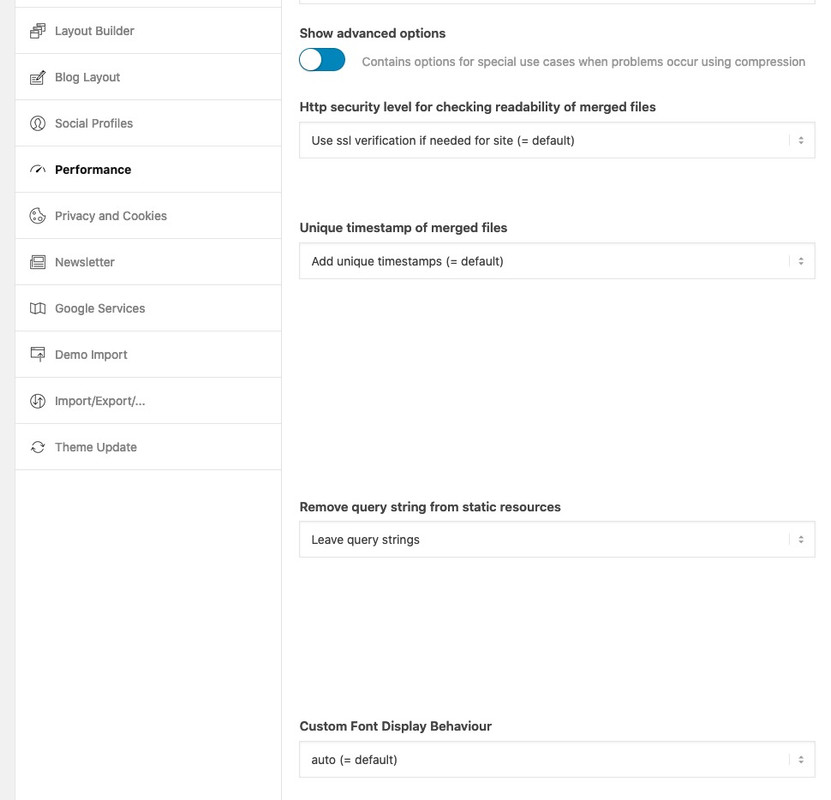
Bin mir aber nicht sicher, ob das auch auf die selbstgehosteten Fonts auswirkung hat. Sonst musst du es selbst implementieren.
Wahrscheinlich hast du ja über @font-face geladen dann z.B. dort einfach einfügen:@font-face { font-family: 'Arvo'; font-display: swap; src: local('Arvo') …; }hier ist mal eine ausführliche Anleitung die zeigt, wie man einem Menu-punkt eine benutzerdefinierte Klasse zuordnet.
Nicht jeder weiss, wie die entsprechenden Felder einzublenden sind : https://kriesi.at/support/topic/how-put-logo-on-full-screen-mobile-menu/#post-1223295Was muss man machen um einen solchen Menupunkt dort zu platzieren?:
Einen Menüpunkt anlegen: Über uns
Diesem Menupunkt die Klasse: menu-item-avia-special geben
Diesen Menupunkt kannst du eigentlich überall ablegen. Am Besten ganz unten__________
here is a detailed tutorial that shows how to assign a custom class to a menu item.
Not everyone knows how to show the corresponding fields : https://kriesi.at/support/topic/how-put-logo-on-full-screen-mobile-menu/#post-1223295What do you have to do to place such a menu item there?
Create a menu item: Über uns
This menu item has the class: menu-item-avia-special
You can actually place this menu item anywhere. Best at the bottomDas von Dir oben erwähnte dient lediglich dazu Menschen, die ein Hamburger Symbol nicht direkt als Menu Symbol erkennen eine Hilfestellung zu bieten.
Das von dir angestrebte würde jedoch den Sinn des Hamburger Menu Buttons ad absurdum führen. Der soll ja nun das Menu öffnen, wäre es möglich den mit einem Link zu belegen, würde der Link öffnen und das Hamburger Menu schließen.
Es ist jedoch möglich neben dem Hamburger Menu – Menupunkt zu haben, die ähnlich der Lupe sichtbar bleiben, und auch bei geöffnetem Hamburger Menu oben stehen bleiben.
___________
But that would take the meaning of the Hamburg menu button ad absurdum. It is supposed to open the menu, if it were possible to assign a link to it, the link would open and close the Hamburg menu.
But it is possible to have menu items next to the hamburger menu, which remain visible like a magnifying glass, and remain on top even when the hamburger menu is open.
Not too complex ?
If you need additonal help – tell mezum 1. Punkt auch nomal was allgemeines: Viele Dinge die wichtig für z.B WAI-ARIA sind werden immer noch von den Validierungstools als Warnung herausgegeben. Roles zB.
– den Punkt: “An element with role=tab must be contained in, or owned by, an element with role=tablist” könnte man mal an die Devs hier weiterleiten.
– warum speak : none als Fehler gilt ?
Die Eigenschaft speak hat sechs Werte. Die folgenden Werte sind in CSS2.1 angegeben:
- none
- normal
- spell-out
Andere Werte werden in CSS3 angegeben:
- auto
- never
- always
_____________
to the 1st point also nominally something general: Many things that are important for e.g. WAI-ARIA are still issued by the validation tools as a warning. Roles e.g.
– the point: “An element with role=tab must be contained in, or owned by, an element with role=tablist” could be forwarded to the devs here.
– why speak : none is an error ?
The property speak has six values. The following values are given in CSS2.1:
- none
- normal
- spell-out
Other values are given in CSS3:
- auto
- never
- always
mal abseits dieses Wahnes den page-speed tools genüge tun zu müssen – ist doch mit der Gtmetrix Messung soweit alles in Ordnung!
Eventuell sollte ich auch mal Autoptimize testen – schein ja was zusätzlich zu bringen.Was mich an deiner Seite zunächst eher stören würde, ist die Tatsache das die Seite nicht https lädt. Das Cert ist gültig bis: 8.10.2020, 16:28:32 (Mitteleuropäische Sommerzeit) aber da muss also was im argen liegen.
Bist du jüngst erst auf ein Zertifikat gewechselt? Denn das ist ein wesentlich schwerwiegenderes Problem bezüglich DSGVO als der fehlende Copyright Hinweis.
Rechtlich denke ich genügt es das detailliert im Impressum anzugeben. Es muss nicht immer direkt bei dem Bild stehen – oder hat sich das was geändert?__________
apart from this delusion of having to do enough with the page-speed tools – everything is fine with the Gtmetrix measurement!
Maybe I should also test Autoptimize – it seems to bring something additional.What would bother me on your side is the fact that the page does not load https. The cert is valid until: 8.10.2020, 16:28:32 (Central European Summertime) but there must be something wrong.
Have you recently switched to a certificate? Because this is a much more serious problem regarding GDPR than the missing copyright notice.
Legally I think it is enough to mention this in detail in the imprint. It does not always have to be directly next to the picture – or has something changed?So my solution is to have all three alb files concerning to submenu in the child-theme shortcodes folder
Activate the usage of child-theme shortcodes instead of the parent files with this in child-theme functions.phpadd_filter('avia_load_shortcodes', 'avia_include_shortcode_template', 15, 1); function avia_include_shortcode_template($paths){ $template_url = get_stylesheet_directory(); array_unshift($paths, $template_url.'/shortcodes/'); return $paths; } // End of child-theme shortcodes loading snippetand download all three files from pastebin here ( based on enfold 4.7.5) :
menu.php : https://pastebin.com/dl/CudTKvh1 and look
menu.js : https://pastebin.com/dl/mTtFgR8K and look
menu.css : https://pastebin.com/dl/Ckpa9z7w and lookcreate a child-theme shortcodes folder via ftp and upload all files to that directory.
i had to set on that in quick css :
@media only screen and (max-width: 989px) {
	#top .sticky_placeholder {
	  position: absolute;
	}
}
But this may be due to the fact that this test website has so many settings in functions.php and quick css that it was overwritten.
Result f.e.: https://webers-testseite.de/transparent-header/
You can see there both ( all three ) cases inbetween 480 and 990 i have submenu and under 480 hamburger.
And: if there are more than one submenu the lower one gets sticky too if comes to the top.I do not see your site link – cause i’m participant as you – to give better advice it would be nice to know more about your header settings.
Well i guess this is not quiet simple as some like to have it.
To get the sticky header even on mobile and on transparency header this is just
quick css:
( i have on most of my installations the 990 break point for burger menu so: )@media only screen and (max-width: 989px) { .responsive #top #wrap_all #header .container { width: 90%; max-width: 90%; } #header { position: fixed !important; height: 80px !important; max-height: 80px !important; } .responsive.html_mobile_menu_tablet #top #wrap_all .av_header_transparency { background-color: transparent; } .responsive #top .av-logo-container , .responsive #top .logo a, .responsive #top .logo img { height: 80px !important; max-height: 80px !important; } .responsive #top .av-main-nav .menu-item-avia-special a { height: 80px !important; line-height: 80px !important; } }__________________________ Just for Info – if you only interested in the solution skip to the next post ________________
The sticky state when burger is active depends on the menu.js and the condition for :
if( burger_menu.is(":visible")
my search here on the board resulted unfortunately only in hits, which commented out this condition, which if you test this of course does not lead to the goal.
so we had to find a calculation for that case – this can be found out more or less quickly – my solution is:if( burger_menu.is(":visible") && (scrolled + modifier > top_pos) ){ this.css({top: header.Height() , position: 'fixed !important'}); fixed = true; }Info: i first had the header.outerHeight() – but with that i had a 1px difference on scrolling on – do not know why.
So far so good, but if you want to use a hamburger for the submenu in the responsive case, what is calculated in the script is unfortunately overwritten by the menu.css by setting values to !important.
Even the calculated inline style could not overwrite these settings because the selector is more specific f.e:/**** from original menu.css - each break point (switch ) has these rules set to !important *********/ @media only screen and (max-width: 989px){ .responsive #top .av-switch-990.av-submenu-container{top: auto !important; position: relative !important; height:auto; min-height:0; margin-bottom: -1px;} }so we had to get rid of the important setting – thats why we need to have an own child-theme menu.css
only the submenu or do you like to have the header with burger fixed too?
if these messages are for me – i can not see it – because i’m Participant as you are an do not see private content area.
May i ask a different question to your heading topic ? What on earth does the title of your topic have to do with your question?
I only do know Duotone Images in relation to print design ( Duplex printing ).All opening brackets need a closing one!
so if you get rid of:if(is_page(19)){you had to find the corresponding closing curly bracket. -( the round one are neutral the open and just closes a few letters behind)
that is the reason why your code is not without error.
Another hint: here on board it might be usefull to insert code as code – therefor we had here the code tag above.
First click on code – then insert your code – click now on/code(oben a tag – close a tag as always)To look what might be not correct it is best to have it 1/1 – boardsoft changes if you do not use the code tag the content ( f.e. quotation marks to something different etc. pp )
if you put this in your color-section as video link:
https://www.youtube.com/watch?v=81hhkBaIvNM?autoplay=1&cc_load_policy=1&enablejsapi=1&playsinline=1&mute=1&color=white&iv_load_policy=3&start=20&end=30&loop=1&playlist=81hhkBaIvNMit starts at the right point – but on loop it starts then from the beginning. The loop=1 has effect on that – you don’t need the playlist ( Contrary to the API instructions of the past ) – don’t know why the loop goes to the real starting point.
No, not now – this little plugin is currently the only method I know that is able to loop the video including the start time
-
This reply was modified 5 years, 9 months ago by
just one moment – brainstorming
there is a little plugin specialized on background- video. This plugin: advanced wordpress backgrounds is capable to play even youtube or vimeo videos from a start to an endpoint as background.
See here with your video from 20sec to 55sec. You only have to set a few smaller css entries to adapt it to Enfold.
The movie will be put into the appropriate section using the code-block element and a shortcode from the plugin.
https://webers-testseite.de/youtube-background/
Password: EnfoldBut i try to find a solution with Enfold Tools only.
-
This reply was modified 5 years, 9 months ago by
i can not reproduce the troubles in question:
if i have no link on an image – there will be no click event on it.
Even if i have some other images on the page with lightbox linking the images with no link are not in the gallery view on lightbox:
https://webers-testseite.de/images-with-no-link/
Or do you mean in gallery or masonry-galleries?June 22, 2020 at 8:01 pm in reply to: Blog Posts ALB with Portfolio – do not work as expected #1224701Well, it would be easy to see if this is the case if my guess is correct, for example by updating Enfold 2017 from version 4.4 to the current Enfold version and seeing how the list view of the blogs looks like.
I have just repaired and optimized the databases on the server side, without success.In fact, I would argue that this should become a standard procedure for you before you release a new version.
What I tried now: Export of the portfolios – complete deletion within the WordPress Dashboard – import with WordPress Importer. – It remains so that these old portfolios do not appear in the list view.
The one older portfolio that appears in the list view, but has a wrong link in the read more link, is the first one after the new created portfolios.may i see the page it concerns.
Think of i’m participant as you are – so i do not see private messages – otherwise you had to wait til mods are here.in contrast to the other code this should not happen here, because the distance to the upper border is taken from the header.offsetTop value here.
if you like to have a big area as aktive link you can surround inside that div the section which is all arround the content (to surround the whole div i would not try) – because an anchor as a block-level element is hard to style f.e. with border-radius and it is hard to position in that manner so my solution now on that page this way:
<div class="my-styling-for-that-ads" …><a href="https: …><section>your content </section></a></div>
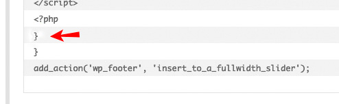
and give the padding to the section or to the textblock as here in the code:function insert_to_a_fullwidth_slider() { ?> <script> (function($){ $( '.avia-fullwidth-slider.my-fullwidth-slider-with-that-ads .avia-slideshow-inner' ).append('<div class="my-styling-for-that-ads" style="background-color: #21495d; border-radius:0px 0px 30px 0px"><a href="https://YOUR-DOMAIN.com" target="_blank" rel="noopener noreferrer"><section class="av_textblock_section" itemscope="itemscope" itemtype="https://schema.org/CreativeWork"><div class="avia_textblock av_inherit_color " style="padding:0 20px 10px 20px; color:#FFF " itemprop="text"><p><img class="alignnone" src="/wp-content/uploads/rhino-on-blob.png" alt="rhino-logo" width="150"></p><div class="hr hr-short hr-left" style="margin: 10px 0;"><span class="hr-inner"><span class="hr-inner-style"></span></span></div><p>Skip your<br>security deposit<br>with <strong>Rhino</strong></p></div></section></a></div>'); })(jQuery); </script> <?php } add_action('wp_footer', 'insert_to_a_fullwidth_slider');just for a better understanding the inserted div – see a solo html page with that div only and the tree-structure:
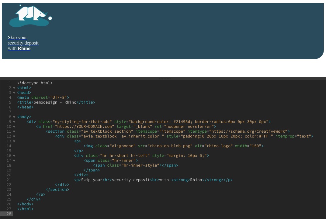
but we need that div in a one-liner to insert it with append in the functions.php. Otherwise we will have a php error on that.
PS : you then can have too a hover style for the whole div:
.my-styling-for-that-ads:hover { background-color: #0040ff !important; }these are only custom-classes – if you like to rename it – just do it and then change the code accordingly.
( thats why i mentioned a : sorry sounds similar but isn’t )You know how to give a custom class to an Enfold Element ?
The code above is the code from my test-page for you – so it is site-specific as Rikard mentioned – if you have this on every page – and want it on every fullwidth slider you can get rid fo page-id and of first custom class.
But this is to insert it the place you like – if a fullwidth-slider has that custom-class f.e. now : my-fullwidth-slider-with-that-ads :
if the fullwidth-slider did not have that class – it will not have the additional divfunction insert_to_a_fullwidth_slider() { ?> <script> (function($){ $( '.avia-fullwidth-slider.my-fullwidth-slider-with-that-ads .avia-slideshow-inner' ).append('<div class="my-styling-for-that-ads" …>…</div>'); })(jQuery); </script> <?php } add_action('wp_footer', 'insert_to_a_fullwidth_slider');a custom-class just to have a simpler selector – now for f.e.: my-styling-for-that-ads
.my-styling-for-that-ads {
    position: absolute;
    border: 1px solid #fff;
    display: inline-block;
    z-index: 10;
    top: -1px;
    left: -1px;
    box-shadow: 3px 3px 20px #fff;
}
June 21, 2020 at 6:26 am in reply to: Colour section layout problem in very wide screen and h1 problem in home page #1224366in other words – css has agreed to shorten the specifications for many of the properties.
Sizes that can be set to four settings because an up/down – left/right exists is as follows:2 values instead of 4:
margin: 0 auto; /*** on the following that is interpretation of the given short form ***/
    margin-top: 0px;
    margin-right: auto;
    margin-bottom: 0px;
    margin-left: auto;
so two values if there could be 4 means that we have same values for top/bottom and right/left
3 values :margin: 0 auto 30px; margin-top: 0px; margin-right: auto; margin-bottom: 30px; margin-left: auto;you see the values are set clockwise beginning from top value: top, right, bottom, left
Values that refer to corners starts top-left and then clockwise:
border-radius: 2px 3px 4px 5px;
    border-top-left-radius: 2px;
    border-top-right-radius: 3px;
    border-bottom-right-radius: 4px;
    border-bottom-left-radius: 5px;
on hex-color settings there is only if the value inside a color-channel is the same you can not it f.e.:
#33FF22 short to : #3F2
Thats all so if you have white : #FFFFFF this is the only shortform for it : #FFF
etc. pp:
for your setting above:.custom-class .container { max-width: 1500px; padding-left: 0 20px; /** maybe here is an !important necessary **/ margin: 0 auto; /** this is standard value - no need to change it **/ }you can see here a brilliant list of css settings : https://tympanus.net/codrops/css_reference/
in this context please explain the difference between the two possibilities:
“Display selected page withour redirect” – and – “Redirect to selected page”June 19, 2020 at 2:09 pm in reply to: Logo in the middle and burger menu on the right in desktop mode #1224064see now: https://webers-testseite.de/cynthia/
By the way working on that – i recognized that it might be more easy to use the normal header style: logo: left – menu right !
no the one is than from the older post obsolete.
June 19, 2020 at 10:59 am in reply to: place a small "static ad" over the top of the slider #1224017I would strongly recommend to install a child theme for Enfold.
You could of course place it in the functions.php of the parent theme, but these entries would be lost with the next update.
So you have exactly one place for such snippets – the child-theme functions.php.See here some info and donwload a predefined child-theme: https://kriesi.at/documentation/enfold/child-theme/
I do that from the beginning of all my installations – but Enfold offers some tools to take over the parent-theme settings.
On Enfold – Import/Export there are some buttons that could help you.My experience and the reading here on board show that the following procedure is probably the most successful:
- Parent Theme active : export theme settings file
- Child Theme activate then : import that file.
for responsive case maybe you decide to shrink a bit or to remove parts of the content:
@media only screen and (max-width: 767px) {
  .page-id-37941 .add-in-slider {
    transform-origin: left top;
    transform: scale(0.6);
    transition: all 0.7s ease
  }
}

@media only screen and (max-width: 480px) {
  .page-id-37941 .add-in-slider img,
  .page-id-37941 .add-in-slider .hr-short{
    display: none
  }
}
As Rikard said – you had to adjust it to your page-id
-
This reply was modified 5 years, 9 months ago by
-
AuthorPosts