Forum Replies Created
-
AuthorPosts
-
Or do you mean a navigation in the #footer ( not footer : #socket) – and you put a widget to one of your #footer columns by : navigation menu widget ???
as far as i know
1) the enfold main menu is always: .main_menu
( a class here because if you got menu below logo there will be an extra container ( #header_main_alternate) for that cloned menu)
2) the top menu : #avia2-menu
3) footer menu: #avia3-menu
these are theme_locations not names of the menu.are you familiar with developer tools of your browser? Inspect the footer menu and see what ID this menu has got.
but nevertheless – have you seen my concerns about the position?
August 10, 2020 at 2:21 pm in reply to: How can I require at least one checkbox to be checked #1236428to go this way via filter would not be necessary here, but I just left it like that for my Contact Form 7 form. I can assign a class to these acceptance checkboxes, and I can use this class to address several boxes; and only if all of them are checked, the Send button is released.
by the way normal transition on submit button is 0.3s ease-in-out
you can have it in this case a little different by:.avia_ajax_form p input[type="submit"] { -webkit-transition: all 1s linear; transition: all 1s linear; }August 10, 2020 at 2:11 pm in reply to: How can I require at least one checkbox to be checked #1236427You like to have an acceptance button – but for enfold contact form?
By the way – dear Dev’s – might be a nice to have thing: acceptance Checkbox
You had to know the ID of the checkbox you like to have as an acceptance button. ( on my example it is checkbox with ID: avia_5_1 )
if you are not familiar with developer tools – you even can count from top to bottom – left to right. – you see on my test page that it is the 5th element on that form.
By the way – if it is the last visible element before submit you can use as selector even the class: av-last-visible-form-element
With the setting of that checkbox you can style and influence the behavior of the submit button:this code here is for a specific page – you had to adjust it to your page ID.
code comes to child-theme functions.php:
function change_submit_button(){
if(is_page('38472')){
?>
<script type="text/javascript">
(function($){
$(document).ready(function(){
	$('form.avia_ajax_form').find('input[type="submit"]').val("Stop").css({
			'background-color': 'red',
			'pointer-events': 'none',
			});

	$("#avia_5_1").on( "click", function(){
	    var a = $("#avia_5_1");
	    if(a.length == a.filter(":checked").length){
	        $('form.avia_ajax_form').find('input[type="submit"]').val("Submit").css({
			'background-color': 'green',
			'pointer-events': 'auto',
			});
		}
		else{
			$('form.avia_ajax_form').find('input[type="submit"]').val("Stop").css({
			'background-color': 'red',
			'pointer-events': 'none',
			});
		}
	});
});
})(jQuery);
</script>
<?php
}
}
add_action('wp_footer', 'change_submit_button');
PS: Change value ( Stop, Submit ) to your needs.
results page: https://webers-testseite.de/contact/August 8, 2020 at 6:51 pm in reply to: Full width AND bottom aligned Read more button in Post Slider #1236247nice – it is because standard setting on display: flex is : align-items: stretch !
background-color : none /*** is not a valid value ***/i’m participant as you are – so you had to wait til mods are here – i can not see private content.
it could not be the browser cache – because i see the header fixed too.
And any other cache? we had to find then that rule concerning to a fixed header – but even with the css set the header to postion absolute – it has to scroll away..html_header_top.html_header_transparency #header { position: absolute; }and there is the correct class on html: html_header_sticky_disabled
( with a sticky header there should be : html_header_sticky )so this is strange!
given up already?
see my comment that you only have to exclude from the divs the submenu. thats all insert that code – it is corrected allready – just copy & paste from here: https://kriesi.at/support/topic/fixed-background-color-section-doesnt-work/#post-1235469
all grid-rows that you like to have as no full-width elements give that custom-class to them: grid-notfull
as participant i do not see your private content – but lightbox has in its markup a mfp-bg ( background) and the mfp-wrap for the content – i guess what you look for is the mfp-bg opacity which is on default at 0.8
this is standard definition:.mfp-bg { top: 0; left: 0; width: 100%; height: 100%; z-index: 1042; overflow: hidden; position: fixed; background: #000; opacity: 0.8; }but sometimes ( depends on the source you open it must have a more specific selector like:
.mfp-zoom-in.mfp-ready.mfp-bg,
.mfp-zoom-in.mfp-ready .mfp-preloader {
  opacity: 0.8;
}
August 6, 2020 at 5:49 pm in reply to: Solution: Contact Form 7 reCaptcha and Enfold privacy settings #1235811Nice – thanks for the code.
I prefer my borlabs cookie – but this is a good addition for enfold usage.August 6, 2020 at 5:18 pm in reply to: Full width AND bottom aligned Read more button in Post Slider #1235803by the way : this is with collecting all articles in one container that we can style it with flexmodell:
function wrap_read_more_link(){
if(is_page(37595)){
?>
<script type="text/javascript">
(function($) {
    $(window).load(function(){
        $('.read-more-link').each(function() {
            $(this).parent().parent().append($(this));
        });

        $('.slide-entry').each( function() {
            $(this).find('.slide-content .entry-content-header').append($(this).find('.entry-footer'));
            $(this).find('.more-link' ).wrapInner('<span class="weiter"></span>');
        });

        $('.avia-content-slider-inner .slide-entry-wrap .slide-entry').each( function() {
            $(this).detach().appendTo('.avia-content-slider-inner .slide-entry-wrap:first');
        });
        $('.avia-content-slider-inner .slide-entry-wrap:empty').remove();
    });
})(jQuery);
</script>
<?php
}
}
add_action('wp_footer', 'wrap_read_more_link');
this is only for my testpage – pagespecific.
But to reconfigure the DOM in this way it is not nice – it works but it takes timeResults see : https://webers-testseite.de/blog-posts-in-list-view/
<a href="link to your image" ><i class="fa fa-eye" aria-hidden="true"></i></a>I removed it from my page now – because i do not need font-awesome.
it remains visible in the frontend, but in the backend the code is unfortunately no longer visible after saving.
Maybe it is also due to my implementation via:( just embedded via functions.php the fast way by:
function font_awesome_5(){
?>
  <link rel="stylesheet" href="https://use.fontawesome.com/releases/v5.8.1/css/all.css" integrity="sha384-50oBUHEmvpQ+1lW4y57PTFmhCaXp0ML5d60M1M7uH2+nqUivzIebhndOJK28anvf" crossorigin="anonymous">
<?php
}
add_action('wp_head', 'font_awesome_5');
August 6, 2020 at 2:48 pm in reply to: Solution: Contact Form 7 reCaptcha and Enfold privacy settings #1235749is there anything to adjust in your code – that it works?
Where did you enter the api key on cf7 integration – or on Enfold Options?Thanks
so again my question : how did you insert that icon
Custom ID : you did read this carefully: “Use with caution, be sure to have a unique value on the page and also make sure to only use allowed characters (latin characters, underscores, dashes and numbers, no special characters can be used).”
Edit: i can confirm that only on normal ( not pricing tables the ID is missing)
______________
Edit ( no on my side your html code works – and there is not custom ID in it )
so this is not the reason for your problem:
i think that you are using the dollar symbol that is a code symbol too like greater than or less than.
There is a little plugin written by Günter to have these special characters in the content without breaking the layout: avia-special-characterslittle description: https://kriesi.at/support/topic/problem-with-hyphens/#post-1179376
-
This reply was modified 5 years, 7 months ago by
Guenni007.
i thought you like to have it full-width on that page ?
then you had to remove the max-width ( or set to 100%)
and maybe set an margin: 0 auto – and a padding : 0 50pxsomething like this:
.ajde_evcal_calendar { width: 100%; text-align: left; white-space: normal; position: relative; color: #808080; padding-bottom: 10px; max-width: 100%; margin: 0 auto; padding: 0 50px; }can you show me a link to that page with the icon?
how did you insert the icon ( guess it is font-awesome) – as shortcode ?
or this way ?
<i class="fa fa-eye" aria-hidden="true"></i>you can surround this with an
<a href …></a>
see here your eye: https://webers-testseite.de/abc/by the way – entypo-fontello got the eye too in the list – that is more comfortable to style.
as i understand him he wants to have a bigger logo displayed – and not one that is downscaled to 300px – not even the original image
if you like to have that – and you do not want to let the logo overlap the header container – you only have the chance to rise up the header height.
because this is responsible for the max-height value of the logo inside.August 6, 2020 at 12:05 pm in reply to: Styling for Masonry Title when brining in portfolio items #1235664these selectors are correct – but even if you set the rules to !important – there might be another rule concerning to these elements with a higher specifity.
You can see here a specifity calculator that gives you a feeling which selector wins the run! ;) Link
ID’s got a higher weight on specifity than classes than pseudo-classes – so maybe you try:#top .av-masonry-entry-title.entry-title { font-size: 10px !important; color: #fff !important; } #top .figcaption.av-inner-masonry-content { padding: 30px !important; }better advice only possible if i can see the real site
there must be a css rule that is:
.ajde_evcal_calendar {
    width: 100%;
    text-align: left;
    white-space: normal;
    position: relative;
    color: #808080;
    padding-bottom: 10px;
    max-width: 1310px;
    margin: auto;
}
you see the max-width : 1310px
and that is the way i see it : reduced to that widthBest would be to see the site it concerns. because i do not know how you placed the image in the footer.
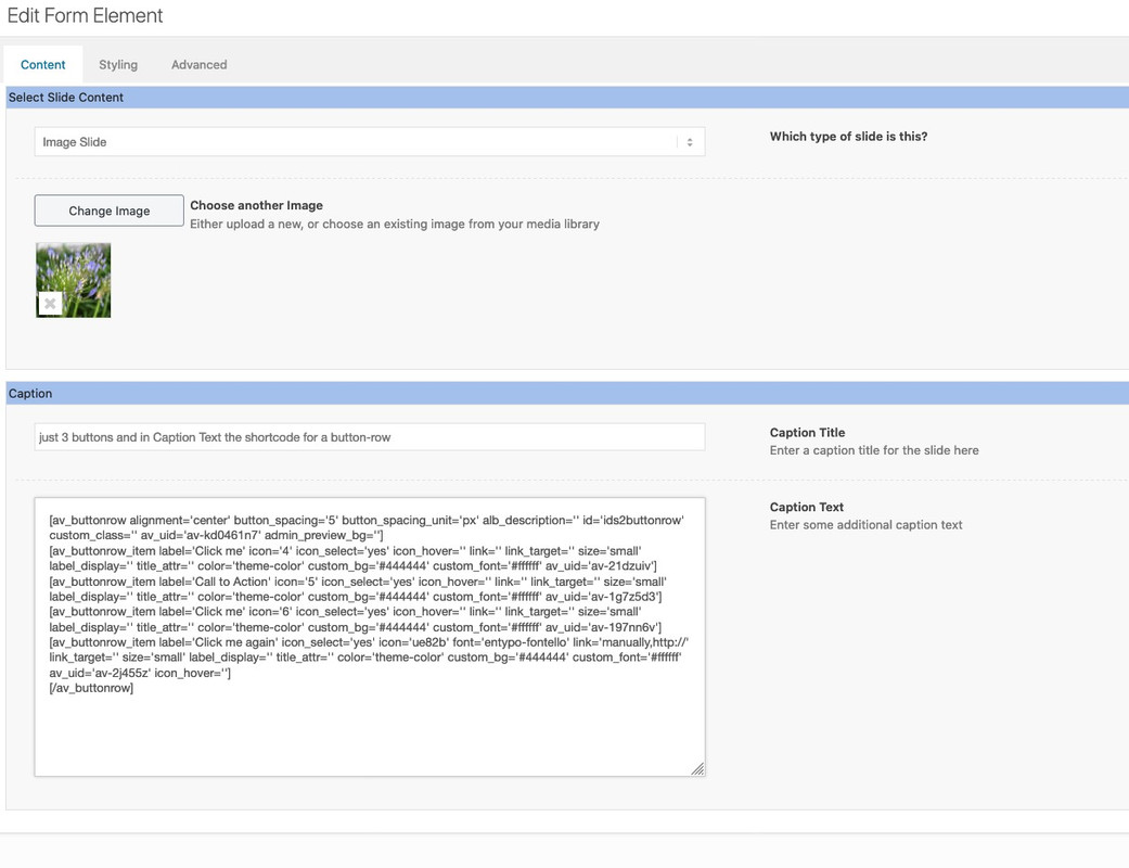
Is it an image widget or a text with implemented image ?you can insert in the Caption Text the Shortcodes from a button-row:
And to what direction the search-input field should open?
Where does the ajax search results should toggle?
What happend to the scroll to top button?This in child-theme functions.php will place the magnifier icon in the menu3 of enfold:
function avia_append_search_nav3 ( $items, $args )
{
    if ((is_object($args) && $args->theme_location == 'avia3') || (is_string($args) && $args = "fallback_menu"))
      {
          global $avia_config;
          ob_start();
          get_search_form();
          $form =  htmlspecialchars(ob_get_clean()) ;

          $items .= '<li id="menu-item-search3" class="noMobile menu-item menu-item-search-dropdown menu-item-avia-special">
                 <a href="?s=" data-avia-search-tooltip="'.$form.'" '.av_icon_string('search').'>
                  <span class="avia_hidden_link_text">'.__('Search','avia_framework').'</span>
                 </a>
               </li>';
      }
      return $items;
}
add_filter( 'wp_nav_menu_items', 'avia_append_search_nav3', 10, 2 );
but i do not know how to get the ajax search results to show
colorize the sort button too:
.category-allgemein .av-masonry-entry-title, .allgemein_sort_button span { color: red; } .category-grafik .av-masonry-entry-title, .grafik_sort_button span { color: green; }https://webers-testseite.de/gallery/
.category-allgemein .av-masonry-entry-title { color: red; } .category-grafik .av-masonry-entry-title { color: green; }any link to see what is the matter?
On the anchor of the masonry-item there are classes – f.e. if you show portfolios there is a class f.e. portfolio_entries-webdesign
the webdesign is the portfolio “category”
So if you define for each category like this:
syntax is: portfolio_entries-xyz.portfolio_entries-webdesign .av-masonry-entry-title { color: red; }there must be a similar solution for blog posts and categories something like: category-allgemein
syntax here is: category-xyzwait – there is a sub-menu – ok i look …
yes : change in the css code above ( inside the mediaquery – not as an addition – a substitue) :
#main > div:not(.av-submenu-container) {
    z-index: 3;
    position: relative !important;
}
so that there is only: https://kriesi.at/support/topic/fixed-background-color-section-doesnt-work/#post-1235469
The not rule excludes the submenu container from that.
-
This reply was modified 5 years, 7 months ago by
-
AuthorPosts