Forum Replies Created
-
AuthorPosts
-
Responsible for that behavior is the construction of the border via pseudo-container box-shadow and a z-index of that higher than the z-index of the content.
.avia-icongrid-borders-all li .avia-icongrid-wrapper:before,
.avia-icongrid-borders-between li .avia-icongrid-wrapper:before {
 content:"";
…
 z-index:8
}
we had to find a solution on that
October 20, 2020 at 8:38 am in reply to: A bit URGENT :) – Enfold theme and child theme update not working #1254262Some hints on updating via ftp:
https://kriesi.at/support/topic/some-hints-and-advice-to-update-enfold/#post-1056107I do not replace the enfold folder installed – i rename it and upload the new enfold. So if there are troubles like you have it is just a few steps to get back to your former version.
STRANGE BEHAVIOR : if you choose the border option : on styling tab: “Grid Borders” ( both border options lead to that result )
the backside links do not workcan you confirm this with one of your installations?
go on reading with the b-quote
-
This reply was modified 5 years, 5 months ago by
Guenni007.
October 16, 2020 at 10:37 am in reply to: Code Block ALB Element and insert Code as Content #1253222There was a hint that ended up in a solution for me:
https://kriesi.at/support/topic/special-characters-within-code-blocks-on-3rd-party-forms/#post-1253220This is the disadvantage of placing installations in subfolders and not thinking that security plugins can of course affect them.
Can be closed – it is solved
October 16, 2020 at 10:30 am in reply to: Special Characters within CODE BLOCKS on 3rd Party Forms #1253220where did you switch Wordfence to learning mode?
Edit ok i found it – All Options – basic firewall options.
this hint is good for a problem i got with code block too.But what I didn’t think about the firewall is that the installation caused the problems was in a subfolder of another site.
There Wordfence was installed and activated on that “Parent Installation”
( webers-testseite.de and another wordpress in webers-testseite.de/subfolder/ )
That the installation there also affected the subfolder installation – I didn’t think of that.Brilliant tip – Thanks
yes Günter – but that is a very simple insertion.
But before, even komplex svg could be inserted without trouble. They were not shown on layout preview but layout itself could be seen and could be edited after insertion.See home4 on that !
you can see that the layout isn’t shown on top – so no Editing of the layout could be done – allthough the shortcode is correct.
The Frontend of that page works!:
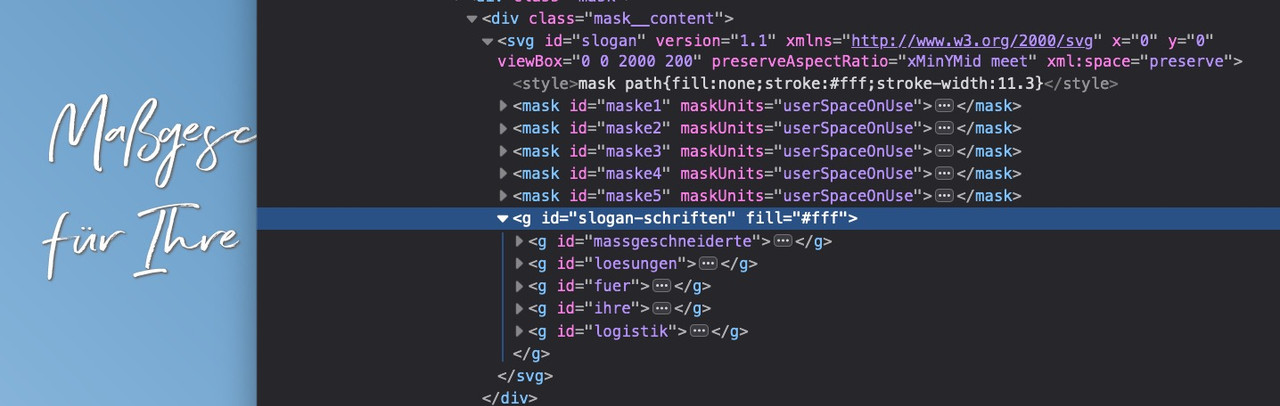
And Enfold Shortcode-Verarbeiter : “Keine Fehler wurden bei der Analyse der Shortcodes erkannt.”That Plugin can help you to have new buttons on that text-editor ( don’t know if it works on block-editor too )
f.e.:
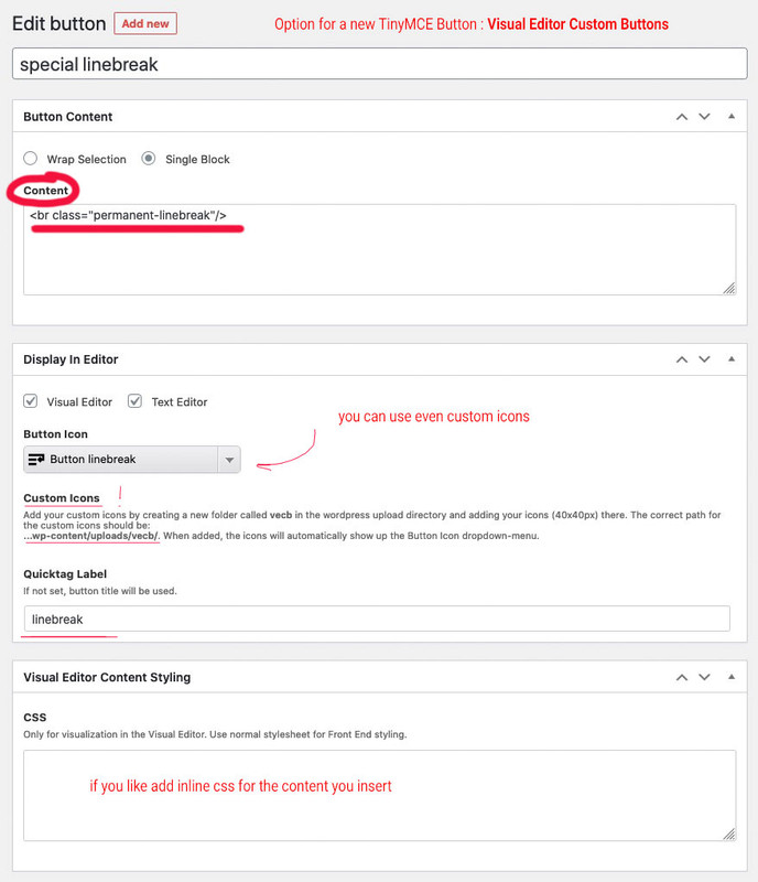
That plugin is if you want to have more than this line-break button – because now Enfold ( or maybe it is a new thing from WP ) shows a button on visible mode:
can you see this:
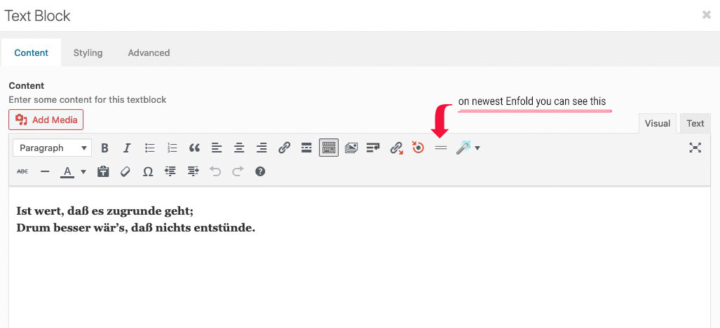
if you click : Enfold will insert the tags itself (
<br class=”avia-permanent-lb” />); switch to text mode then you will see what i mean
If it has to be above the title – change the selector and insertBefore:
function metaAfterTitle(){ ?> <script> (function($){ $(".template-blog .post-entry").each(function(){ var postTitle = $(this).find('.av-heading-wrapper'); var metaInfo = $(this).find('.post-meta-infos'); $(metaInfo).insertBefore($(postTitle)); }); })(jQuery); </script> <?php } add_action('wp_footer', 'metaAfterTitle');you can test always – even each functions via Developer Tools and the Console
just open the concerning page/post and put the pure script to the console and press return.
see video:
Vimeofilmi am a participant like you, and thats why i could not read private content area and if you prefer to hear it from a mod that needs to be improved in the code then that’s ok for me too.
You could have just tested the code – it wouldn’t have been that much work.
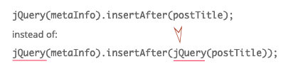
not that is the error – the error is in your syntax:
you Code is :
jQuery(metaInfo).insertAfter(postTitle);
and it has to be:
jQuery(metaInfo).insertAfter(jQuery(postTitle));the other mentioned is only stylistic point of view. Instead of using on the whole code jQuery each time a $ is set – you can do it as said above.
the one big error is that you do not enter the $(postTitle)
and to avoid to write always the jQuery instead of $ i do surround the code in this way – so you can use inside normal $ sign:<script> (function($){ … })(jQuery); </script>and if you are not using any index you can remove that too:
( if your selectors are right – try this) :function metaAfterTitle(){ ?> <script> (function($){ $(".template-blog .post-entry").each(function(){ var postTitle = $(this).find('.blog-categories.minor-meta'); var metaInfo = $(this).find('.post-meta-infos'); $(metaInfo).insertAfter($(postTitle)); }); })(jQuery); </script> <?php } add_action('wp_footer', 'metaAfterTitle');but the pages you complain about are not normal layout pages. As such the created pages are inside a “container” which is set to 1310px max-width.
I do not know how you get this markup – maybe you post an image of your layout f.e. of that page please: https://tiptig.com/welding-equipment/
There must have been a conflict after the update.
Because if i use the “page content” Element – the markup is different – it inserts the color-section with correct numbering ( or ids) directly to it without creating a div with classes: main_color container_wrap_first container_wrap fullsize
And my Enfold is on Version 4.7.6.4if you add those tags with custom class they will not be removed!
<br class="noclear"/>
same with p-tagsOn Enfold 4.7.6.4 the permanent linebreak seems to exists as a button in the tool-bar
and it inserts :<br class="avia-permanent-lb" />i use for some “extras” this little plugin: https://kriesi.at/support/topic/line-break-not-working-in-front-end/#post-1146117
October 12, 2020 at 8:41 am in reply to: Special Characters within CODE BLOCKS on 3rd Party Forms #1252196i could believe that on normal content these characters maybe break the layout – but on code-block element this should not happen.
It is just the sense and purpose of such an element to be allowed to use just such characters. I at least, used the possibility to insert shortcodes ( square brackets ) by means of this element.
Or as described here ( Link ) , to insert a more complex svg with animation via stroke-dasharray and -dashoffset.
Example ( Link ) (on that case i did insert this as img – but replace it by svg-support with an inline-svg ) but the better way would be to insert it directly with code-block element as svg code.Account and Page inside private content
1) And of course there are two opening divs and one closing!
2) then – if it should be a text-block element you are trying to insert shortcode will be something like:
[av_textblock size='' av-medium-font-size='' av-small-font-size='' av-mini-font-size='' font_color='' color='' id='' custom_class='' av_uid='av-k3unomjx' admin_preview_bg='']…[/av_textblock]3) if it has to be a textarea tag – define for the textarea rows and cols:
<textarea id="ABC" name="ABC" rows="4" cols="50"> … </textarea>4) go and get that little plugin from Günter to insert special characters: https://github.com/KriesiMedia/enfold-library/tree/master/integration%20plugins/Enfold/Special%20Character%20Translation
after that place a textblock element instead and insert it like:
###lt###textarea id="CONTACTCF4" name="CONTACTCF4" rows="4" cols="50"###gt### ###lt###/textarea###gt###to 4 see here: https://webers-testseite.de/3columns/
October 8, 2020 at 3:50 pm in reply to: 4.7.6.4-Update / Drag&Drop and Scroll-Problem is back again. ;-( #1251459@ Cliffy
1) the changelog (version.txt) is in the big zip file on Envato (“All files and documentation”) – yes it would be nice to have this file in the “Installable WordPress File only” archive too.2) i do always update like this ( https://kriesi.at/support/topic/some-hints-and-advice-to-update-enfold/#post-1056107 ) – so there is always a rollback version.
3) if you update manually ( by uploading that zip file or via ftp) you can decide when you like to update. It is not necessary to do it on the first day of release – wait till the changelog is here: https://kriesi.at/documentation/enfold/changelog/
no – and on wp cache i do not know – but you see on the gtmetrix that it isn’t enabled.
This could save about 80% bandwidth.but your link on top is no enfold theme – it is gaia
So i guess Enfold support is the wrong place to ask?for the link ( https://www.urasessence.it/ ) above – and only for small screens :
@media screen and (max-width:414px) { #mobile-bar { max-height: 100px; height: 100px; } .breakpoint .logo a img { height: 50px !important; } .logo-container { float: none; width: 100% !important; display: inline-block; } .logo { display: inline-block; } .breakpoint .logo a img.logo-img, #mobile-bar #toggle { left: 50%; position: relative; transform: translateX(-50%); } }First of all : enable gzip Compression.
https://www.giftofspeed.com/enable-gzip-compression/
Then optimize your images.
There are different ways to do that. I prefer the htaccess method.
https://gtmetrix.com/reports/www.closeoutstreetwear.com/s6i1kHKlhm i can not reproduce your problems: https://webers-testseite.de/vimeo-embed/
The left one is enfold video alb.
And the right one is iframe ( but i prefered the responsive setting – on share button you can see options button on top right)( That testpage is on Enfold 4.7.6.4 and WP5.5.1 )
have you set any Content Security Policy (CSP) or f.e. a plugin which has set it?
if you are familiar with developer tools have a look to the Console – if there are blocking rules on vimeo sources.October 6, 2020 at 2:17 pm in reply to: Avia Builder Element not clickable/draggable in pages #1250850i had that last week too. on my end it derives from Yoast SEO Plugin. ( https://kriesi.at/support/topic/yoast-seo-hampers-alb-usage/ )
The meta box of Yoast SEO lays over the ALB.
If i read the new changes of the log from Enfold 4.7.6.4 correct:tweak: added z-index 10 to #avia-builder and #avia_sc_parser in ALB to fix problem with plugins
maybe that is correlated to that problem. And should solve that problem without that code beneath
I solved it via child-theme functions.php ( the new update wasn’t available last week) :
function admin_head_mod() {
  echo '<style type="text/css">
	#advanced-sortables { display: inline-block;}
  </style>';
}
add_action('admin_head', 'admin_head_mod');
or
function admin_head_mod() { echo '<style type="text/css"> #normal-sortables {z-index: 10} </style>'; } add_action('admin_head', 'admin_head_mod');i found a solution on that – don’t know why it is on that page only – because i tested it on another installation –
on that page mentioned above the container for the SEO settings overlaps the top containers
a :
this css had to be inserted to admin_head so only functions.php will do the job:function admin_head_mod() { echo '<style type="text/css"> #advanced-sortables { display: inline-block;} #normal-sortables { z-index: 10;} // this as alternative to above rule </style>'; } add_action('admin_head', 'admin_head_mod');solved the problem
ThanksAre these images svg’s ? Then there must be a rule for them to have absolute width – not relative. (px)
just to mention: if you got older additional font-icons in your import – the fontello page now generates the woff2 format too.
it could be solved by extracting the svg font file from your former upload zip file and drag and drop it into fontello page
“Drag custom SVG icons or SVG font here.”
activate all your wanted icons and then download it from fontello and upload that new zip file.October 3, 2020 at 3:35 pm in reply to: PNG images have thin tear in right corner when used within gallery media element #1250333as someone who has been doing internet design for a long time, and someone who started using Photoshop in the early 90s to do image editing would be very interested to see this live at your site. If you don’t want to make it public you can send me a link via e-mail.
The contact information can be found on my avatar or nick.September 23, 2020 at 10:25 am in reply to: PNG images have thin tear in right corner when used within gallery media element #1247805OK – i just asked because i can not reproduce the issue.
See the bottom of that page : https://webers-testseite.de/gallery/
This is a gallery with left jpg – right png.
Click to see the lightbox – allthough this is a big png – there is no darker corner. – no tear ( rupture, torn, crack, rip nor break)
Yes, you are right – the png is a bit sharper on the preview image of the gallery, but at what price?
A page with 5-6 png of this dimension would take much longer to load completely. The surfing behaviour of most visitors to a page is such that if a page takes longer than 5 seconds to load, the attention is reduced to zero. -
This reply was modified 5 years, 5 months ago by
-
AuthorPosts