Forum Replies Created
-
AuthorPosts
-
first – you can make them smaller – on my page i have this as quick css entry:
.search-result-image img {
    width: 200px;   /****  here you can adjust the image sizes shown  ***/
    border: 1px solid #aaa
}
a.slide-image.search_image {
  overflow: visible !important;
}
a.search_image .image-overlay.overlay-type-extern {
  left: 0 !important
}
next tip: this line of the replaced code:
$searchthumb = get_the_post_thumbnail( $the_id, 'large' );
it will take the large images from enfold recalculation as source for those thumbnails.
if you have:
$searchthumb = get_the_post_thumbnail( $the_id, 'portfolio_small' );it will have that source image for it._____________
see here: https://kriesi.at/support/topic/show-featured-images-in-search-results-page/#post-805253
now the line is on Enfold 4.8.2 line 33
echo "<span class='search-result-counter {$counterclass}'>{$post_loop_count}</span>";replace that whole line 33 with:
$searchthumb = get_the_post_thumbnail( $the_id, 'large' );
echo "<span class='search-result-counter {$counterclass}'>{$searchthumb}</span>";
and this to quick css:
.search-result-counter { padding: 0; } .search-result-counter img { width: 100%; height: 100%; border-radius: 100px; }yes – thats it the line
.avia-fullscreen-slider .caption_bottom .slideshow_caption {
has no closing bracket ( and is empty – but that is not the reason for the mismatch )
______________
btw. if you use the code tag here on board
you got two possibilities :- click the code button – enter your code – click again ( now it is shown as /code ) the code button.
- enter your code – activate the whole code you like to have in the code block and click once the code button
The reason why I am so keen on this is not to be petty, but rather that such errors can simply only be found if the code is also there in the original.
For example, without this code block, all the quotation marks change into their oblique variants.
But that could also be an error if they appear like this in the quick css. F.e. by copy them in this notation and paste them to quick css.if these are only #footer flex_columns – try:
@media only screen and (min-width: 768px) {
  #footer .container {
    display: flex;
    flex-flow: row wrap;
    justify-content: space-between;
    align-items: flex-start;
    max-width: 1600px;
  }

  #footer .container::after {
    display: none;
  }

  #footer .container .flex_column {
    width: unset;
    flex: 1 1 auto;  /*** the first "1" and the auto value has the possibility that column 2 can grow bigger than the others - else 30%  ***/
    margin: 0 0 20px;
  }

  #footer .container .flex_column:nth-of-type(2) {
    padding: 0 20px;
  }
}
adjust the wanted column-width with the flex setting
and adjust the max-width of the container to your needs-
This reply was modified 4 years, 11 months ago by
Guenni007.
April 23, 2021 at 9:46 am in reply to: responsive tables: missing heading-row headline (before-element) #1296246You only got one heading row ? Then there must be other things that hamper that responsvie behavior.
I guess a mod should then look at your page in the backend to find the fault.Danke nochmals – kann also geschlossen werden.
read carefully – my posts – if it works on my Enfold it should work on yours too:
https://webers-testseite.de/?s=WordpressOk –
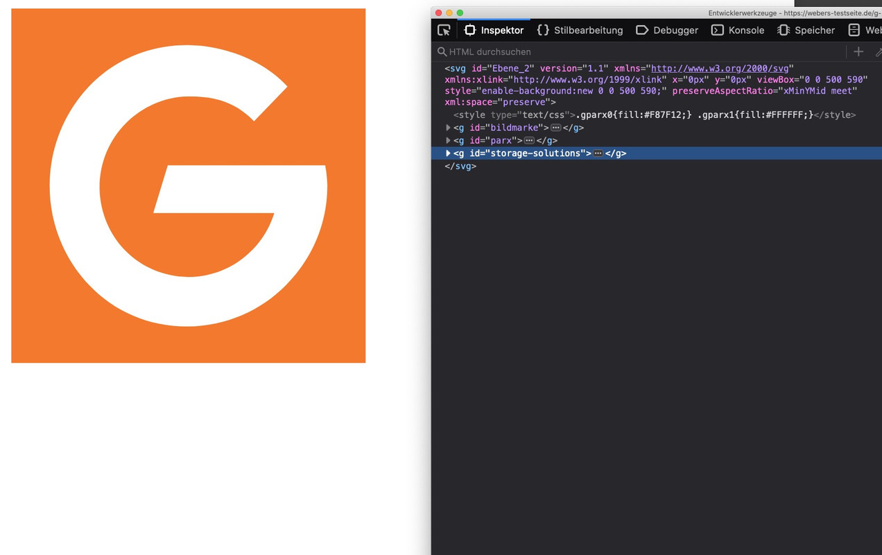
if you are interested in that solution – just download the logo ( svg ) and we will find a satisfying solution.
PS ( See mobile Solution aswell )
If you will do that – it might be better either to have on the big logo a background behind the letters ( maybe semitransparent) – or to have a littel outline on the letters. Sometimes you got a light background – then the dark outline will be good to have – or you got a dark background- then the white letters have enought contrast.yes – thats what i like to see. This is a logo that could be easily created as svg ( vectorbased ) logo.
You can move Groups in that svg separatly – and the trigger will be the class on header : header-scrolled.see here an example with your approximate logo ( man of tomorrow and avenir next ) and some changings on scrolled version.
of course there is still some css code to be optimized – especially for the responsive case, but this is a possibility to change with one and the same logo portrait and landscape even animated.https://webers-testseite.de/g-parx/
see here your logo : https://webers-testseite.de/g-parx-logo.svg
look to the source code in your browser – you can see that i grouped the way we want to move parts of the logo:
( click to enlarge )
And your posts and pages all got featured images ?
Danke Dir, dann geht aber auch mein Script – ohne Probleme
-
This reply was modified 4 years, 11 months ago by
see here: https://kriesi.at/support/topic/show-featured-images-in-search-results-page/#post-805253
and alternative – a little image inside the circle.
go and create a subfolder to your child-theme : includes
put in the edited : loop-search.phpyou can see the edited element here: https://pastebin.com/KQYvfYhm
download: https://pastebin.com/dl/KQYvfYhmonly lines 33,34,35 are added
Guess if the folder structure is similar to the parent folder structure – this will take effect immediately – otherwise try this:
https://kriesi.at/documentation/enfold/intro-to-layout-builder/#add-elements-to-albThe Rest is quick css styling.
can i see your page – and the logo?
April 22, 2021 at 11:50 am in reply to: responsive tables: missing heading-row headline (before-element) #1296011you can follow this : https://kriesi.at/support/topic/responsive-table-not-listing-correct-row-style/
on the bottom there is a css solution for that
there is one possibility i see with enfold – but in your case you had to do that for each language.
On content elements you got that alb element : page-content.
If you place this element inside your pages – it will be synchronized whenever you edit that inserted page.i used this alb in former enfold versions to have a page as footer! But i do not know if this is what you are looking for.
so you got a different Enfold than me?
You see on the example page that it works?
have you a link for me to see what is the issue?sorry Ismael – a grid-row with .container ? ;)
The Grid-Row itself got that class: .container_wrap
or do you see more info about the page – is it a grid-row he is talking about?i do not see his page – but even with that class adjustment he will have trouble if .main_color is set to something different than white.
my solution for that is to wrap the grid-row in a container that has the attributes of a color-section.
Just give the custom-class: grid-notfull to the grid-row element.
The additional class – added by the script color1 is for custom color if you would like to deviate from the default setting.See example page – https://webers-testseite.de/grid-row-alb/
- on top normal grid-row
- in the middle : grid-row with that custom-class : grid-notfull
- on the bottom : grid-row with only css setting ( set the .container_wrap to max-width )
here is the little snippet for child-theme functions.php:
function grid_layout_notfull(){
?>
<script>
(function($){
    $('.av-layout-grid-container.grid-notfull' ).wrap( '<div class="main_color notfullsize color1"></div>');
    $('.notfullsize').css({"clear": "both", "width": "100%" , "float": "left" , "position": "static" , "min-height": "100px" });
    $('.grid-notfull').css({"max-width": "1310px", "margin": "0 auto" , "padding": "0 25px"});
})(jQuery);
</script>
<?php
}
add_action('wp_footer', 'grid_layout_notfull');
adjust the grid-notfull class to your settings ( your container generall setting on Enfold Options)
The padding has to be adjust tooand you do not have this on your WPML Settings ?
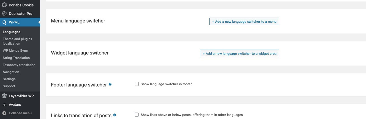
The Menu Language Switcher : “Add a …
Try that to get into main menu your switch.
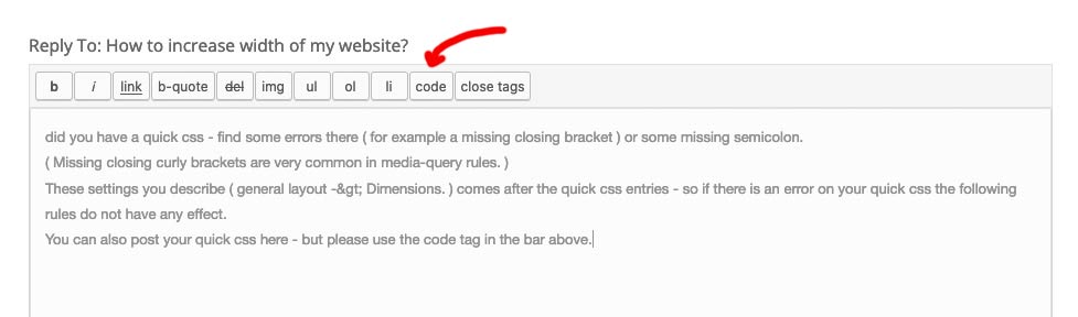
To get rid of the header_meta you got the right instruction :#header_meta .avia_wpml_language_switch { display: none; }do you have some quick css entries ? – find some errors there ( for example a missing closing bracket ) or some missing semicolon.
( Missing closing curly brackets are very common in media-query rules. )
These settings you describe ( general layout -> Dimensions. ) comes after the quick css entries – so if there is an error on your quick css the following rules do not have any effect.
You can also post your quick css here – but please use the code tag in the bar above.
 April 22, 2021 at 12:52 am in reply to: PORTFOLIO POST – 3 videos or more causes problem when encased in 2/3 column #1295897
there must be a difference on your setting between these three videos.
i can all embed them in a 2/3 column.: https://webers-testseite.de/portfolio/canopy/can you please do the following: erase the third video alb element and duplicate the second one.
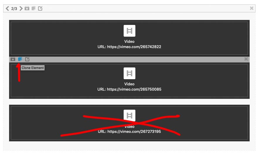
now there are again 3 video alb elements – open the last and only replace the video link to :https://vimeo.com/267273195and lets see what happens
i can only strongly advise not to self-host videos of this size. Your server will go down if even one or two visitors to your site watch the video.
This is one of the reasons for the existence of Vimeo, Youtube, etc.
Gerne !
aber auch ohne eigenes markup
so leider noch nicht
if you have your icon boxes in a column (e.g. one icon box in each 1/3 column), imitate the complete icon box by moving the icon box over the edge of the column.
See here ( on the bottom animated) how you can achive this. :https://webers-testseite.de/equal-height/
you only have to colorize the background of the columns and make the whole iconbox transparent ( except the icons itself )
to complex for me now.
or with ternary operators a little shorter:
function ava_tab_section_arrows(){ ?> <script> (function($) { $('.av-tab-section-container').each(function() { $(this).find('.av-tab-section-outer-container').prepend("<div class='av-tabsection-navs av-tabsection-nav-prev'>⟨</div><div class='av-tabsection-navs av-tabsection-nav-next'>⟩</div>"); var arrowColor = $(this).find('.av-tab-section-tab-title-container').css('background-color'); $(this).find('.av-tabsection-navs').css('color', arrowColor); var that = this; $('.av-tabsection-nav-prev', this).on('click', function(){ var activeElement = $(this).closest('.av-tab-section-outer-container').find('.av-active-tab-title'); activeElement.prev().length ? activeElement.prev().trigger('click') : activeElement.siblings(":last").trigger('click'); }); $('.av-tabsection-nav-next', this).on('click' , function(){ var activeElement = $(this).closest('.av-tab-section-outer-container').find('.av-active-tab-title'); activeElement.next().length ? activeElement.next().trigger('click') : activeElement.siblings(":first").trigger('click'); }); }); })(jQuery); </script> <?php } add_action('wp_footer', 'ava_tab_section_arrows');by the way – loop these arrows
if the first tab is shown and you click to the left side the last sibling tab is shown – rotation like in post navigation:function ava_tab_section_arrows(){ ?> <script> (function($) { $('.av-tab-section-container').each(function() { $(this).find('.av-tab-section-outer-container').prepend("<div class='av-tabsection-navs av-tabsection-nav-prev'>⟨</div><div class='av-tabsection-navs av-tabsection-nav-next'>⟩</div>"); var arrowColor = $(this).find('.av-tab-section-tab-title-container').css('background-color'); $(this).find('.av-tabsection-navs').css('color', arrowColor); var that = this; $('.av-tabsection-nav-prev', this).on('click', function(){ if($(this).closest('.av-tab-section-outer-container').find('.av-active-tab-title').prev().length){ $(this).closest('.av-tab-section-outer-container').find('.av-active-tab-title').prev().trigger('click'); } else{ $(this).closest('.av-tab-section-outer-container').find('.av-active-tab-title').siblings(":last").trigger('click'); } }); $('.av-tabsection-nav-next', this).on('click' , function(){ if($(this).closest('.av-tab-section-outer-container').find('.av-active-tab-title').next().length){ $(this).closest('.av-tab-section-outer-container').find('.av-active-tab-title').next().trigger('click'); } else{ $(this).closest('.av-tab-section-outer-container').find('.av-active-tab-title').siblings(":first").trigger('click'); } }); }); })(jQuery); </script> <?php } add_action('wp_footer', 'ava_tab_section_arrows'); -
AuthorPosts