Forum Replies Created
-
AuthorPosts
-
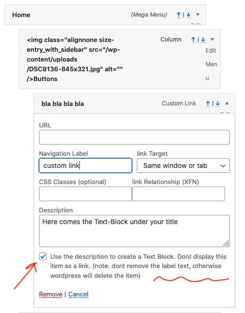
can you make the link to these images public. maybe someone new has another view on it.
ok – i see there is a hidden checkbox with id and class – so i can use
$('.aviaPrivacyVideoEmbedsDisabled:checkbox').change(function() { if (this.checked) { // do something } }); // or : if ($('.aviaPrivacyVideoEmbedsDisabled:checkbox').is(':checked')) { // do something }Can you be more specific about what you want to achieve?
You see here: https://kriesi.at/support/topic/make-all-mega-menu-images-the-same-size/#post-1305031 that the space for calculating how many list points are next to each other is only made for the row. I assume that the classe at the mega-div itself depends on the maximum value of columns.
In a row, the list points then have a class that determines how many columns are next to each other.
So if you decide to start a new row – this code will work for the most circumstances.By the way: how did you style this menu ?
That the sub-menu levels of the mega-menu title did not have an anchor?Edit : oh i see – didn’t recognize that option on description
just besides the mega div with 5 columns – here are more general css code:
NOW : we have to see what happens to these rules when there is a second row underneath the first.
edited code to fit for new row in that mega div:
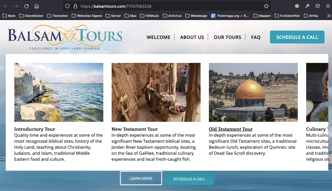
#top #wrap_all #header .avia_mega_div > .sub-menu {
    display: flex !important;
    flex-flow: row nowrap;
    justify-content: space-around;
    padding: 2% 1% !important;
}

#top #header .avia_mega_div li {
    width: unset !important;
    padding: 0 !important;
    margin: 0 !important;
}

/*** settings for different mega_div ***/
#top #header .avia_mega_div li.avia_mega_menu_columns_6 { flex: 0 1 14% }
#top #header .avia_mega_div li.avia_mega_menu_columns_5 { flex: 0 1 18% }
#top #header .avia_mega_div li.avia_mega_menu_columns_4 { flex: 0 1 23% }
#top #header .avia_mega_div li.avia_mega_menu_columns_3 { flex: 0 1 31% }
#top #header .avia_mega_div li.avia_mega_menu_columns_2 { flex: 0 1 48% }

#top #header .avia_mega_div li > .mega_menu_title {
    display: inline-block;
    margin-bottom: 0 !important
}

#top #header .avia_mega_div li > .mega_menu_title a {
	display: inline-grid;
    overflow: hidden !important;
}

#top #wrap_all #header .avia_mega_div > .sub-menu > li img {
    margin-bottom: 15px !important;
    -webkit-filter: saturate(0.2);
    filter: saturate(0.2);
}

/*** just to have some indicators for hovering ***/
#top #wrap_all #header .avia_mega_div > .sub-menu > li:hover img {
    -webkit-filter: saturate(1);
    filter: saturate(1);
}
see Mega Menu on page: https://consulting.webers-testseite.de/
The fact that I’m asking you to try copy&paste is that I can’t see from your posting if you used the correct quotation marks.
Unfortunately, far too few people on this forum use the code tag function.I tested it on a new installation and it works on my end.
i think your code works
try with copy pastefunction my_avf_masonry_loop_entry_content($loop_excerpt, $entry) { $loop_excerpt = $entry->post_excerpt; return $loop_excerpt; } add_filter('avf_masonry_loop_entry_content', 'my_avf_masonry_loop_entry_content', 10, 2);believe it or not – my solution works better.
look at the current page at narrower screen width:
remove the rules from Ismael and try it out ;)
SEE general solution next
-
This reply was modified 4 years, 9 months ago by
Guenni007.
or escape enfold settings – with different padding for first and last li.
Try this instead in your quick css:
#top #wrap_all #header .avia_mega_div > .sub-menu {
    display: flex !important;
    flex-flow: row nowrap;
    justify-content: space-around;
    padding: 2% 1% !important;
}

#top #header .avia_mega_div li {
    flex: 0 1 18%;
    width: unset !important;
    padding: 0 !important;
    margin: 0 !important;
}

#top #wrap_all #header .avia_mega_div > .sub-menu > li img {
    transition: 0.3s all ease;
    margin-bottom: 10px
}
and if you like to have some hover indicators on that try in addition:
#top #wrap_all #header .avia_mega_div > .sub-menu > li:hover img { transform: scale(1.05); transition: 0.7s all ease; margin-bottom: 20px }or – if you are on Enfold 4.8.3 click on one of those links
( click to enlarge )
 June 4, 2021 at 10:10 am in reply to: Layerslider loading last – how do I get it to load first? #1303972
Well one thing to mention is that you have a max width of your content of 925px – why do you load images bigger than that.
The one is nearly twice bigger.
The same with the 768px version for the responsive case.
And it seems that you load the images as background and as layers:

you can see it between 768px and 990pxset your rules to important
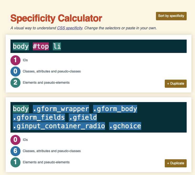
besides that trial – i can not see your inserted css code at all in your existing css. – try to refresh all cachings and refresh css and js file mering of enfold too.body .gform_wrapper .gform_body .gform_fields .gfield .ginput_container_radio .gchoice, body .gform_wrapper .gform_body .gform_fields .gfield .ginput_container_checkbox .gchoice { display: inline-grid !important; grid-auto-flow: column !important; } #top .gform_wrapper .gfield_checkbox li label, #top .gform_wrapper .gfield_radio li label { margin: 5px 0 0 5px; }you see these rules are all classes except the body tag – if there is an enfold rule only with one ID that is concerning to the li – it will overwrite the normal rules.
f.e.:
 June 2, 2021 at 8:11 am in reply to: Layerslider loading last – how do I get it to load first? #1303520
The button that is part of the fullwidth slider can only be placed on default to the left side. But with a bit css in quick css you can shift this button to a right position.
In the Element ( as on most of the advanced Layout Builder Elements ) they have the opportunity to show or hide on 4 differnt screensizes.
So i placed two fullwidth sliders on top:
( click to enlarge the images )

The second fullwidth slider with the oposite setting.For the button positioning i gave a custom-class to the sliders : homeslider
.homeslider .avia-slideshow-button {
    position: absolute;
    right: 5vw;
    bottom: 5vw;
    padding: 15px 25px !important;
    box-shadow: 2px 2px 15px -5px #000;
    font-size: 18px;
}
June 1, 2021 at 6:27 pm in reply to: Layerslider loading last – how do I get it to load first? #1303456Do you use the advanced layerslider elsewhere on your page?
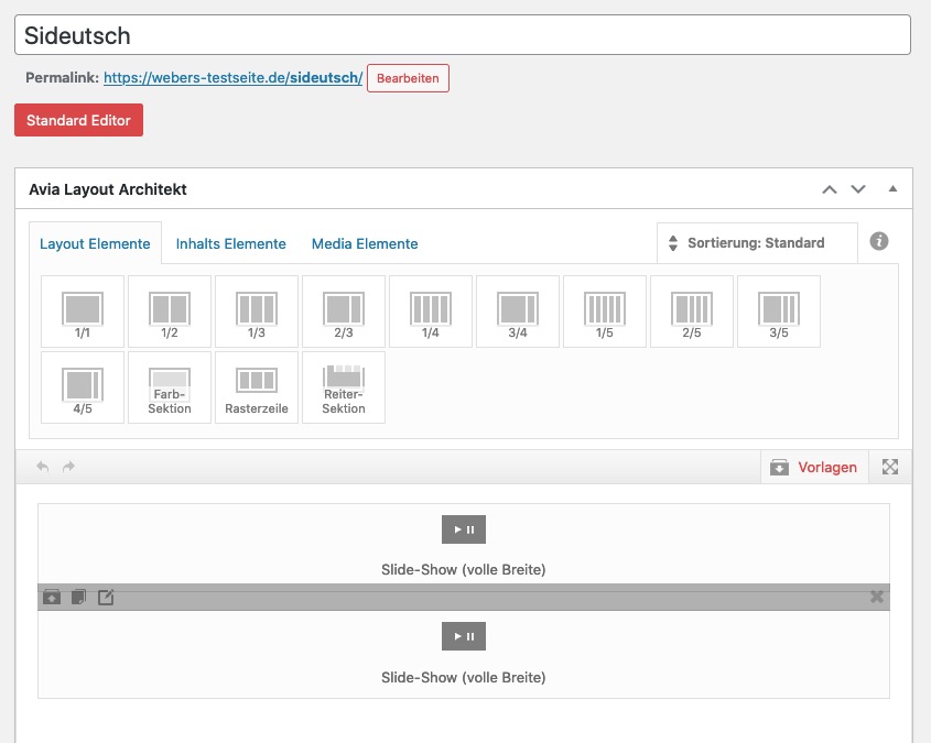
As far as i can see it is only one image and a button – something you can achieve with enfold sliders aswell.see here ( for mobile view with the other image ) https://webers-testseite.de/sideutsch/
two fullwidth enfold sliders.you only need this ( nice ) slider if there are more action in the layers. Link
btw: if your content is only 925px wide – why not optimize it for this maximum widthit is a wordpress limitation : 2560px – all images bigger than that will be recalculated and saved as xyz-scaled.jpg ( or png etc )
– Enfold creates some image-formats for their used elements ( see functions.php line 185ff : sizes )
– on functions.php lines 246ff – you see that for these images a compression level is set to 100% – : no compression.That is the reason why the original jpg ( with 2560px width) might be smaller in file-size as the recalculated 1500px image ( featured_large or extra_large ).
You can set this compression level by a small snippet in child-theme functions.php:
e.g. for compression level 55%:add_filter("avf_jpeg_quality", "avf_set_quality_mod", 9999, 1); add_filter("avf_wp_editor_set_quality", "avf_set_quality_mod", 9999, 1); function avf_set_quality_mod($quality) { $quality = 55; return $quality;}This will only influence the uploading process. If you want the existing images have the same compression level you might use a “regenerate Thumbnails” Plugin afterwards.
__________________
PS: you can influence this big image threshold via a filter : big_image_size_threshold see here: Link
f.e.:function increase_big_image_size_threshold( $threshold ) { return 3500; // new threshold } add_filter('big_image_size_threshold', 'increase_big_image_size_threshold', 999, 1);Ps : i restored now the page settings before – can be closed
aha – now i see what the new feature is going to do.
But is something totaly different to the approach i gave on : https://webers-testseite.de/tab-section/i thought you will show these arrows ( on content area ) if the tab-title-container is out of view on scrolling down ( that makes sense for big tab section containers ).
You don’t have to scroll to top to switch between the tabs but to press the left / right arrows.
to show arrows if there are too many tab titles when screen width has less space ;) is a lame ducksee private Content
by the way @Yigit – I mention it here again now; this should actually be the standard behavior. It makes no sense when you are in the single post to set the link that leads to itself. Maybe you pass this on as a suggestion to Günter.
Oh, come on now – you should be able to provide a little of your own effort and, above all, transfer performance!
make the selector more specific.
if there is$('.pum-trigger').each(function() {– this will influence all elements with “pum-trigger” class.
you can give to those columns f.e. a custom class – or to the color-sections etc. pp.
if it is only on that page ( page id : 7) and in that color-section etc etc.$('#top.page-id-7 #av_section_2 .pum-trigger').each(function() {the first snippet is untouched of that – so in the popup there will be the date.
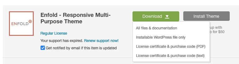
But the transfer to the trigger is only on those more specific selected elements.Did you download the “installable wordpress file only” or the “All files & documentation” zip ? ;)
or: prevent the creation of these links: if you are on single post
see: https://kriesi.at/support/topic/remove-permanent-link-from-the-post-h1-title/#post-1220155
sadly the hover style is correlated not to the anchor but to that class .post-title:
so set it to 1.html_elegant-blog #top .post-entry .post-title:hover, .html_elegant-blog .avia-content-slider .slide-entry-title:hover { opacity: 1; }PS: stell die Seite mal auf Deutsch um !
bin gespannt ob das hier dann noch vorkommt:
it is not as perfect as it could be.
@ismael – i think he is looking for a solution in that li with a lot of text following “Dabei werden zwei Arten unterschieden:”

Please remove the code – and after that i will see if it is better with some different code.Add to your code :
.entry-content-wrapper .smaller-dots li {
    display: flex;
}
and maybe 8px padding-right is enough to synchronize it with the other normal dots:
.smaller-dots ul li::before { content: "\00BB"; padding-right: 8px; color: red; }-
This reply was modified 4 years, 9 months ago by
May 31, 2021 at 9:06 am in reply to: Layerslider loading last – how do I get it to load first? #1303119maybe you find some settings on
Dashboard – Layerslider WP – Options – Advanced
some helpfull settings to solve the issue:
( click to enlarge )

if you look to my testpage now :
Uploaded Images ( left tranfered to sRGB before uploading) ( right – with ProPhotoRGB)
all smaller calculated images are not “well colored”
what I don’t quite understand is why the original Size on both images ( and in my lightbox these are displayed ) have correct colors – although it is a ProPhotoRGB.hm – the original size of your image:
https://www.bureaureinasmallenbroek.nl/wp-content/uploads/2021/05/Gasterse-Duinen-4-bomen.jpg
it has a ProphotoRGB embedded – maybe that will cause the color shift on upload and recalculation to smaller images.-
This reply was modified 4 years, 9 months ago by
Yes – and i see on your Webpage that you are a professional Photographer.
If i work with my photos i do work as long as possible in AdobeRGB – because the color room is bigger than on sRGB. For webupload i do transfer those profiles to sRGB – not all Browsers have a color-management for adobeRGB ( Firefox , Edge) – Safari and Chrome not.
See here one of your Photos – left with sRGB Profile embedded – right with adobeRGB:
https://webers-testseite.de/reina/
when you have seen it – i will remove those examples.your color mode rgb is a sRGB profile or is it f.e. an adobeRGB.
– I used to work for museums and the color correct reproduction was always an issue.
Unfortunately, many of the images were also intended for printing, so I sometimes got a CMYK in the web upload.
Maybe that’s what happened to you with that one image without you realizing it, you failed to convert it to sRGB.
The standard RGB Profile is for Web – guess all browsers try to generate the image display according to this standard.
If i rember it well – the adobeRGB interpreted as sRGB looks a bit more magenta – especially the blue colors.-
This reply was modified 4 years, 9 months ago by
-
This reply was modified 4 years, 9 months ago by
-
AuthorPosts