Forum Replies Created
-
AuthorPosts
-
by the way: Link
I then made a copy of iconbox.php file and placed it in enfold-child>config-templatebuilder>avia-shortcodes>iconbox
Just create a folder in your child-themes folder : shortcodes
as you can see in the code itself :
$template_url.'/shortcodes/so insert the copy of iconbox.php to enfold-child/shortcodes
Similar way – but with shinking header in action:
https://webers-testseite.de/xeovision3/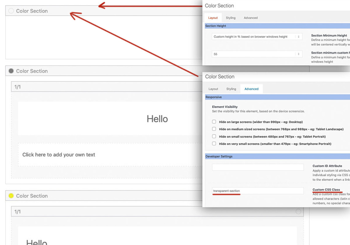
___________________
adjust it to your page-id !#top.page-id-40389 { background-size: 0 !important; overflow: hidden; position: relative; } #top.page-id-40389:before { background-image: url(/wp-content/uploads/nature-3082832_1920.jpg); background-repeat: no-repeat; background-size: cover; content: ""; position: fixed; width: 100%; height: 100%; top: 0; left: 0; z-index: -1 !important; will-change: transform; pointer-events: none; } #top.page-id-40389 #wrap_all { background-color: transparent !important } #top.page-id-40389 #main { background-color: transparent !important } #top.page-id-40389 .avia-section.transparent-section { background-color: transparent !important; }The trick via before pseudocontainer is that it is a container set to fixed position – and not that body has a background-attachment : fixed. some Browser do react on that with jitter (Safari)
if the section on top – had to be less than 100% screen height, there will be a tricky way to have that:
we gave to body itself a background-image !
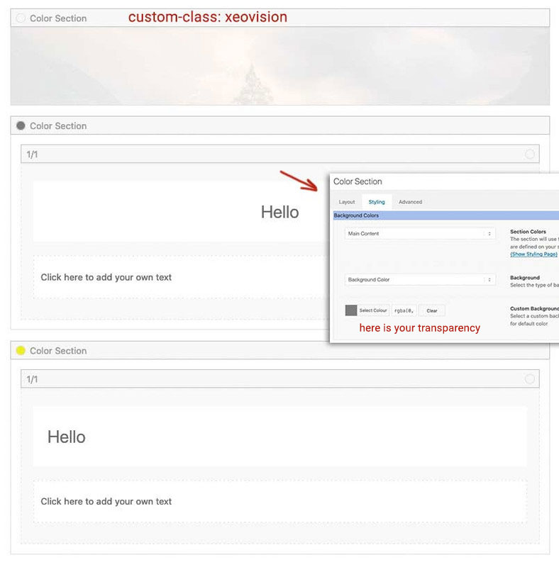
same layout setting – top section got custom-class: transparent-section and height is determined by alb setting ( 50% or anything you like )result: https://webers-testseite.de/xeovision2/
css code for that page-id of mine is:
#top.page-id-40352 {
  background-image: url(/wp-content/uploads/nature-3082832_1920.jpg);
  background-repeat: no-repeat;
  background-size: cover;
}

#top.page-id-40352 #wrap_all {
  background-color: transparent !important
}

#top.page-id-40352 #main {
  overflow-x: hidden;
  height: 100vh;
  background-color: transparent !important
}

#top.page-id-40352 .avia-section.transparent-section {
    position: -webkit-sticky;
    position: sticky;
    top: 0;
    display: flex !important;
    justify-content: center;
    align-items: center;
    background-color:  transparent !important;
}
One thing to mention here : the shrinking header does not work anymore – due to set the #main container to 100vh
hm – isn’t it solved ?
why another topic for it?https://kriesi.at/support/topic/color-section-parallax-image-scaling/#post-1307972
https://webers-testseite.de/xeovision/on Image ALB
Edit : you changed your Content above so this post is obsolete-
This reply was modified 4 years, 8 months ago by
Guenni007.
with the changes above it will be:
( click to enlarge )

PS : on Iconlist the same – lines 892ff
enfold/config-templatebuilder/avia-shortcodes/iconlist/iconlist.php_________
btw: an anchor link does not have on default an alt attribute: https://html.spec.whatwg.org/multipage/text-level-semantics.html#the-a-element
href — Address of the hyperlink
target — Browsing context for hyperlink navigation
download — Whether to download the resource instead of navigating to it, and its filename if so
ping — URLs to ping
rel — Relationship between the location in the document containing the hyperlink and the destination resource
hreflang — Language of the linked resource
type — Hint for the type of the referenced resource
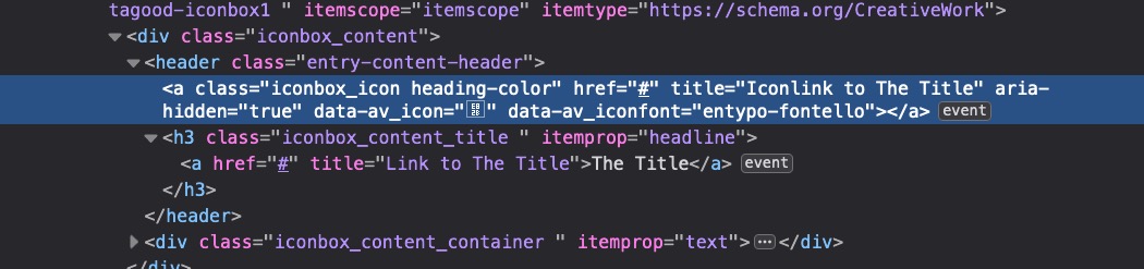
referrerpolicy — Referrer policy for fetches initiated by the elementfor example you can change those lines to :
if( ! empty( $link ) )
{
	$linktitle = $title;

	switch( $linkelement )
	{
		case 'both':
			if( $title )
			{
				$title = "<a href='{$link}' title='Link to " . esc_attr( $linktitle ) . "' $blank>$linktitle</a>";
			}

			$display_char_wrapper['start'] = "a href='{$link}' title='Iconlink to "  . esc_attr($linktitle) . "' {$blank}";
			$display_char_wrapper['end'] = 'a';
			break;
		case 'only_icon':
			$display_char_wrapper['start'] = "a href='{$link}' title='Iconlink to " . esc_attr($linktitle) . "' {$blank}";
			$display_char_wrapper['end'] = 'a';
			break;
		default:
			if( $title )
			{
				$title = "<a href='{$link}' title='Link to " . esc_attr( $linktitle ) . "' {$blank} >$linktitle</a>";
			}

			$display_char_wrapper['start'] = 'div';
			$display_char_wrapper['end'] = 'div';
			break;
	}
}
see results here on those two iconboxes on the right: https://webers-testseite.de/tagood/
hm ?
But isn’t that a strange take on ADA compliance? A reader is supposed to read the title attribute of the link, after all. So it makes a lot of sense for them to match, doesn’t it?
_________________you find the file in : enfold/config-templatebuilder/avia-shortcodes/iconbox/iconbox.php
Edit: you can have an edited copy of that file in a child-theme.
Just create a folder in your child-themes folder : shortcodes and put in your child-theme functions.php:function avia_include_shortcode_template($paths){ $template_url = get_stylesheet_directory(); array_unshift($paths, $template_url.'/shortcodes/'); return $paths; } add_filter('avia_load_shortcodes', 'avia_include_shortcode_template', 15, 1);this is the layout i used for it:
( click to enlarge )
here is the css code for it in quick css:
( in my case it is that page-id – adjust to your page-id )#top.page-id-40318 #main { overflow-x: hidden; height: 100vh; } #top.page-id-40318 .avia-section.xeovision { position: -webkit-sticky; position: sticky; top: 0; height: 100vh; display: flex !important; justify-content: center; align-items: center; letter-spacing: 0.2em; color: white; background-size: cover !important; background-position: center !important; } /*** and everything that follows the xeovision section f.e.: a grid-row (.av-layout-grid-container) ***/ #top.page-id-40318 .avia-section:not(.xeovision) { position: relative; }sorry tim that post above goes to @xeovision
___how about the different background-images if you have a your screen in landscape or protrait mode?
have you installed a child-theme? then test the snippet :add_filter('avf_parallax_speed','avia_change_parallax_ratio', 10, 2); function avia_change_parallax_ratio($ratio, $id){ $ratio = "0.3"; return $ratio; }you will see that the images have less cropping.
@xeovision: fixed: the element is removed from the flow of the document like absolutely positioned elements. In fact they behave almost the same, only fixed positioned elements are always relative to the document, not any particular parent, and are unaffected by scrolling.
I think that you will not succeed with a fixed section. However, it would be better to see your page live where you tried it. I can then rather give advice on how it might be done.
However, it may be enough as it is here: https://webers-testseite.de/xeovision/
but for a transparent color-section following – the top section had to be 100% screen-height. (100vh)Or more tricky : background image to html ;)
and transparencies where ever you like : https://webers-testseite.de/xeovision2/one more note from me: if an image is so important that cropping the edges might bother the creator, why use it as a background?
If an image is important – why not use it as foreground ;)
____
If the image has more important elements only on one side, you can of course still prevent the left side from being cropped via the positioning (e.g. top left).the calculation of the height is on shortcodes.js on line 285ff:
_fetch_properties: function()
{
	this.property.offset 	= this.$parent.offset().top;
	this.property.wh 		= this.$win.height();
	this.property.height 	= this.$parent.outerHeight();

	//set the height of the element based on the windows height, offset ratio and parent height
	this.$el.height(Math.ceil((this.property.wh * this.ratio) + this.property.height));

	//re-position the element
	this._parallax_scroll();
},
you see that the scroll ratio comes into account.
If your scroll ratio will be less than the default 0.5 the height will result in a less height.
you can influence the scroll speed by this snippet in child-theme functions.php:add_filter('avf_parallax_speed','avia_change_parallax_ratio', 10, 2); function avia_change_parallax_ratio($ratio, $id){ $ratio = "0.2"; return $ratio; }but then the parallax effect is less impressiv – but the background-images won’t be cropped as much as a 0.5 ratio will do.
There is one more thing to clarify where is the influence of the scroll offset and wouldn’t it make sense to include the height of the header in the calculation if it is fixed.
I use a fixed header quite gladly, and also already times with 150px height and more. So such an image would not have to have height.
this.$el.height(Math.ceil((this.property.wh * this.ratio) + this.property.height));you have these classes ( header-scrolled and header-scrolled-full ) only with a shrinking header – it could also be a fixed header – but the shrinking option must be selected.
Leider kein Private Content für mich. Bin selbst hier nur Teilnehmer.
Kannst mir aber gerne ne E-Mail schicken. Infos unter meinem Nick oder Avatar.PS: bislang sehe ich keine Änderung. Der erste Aufruf der Seite – ohne auf das popup unten zu reagieren! – Seite mit Developer Tools gecheckt!
Analytics immer noch aktiv. Ein OptOut ist nicht zulässig!
Sonst habe ich ja Borlabs Cookies am Start, aber es geht auch mit Enfold: https://webers-testseite.de/weber/
Du musst da auswählen: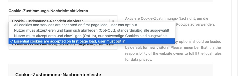
To be more precise, both the width and the height must fill the screen.
Where the height of the image must always reach the 100% height of the screen. Once it has reached this height, the program decides whether it needs to enlarge the image more to fill the width.
_______
Um es noch präziser auszudrücken: Es muss sowohl die Weite als auch die Höhe den Bildschirm füllen.
Wobei die Höhe des Bildes immer die 100%ige Höhe des Bildschirmes erreichen muss. Hat Sie diese erreicht, dann wird entschieden ob noch mehr vergrößert werden muss um die Weite zu füllen.If you want to keep the aspect ratio, the height determines the enlargement factor if you are using landscape images.
Therefore, I recommend using a different image in portrait format than in landscape format.This avoids that important content is cut off.
________
Wenn du die Seitenverhältnisse beibehalten willst, bestimmt die meist die Höhe eines Querformatbildes den Vergrößerungsfaktor.
Daher empfehle ich dann im Hochformat ein anderes Bild einzusetzen als im Querformat. Hierdurch wird vermieden, dass Bildwichtige Inhalte beschnitten werden.The whole reason is in the inherent nature of the matter. Background images that are fixed or set as parallax backgrounds must always be able to cover the entire screen in their height. Otherwise gaps could appear when scrolling.
So if you have a landscape image, it will be cropped left and right.
The height indicates the magnification factor. With Parallax, you have to zoom in even beyond this dimension, because the image scrolls with a different ratio.
But you could change the backgrounds via Quick Css and some media query rules.
With Parallax the image is in its own container with the class av-parallax-inner.
here you could even consider the orientation of the device screen.
e.g.:see example page: https://webers-testseite.de/parallax-page/
make your browser window narrower or go to the portrait and landscape formats as well
_________
Das Ganze liegt in der Natur der Sache. Hintergrundbilder die fixiert oder als parallax Hintergründe gesetzt sind müssen immer den kompletten Screen in ihrer Höhe abdecken können. Sonst würden beim Scrollen Lücken entstehen können.
Wenn du also ein Querformat Bild hast, dann wird links und rechts eben angeschnitten.
Die Höhe gibt den Vergrößerungsfaktor an. Bei Parallax muss sogar über dieses Maß hinaus vergrößert werden, da das Bild mit einer anderen Ratio scrollt.
Du könntest aber via Quick Css und einigen Media Query Regeln die Hintergründe austauschen.
Bei Parallax befindet sich das Bild in einem eigenen Container mit der Klasse av-parallax-inner.
hier könnte man dann sogar auch die Orientierung des Geräte Bildschirmes berücksichtigen.
z.B.:@media only screen and (max-width: 767px) and (orientation: portrait) { .responsive #top.page-id-40289 #myid .av-parallax-inner { background-image: url(/wp-content/uploads/Donkey-Mobile-scaled-1.jpg) !important; } }siehe Beispielseite: https://webers-testseite.de/parallax-page/
ziehe dein Browserfenster mal schmaler bzw gehe auch in die hoch- und querformatethere are two if clauses to add. I told you above that the svg attribute of preserveAspectRatio decides how the svg react on shrinking.
so if your logo is on the right side ( a class exists on html : html_logo_right – and if the logo is centered it has on html the class: html_logo_center
so code of changing all img svgs goes to inline-svgs has two check if img is a logo img and if html got this class – and change that attribute:// replace every svg with its inline code function replace_img_if_svg_with_inline_svg() { ?> <script type="text/javascript"> (function($) { $('img').filter(function() { return this.src.match(/.*\.svg$/); }).each(function(){ var imgSVG = $(this); var imgURL = $(this).attr('src'); var imgAlt = $(this).attr('alt'); var imgTitle = $(this).attr('title'); var imgClass = $(this).attr('class'); $.get(imgURL, function(data) { var svg = $(data).find('svg'); // Remove invalid XML tags svg = svg.removeAttr('xmlns xmlns:xlink'); // add replaced image's alt tag to the inline SVG typeof imgAlt === 'undefined' || imgAlt === '' ? (svg = svg.attr('alt', 'Replaced Image')) : (svg = svg.attr('alt', imgAlt)) ; // add replaced image's Title tag to the inline SVG typeof imgTitle === 'undefined' || imgTitle === '' ? (svg = svg.attr('title', 'A SVG Image replaced by its inline code')) : (svg = svg.attr('title', imgTitle)); // Add replaced image's classes to the new SVG and add replaced-svg as new class typeof imgClass === 'undefined' || imgClass === '' ? (svg = svg.attr('class', 'replaced-svg')) : (svg = svg.attr('class', imgClass+' replaced-svg')); // check where the logo is placed : left or right or centered in the header if ($(imgSVG).parents('.logo').length && $('html').hasClass('html_logo_left')) { svg.attr('preserveAspectRatio', 'xMinYMin meet'); }; if ($(imgSVG).parents('.logo').length && $('html').hasClass('html_logo_right')) { svg.attr('preserveAspectRatio', 'xMaxYMin meet'); }; if ($(imgSVG).parents('.logo').length && $('html').hasClass('html_logo_center')) { svg.attr('preserveAspectRatio', 'xMidYMin meet'); }; // Replace image with inline SVG Code imgSVG.replaceWith(svg); }, 'xml'); }); })(jQuery); </script> <?php } add_action('wp_footer', 'replace_img_if_svg_with_inline_svg');you can see here on my test-page that if the logo is on the right – it shrinks to the right:
https://webers-testseite.de/impressum/datenschutzerklaerung/
here is the css code for “nearly” all instances ( header left, center, right with transparency or not ):.logo, .logo a { overflow: visible; } .logo a { display: flex; } #top .logo svg { position: relative; left: 0; top: 0; width: 450px; } #top .logo .subtext svg { position: absolute; } .html_logo_right #top .logo svg { left: auto; right: 0; } .html_logo_center #top .logo > svg { -webkit-transform: translateX(-50%); transform: translateX(-50%); } #top .av_header_transparency.av_alternate_logo_active .logo a > svg { opacity: 0; filter: alpha(opacity=0); } #top :not(.av_header_transparency).av_alternate_logo_active .logo .subtext svg { opacity: 0; filter: alpha(opacity=0); } .av_header_transparency .logo .subtext svg { opacity: 1; }Does this concern your homepage?
Can you post a link to it.PS: – I do not consider Google Analytics to be an essential cookie. Therefore, I think your strategy is to activate it directly when opening the page without consent for warnable. Better is the other way – first disable all cookies and then get consent.
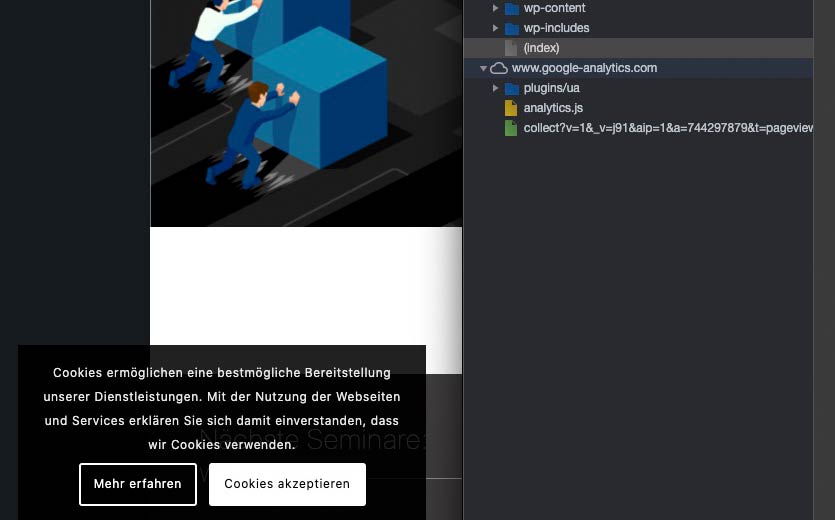
________________
Betrifft das eure Homepage?
PS: – ich halte Google Analytics nicht für ein essential Cookie. Von daher ist denke ich deine Strategie es beim Öffnen der Seite direkt zu aktivieren ohne Zustimmung für abmahnfähig. Besser ist der andere Weg – zunächst alle Cookies zu deaktivieren und dann eine Zustimmung einzuholen.
Edit – the menu is very nice – i now see that the first sublevel Links goes under the main navigation ( mybe that is the reason for the middle positioning)
wow. that will be hard to reach with enfold only options and css.Well – yes they have a slider on top – so place a full-width slider ( or fullscreen) as first element in your advanced layout.
if you like to have 6 columns in the footer that is possible too : https://kriesi.at/support/topic/2021-enfold-theme-solution-6-columns-in-footer/#post-1286573
See responsive behavior on those 6 columns footer here too: https://kriesi.at/support/topic/2021-enfold-theme-solution-6-columns-in-footer/#post-1286575A nice idea is to have both shown in the header – the normal navigation and the hamburger.
The Navigation is only for the top level links and the burger is for complete Navigation with sublevel links.
This could be reached too – but probably with a little more css rules and maybe additonal scripts.on website opening in a lightbox the ?iframe=true is ok. See: https://webers-testseite.de/my-website/
For images as Yigit said it is not necessary.
( you can see that on enfold/js/avia-snippet-lightbox.js on line 207ff)
the groups and autolink elements do open in lightbox without any addons.If you like to replace all imgs that are svg files with its inline code without plugin – it might be nice to preserve ( or set ) title, alt and class attributes.
I wouldn’t change the inline svg ID.
Put this to your child-theme functions.php:// replace every svg with its inline code function replace_img_if_svg_with_inline_svg() { ?> <script type="text/javascript"> (function($) { $('img').filter(function() { return this.src.match(/.*\.svg$/); }).each(function(){ var imgSVG = $(this); var imgURL = $(this).attr('src'); var imgAlt = $(this).attr('alt'); var imgTitle = $(this).attr('title'); var imgClass = $(this).attr('class'); $.get(imgURL, function(data) { var svg = $(data).find('svg'); // Remove invalid XML tags svg = svg.removeAttr('xmlns xmlns:xlink'); // add replaced image's alt tag to the inline SVG typeof imgAlt === 'undefined' || imgAlt === '' ? (svg = svg.attr('alt', 'Replaced Image')) : (svg = svg.attr('alt', imgAlt)) ; // add replaced image's Title tag to the inline SVG typeof imgTitle === 'undefined' || imgTitle === '' ? (svg = svg.attr('title', 'A SVG Image replaced by its inline code')) : (svg = svg.attr('title', imgTitle)); // Add replaced image's classes to the new SVG and add replaced-svg as new class typeof imgClass === 'undefined' || imgClass === '' ? (svg = svg.attr('class', 'replaced-svg')) : (svg = svg.attr('class', imgClass+' replaced-svg')); // Replace image with inline SVG Code imgSVG.replaceWith(svg); }, 'xml'); }); })(jQuery); </script> <?php } add_action('wp_footer', 'replace_img_if_svg_with_inline_svg');This code snippet takes into account the assignment of the attributes within the ALB element.
A few things to keep in mind:
If both the logo and the logo for the transparencies is an inline svg.logo, .logo a { overflow: visible; } .logo svg { position: absolute; left: 0; top: 0; width: 450px /*** an absolute value might be necessary for best browser support ***/ } #top :not(.av_header_transparency).av_alternate_logo_active .logo .subtext svg { opacity:0; filter:alpha(opacity=0) }the svg code inside in the head section :
<svg alt="transparent Logo Webers Webdesign" title="Webers Webdesign" version="1.1" id="Webdesign-transparent" xmlns="http://www.w3.org/2000/svg" xmlns:xlink="http://www.w3.org/1999/xlink" x="0px" y="0px" width="100%" height="100%" viewBox="0 0 570 200" preserveAspectRatio="xMinYMid meet" xml:space="preserve">- if width and height is set it will be responsive to the surrounding container.
- the preserveAspectRatio setting determines the way the svg shrinks with its surrounding container (xMinYMid – means it shrinks to the left side but stays in the middle on y-Achsis)
if this is the fact – you do not need to set different display options for the .logo and .logo a
see here: https://webers-testseite.de/copy – or more generally in use – it checks if the inserted logo ( if header transparency logo too ) is svg – then replaces it.
to allow the mime type you can use this littel snippet – or better use svg support:function custom_mtypes( $m ){ $m['svg'] = 'image/svg+xml'; $m['svgz'] = 'image/svg+xml'; return $m; } add_filter( 'upload_mimes', 'custom_mtypes' );here is a new code:
( it takes the svg files inserted in the enfold options dialogs ( logo and transparency logo ) as source for the scriptfunction replace_logo_if_svg_with_inline_svg() { ?> <script type="text/javascript"> (function($) { $('.logo img').filter(function() { return this.src.match(/.*\.svg$/); }).each(function(){ var imgLogo = $(this); var imgURL = $(this).attr('src'); $.get(imgURL, function(data) { var svg = $(data).find('svg'); // Remove any invalid XML tags as per http://validator.w3.org svg = svg.removeAttr('xmlns xmlns:xlink'); // Replace image with new SVG imgLogo.replaceWith(svg); }, 'xml'); }); })(jQuery); </script> <?php } add_action('wp_footer', 'replace_logo_if_svg_with_inline_svg');-
This reply was modified 4 years, 9 months ago by
you can use this snippet in child-theme functions.php to place an svg inline instead of the existing img:
// insert svg as logo
function replace_logo_with_svg() {
?>
  <script type="text/javascript">
  (function($) {
    function a() {
      $( ".logo a img" ).remove();
      $.get('/wp-content/uploads/YOUR-LOGO.svg', function(svg){
        $( ".logo a" ).html( svg );
      }, 'text');
    }
    a();
  })(jQuery);
  </script>
<?php
}
add_action('wp_footer', 'replace_logo_with_svg');
I use svg support too – but to replace the logo via the “force replace” of that plugin might be to slow
if you want that only on special pages – you can use if clausesyou need to set some absolute width to the inlins svg logo – and for shrinking headers the display options had to be changed.
f.e.:.logo svg { width: 450px; } .logo a { display: flex; position: relative; }This will work on masonry and masonry galleries aswell.
both masonry default h3 got the class : av-masonry-entry-titleBy the way the code-block element is not necessary to have it on top of the page.
if you got one masonry on top and one on the bottom you can differ between them on having custom class f.e. on the masonry element itself ( in my test page the masonry on top got custom class: is-h2
and the script in that case is:
https://webers-testseite.de/abcdef/<script> (function($) { $(document).ready(function(){ function replaceElementTag(targetSelector, newTagString) { $(targetSelector).each(function(){ var newElem = $(newTagString, {html: $(this).html()}); $.each(this.attributes, function() { newElem.attr(this.name, this.value); }); $(this).replaceWith(newElem); }); } replaceElementTag('.is-h2 h3.av-masonry-entry-title', '<h2></h2>'); }); }(jQuery)); </script>-
This reply was modified 4 years, 9 months ago by
I like in particular the navigation, which creates a top level menu item in which omitted menu items are collected as a submenu. Only when it no longer works, the hamburger is offered as an alternative menu.
-
This reply was modified 4 years, 8 months ago by
-
AuthorPosts