Forum Replies Created
-
AuthorPosts
-
by the way @Mike – for your team-member ALB solution – i tried to find a gallery enabled solution – but did not find yet.
And for that page of the participant – i recommend an additonal csslook to that other topic – there is an image that shows what Rikard mentioned:
https://kriesi.at/support/topic/floating-elements-bar-in-the-editor/#post-1361138yes Mike is right – and for a layerslider – you can see here a page of mine: https://webers-webdesign.de/
This video will play – and autostart the background-video. I don’t know if this is due to layerslider or by using on that layer a html5 video code.<video playsinline autoplay loop muted preload="metadata" style="min-width:1600; min-height:900;" > <source src="/wp-content/uploads/YOUR-VIDEO.mp4" type="video/mp4"> <img src="/wp-content/uploads/video-fallback.jpg" width="1600" height="900" alt="video-fallback-image" title="Your browser does not support the video tag"> </video>
BUT: keep in mind that videos on a page will cause a huge loss of performance. This page is ranked on gtmetrix on B 89% 88% – but with that background-video it will be : D 53% 82%We Webdesigners in Europe and to be more precise : in Germany suffer a little bit under that GDPR ( DSGVO ) Rules. Because a third party hosted Video will have better performance values – and even CDN do not fullfill all Need for the GDPR Compliance. So – without optin this will be illegal.
it is probably not necessary to mention that the Gallery option is prevented by setting it to false.
PS : that part:
/****
// re-appends controls inside the main container
		callbacks: {
		  buildControls: function() {
			this.arrowLeft.appendTo(this.contentContainer);
			this.arrowRight.appendTo(this.contentContainer);
		  },
		},
****/
if you like to have that – just get rid of those two lines with those asterisks
you can completely remove. This is only to have the left and right arrows inside the mfp-content container.
PPS:
if you are loading your jQuery in the footer do not forget to set a priority for that function in the last line:
add_action( 'wp_footer', 'button_for_biography', 999 );
and to have the image of your team-member inside the lightbox – just place the image into your text-block ( that with the mfp-hide class ) – on my test it is a float left setting.yes the first Bio works this way:
function button_for_biography(){
?>
<script>
window.addEventListener("DOMContentLoaded", function () {
(function($) {
	$('#people').each(function(){
	var that = this;
		$(this).find('.flex_column').each(function(i){
			$(this).find('.avia-button').attr('href','#bio-'+(i+1));
			$(this).find('.mfp-hide').attr('id','bio-'+(i+1)).addClass('white-popup');
		});
	});

	$('#people .flex_column').find('.avia-button, .avia_image').magnificPopup({
		type:'inline',
		midClick: true,
		gallery: {
			enabled:true,
		},
	});
})(jQuery);
});
</script>
<?php
}
add_action( 'wp_footer', 'button_for_biography');
and :
.mfp-content .white-popup {
  position: relative;
  background: #FFF;
  padding: 40px;
  width: auto;
  max-width: 800px;
  margin: 50px auto;
}
you see in the first part, that the function will replace that link # with a unique link : #bio-1, #bio-2 etc.
and the hidden textblock will get that unique ID –
the index method eliminates the need to manually set this link – ID correlation.Comming soon …
I just wanted to ask before investing time in a solution again and then not producing what you wanted to have after all.you want to have both functions ? toggle works and a button to open bios?
Or do you only want to have a button instead ( for the toggle container ) just put under your text-block a button. ( button link just #)
under that button put a text-block with the bio and give a custom-class to that text-block : mfp-hidesee here: https://enfold.webers-webdesign.de/sky19er/
If this is what you like to have?PS: or use the image – or the h3 Name as lightbox trigger.
can you try this in your child-theme functions.php:
function inline_popup_for_toggles() {
?>
<script type="text/javascript">
(function($){
	$(window).on('load', function(){

		$('#people .toggler').off('click');

		$('#people .single_toggle').each(function() {
		    $(this).magnificPopup({
				type:'inline',
				midClick: true,
				items: {
					src: $(this).find('.toggle_content').addClass('white-popup'),
				}
		    });
		});
	});
})(jQuery);
</script>
<?php
}
add_action('wp_footer', 'inline_popup_for_toggles');
and this in quick css:
.mfp-content  .white-popup {
  position: relative;
  background: #FFF;
  padding: 40px;
  width: auto;
  max-width: 800px;
  margin: 50px auto;
}
you see that selector – it is only for your ID set by yourself: #people
so if you like to have that on different places you had to adjust that selector –
PS: the .off(‘click’) removes the initial event on the togglesPS : ich finde leider nicht mehr den Link in den Google Einstellungen. Google erlaubt ausdrücklich die Verwendung ihrer Fonts auf localen Servern.
Da konnte man in seinem Google Account deren “Bedingungen” zustimmen dies zu tun. Das habe ich allerdings schon vor einiger Zeit getan. Danach kann man dann in der Datenschutzerklärung die local gehosteten Google fonts erwähnen, und um Copyright Verletzungen auszuschließen erwähnen, dass man die Erlaubnis dazu bei Google Fonts eingeholt hat.
________________
PS : unfortunately I can’t find the link in the Google settings anymore. Google explicitly allows the use of their fonts on local servers.
Since you could agree to their “terms” in your Google account to do so. However, I already did that some time ago. After that, you can mention the locally hosted Google fonts in your privacy policy, and to exclude copyright violations, mention that you have obtained permission from Google Fonts.i use this in my child-theme functions.php:
function enfold_customization_switch_fonts() {
global $avia;
$avia->style->print_extra_output = false;
}
add_action( ‘init’, ‘enfold_customization_switch_fonts’ );but since Enfold 4.4.1. there is that filter – and i guess you can use that either.
function my_output_google_webfonts_script( $activate ){
  return false;
}
add_filter( 'avf_output_google_webfonts_script', 'my_output_google_webfonts_script', 10, 1 );
by the way, I don’t know if Google Fonts support is now disabled by default in the advanced Layerslider. So please have a look there as well on Layerslider Settings Page.
August 12, 2022 at 7:29 am in reply to: Extremely slow page load time with Enfold theme (other themes load fast) #1361509see here the results on gtmetrix: https://gtmetrix.com/reports/www.the-hawkeye-effect.com/lrxz6lz6/ the TTFB ( Time to first byte) is extremly high and the FCP (First Contentful Paint ) as a consequence as well.
In my opinion, however, these variables are initially independent of the theme you use.
On the layerslider Options Dialog there is on top right an icon – these three dots: Click on Systemstatus and look if all your php Values are high enough for a WordPress CMS.


maybe you can post here too the Servervalue Results.
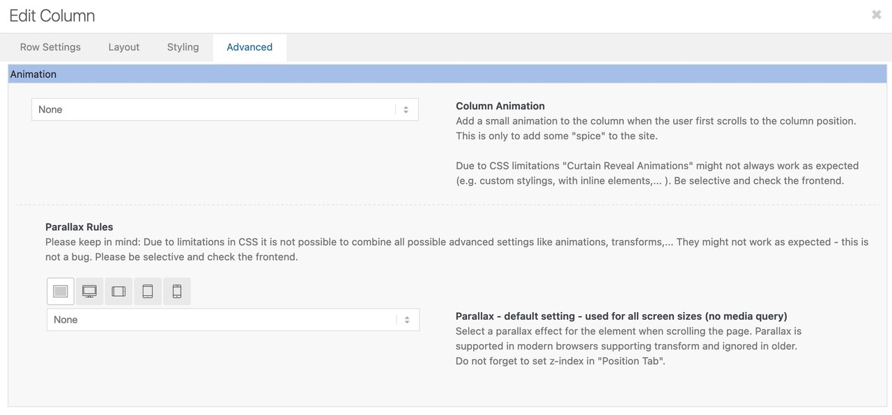
Then what @carlosquispehernandez mentioned – activate first the merging of enfold on Enfold Options – Performance : MergingYour question doesn’t quite make it clear where the parallax effect was used on your part. Does it affect the color sections (background-images)? Or do you already have the latest Enfold installed and mean the parallax that can be activated for columns and images.
______
if you are talking about that last parallax setting:
the first screen on the left is for the default setting and therefore applies to all screen widths. If you leave it on “none” no parallax will be applied. Only if you then edit the individual “Media Query Screens” the effect is applied there. ( Same with positioning – on “use theme default )
 August 10, 2022 at 1:14 pm in reply to: How can I prevent the display of my featured image on my post? #1361349
have you played a bit on that settings here :
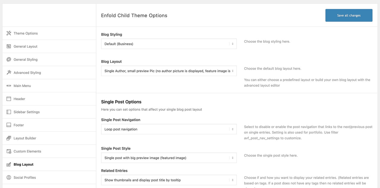
Or if you have done your blog page with enfold alb element blog-posts – on those similar settings ( single author – small preview )
if you decided to have no sidebar on those pages – there are css ways to get this look alike allthough.i needed a sidebar on my search results page – so i think you had to modify only the if clause for your case:
function avia_change_sidebar_layout($layout, $post_id) {
    if( is_search() ) {
        $layout['current'] = $layout['sidebar_right'];
        $layout['current']['main'] = 'sidebar_right';
    }
    return $layout;
}
add_filter('avia_layout_filter', 'avia_change_sidebar_layout', 10, 2);
if you like to place a custom side bar there ( pay attention it is case-sensitive ):
add_filter("avf_custom_sidebar", function($custom_sidebar) {
    if( is_search() ) {
        $custom_sidebar = "Your Custom Sidebar Name";
    }
    return $custom_sidebar;
}, 10, 1);
August 9, 2022 at 5:52 pm in reply to: How can I prevent the display of my featured image on my post? #1361272why don’t you use a different way to show your blog?
f.e.: like this https://kriesi.at/themes/enfold/blog/blog-single-small/guess it is not a bug – it is standard behavior – but you can switch it on/off:
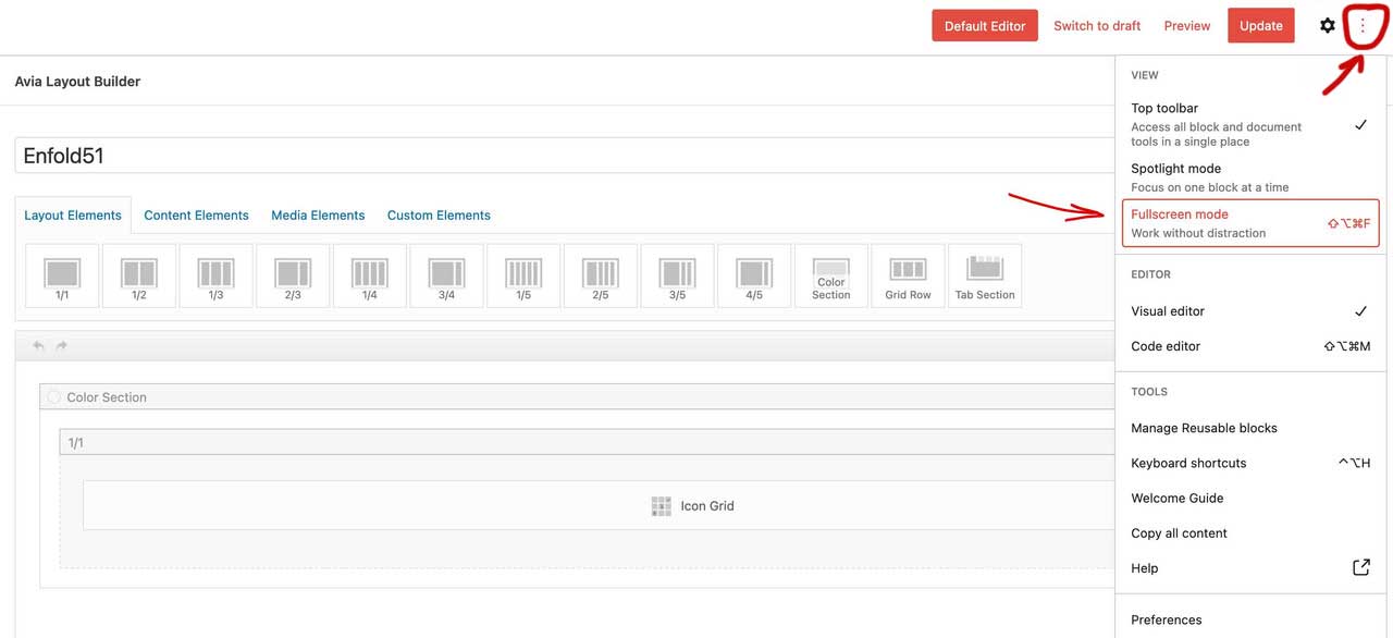
press that little three dots and switch on / off fullscreen mode.
by the way – have you ever used this nice button:
Edit : Ok – i see that you are using the Block Editor. Sorryhm – how did you manage it without that snippet before?
The CPT’s aren’t included to advanced layout builder before Enfold 5.0 too …did you read further on: https://kriesi.at/support/topic/ajout-dicones-dans-enfold/#post-1356658
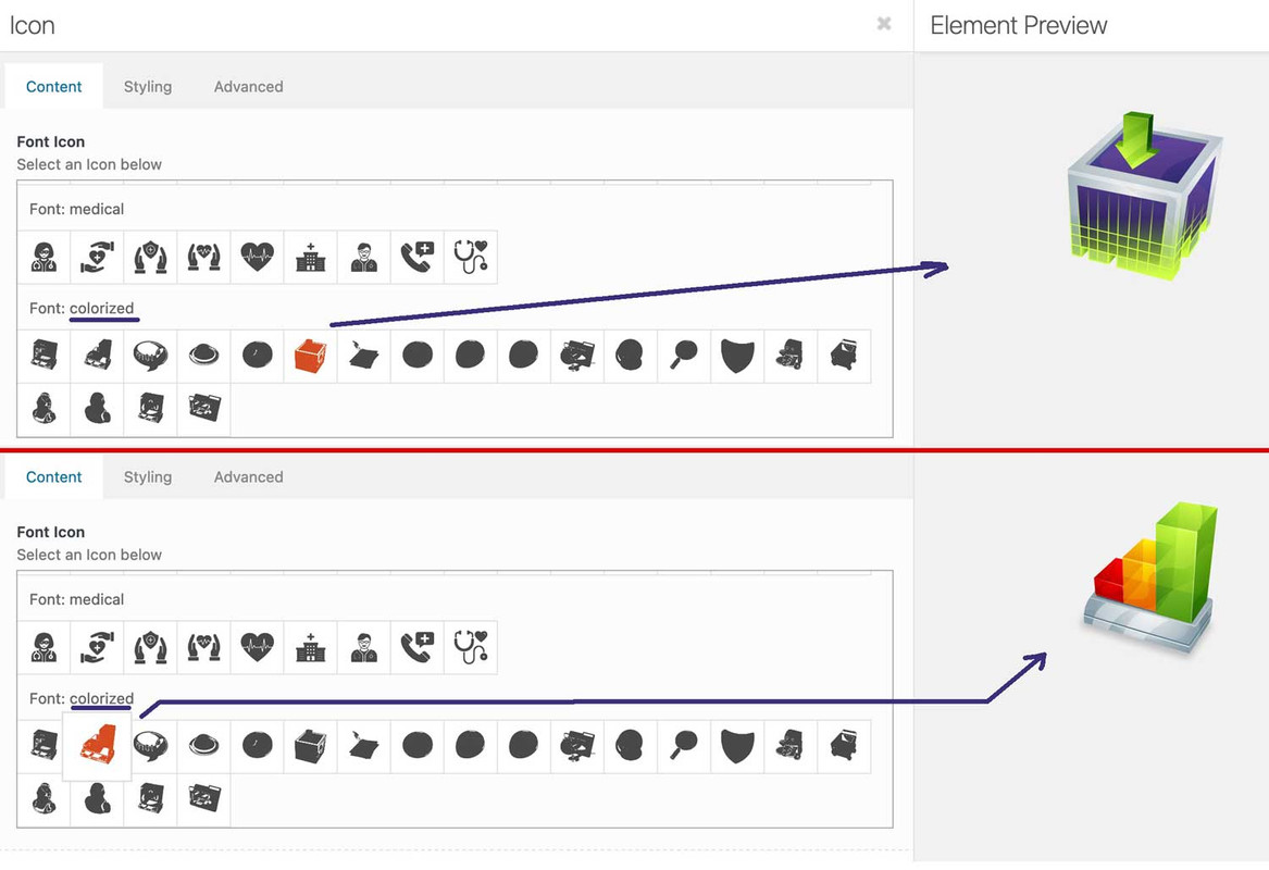
you can upload your svg files to media-library and replace existing font-icons. So you can use the enfold insertion of font-icons – and replace them by css:
f.e. with an unimated svg or gif: https://webers-testseite.de/

webdesing columnafter my posting i recognized that some icons are in span etc. you had to adjust the replacement code then
[data-av_icon="\e837"] {
	content: " ";
	background-image: url(/wp-content/uploads/ezgif-4-64b6614e32.gif);
	background-size: contain;
	background-repeat: no-repeat;
       font-size: 0 !important
}
_______
Yes – it’s a bit of work, but it’s worth doing this way.
You convert your colored svgs in icomoon app to black svgs – upload them to fontello and then import them into Enfold. Then you replace the black pendents with the colored svgs via css. Then you have the advantage to use these colored icons like font-icons everywhere where they can be positioned in Enfold Alb elements.and btw. if you only like to have colorized icons f.e. with gradient:
( You need to be more specific with this selector here – to not address all icons on the page )[data-av_icon]:before { background: linear-gradient(135deg,rgb(74,234,220) 0%,rgb(151,120,209) 20%,rgb(207,42,186) 40%,rgb(238,44,130) 60%,rgb(251,105,98) 80%,rgb(254,248,76) 100%); -webkit-background-clip: text; background-clip: text; -webkit-text-stroke: 0px blue; /*** you even can have strokes on the icons ***/ -webkit-text-fill-color: transparent; }for example: https://enfold.webers-webdesign.de/colorized-font-icons/
i named the svgs analog to the code the black icons have on the fontello fontin edit mode:
Very often it is caused by WordPress autop function.
Can you try these filters if it will solve that issue:remove_filter( 'the_content', 'wpautop' ); remove_filter( 'the_excerpt', 'wpautop' ); remove_filter( 'widget_text_content', 'wpautop');refresh merging of enfold js and css rules – and refresh all cachings ( browser or optimization tools)
____
Sometimes it is caused by manually make some errors in f.e. editor by adding tags yourself.
W3C it is not allowed to have block-elements inside p-tag ( including p-tag itself)
see here a list of allowed elements inside p-tag: https://html.spec.whatwg.org/#phrasing-content
f.e. no ul nor ol tag etc.and btw: i do not see any errors on your starting page! : Link
only warnings are presentok – with grid layout it will work too! Grid-Layout is a bit more complex – so i do seldomly advice this
Link1; Link2 ;)PS: here to – on grid-layout the pseudo-container will be part of those rules – so the got gaps etc. analogo to the visible containers.
So if you add this to your css:#av_section_2 .entry-content-wrapper:before, #av_section_2 .entry-content-wrapper:after{ display:none }you can see the influence they have
it was exactly your error i recognized on my installation – so did you refresh all merging files and delete all cache ( Browser-Cachings, Optimizing Plugins (Cachify) etc) ?
and PS: my last version is 4.5.8 ! not 4.5.2
August 8, 2022 at 8:37 am in reply to: Anchor (ID) Links not landing at the top of the Color Section #1361057i do sometimes prefer that nice plugin: page scroll to id
This plugin has one big advantage – you can insert an ID – where scrolling stops ( f.e.: #header )
but for me it is more important because this works even on scroll to ID on different pages. – That means : if i have a link on page1 to an anchor on page2 it will do a smooth scroll to that position by opening first the #top position and on a little delay ( you can determine how long this is ) it will scroll then to the anchor smoothly. ( “Scroll from/to different pages (i.e. scroll to target when page loads)” )But:
It does not make a difference which blogstyle i use (standard, elegent or modern business) – its always linked.
I am using a page with “masonry element” to pull the blogposts but why should this affect how a single blopgost looks like?on the other posting you are talking about the single posts. So this code has no influence on this link.
there I think in a blog it makes sense to also link the image to the single post.look to : https://kriesi.at/support/topic/remove-link-from-featured-image-3/#post-1360722 to only remove the mouse action – ( but : you had to adjust the selector on different blog-styles etc. )
.slide-entry .slide-image,
.post-entry .small-preview,
.post-entry .big-preview a {
  pointer-events: none;
}
or you had to edit the loop … ( with all its blog-style cases )
Update WPML – i got the same on a customer site.
ok – thanks Ismael – on my testinstallation this code works.
this will immediately be added to my large collection of snippets.And thanks – i did not see that i missed one closing curly bracket ! -Sorry
But i thought that the link function has to be hampered – and not redefine the image source for that image.
Both could be done by echo that new image definition:function av_remove_featured_image_link($image) { if (is_single()) { $image = get_the_post_thumbnail( $current_post['the_id'], 'featured' ); } // return : if you only want to have a different image source for that f.e. : entry_with_sidebar echo $image; } add_filter('avf_post_featured_image_link','av_remove_featured_image_link', 10, 1);and if you choose a different image-size source for this image it might be good to shift the image again to the center of its container:
( but even here there are a lot of possible selectors depending on the blog settings ).template-single-blog .wp-post-image { position: relative; left: 50%; -webkit-transform: translateX(-50%); transform: translateX(-50%); }Der Sinn dahinter ist , dass man nicht iconbox selber einfärbt und in der Höhe angleicht, sondern die columns welche diese beinhalten.
Also lediglich die Iconfarben anpasst, und die Hintergrundfarbe dann inclusive Schattenwurf etc. durch die columns bestimmt.
Will man das Iconbox Aussehen erhalten verschiebt man nur diese über den column Rand hinaus. Bingo.Und pack die Columns bitte in eine Color-Section
PS: du musst irgendwo eine Höhe erzwungen haben:
das brauchen wir nicht

_____
The idea behind this is that you do not color the iconbox itself and adjust the height, but the columns that contain them.
So only the icon colors adjust, and the background color then inclusive shadow throw etc. by the columns determines.
If you want to keep the iconbox look you just move it over the column border. bingo.have a look here on my example page – with all css code and descriptions.
( Don’t know if you have set a minimum height of that section – if so – remove it )shiftings depends on the icon size you have choosen in your iconbox element
what is the reason for making it white ? what you try to obtain with it?
To completly remove it it is much easier:.trail-begin { display: none !important; } -
AuthorPosts