Forum Replies Created
-
AuthorPosts
-
November 8, 2025 at 8:23 pm in reply to: Non-fullwidth Portfolio or Grid Row gets colored sides #1491064
You’re talking about the grid row element, right?
Edit: sadly you did not post a link to your page – but your screenshot is clear enough – i found your site now.
Because it looks exactly the same when you set a grid-row by css to to be not full-width, I thought you had used this element.____________
So – why don’t you put the portfolio grid inside a 1/1 Container
The Color-Section can have the one background-color – and the 1/1 Container a different one.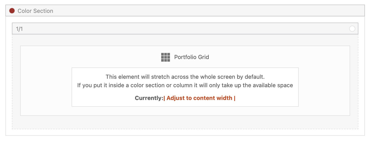
if you then do not want on top and bottom of the 1/1 Container the background-color of the Section just remove padding-top and padding-bottom of 50px.
try first this shorter form – maybe that will work for you.
(do not know if the old filter is still ther avia_ …)
there are more complex snippets – but in almost all installations this will work:function enfold_customization_postnav($settings){ $settings['skip_output'] = false; $settings['same_category'] = true; return $settings; } add_filter('avf_post_nav_settings','enfold_customization_postnav', 10, 1);edit: here is one with more options:
function my_avf_post_nav_settings( array $settings ){
  if( true === $settings['is_hierarchical'] ){
    $settings['skip_output'] = true;
    return $settings;
  }
  if( ! in_array( $settings['type'], array( 'post', 'portfolio' ) ) ){
    $settings['skip_output'] = true;
    return $settings;
  }
  $settings['same_category'] = true;
  $settings['is_fullwidth'] = false;
  $settings['skip_output'] = false;
  return $settings;
}
add_filter( 'avf_post_nav_settings', 'my_avf_post_nav_settings', 10, 1 );
November 8, 2025 at 4:06 pm in reply to: Non-fullwidth Portfolio or Grid Row gets colored sides #1491061a pure css solution is perhaps not possible.
i have my snippet for child-theme functions.php :
function grid_layout_notfull(){
$responsive_size = avia_get_option('responsive_size');
?>
<script>
(function($){
  $('.av-layout-grid-container.grid-notfull' ).each(function() {
    var notfullID = $(this).attr('id');
    $(this).hasClass('main_color') ? $(this).wrap('<div class="main_color notfullsize '+notfullID+'"></div>') : '';
    $(this).hasClass('alternate_color') ? $(this).wrap( '<div class="alternate_color notfullsize '+notfullID+'"></div>') : '';
  });
  $('.notfullsize').css({"clear": "both", "width": "100%" , "float": "left" , "position": "static" , "min-height": "100px" });
  $('.grid-notfull').css({"max-width": "<?php echo $responsive_size; ?>" , "margin": "0 auto" , "padding": "0 50px"});
})(jQuery);
</script>
<?php
}
add_action('wp_footer', 'grid_layout_notfull');
what you had to do: give a custom class to the grid-row element: grid-notfull
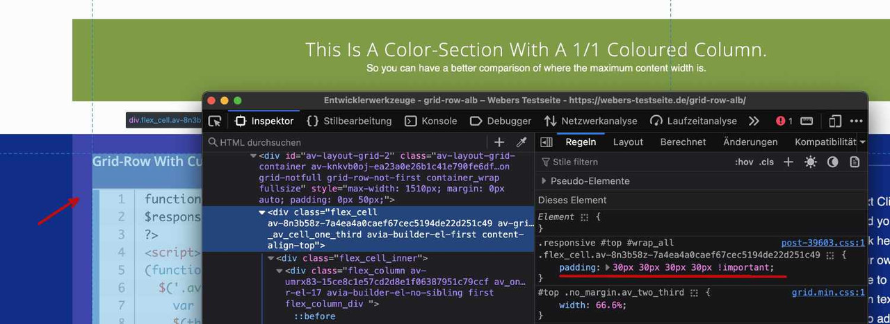
see: https://webers-testseite.de/grid-row-alb/the difference between green color-section to following grid-row on my testpage comes from the standard padding of grid-cells of 30px
PS: the ID of the grid-row element goes to its wrapper as class.
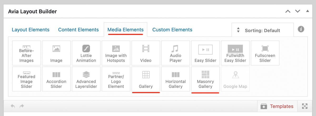
ok – i think you should use not the nextgen gallery images for that – In that case, you would not have taken advantage of the lightbox, which displays an enlarged version of your images. Instead, use the original uploaded files.
Why not try the Masonry gallery? It offers even more configuration options. – The css code is on my testpage
Assign a custom class to this gallery – and reduce the value for the maximum width – as on blog pages. e.g: 800px
.avia-gallery.your-custom-class {
  max-width: 800px;
  margin: 0 auto;
}
you can decide to show on grid a smaller version of your images – and in light-box to show the full image. On masonry-gallery you can set to have different column-counts on responsive case.
why don’t you use the gallery or masonry gallery element?
Are you talking about the tooltips displayed by the browser itself when hovering over the image?
They appear automatically if the image has a title attribute.
However, if you have a gallery that displays images in a lightbox, this title attribute is also displayed as text in the bottom bar of the lightbox. Completely removing the title tag would therefore be suboptimal. For galleries, you can switch to displaying the description or caption instead, but this is not possible for all Enfold elements.
So if it only affects the galleries on your site, you could do that, but you would then have to update the description of the images, for example.There is a snippet that, when placed in the child theme’s functions.php, temporarily removes this title tag on hover but adds it back when clicked:
function temporary_removal_title_tags(){
?>
<script>
  window.onload = function() {
    var elementsWithTitle = document.querySelectorAll('a, img, *[title]');
    for (var i = 0; i < elementsWithTitle.length; i++) {
        var element = elementsWithTitle[i];

        element.setAttribute("data-original-title", element.title);

        element.addEventListener("mouseenter", function() {
            this.title = "";
        });

        element.addEventListener("mouseleave", function() {
            this.title = this.getAttribute("data-original-title");
        });

        element.addEventListener("mousedown", function() {
            this.title = this.getAttribute("data-original-title");
        });
    }
  };
</script>
<?php
}
add_action('wp_footer', 'temporary_removal_title_tags');
here you see that this script is working for all anchor elements or images – or all elements that have a title-tag
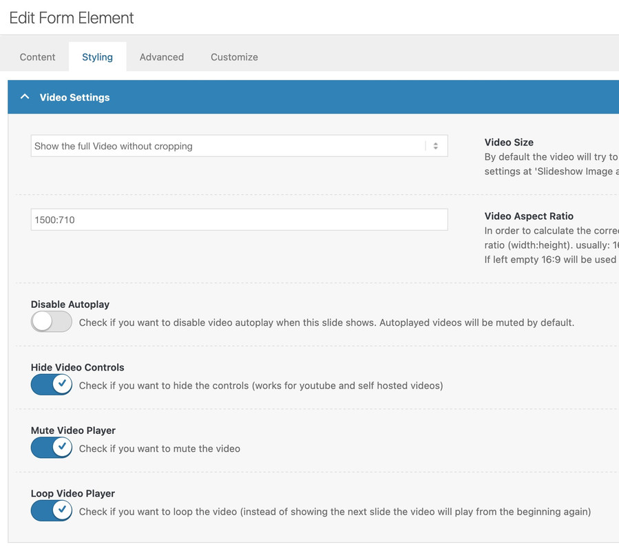
did you try out my suggestions? https://kriesi.at/support/topic/video-on-home-page-2/
and again see your video placed on one of my testpages: https://webers-testseite.de/lara-video/
the only thing you had to know is the aspect ratio of your video ( in your case 1500:710 ) and this is not 16/9
this belongs to paragraph margin setting. So maybe it is enogh to only get rid of default margin-top value on first p tag.
#top p:first-child { margin-top: 0 ; }Filesize is on original jpg small enough – so you can insert the full image. Maybe that is a bit sharper then.
And maybe you switch earlier to hamburger menu :
@media only screen and (max-width: 1200px) { #top #header .av-main-nav > li.menu-item { display: none!important; } #top #header .av-burger-menu-main { cursor: pointer; display: block!important; } }maybe that option for logo and Navigation on Enfold – Header : “Let Logo And Menu Position Adapt To Browser Window” is a possibility.
Because your navigation is overlapping your logo on smaller screens.if your graphic designer got a vectorgraphic of it this will be sharper than a png file. He should offer it as svg graphic.
btw. a png file is usefull if there are transparencies (f.e. the pure green logo without background) so here is a cropped logo as jpg – you can use it for now.download it here as zip file: https://webers-testseite.de/First_business_card_5.jpg.zip
Open that image link in your browser: https://dapoostkapelle.nl/wp-content/uploads/2025/06/First_business_card_5.png
you then can see the whitespace around it.
on your landing page (no enfold page ) or on the other pages?
(ok www leads to a different landing page )First hint – your logo got quite a lot of white space around the green logo inside.
So unless the corporate design specifies that there should be so much white space around the actual logo, I would change that first.November 7, 2025 at 8:08 am in reply to: Possible Bug: Search widget loses focus on mobile during live search #1491015hm – if so – then it had to be a part of your layerslider – because on my testpage i got an advanced layerslider too on top – but ajax search acts normal.
https://webers-testseite.de
or https://webers-testseite.de/advanced-layerslider/sorry Typo in link
Would you like to hide only the logo image or both the logo image and navigation?
Would you like to hide it on small screen sizes or exclusively on mobile devices?css depends on the place where you show it – f.e. in the top header:
#top #wrap_all .av-social-link-bluesky:hover a { color: #fff; background-color: #1185fe; } #top #wrap_all .av-social-link-bluesky a svg * { fill: var(--enfold-header_replacement_menu_color); } #top #wrap_all .av-social-link-bluesky a:hover svg * { fill: #FFF }you can use even colorized svgs if you just upload them to media-library.
On media-library list view – you see the ID of that svg file – note it for the code snippet:add this to your child-theme functions.php:
(change the 49551 to your ID)function avia_add_custom_icons($icons){ $icons['bluesky'] = array( 'font' =>'svg_wp-media-library', 'icon' => '49551', 'display_name' => 'Bluesky'); return $icons; } add_filter('avf_default_icons','avia_add_custom_icons', 10, 1); function avia_add_custom_social_icon($icons){ $icons['bluesky'] = 'bluesky'; return $icons; } add_filter('avf_social_icons_options', 'avia_add_custom_social_icon', 10, 1);you will find then the bluesky at the end of the drop-down list where all the others are.
Important: pay attention that your uploaded svg file is not a svg with height/width settings but with viewport.or you can transform your svg on svgomg
now – thanks for the admin permissions.
i did what i mentioned above: for the thumbs in grid i take the portfolio size (495×400)
using that snippet to have original images in the ajax preview image ( on imagify you have choosen to have no compression – so original image might be of less file-size than the recalculated large image-size )
and disabeling the enfold option to use lazyloading ( maybe the option of wp-rocket is better )but with these changings – you can see a much better loading performance.
in additon – i decided to show on lightbox the full image ( because your large recalculated images are much bigger in file-size than the full one )
and to have no scroll on background – on opend lightbox.ok – this seems to be enough inside child-theme functions.php:
add_filter("avf_ajax_preview_image_size", function($size) { $size = "full"; return $size; }, 10, 1);you know that and how you can add your own social media icons to the enfold system.
Are these self-hosted videos? How large are the files?
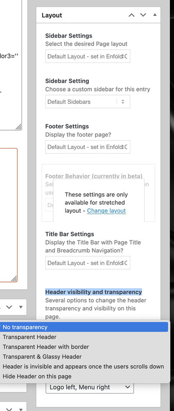
open that page on editor – see on the right side inside “Layout” box : “Header visibility and transparency” – choose your option
PS : you should use for the thumbnails in the grid recalculated smaller images e.g.
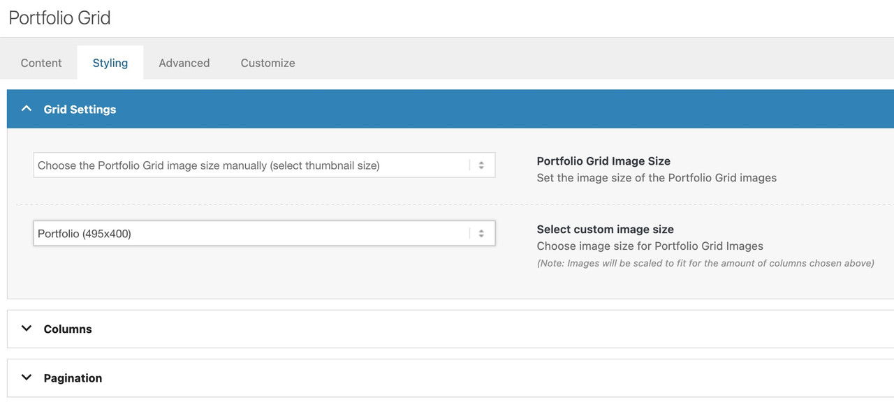
you are now using the full image (no-scaling).Edited – because there is that existing filter to influence the shown image in preview …
can we influence the image shown in the ajax preview ( that img insided avia-gallery-big ) – it seems to use the recalculated “large” image.
But as you know this might be bigger in file size than the original uploaded image!
I can not find a filter to adjust it.or could we influence it by
$params['preview_size'] = apply_filters( 'avf_ajax_preview_image_size', 'gallery' );i can find this in portfolio.php
//	create array with responsive info for lightbox
	$img = Av_Responsive_Images()->responsive_image_src( $attachment->ID, 'large' );
bring it to full will often reduce file-size – as you know that Enfold standard compression leads to bigger file-sizes on large image.
ok – i found the place to change in gallery.php (line 757)
$prev = wp_get_attachment_image_src( $attachment->ID, $preview_size );if we would use :
$prev = wp_get_attachment_image_src( $attachment->ID, 'full' );looking to his page f.e.:
the krebs-treppen-systeme-gelaender-system30-3.jpg is 121kb
but krebs-treppen-systeme-gelaender-system30-3-1030×839.jpg is 268kbthe whole page got over 112MB images – and could be reduced to a half size.
November 5, 2025 at 7:50 am in reply to: Replace default Entypo Fontello SVG icons in Easy Slider and Content Slider #1490960you can find the defintions of standard icons on enfold/includes/config-enfold/init-base-data.php
Easy Slider is on default using:
'svg__next_big'  	=> array( 'font' => 'svg_entypo-fontello', 'icon' => 'right-open-big' ),
'svg__prev_big'  	=> array( 'font' => 'svg_entypo-fontello', 'icon' => 'left-open-big' ),
The Filter you can use to change these icons is: avf_default_icons
you can use it like this in your child-theme functions.php:
function avia_replace_default_icons($icons){
// e.g.: changed by uploaded svg files - using the ID's and the font-name is svg_wp-media-library
	$icons['svg__prev_big'] =  array( 'font' =>'svg_wp-media-library', 'icon' => '50913');
	$icons['svg__next_big'] =  array( 'font' =>'svg_wp-media-library', 'icon' => '50591');
	return $icons;
}
add_filter('avf_default_icons','avia_replace_default_icons', 10, 1);
but: What is the font-name of your uploaded icon-setyou find that information on :
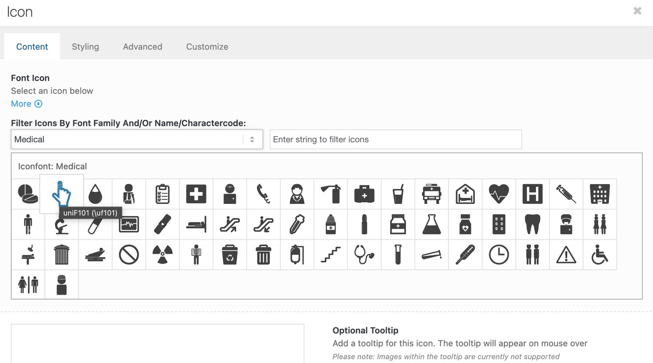
now f.e. if you like to replace these standard icons by icons of the iconset : medical
function avia_replace_default_icons($icons){
	$icons['svg__prev_big'] =  array( 'font' =>'medical', 'icon' => 'uf101');
	$icons['svg__next_big'] =  array( 'font' =>'medical', 'icon' => 'uf135');
	return $icons;
}
add_filter('avf_default_icons','avia_replace_default_icons', 10, 1);
you can find those font icon codes f.e. on trying to place that icon you like to have and hover it :
( it is the value inside the brackets – without that backslash)
maybe this gives you some hints how it could be obtained: https://kriesi.at/support/topic/the-website-loads-invisible-elements/#post-1490800
you can try:
#top .avia-featureimage-slideshow .avia-caption-title a {
  display: inline-block;
  line-height: 1.4em;
  background-color: rgba(0,0,0,0.3);
  backdrop-filter: blur(4px);
  padding: 5px 8px;
  border: 2px solid #FFF;
  border-radius: 5px
}
Just leave out the border styling if you don’t like to have it. I’ve now adjusted it so that it fits the button.
This is an Enfold CSS that controls the respective element.
In this case it can be found here: /enfold/config-templatebuilder/avia-shortcodes/testimonials
But at least the Quick CSS variant will remain intact when you update Enfold. -
AuthorPosts