
-
AuthorPosts
-
March 13, 2025 at 9:27 am #1479220
hello
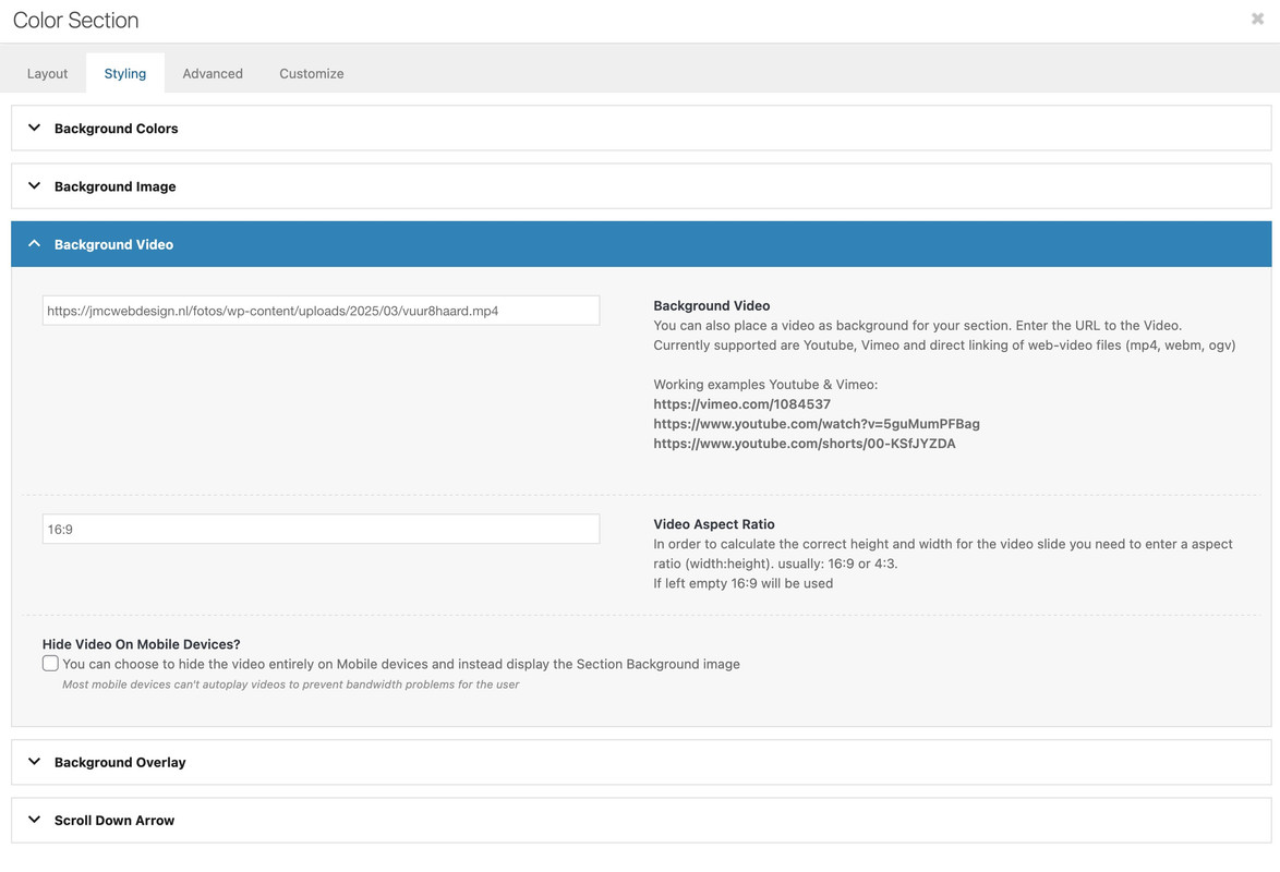
here: https://www.drufire.com/nl-nl/
is what i want: a full foto with a fire and BELOW that another textfield with textthis is what i got:
http://www.jmcwebdesign.nl/fotos/vuur4/but…whatever i do, it seems impossible to create another content section below the first one where i can see the text.
the text should not scroll up, i should stay below the picture with the firehow would i get such a result?
best regards, jelleMarch 13, 2025 at 10:13 am #1479225you see your example page – that section scrolls away!
but you set your video container to fixed position:#video-container { position: fixed; top: 0; left: 0; width: 100vw; height: 100vh; z-index: -1; }so this will stay at position
do you like to have this?
#video-container {
  position: absolute;
  top: 0;
  left: 0;
  width: 100vw;
  height: 100vh;
  z-index: -1;
}

#top #av_section_1 .container {
  max-width: 100vw !important;
  margin: 0 !important;
  top: 0;
  left: 0 !important;
  position: absolute;
  padding: 0 !important;
}
March 13, 2025 at 10:46 am #1479226next question: why don’t you use the enfold options on adding video to color-section:
see with css code:
https://webers-testseite.de/vuur/March 13, 2025 at 12:52 pm #1479231March 13, 2025 at 1:52 pm #1479248Hello Guenni
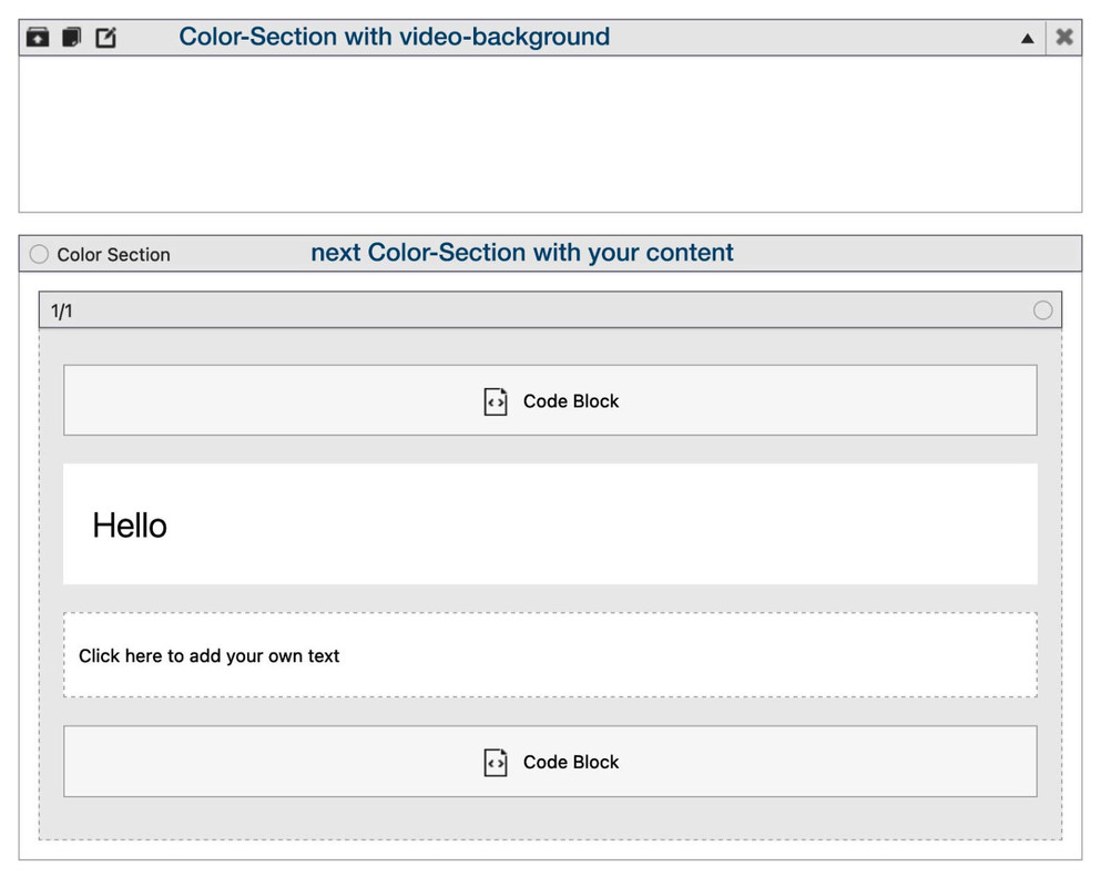
thanks for your quick respons.next question: why don’t you use the enfold options on adding video to color-section:
ive tried to use the Enfold options (see exampel below), but the pic wont do 100% width….for the rest, your way works great, second content section neatly below the first one…
surely i will be doing something wrong…best regards, jelle
http://www.jmcwebdesign.nl/fotos/vuur5/
-
This reply was modified 1 year, 1 month ago by
jeel147.
March 13, 2025 at 1:57 pm #1479250http://www.jmcwebdesign.nl/fotos/vuur4/
looks quite good now, thanks! the only thing is:the text is now finally, just below the image/video/first content section.
but…on a mobile it appears much too low…
probably something to do with: margin-top: 110vh;
but using a spacer does not help either.
how to move the text, also on a mobile and tablet, directly below the picture?-
This reply was modified 1 year, 1 month ago by
-
This reply was modified 1 year, 1 month ago by
-
This reply was modified 1 year, 1 month ago by
-
This reply was modified 1 year, 1 month ago by
-
This reply was modified 1 year, 1 month ago by
-
This reply was modified 1 year, 1 month ago by
-
This reply was modified 1 year, 1 month ago by
March 13, 2025 at 4:15 pm #1479269hm – boxed content seems to be a bad guy for that. …
try ( now just for that post : vuur5 to not have influence from other settings )
#top.postid-227 #main {
  overflow: visible !important;
}

#top.postid-227 #av_section_1 {
  position: absolute;
  height: calc(100vh + var(--enfold-header-height)) !important;
  width: 100vw;
  left: 0;
  top: calc(-1 * var(--enfold-header-height)) !important;
}

#top.postid-227 video {
  position: absolute;
  top: 0;
  left: 0;
  width: 100%;
  height:  calc(100vh + var(--enfold-header-height)) !important;
  z-index: -1;
  object-fit: cover;
}

@media only screen and (max-width: 1200px) {
  #top.postid-227 video {
    left: -250px !important;
  }
}

@media only screen and (max-width: 767px) {
  #top.postid-227 video {
    left: -350px !important;
  }
}
March 13, 2025 at 4:58 pm #1479273hello Guenni, i ve tried this css but it didnt work
http://www.jmcwebdesign.nl/fotos/vuur4/
is now in fact oke, but on mobiles en tablets the text is too low. tried to work with a spacer but that was no good either.is it possible to test 1 particular page with 1 particular css? now i have to delete constanntly the Quick Css and put another in, which will of course effect all pages…
best regards, jelle
-
This reply was modified 1 year, 1 month ago by
March 13, 2025 at 8:37 pm #1479279try ( now just for that post : vuur5 to not have influence from other settings )
March 14, 2025 at 7:18 am #1479309Hi,
Try to wrap the css modification inside this css media query so that it won’t affect the mobile view.
@media only screen and (min-width: 768px) {
/* Add your Desktop Styles here */

}
And to be able to target specific elements in the page, try to apply a unique ID or class names to them.
— https://kriesi.at/documentation/enfold/add-custom-css/
Best regards,
IsmaelMarch 14, 2025 at 10:57 am #1479330can you please make a decision if you like to have boxed layout or not.
You can see on my stretched layout that it is quiet simple to fullfill your needs. – but with boxed layout it is hard to get.
Now you got on you page stretched layout – so see below the css ruleset.this is my layout on that example page with stretched layout:
 March 14, 2025 at 11:11 am #1479332
this is the code for your vuur4 page now:
#av_section_1 {
  height: 100vh !important;
}

.responsive #av_section_1 .container {
  max-width: 100%  !important;
  padding:0 !important;
  margin: 0 !important;
}

video {
  position: absolute;
  top: 0;
  left: 0;
  width: 100vw;
  height: 100vh;
  z-index: -1;
  object-fit: cover;
  overflow: visible !important;
}
ps: you can shift the video position by
/* === Keeping the fireplace in view === */
@media only screen and (max-width: 1425px) {
  video {
    object-position: -335px;
  }
}
March 15, 2025 at 4:24 pm #1479411Hello Guenni007
thanks for your help! i appreciate it very much.
the layout is stretched now.
looks good, but a few small things are not oke yet:1. https://jmcwebdesign.nl/fotos/wp-content/uploads/2025/03/halfbeeld-scaled.jpg
turning the screen of small devices the image/video leaves a gap at the right side (see also : screenfly )
the Keeping the fireplace in view bit may be not totally correct? im not sure…
2. there is some kind of haze over the text below the pic….has something to do with the z-index i belief but i cant figure out what exactly…Best regards, jelle
-
This reply was modified 1 year, 1 month ago by
March 15, 2025 at 7:56 pm #1479430I’m on a Retina display here and can’t test it under all eventualities – maybe you needed to remove that rule set:
@media only screen and (max-width: 1425px) {
  video {
    object-position: -335px;
  }
}
and find your own media-query setting for it maybe with more conditions like -webkit-min-device-pixel-ratio: 2 or min-resolution: 192dpi
maybe we start with :
@media only screen and (max-width: 875px) {
    video {
        object-position:-235px
    }
}
March 23, 2025 at 1:07 pm #1479963thanks again,
this ticket can be closed now, best regards, jelle -
This reply was modified 1 year, 1 month ago by
-
AuthorPosts
- The topic ‘content section below content section’ is closed to new replies.