Forum Replies Created
-
AuthorPosts
-
You do not have this on your advanced Tab ?
Yesterday i had a similar message with that tool – and it was my logo image – but i used it additionally on a different place ( in my case in icon circle as center logo image) unfortunately the alt attribute from the media library is not taken over here.
or f.e.: in your footer widget – have a look if you place that image elsewhere – because that tool does not show where you placed that image – only the path of that image.By the way @ThiloKiefer – this is a nice tool – to inspect a whole page – and the free-version is quite sufficient. (Screaming Frog)
December 7, 2022 at 10:27 pm in reply to: Kleine Leiste über dem Hauptmenü – Höhe verändern #1375450per css kannst du die min-height einstellen – allerdings verändert sich dadurch nicht automatisch das padding-top von #main.
also zB:#header_meta .container { min-height:50px; }der default Wert ist 30px – diese extra 20px müsstest du dem padding-top für #main zu addieren.
Und zwar für alle responsiven Fälle – ausgenommen den Seiten mit transparentem Header.December 7, 2022 at 10:01 pm in reply to: How to prevent 2 people working on the website at the same time? #1375449The posts/pages are not a problem so far – because when you go into editor mode, a popup appears asking if you want to kick out the other active user. You just have to control yourself and inform the other user if you are allowed to take over.
Only the Quick CSS is a special case here. Here you do not notice if someone else is in the process of editing the same.
Therefore I recommend to run a refresh of the admin page shortly before you make your own entries. Then at least not all entries of the other are lost or you reset to a too old state.can you try something like this:
function av_change_logo_link_for_language($link){
    $currentlang = get_bloginfo('language');
    if($currentlang=="en-US"){
        $link = get_site_url().'/?lang=en';  // you know your permalink structure better than me
    }
    return $link;
}
add_filter('avf_logo_link','av_change_logo_link_for_language');
December 6, 2022 at 6:43 pm in reply to: avia_animate_when_visible : how to hamper – or to change offset #1375253A question about understanding the filter application:
The shortcode name is what we can find in the corresponding alb under $this->config[‘shortcode’]
and to positivly influence only av_icon_circles ? the != means notfunction custom_alb_element_animation( $class_animation, array $atts, aviaShortcodeTemplate $sc, $shortcodename ){ if( $shortcodename == 'av_icon_circles' ){ return 'av-animated-when-visible-40'; // corrected here - the class without dot } return $class_animation; } add_filter( 'avf_alb_element_animation', 'custom_alb_element_animation', 10, 4 );This way is possible too ?
December 6, 2022 at 3:52 pm in reply to: avia_animate_when_visible : how to hamper – or to change offset #1375238the 95% was only an example value (admittedly a poorly chosen) – so f.e. 15%
can you give us an example how to use that filter to change the offset amount or to block the animation?December 2, 2022 at 11:56 am in reply to: avia_animate_when_visible : how to hamper – or to change offset #1374759This works:
function change_waypoints_offset_on_specific_element(){
?>
<script>
window.addEventListener("DOMContentLoaded", function () {
  (function($) {
  if( $.fn.avia_waypoints ){
    if( typeof container == 'undefined' ){container = 'body';}
    $('#customID.avia_animate_when_visible', container ).avia_waypoints( { offset: '95%'} );
  }
  })(jQuery);
});
</script>
<?php
}
add_action('wp_footer', 'change_waypoints_offset_on_specific_element', 999);
but i think a different method before generating the element would be better.
and do not forget the filter – you can change the source for those images by:
function my_avf_newsbox_image_size( $image_size, array $args, array $instance ){
  if( $args['widget_id'] == ( 'portfoliobox-3' || 'newsbox-2' || 'newsbox-4' ) ){
    $image_size = 'square';
  }
  return $image_size;
}
add_filter( 'avf_newsbox_image_size', 'my_avf_newsbox_image_size', 10, 3 );
filter is for portfolioboxes and newsboxes ! you only had to know the index of your setting.
place on your page – where the popup should do what popup do ;) – a container ( 1/1 ) – fill with your content.
Goto Advanced Tab of that container and give the custom ID to it: myPopup
fill in the custom class: white-popup mfp-hide
so there will be two classes now on this container.now place on your child-theme functions.php :
function open_popup_on_load(){
?>
<script>
window.addEventListener("DOMContentLoaded", function () {
  (function($) {
    setTimeout(function() {
      if ($('#myPopup').length) {
        $.magnificPopup.open({
          items: {
          src: '#myPopup'
          },
          type: 'inline'
        });
      }
    }, 1000);
  })(jQuery);
});
</script>
<?php
}
add_action('wp_footer', 'open_popup_on_load', 999);
change the value 1000 (ms) to whatever you like
see: https://enfold.webers-webdesign.de/selfopen-popup/or – if it necessary to wait till DOM is loaded:
function hide_header_main() {
?>
<script>
window.addEventListener('DOMContentLoaded', function() {
  (function($) {
      var element_to_animate = $('.waypoint-trigger');
      var $header = $('#header_main');

    element_to_animate.waypoint(function(direction) {
      if (direction === 'down') {
        $header.addClass('waypoint-hide');
      }
     },{offset: '10%'}
    );

    element_to_animate.waypoint(function(direction) {
      if (direction === 'up') {
        $header.toggleClass('waypoint-hide');
      }
     },{offset: '10%'}
    );
  })(jQuery);
});
</script>
<?php
}
add_action('wp_footer', 'hide_header_main', 9999);
or try your script and look if the semicolons are needed
maybe you try it this way:
function hide_header_main() { ?> <script> (function($) { var element_to_animate = $('.waypoint-trigger'); var $header = $('#header_main'); element_to_animate.waypoint(function(direction) { if (direction === 'down') { $header.addClass('waypoint-hide'); } },{offset: '10%'} ); element_to_animate.waypoint(function(direction) { if (direction === 'up') { $header.toggleClass('waypoint-hide'); } },{offset: '10%'} ); })(jQuery); </script> <?php } add_action('wp_footer', 'hide_header_main', 9999);On your media library – did you insert on attachment details any title or alt attribute?
are you using a svg graphic for your logo?
In that case the img tag is replaced by an inline svg file. The alt ( and title ) tag is not transfored to the inline svg – because this is not the way svgs are handled. Instead the most svg files do have title tag inside and f.e. a description:<svg role="img" aria-label="[title + description]"> <title>[title]</title> <desc>[long description]</desc> ... </svg>if you want to do it the correct way for wai-aria : just open your svg file before upload and add these two ( title is commonly present: change it to your needs ) add description of that svg file.
BUT: these attributes are not needed inside svg – see : https://developer.mozilla.org/en-US/docs/Web/SVG/Attribute/Core
-
This reply was modified 3 years, 3 months ago by
Guenni007.
maybe this could be an alternative solution: it calculates the amount of top-level menu-items and places a copy of your logo to the navigation.
best presetting will be logo left – menu right – because on hamburger active it will have the logo then the right way.see: https://pureinstall.webers-testseite.de/logo-centered/
PS: you have to synchronize the css media query with your setting – when burger will be active
btw: – you do not need the script – you can place an image yourself manually to main menu ( even svg code is accepted on label ) – give a custom-ID to that menu-item ( e.g.: menu-item-logo ) and play with show or hide real logo or navigation logo image. Like the css on the example page does.
Create a Page with only that color-section you like to have on all pages synchronized.
To insert that color-section now use the page content alb ( on content elements ) : very nice it got the correct color-section ID if it has not a custom ID.November 24, 2022 at 10:50 pm in reply to: Responsive Images For Lightbox (currently in beta only) #1373820probably it is because of a child-theme functions.php which already had a size of over 4500 lines.
I am currently cleaning out.
Edit: ;) from 4500 to 2650 linesGuess it can be closed
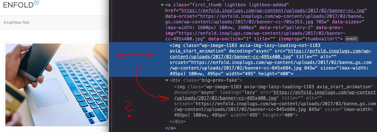
November 24, 2022 at 9:05 pm in reply to: Responsive Images For Lightbox (currently in beta only) #1373818Edit : i switched the option on your test installation to responsive image support on lightbox- but there it opens the bigger image ?
i do not see the reason why ?November 24, 2022 at 8:45 pm in reply to: Responsive Images For Lightbox (currently in beta only) #1373815Aha : and you haven’t checked the “Responsive Images For Lightbox (currently in beta only)” on your test-page.
– but if you do so – the small images are loaded –
– when i switch off that option – the bigger images open without that filter.So my point is – if i use that option “Responsive Images For Lightbox” – that the opend lightbox image is a small one allthough the src and srcset have other source options – and i guess the reason is the size calculation:
it may have to do with the size setting being passed to the mfp content. jQuery.magnific-popup.js 1301ff in:
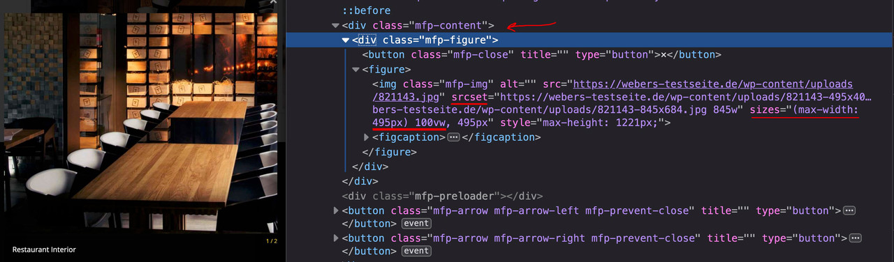
if( $( 'body' ).hasClass( 'responsive-images-lightbox-support' ) )
{ …
November 24, 2022 at 8:30 pm in reply to: Responsive Images For Lightbox (currently in beta only) #1373814i see the first time that this is normal DOM of gallery – with a kind of double-content. Why is that necessary? For what do i need that div.big-prev-fake
what is it as source – an image or something else?
if it is an image try:#top .mfp-image-holder .mfp-content { max-width: 90vw; }for image lightbox put this to your child-theme functions.php:
function change_lightbox_size() {
    return "full";
}
add_filter('avf_avia_builder_helper_lightbox_size','change_lightbox_size', 10);
for the rest you can test:
/**  Masonry Gallery ??? ********************************/
function avia_change_masonry_thumbnail_link($size){
  return "full";
}
add_filter('avf_avia_builder_masonry_lightbox_img_size', 'avia_change_masonry_thumbnail_link', 10, 1);
/*** End ***/

/** Image Gallery **/
function avia_change_gallery_thumbnail_link($link, $attachment, $atts, $meta){
    $link = wp_get_attachment_image_src($attachment->ID, "full");
    return $link;
}
add_filter('avf_avia_builder_gallery_image_link', 'avia_change_gallery_thumbnail_link', 10, 4);
/*** End ***/

/** Source for the Ajax Gallery **/
add_filter("avf_ajax_preview_image_size", function($size) {
   $size = "full";
   return $size;
}, 10, 1);
/*** End ***/
btw: do not use the option : Enfold (Child) – Performance : “Responsive Images For Lightbox (currently in beta only)”
i think there is a little bug – i will open a topic for it now.November 21, 2022 at 5:21 pm in reply to: Remove self from displaying in masonry/portfolio elements #1373401True, I didn’t think of the load more button – and it’s probably similar with pagination.
Edit : tested pagination – that will work – but looks strange ( as if i reload the page )
-
This reply was modified 3 years, 3 months ago by
November 21, 2022 at 2:00 pm in reply to: Browser cache keep bugging me – any suggestions/solutions? #1373369Yes – that’s probably the best course of action – wait until the layout is finished and all the content is set.
Only when it is time to do performance tests on the page should you go over to using these settings or activating plug-ins of this kind.With the browser cache, however, there is probably no good solution – apart from the one you have already mentioned.
There used to be keyboard shortcuts that could clear the browser cache. Unfortunately, there is probably no such thing any more. Depending on the browser, it can be done via various menu items. It’s probably easier to set the browser so that it clears the cache when you close it.But : there are a lot of Browser Addons that will do the job by one click or ( Key Setting )
i do not think that this will be a good solution at all. Because Hamburger is part of #header – or do you have a one-pager with no navigation?
Guess that Yigits posting is still working: Link
Or if you like to have a similar behavior – this instead:
@media only screen and (max-width: 768px) { #header.av_header_scrolldown { position: fixed !important; top: 0; width: 100%; transition: all 1s ease; } #header.av_header_scrolldown.av_header_transparency { -webkit-transform: translateY(-100%); transform: translateY(-100%); transition: all 1s ease; } }First: Columns have zero padding as the default value.
Color-sections do have a default padding value ( 0 50px ) that goes to the div with class : container ( just a left/right padding )
the next following container with class: content got top and bottom padding ( 50px 0 ) as a default value.
Color-sections do have a min-height option ( put that is a different standard value of 100px )Do I understand you correctly in the sense that you initially set paddings on the two elements – but would like to globally undo them using a css rule for it ?
November 21, 2022 at 11:08 am in reply to: Remove self from displaying in masonry/portfolio elements #1373338but wouldn’t this solve your problem:
( use it in your child-theme functions.php )function ava_exclude_current_post($query) { if (is_singular('post') || is_singular('portfolio') ) { $exclude = avia_get_the_ID(); $query->set( 'post__not_in', array($exclude) ); } } add_action('pre_get_posts', 'ava_exclude_current_post');I think it is generally pointless to include the current post in a listing that appears on the same page.
In my opinion, this could also readily become the default behaviour – without a checkbox.Thanks – i tested this way – and it concerns icon-fonts aswell.
With the wording “due to risk of breaking sites because of database entries”, I thought I’d better ask beforehand.November 16, 2022 at 3:44 pm in reply to: Headline rotator Typewriter – could I make it faster? #1372797do you mean the time span between the sentences? or the time when the individual letters appear.
the first got an alb options dialog : Advanced – Animation : “Autorotation duration” -
This reply was modified 3 years, 3 months ago by
-
AuthorPosts