Enfold reimagined – Version 4.0
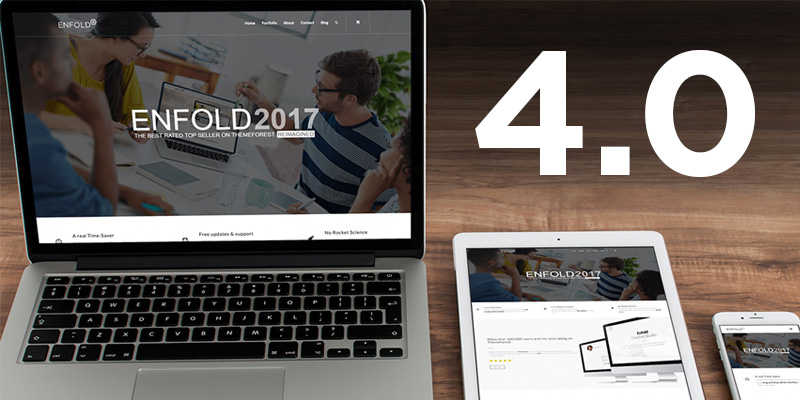
If Enfold were a new theme and we were to release it in 2017, that’s probably what it would look like
Everything in this release was geared toward the question: If we would release a new theme today, how would it look like and how would it behave? More detailed:
- Would we build the site with a frontend editor or still use a backend editor?
- How would it look like?
- Would we need another slew of elements for the builder or are we fine with what we got?
- What about the design of existing elements?
- Which demos would we need?
First of all, I think a lot of the decisions and assumptions on how a theme should work that we made back when we built Enfold are still valid. And I think a lot of our customers agree with us, since Enfold is still the best rated top seller on Themeforest with an astonishing rating of 4.85 out of 5. If you think about it, thats quite insane. Our rating gets worse if someone rates the theme with 4 stars; yet 4 stars is already considered an excellent rating :)
But there are always things to improve so here here are a few explanations, thoughts and conclusions for those questions above, and what we plan to do in the future:
#1) The Editor
These days one of the core experiences to improve is the way a website gets built. So the first question we asked ourselves was if a frontend editor should replace (or be added) to the backend advanced layout editor that we currently use.
There are a lot of merits for that argument, and the most noticeable one was that you can see how an element looks like while you are editing it. This is especially beneficial if you take new users into account, who have little or no idea how a certain element will look like if they change an option or setting.
On the other hand, we consider lay-outing a site with front-end editors a pain. We have not seen an approach by anyone yet which works as fine as the visual dumbed down version of a backend editor. Even with several prototypes built by ourselves, there was no way we could reproduce the super simple and clear process of building a layout in your backend.
So we decided to marry the best features of both worlds and heavily improved our backend editor with a lot more visual cues for layout elements like sections, grids and columns (which now display their backend color, their id, their background image and more…)
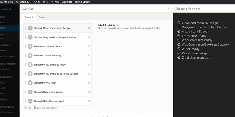
More importantly we also added a live preview window to most of the content elements, which allows us to show to users how their changes visually affect an element without the need to switch to the frontend.
I built the whole Enfold 2017 Demo with these features already implemented and really loved the experience, so I am very curious about your feedback :)
#2) Design and availability of layout builder elements
In general we don’t think that there are a lot of elements that would be totally necessary to add to the theme. We already got about 70 different ones (also counting the ones that are only activated when plugins like WooCommerce are active) and our demos show that you can build pretty much everything you can think off.
BUT: every now and then we encounter something nice on other websites or get feature requests that make total sense at the time and then decide to add that element. I still like that approach and I think we will keep doing that in the future. This was also the case with the latest element that got added, the tab section.
Customers have requested a tab element that can take full advantage of the layout builder for a while now, but since it required a lot of rewriting of the way the builder works in the backend, we postponed it time and time again. However with the latest release and with the extensive rewrites to the layout builder that we already did, the time for this element has finally come :)
In addition to that, now that we got a visual preview for content elements, its also a lot easier for us to add more design options without overwhelming newer customers. The first few elements that received more styles to chose from are the progress bar, the testimonial element and the icon box but others will soon follow.
We also tried to streamline a lot of the design elements on our pages among all elements (e.g.: the loader that is visible once you click a light-box image, a portfolio Ajax item, a masonry load more button etc. was modernized and streamlined across all elements and also improved for retina display)
This is the way we intend to go forward in the future as well. Be careful with adding new elements, be careful with adding new theme options that don’t offer visual feedback, but try to add more options for elements that work with the preview window; and on top of that make sure that all of this stuff fits together well and then pack it into new amazing demos. Speaking of demos…
#3) The Main Demo
Another question to be asked when you release a new theme: How should the main demo look like?
We still like the Classic Enfold Demo that was released 4 years ago, but there are certain elements and design choices that look a little dated by now. They are still beloved by a lot of users, thats why we did not simply change existing elements, but as mentioned above, added additional style now that we got the preview window.
But in order to take full advantage of all the stuff that we built during the last 4 years we decided that we need a new main demo. This always takes a lot of effort, since other than the usual niche demo which seldom has more than 5-10 pages, these full feature demos have several hundred individual pages. We are really happy with the outcome and hope you like it as well!
The old main demo will of course still stay online and be available for demo import in the future.
And whats next?
Next thing on our agenda is to improve all the elements that could benefit from an overhaul on mobile devices. We have snuck a few things into this release already but will try to heavily improve the mobile experience with the next one. Feel free to leave any suggestions in the comment section of this post.
Last but not least we got the usual change log with a list of bug fixes and improvements.
Here are the most important changes.


Great work guys! Keep on going.
Great work… and the focus on how elements perform on mobile is most welcome given user behavior … especially how galleries and buttons perform and text size and spacing
Great job… really great job…
… but what about social media?
I work with the Enfold Theme since years and it’s always been a pleasure. What I miss, and this is my suggestion for one of the future releases, is a more flexible adjustment of column width in the Avia Layout Architekt. Why not just 12 elements each of 1/12 width and leave the rest (one fourth, one fifth etc.)?
My problem is: if I combine elements in a row, for example two with 1/4 width and one with 1/3 width, I definitely miss the existence of an element with 1/6 width which would fill up the row. As I learned pictures in elements behave different if a row is not complete and the way they behave is sometimes almost not to calculate.
This is just an idea but for sure you know that other cms systems work with this and it is a great feature.
Nevertheless: THX for all the effort you made for having this wonderful theme ENFOLD!
I use Enfold since it was a young baby… now it’s adult and improving better and better ! good jobs guys!
Tested 4.0 speed and optimization. Pingdom: 90/100. Google: mobile 52/100, desktop 52/100. Pretty much the same issues with every website, not just Enfold: Eliminate render-blocking JavaScript and CSS in above-the-fold content ,Minify JavaScript, Minify CSS. If Kriesi and team could solve this, then there would be no competition :)
if on a linux/php environment running mod_pagespeed you can enable the filter to prioritize_critical_css. Google then manages the css and js, moving most of it below the fold. It really works – and tremendously speeds up page load. (Do this only when your site is production stable; don’t do this in development.)
Good job guys, I’m still using it for our main website.
Tommy
I honestly didn’t know I would get this excited reading about a theme update :)
Thanks guys!
The next in the agenda should be the user experience on the phone and it would be good to include:
1. The mobile menu should change to something modern like the following: http://pillar.mediumra.re/elements-navigation-navoffscreen.html
2. Implement the parallax effect on the mobile
3-. Improve items that are not displayed correctly on mobile today.
Examples:
The partner / logo
Finally and other things on the future agendas is to do official compatibility with the buddypress plugin.
Hopefully you’ll soon see that and do not take months to get updates.
Super, you’re still on the track! Impatient to test it out :)
Enfold 4.1 should also have options in the theme an option to add a different logo for the mobile and another for retina screens and a the a field to add javascript code.
Finally in my review some elements to consider for new styles are the blog and portfolio look very old in design and also the element: https://kriesi.at/themes/enfold/shortcodes/team/ and http: / /kriesi.at/themes/enfold/shortcodes/animated-number/
I hope that what is written helps the Enfold of the future and we hope to see it in 4.1 and not too late the update.
Keep up good work.
Thanks :)
Dear Kreisi,
Please, consider more mobile friendly UI in the next upgrade as well as more Woocommerce element and design pages, such as checkout, cart etc. I think with these are 2 important components. It will be a major improvement to what is already pretty awsome
Thanks
In my opinion, this is the best theme and the most useful backend editor. But It would be great to be able to completely disable an item/section/column on either desktop or mobile.
So the options would be:
Display on all devices
Hide on desktop
Hide on mobile devices
**Similar of new Layer Slider: https://support.kreaturamedia.com/docs/layersliderwp/assets/img/illustration-dynamic-layer@2x.png
I echo the comments around page speed and mobile. Both are life or death when it comes to Google rankings. I do think the ability to see changes on the front end is useful. I’ve seen plugins that will even let you re-work / add css to a page to change styling, which could be cool if implemented somehow in the theme to change things like button size and padding easily for those who don’t know css. I still love Enfold and can’t wait to see what’s next… don’t make us wait too long!
Thank you for your excellent work.
(!) For the New Tab Section very much needed Tab Element ID
…#tab-id-1 …#tab-id-2 …#tab-id-3
(!) For New Tab Section tabs need to make the alignment of the “left” or “right” or in the “middle”.
(!) For New Tab Section tabs need to make so that this height was like the contents of each tab (now every tab has a height the same as the tab in which the most content – get a lot of empty space in the tabs where there is less content).
Yes! Me and my 20+ clients love Enfold. I suggest a tag system in the layout builder for none WYSIWYG objects like Tables.
Suggestion for the future development: some kind of gamification feature like a simple wheel of fortune, scratch card, lottery, puzzle etc. Gamification is a fantastic way to engage and attract visitors, and fun! :-) And there are extremely few really good plugins for that.
This would be absolutely fascinating to have added as a feature. Many of the visitors to our website are under 30 years old and ANYTHING that can be added to engage their short attention spans would be appreciated!
Absolutely great work guys. The new demo theme shows your strong commitment to design.
Our two feedbacks, be able to quickly optimize the scripts and files for google speed.
And the other would be to have much more attention to the mobile ux.
Keep being awesome!
Oh man i’m looking forward to playing with these new features and seeing how they change my UI/UX when testing it.
One thing I hope gets implemented is a Modal feature, yes I know i can add it using a plugin, but i think it should be built within enfold, so much usual info can be displayed via the modal as well as contact forms.
None the less, keep up the fantastic work, i love enfold!!
This is all great work and I’m really happy that I use Enfold for 4 of the sites I mange, soon to be for 3 more!
That said, the ability to have a pop-out ‘Call to Action’ or ‘Join Email List’ sort of feature would be great. Getting potential buyers to the site’s great, but getting their information to convert them into steady brand engagers and buyers is even better!
That said, well done and thank you for always providing a quality product and exceptional support.
Great idea of the popup window hopefully soon include it.
First I have to say great work on the new theme release. Some of the new additions and improvements to existing items are very nice. I have worked on the Enfold theme for many years now. When I found it I felt that I found a diamond in the rough. So many theme developers overthink the experience and end up building a clunky feeling page builder / theme options panel that might be feature rich but just doesn’t feel like it fits within the WordPress platform. You guys have done an amazing job of keeping your builder / theme options simple and clean. Please don’t evolve the Avia Builder to look like your competition. When I have used Enfold to build client sites, they literally don’t know that those features and the Avia Builder are not native to WordPress. Love the white glove approach!!! Truly love it!
That being said I do agree with several of the comments above. My biggest pain point though is the treatment of your mobile menus. There are so many themes out there that lack in the features of Enfold but have amazingly elegant mobile menus. Here’s hoping that a menu revamp is in the future of Enfold. When that time comes I would encourage you to spend time just looking at the menus other theme developers have created and even plugins like ShiftNav, TapTap and Superfly (plugins I have used in concert with Enfold to provide a better navigation experience). Please consider this, if only to see the competitive landscape and create something that is even better than what they are providing. I am confident the team at Kriesi is up to the challenge.
Again… Great work with the new release! Keep it up. I can’t tell you how many people I have recommended this theme to. It is one of the best!
Very true there are so many themes that have smart mobile menus like this: http://demo.themebeans.com/ava/ it is urgent to have something similar to improve that aspect so important or enfold will be getting older in mobile design.
I agree with the other comments. Its time to ramp up mobile and speed. Why not focus on that first, you are far behind on this.
Great Post , very informative post with best and easy description, thank you sir.
When will you release version 4.0.3.1 that fixes the issues, that update 4.0.3 has unleashed on consumers masonry galleries?
An user has even pointed out how to fix some of the elements: https://kriesi.at/support/topic/urgent-latest-update-creates-masonry-issues/
Hello,
We want official compatibility with buddypress and a new modern mobile menu and improve mobile usability.
Loved this article! I still like the Classic Enfold Demo that was released 4 years ago as well but I totally agree – many elements are outdated and could be designed from a new perspective.
Thanks for your review! Greets, Gerald