Enfold 4.1: Mobile improvements, Photography Demos, new Gallery and more
This update is the first in a series of updates to enhance Enfolds performance even more, both on mobile and desktop devices
Lets start with the new demos and the new layout builder element. We noticed a lot of photographers are using enfold for their projects and wanted to provide a few more demos for them to present their work. Therefore we created a new minimal photography demo, a dark photography demo and a horizontal gallery element.
What else is new?
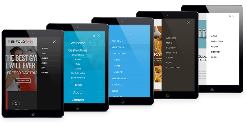
After releasing Enfold Version 4 we took a closer look at the requests we got and one that keept poping up was an enhanced mobile experience. We figured thats a good idea since mobile devices are an every growing way to browse the web, and Enfold lacked in a few ways.
So what we added in this first release, which targets mobile devices are a much improved mobile menu that allows to change a lot of styles to make your mobile menu as unique as your site. It is also possible to use the site search on mobile, something that was also not possible.
Another part of the theme which was heavily improved was the mobile options you got for your advanced layout builder. Pretty much all of the elements got a new option tab called “Screen Options” and depending on the element you will find several new settings there. Text based elements, for example, received the option to set the font size based on screen size. Column based elements received the same option for columns. Pretty much all elements can now be shown or hidden depending on the screen size. This allows for some interesting ways to build your website:
Previously you had to set up an element for desktop size and then check if the theme properly scales it down on mobile devices. And although this usually works fine, there are elements or situations were this can get tricky.
Now what you can do is simply set up 2 versions of an element and display/hide them at a breakpoint of your choice. Although it is not recommended to overdo this for the sake of search engines, it is now much easier to present tables of data or various sized images for various devices, for example.
We also added 2 new tabs in your Enfold theme settings (“Main Menu” & “Layout Builder”) and added new options for those tabs, as well as placing existing once in there if they are a better fit than their previous parents ;)
There are of course a lot of smaller improvements and bugfixes which you can check out in the change log below.
What’s next?
We will keep improving the mobile experience with the next release and also want to improve the performance of Enfold in general. So if you got any suggestions in that direction feel free to use the comments.
Having Update Problems?
Since a lot of files have changed in this release there might be smaller issues (especially with menu customizations) some of you might encounter. If you encounter any issues please follow the steps in this thread and if that does not help: feel free to open a new thread in our support forum. We will do our best to take care of you :)
Change log
- added: new photography theme demos: minimal photography and dark photography
- added: new template builder element: horizontal gallery
- added: new modern mobile menu with more options (old mobile menu item was removed)
- added: new theme options tab for the main menu
- added: several new options to edit and style the main menu on mobile devices
- added: most elements received a “screen options” tab.
- added: visibility settings based on the screen options for all template builder elements
- added: font size settings to the screen options tab for text based elements (eg headings)
- added: column count settings based on the screen options for complex column based elements (eg masonry)
- added: advanced styling options for the mobile menu to create unique fly-out and overlay menus
- added: new theme options tab for the layout builder
- added: option to disable the live preview in backend
- added: option to enable custom css classes for template builder elements
- added: option to disable the post navigation between single posts
- added: google maps options to display Satellite, Hybrid or Terrain maps
- added: team element option to change image size
- added: Woocommerce can now add structured data to template builder elements
- added: tab sections can be pre-opened by url now
- added: google maps key check is now done when entering the key for easier checking if the key is valid
- added: new orientation for masonry image elements when set to “perfect grid” – you can now display images as squares, as well as landscape or portrait images of various sizes
- fixed: an issue with broken columns in tab section in backend
- fixed: breadcrumb function with custom shops
- fixed: an issue with tab sections on firefox when more than one word was used for the tab title
- fixed: several frontend issues with equal height tabs and columns within tabs
- fixed: RTL related issues
- fixed: an issue with shortcodes when they where copied from one page to another without using the default content field
- fixed: several minor query issues with the latest version of Woocommerce
- fixed: an issue with special chars in heading elements
- fixed: woocommerce cart dropdown on the checkout page was not updated properly
- fixed: several minor spelling errors in the template builder
- fixed: portfolio custom links now work better with various slideshows
- fixed: a woocommerce issue with out of stock items
- fixed: an issue with google maps click events and firefox
- fixed: an issue with initial active item on tab sections
- fixed: a problem with product layout settings
- fixed: an issue with linked images inside the layerslider slideshow
- fixed: a bug with portfolio ajax slideshows not autorotating or stoping after one cycle
- fixed: a minor character encoding problem in the template builder
- fixed: a display issue with comment forms when displayed after certain elements
- fixed: a few minor issues with php 7.1
- fixed: a menu display bug in ios 10+ when the items are animated
- fixed: a z-index issue with section overlays
- fixed: a problem with disabled backend options not beeing rendered properly after enabling them
- fixed: a flickering issue caused by css with the main menu on webkit engines (chrome, safari, opera)
- fixed: a validation issue with the mailchimp API key
- fixed: an issue with the live preview not updating properly after an option change
- fixed: a blog gallery bug when no sidebar blog was used in conjunction with the sidebar main menu
- fixed: menu overlay sub level menu items font size and line height are now set properly
- fixed: an issue with custom menu color settings and transparent menus
- improved: search functionality can now be used on mobile phones
- improved: cleanup of several CSS classes
- improved: removal of several JS functions that were no longer needed and improvement of existing functions like menu and smoothscroll
- updated: layerslider to the latest version
- updated: several language translation files


Very nice update. Have already set up a demo yesterday to test out the new elements. Kudo’s for the mobile options.
For people that could use more animation-eyecandy: check out animista. The CSS animations work flawless with Enfold if you set up this:https://kriesi.at/documentation/enfold/turn-on-custom-css-field-for-all-alb-elements/
Now Kriesi… If you could add this in the builder itself … :) hehehehe.
Thanks for the great work!
Can you please give brief instructions on how to use animista? I turned on custom CSS class, chose an animation and pasted the generated class and keyframes into the child theme CSS. I added the class into the class field. I see no animation.
It is a good update
Of course there are still some problems. i use version 4.1.1
Thanks for this nice template
Someday we will have a menu like this: http://divinityhtml.oxygenna.com/songs/assets/images/headers/divinity-menu-normal-center.jpg
A mí también me gustaría tener un menú es una pena tener que usar un plugin para eso.
Yes! So many other themes have this option but none of them could live up to Enfold
I have been a happy user of this theme for many years and have slowly moved nearly all my sites to Enfold. The 4.1 update is fantastic!
My only request would be an option with multi-author blogs to have a more extensive author element at the bottom of each article with short bio and icon links to social profiles or other websites for each author. There are plugins that can do this, but I have a feeling that your team could make something that matches and flexes with each blog style. Thanks for all the effort!
A fantastic update for a fantastic theme. The best on Themeforest, hands down!
Finally menu with the “search” icon on mobile devices ….. Great update!!!
Thank you so much for new version of Enfold Theme with added new design.
Looking for a better mobile experience using the Portfolio Grid. Some clients use this for storytelling, so having to scroll to the top for paging is unfriendly. Repeating the titles (as links) is also a lot of scrolling for mobile users. Prefer bottom of page NEXT buttons or some other method to get to the next portfolio item.
Thank you.
My only request is an alternative with blogs to possess a author element that is broader with bio and celebrity links to profiles that are societal or sites for each writer in the base of every post. There are but I’ve a feeling your staff could make something which matches and matches with each design. Thank you for of the effort!
More options for designing the header and footer. This update is a step in the right direction though, good job!
I love this theme. It’s just long enough to open with a mobile device.
Do you have a solution?
Thank you
Vielen Dank für die tollen Änderungen. Was ich mir noch wünschen würde, wäre bei der Vorschau die Möglichkeit zwischen den Ansichten zu wählen (Smartphone/Tablet und Desktop).
Liebe Grüße Sonja
wow…
thanks for this: “fixed: an issue with tab sections on firefox when more than one word was used for the tab title”
Wow, I love this theme. It’s just long enough to open with a mobile device.
Do you have a solution?
Hello,
The mobile menu has yet to be corrected but it is a breakthrough for Enfold.
There are missing options for adjusting the font size in item testimonial.
And add font type from all the elements that use text in the visual constructor.
Also missing an option to add a logo retina and a logo for the mobile as any modern payment template.
Great job! Lots of exciting improvements and fixes. Love the theme and the support provided.
Now I know that I was reading a blog with a post that is very commete. Thank you for sharing the information you post. I just subscribe to your blog. This is a great blog.