Hi,
Great, I’m glad that you got it working. Please let us know if you should need any further help on the topic, or if we can close it.
Best regards,
Rikard
Dear Support Team,
On the website https://gerlindemichel.osmosis.de/ the burger menu is active for the tablet and the mobile version: but when you open the burger menu on the mobile devices, the navigation is not visible. This is probably due to the fact that the header for this page is transparent for the desktop version and the navigation color is displayed in white.
What can I do to ensure that the navigation in the burger flyout menu is displayed in black on mobile devices?
See screenshots:
Tablet: https://osmosis.de/support/gm/home/nav-mobile.jpeg
Cell phone: https://osmosis.de/support/gm/home/nav-tablet.jpeg
Best regards, Diana
I tried disabling all the plugins before posting the topic. That did not resolve it. I do not have a caching plugin and I am not using the caching settings built into the theme. So I don’t think that is the issue. Just in case I tried it in an incognito tab and cleared caches. It still did not work.
Dear team,
we still have the problem that on smaller screens (-> 15” laptop) the menu buttons overlap the logo.
The screens that have this problem are a bit bigger than the installed tabled size.
Could you please give me a css code that says, on screens which are bigger than the tabled size it should move to the mobile / tablet burger menu?
Unfortunately I can’t tell you the exact dimensions for the screens but maybe you can find it out?
Thanks for your help!
if i test my page on : https://securityheaders.com/?q=https%3A%2F%2Fwebers-webdesign.de&followRedirects=on
you can read the description of:
x-content-type-options: X-Content-Type-Options stops a browser from trying to MIME-sniff the content type and forces it to stick with the declared content-type. The only valid value for this header is “X-Content-Type-Options: nosniff”.
So your advice is to change the mime types for those generated post css to : text/css
but as far i can see on : class-post-css-management.php – line 919:
return '<style type="text/css">' . $this->new_ln . $rules . '</style>' . $this->new_ln;
isn’t this responsible for those css settings?
__________
i set the filter ( avf_post_css_create_file ) now on one of my testinstallations to true ( only then files are generated inside dynamic-avia folder) – and switched of merging.
On dev tools i checked if i find some text/html in DOM – but nothing to find.
Hi,
To hide the side post navigation try this CSS in your Enfold Theme Options ▸ General Styling ▸ Quick CSS field:
#top .avia-post-nav  {
	display: none;
}
aAfter applying the css, please clear your browser cache and check.
Best regards,
Mike
and your layerslider got the id 8? and nomenklatura is there a bit different #layer_slider_X
on default the first on a page will have : #layer_slider_1
the next #layer_slider_2
so you can have:
@media only screen and (min-width: 768px) {
  #layer_slider_1{
    display: none!important;
  }
}

@media only screen and (max-width: 767px) {
  #layer_slider_2{
    display: none!important;
  }
}
check your page with developer tools which ID those sliders have.
_______
or you can have both videos in one layerslider and choose there the visibility.
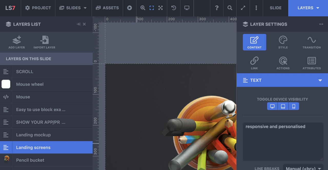
you have on each layer on the right side the tabs of layersettings – and on content tab you can set the layervisibility for desktop, tablett, mobile “toggle device visibility”
oh sorry – then I misunderstood your request. To me it sounds like you want to see the icons inside the mobile menu as well (hamburger menu). – The above way is a quick and easy way to have this for small social icon lists. I didn’t see that these are hidden below. of 479px.
__________
or try to preserve the social-bookmarks on the same place – because even on 280px screenwidth ( most mobile phones got 320px and more ) the logo does not overlap that area:
@media only screen and (max-width: 989px) {
  .responsive.av-burger-overlay-active #top #header .main_menu .social_bookmarks a {
    color: #FFF;
  }
/** if you had changed the phone-info input field - see at bottom of my message **/
  .phone-info .header-meta-mail {
    display: none;
  }
}

@media only screen and (max-width: 479px) {
  .responsive #top #wrap_all .main_menu .social_bookmarks {
    display: block !important;
  }
  .responsive #top #wrap_all .main_menu .avia-menu .av-burger-menu-main {
    border-color: #1b5289;
    padding-right: 15px;
    margin-right: 5px;
    border-right-width: 1px;
    border-right-style: solid;
    transition: border-color 0.2s ease-in-out;
  }
}

but i guess you have to change then a bit your phone-info input field. The standard behavior of enfold between 768px and 989px here in your setting is to show the burger icon and the social-bookmarks besides each other and to hide header_meta social bookmarks, so the “of mail” is obsolete on top then.
maybe you can do this:
<div><a href="tel: +31595729729">Bel 0595 729 729</a><a class="header-meta-mail" href="https://noorderwindbewindvoering.nl/contact/#contactformulier"> of mail</a></div>
– and with that class we can hide it on demand
or in my opinion better – just to add the binding word to e-mail bookmark without link:
<div><a href="tel: +31595729729">Bel 0595 729 729</a><span class="header-meta-mail"> of mail</span></div>
I set all the content in a page to default font and it looks uniform on desktop but when i look at the page on my android phone the fonts are two different sizes. Really stumped on why this is. Two what appears to be identical icon lists have different size fonts on mobile.
Starting with the “managed IT” and icon list all the fonts on the page are noticeably bigger then the first group of icon lists.
i could not test it now if it works – but the code from : https://kriesi.at/support/topic/accordion-slider-stop-allowing-all-images-to-show-in-slider/#post-1435166 does not lead to a functions.php error on my end here – means – the syntax is o.k.
yes – where is the leading:
function ava_custom_script_group_lightbox()
on : link
Hi,
Great, I’m glad that we could help. Please let us know if you should need any further help on the topic, or if we can close it.
Best regards,
Rikard
Hello Ismael,
Please see the previous topic:
Because that has been closed, I made a new topic;
The problem is still not resolved;
Every day the files seems to get corrupted or something…
I need to upload a fresh copy of the Enfold main theme to the themes folder to get it working again.
That it works for max 1 day and I need to upload the main theme again and again.
How can this be and how can I resolve this?
I have no caching or something active, so that can’t be the problem.
Also; because it’s a live site I had to upload a fresh theme, so as of now the layersliders works as expected.
But like I said; I know for a fact that tomorrow the same problem will occure.
Greetings Jeen
I have 2 layersliders, each with a video of different sizes, for desktop and mobile. I can hide the desktop one on mobile, but not the reverse. How do you go about hiding a layerslider on desktop?
Hi,
Thanks for that. Please try the following in Quick CSS under Enfold->General Styling:
#top .av_header_with_border.av_header_transparency #header_main {
  border: none;
}
Best regards,
Rikard
Okay, apparently that doesn’t work. The menu is too big on the phone anyway and I would solve it by making it a collapsed menu. Is there a way to pin it to the top of your phone? Now it scrolls away and it should stay at the smartphone display / burger menu.
Hi,
Thank you for the inquiry.
Social bookmark icons are hidden on mobile devices by default. If you want to display it back, please add this css code.
@media only screen and (max-width: 479px) {

  .responsive #top #wrap_all #header_meta .social_bookmarks {
    display: block;
    float: left;
    width: 30%;
    padding: 0;
    margin: 0;
  }

  .responsive #top #header_meta .social_bookmarks li {
    border: 0;
  }

  .responsive #top #wrap_all #header_meta .phone-info {
    width: 70%;
    float: left;
    clear: none;
  }
}
Best regards,
Ismael
Top ..thats what i didn’t know what the page id it is… i added ” || is_search() ” and it works fine.
Just one thing .. where does the sidebar comes from? There is no widget with this content … can this be deactivated?
Sure i can do it by css but can i do it also in template?

-
This reply was modified 2 years, 1 month ago by
 xeovision.
put this to your quick css:
@media only screen and (max-width: 989px) {
  .responsive.av-burger-overlay-active #top #header .main_menu .social_bookmarks a {
    color: #FFF;
  }
}
I would like the ‘envelop’ icon on top, to appear on mobile the same way as on desktop. So in one row on top of all content.
The solutions I found so far in your documentation and at the forum are css-es that create all the icon(s0) to appear then on top of all content ánd next to the hamburger menu. I do not want next to the hamburger and I want the icon not on top, but in the same row as my telephone number.
See website https://noorderwindbewindvoering.nl on desktop and on mobile the ‘envelop’ is missing now
Hi,
Great, I’m glad that Ismael could help you out. Please let us know if you should need any further help on the topic, or if we can close it.
Best regards,
Rikard
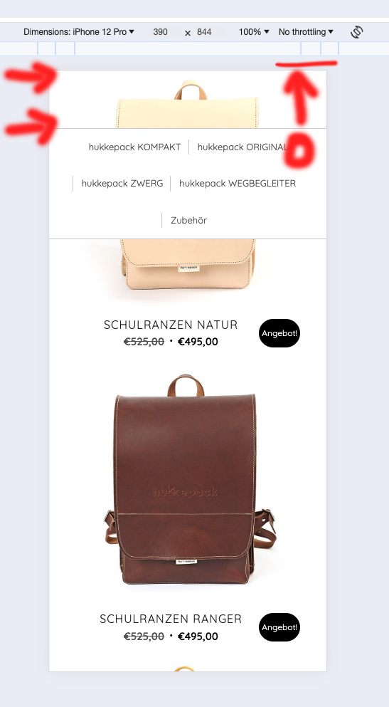
Hello Rikard,
The area above the navigation when you scroll down should disappear. My screen for this: http://designplanung.de/screen.jpg
So the upper area of the bag should not be shown, the menu/nav should end at the top and not a few pixels further down.
Great! Thank’s a lot :) Problemis solved an topic can be closed
Hey northorie,
Thank you for the inquiry.
Have you tried increasing the top padding of the second cell containing the Blog Posts element? You can also add this css code.
.flex_cell.av-lsvwj3of-18478217b22834a47eecc5a153470720 {
    padding-top: 100px;
}
Best regards,
Ismael
Hey holstchristoph,
Thank you for the inquiry.
You can add this css code to hide the sorting buttons.
.product-sorting {
    display: none;
}
And to remove the category thumbnails, add this code.
.tax-product_cat .page-thumb {
    display: none;
}
Best regards,
Ismael
Hey sunhouse_ops,
Thank you for the inquiry.
Background videos on Slider or Color Section elements are disabled on mobile devices by default. You will need to apply a fallback image. If you really need the video to display on mobile view, you can replace the slider with a Video element or the Layer Slider element. Make sure that the video is muted to enable autoplay.
Best regards,
Ismael
Hey northorie,
Thank you for the inquiry.
The padding is applied by this css rule.
.responsive #top #wrap_all .av-flex-cells .no_margin {
    display: block;
    margin: 0;
    height: auto !important;
    overflow: hidden;
    padding-left: 8% !important;
    padding-right: 8% !important;
}
You can override it with this css code.
@media only screen and (max-width: 767px) {
    .responsive #top #wrap_all .av-flex-cells .no_margin {
        padding-left: 0% !important;
        padding-right: 0% !important;
    }
}
Best regards,
Ismael


