Viewing 5 posts - 1 through 5 (of 5 total)
  • Author
    Posts
  • #1435031

    Hello,

    I would like to have a submenu on the site https://hukkepack.de/hukkepack-shop/, which works so well. But when I look at the page on the smartphone, the menu has a space at the top. Can it be taken away? But in such a way that the menu can still be seen. The function is good, I just want to get rid of this distance.

    Best regards,
    Martin

    #1435055

    Hey Martin,

    I’m not sure if I fully understand the problem you are having. Could you post a screenshot highlighting the problem and how to reproduce it please?

    Best regards,
    Rikard

    #1435110

    Hello Rikard,

    The area above the navigation when you scroll down should disappear. My screen for this: http://designplanung.de/screen.jpg
    So the upper area of the bag should not be shown, the menu/nav should end at the top and not a few pixels further down.

    #1435172

    Okay, apparently that doesn’t work. The menu is too big on the phone anyway and I would solve it by making it a collapsed menu. Is there a way to pin it to the top of your phone? Now it scrolls away and it should stay at the smartphone display / burger menu.

    #1435284

    Hi,
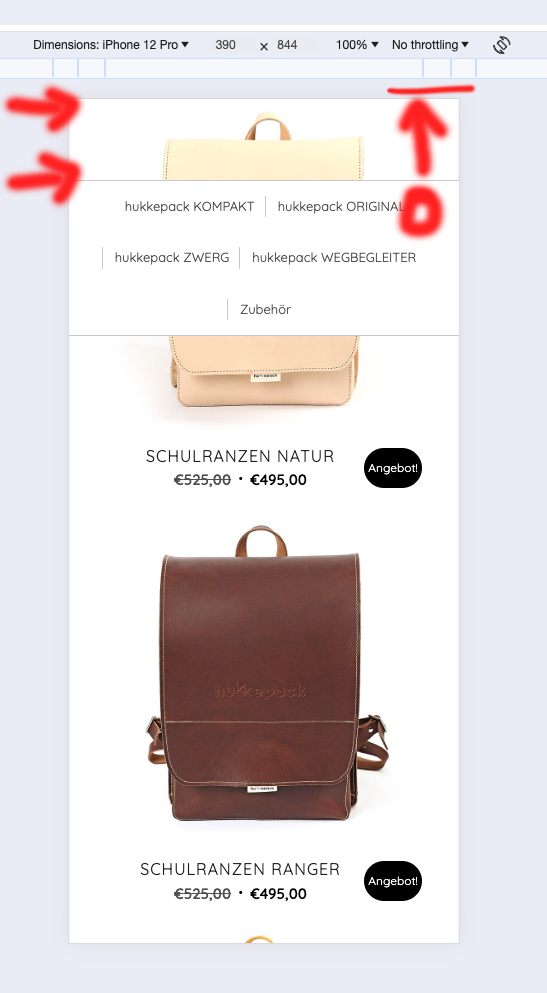
    Thanks for your screenshot and the link to your shop page, I didn’t find the sub-menu as in your screenshot, so I assume that you have it disabled right now.
    By default the sub-menu is not sticky on mobile devices so I assume that you are using some custom css to achieve this, I also recognize the extra space as the space of the admin bar when you are logged in. Try enabling the sub-menu and log out and check again.

    Best regards,
    Mike

Viewing 5 posts - 1 through 5 (of 5 total)
  • You must be logged in to reply to this topic.