
Tagged: social icons on mobile screen
-
AuthorPosts
-
February 22, 2024 at 2:31 pm #1435130
I would like the ‘envelop’ icon on top, to appear on mobile the same way as on desktop. So in one row on top of all content.
The solutions I found so far in your documentation and at the forum are css-es that create all the icon(s0) to appear then on top of all content ánd next to the hamburger menu. I do not want next to the hamburger and I want the icon not on top, but in the same row as my telephone number.
See website https://noorderwindbewindvoering.nl on desktop and on mobile the ‘envelop’ is missing now
February 22, 2024 at 7:31 pm #1435147put this to your quick css:
@media only screen and (max-width: 989px) {
  .responsive.av-burger-overlay-active #top #header .main_menu .social_bookmarks a {
    color: #FFF;
  }
}
February 23, 2024 at 7:29 am #1435163Hi,
Thank you for the inquiry.
Social bookmark icons are hidden on mobile devices by default. If you want to display it back, please add this css code.
@media only screen and (max-width: 479px) {

  .responsive #top #wrap_all #header_meta .social_bookmarks {
    display: block;
    float: left;
    width: 30%;
    padding: 0;
    margin: 0;
  }

  .responsive #top #header_meta .social_bookmarks li {
    border: 0;
  }

  .responsive #top #wrap_all #header_meta .phone-info {
    width: 70%;
    float: left;
    clear: none;
  }
}
Best regards,
IsmaelFebruary 23, 2024 at 4:59 pm #1435231oh sorry – then I misunderstood your request. To me it sounds like you want to see the icons inside the mobile menu as well (hamburger menu). – The above way is a quick and easy way to have this for small social icon lists. I didn’t see that these are hidden below. of 479px.
__________
or try to preserve the social-bookmarks on the same place – because even on 280px screenwidth ( most mobile phones got 320px and more ) the logo does not overlap that area:
@media only screen and (max-width: 989px) {
  .responsive.av-burger-overlay-active #top #header .main_menu .social_bookmarks a {
    color: #FFF;
  }
/** if you had changed the phone-info input field - see at bottom of my message **/
  .phone-info .header-meta-mail {
    display: none;
  }
}

@media only screen and (max-width: 479px) {
  .responsive #top #wrap_all .main_menu .social_bookmarks {
    display: block !important;
  }
  .responsive #top #wrap_all .main_menu .avia-menu .av-burger-menu-main {
    border-color: #1b5289;
    padding-right: 15px;
    margin-right: 5px;
    border-right-width: 1px;
    border-right-style: solid;
    transition: border-color 0.2s ease-in-out;
  }
}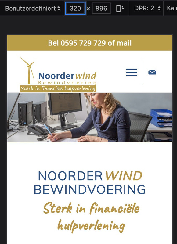
but i guess you have to change then a bit your phone-info input field. The standard behavior of enfold between 768px and 989px here in your setting is to show the burger icon and the social-bookmarks besides each other and to hide header_meta social bookmarks, so the “of mail” is obsolete on top then.
maybe you can do this:
<div><a href="tel: +31595729729">Bel 0595 729 729</a><a class="header-meta-mail" href="https://noorderwindbewindvoering.nl/contact/#contactformulier"> of mail</a></div>
– and with that class we can hide it on demandor in my opinion better – just to add the binding word to e-mail bookmark without link:
<div><a href="tel: +31595729729">Bel 0595 729 729</a><span class="header-meta-mail"> of mail</span></div>February 27, 2024 at 11:39 am #1435578@guenni007 and @ismael
Thanks for all the input, for now I choose for the version with the envelop icon next to the hamburger menu.
February 27, 2024 at 5:08 pm #1435608Hi,
Thanks for the update. Please let us know if you should need any further help on the topic, or if we can close it.
Best regards,
RikardFebruary 27, 2024 at 5:39 pm #1435620@rikard You can close the topic, thanks
February 27, 2024 at 7:08 pm #1435637Hi,
Thanks for letting us know. Please open a new thread if you should have any further questions or problems.
Best regards,
Rikard -
AuthorPosts
- The topic ‘social icon in header on mobile’ is closed to new replies.