-
AuthorSearch Results
-
May 27, 2024 at 8:54 am #1446686
In reply to: Blogs slider
Hi Mike,
Thanks for these. I was renaming the enfold directory name to be it not active. With removing the footer and header not much is changing regard the issue at hand.
So yes I guess I have to review the custom avia-shortcodes, which I stated when I started the topic. I am not sure which shortcode it is, or how to debug it.I guess I have to go old school and write a lot of debugging information in it to see what the culprit function or shortcode is.
May 27, 2024 at 5:32 am #1446669In reply to: slideDown speed on toggles
Hey Guenter,
Thank you for the inquiry.
You can try to override the entire avia_sc_toggle with your own modifications. In the modified code below, we adjusted the duration from 200 to 10000.
function ava_custom_script_toggles()
{
    ?>
    <script>
        (function ($)
        {
            $(document).ready(function ()
            {
                if ($.fn.avia_sc_toggle)
                {
                    $.fn.avia_sc_toggle = function (options)
                    {
                        var defaults =
                        {
                            single: '.single_toggle',
                            heading: '.toggler',
                            content: '.toggle_wrap',
                            sortContainer: '.taglist'
                        };

                        var win = $(window),
                            options = $.extend(defaults, options);

                        return this.each(function ()
                        {
                            var container = $(this).addClass('enable_toggles'),
                                toggles = $(options.single, container),
                                heading = $(options.heading, container),
                                allContent = $(options.content, container),
                                sortLinks = $(options.sortContainer + " a", container),
                                preview = $('#av-admin-preview');

                            //	needed to avoid scroll to top when opening and closing toggles - can be removed when other solution found (readded @since 4.8.4.1)
                            var activeStyle = '',
                                headingStyle = '';

                            heading.each(function (i)
                            {
                                var thisheading = $(this),
                                    content = thisheading.next(options.content, container);

                                function scroll_to_viewport()
                                {
                                    //check if toggle title is in viewport. if not scroll up
                                    var el_offset = content.offset().top,
                                        scoll_target = el_offset - 50 - parseInt($('html').css('margin-top'), 10);

                                    if (win.scrollTop() > el_offset)
                                    {
                                        $('html:not(:animated),body:not(:animated)').animate({ scrollTop: scoll_target }, 200);
                                    }
                                }

                                if (content.css('visibility') != "hidden")
                                {
                                    thisheading.addClass('activeTitle').attr('style', activeStyle);
                                }

                                thisheading.on('keydown', function (objEvent)
                                {
                                    if (objEvent.keyCode === 13)  // if user presses 'enter'
                                    {
                                        thisheading.trigger('click');
                                    }
                                });

                                thisheading.on('click', function ()
                                {
                                    if (content.css('visibility') != "hidden")
                                    {
                                        content.slideUp(10000, function ()
                                        {
                                            content.removeClass('active_tc').attr({ style: '' });
                                            win.trigger('av-height-change');
                                            win.trigger('av-content-el-height-changed', this);

                                            if (preview.length == 0)
                                            {
                                                location.replace(thisheading.data('fake-id') + "-closed");
                                            }
                                        });

                                        thisheading.removeClass('activeTitle').attr('style', headingStyle);

                                    }
                                    else
                                    {
                                        if (container.is('.toggle_close_all'))
                                        {
                                            allContent.not(content).slideUp(200, function ()
                                            {
                                                $(this).removeClass('active_tc').attr({ style: '' });
                                                scroll_to_viewport();
                                            });

                                            heading.removeClass('activeTitle').attr('style', headingStyle);
                                        }

                                        content.addClass('active_tc');

                                        setTimeout(function ()
                                        {
                                            content.slideDown(200, function ()
                                            {
                                                if (!container.is('.toggle_close_all'))
                                                {
                                                    scroll_to_viewport();
                                                }

                                                win.trigger('av-height-change');
                                                win.trigger('av-content-el-height-changed', this);
                                            });

                                        }, 1);

                                        thisheading.addClass('activeTitle').attr('style', activeStyle);

                                        if (preview.length == 0)
                                        {
                                            location.replace(thisheading.data('fake-id'));
                                        }
                                    }
                                });
                            });

                            sortLinks.on('click', function (e)
                            {
                                e.preventDefault();

                                var show = toggles.filter('[data-tags~="' + $(this).data('tag') + '"]'),
                                    hide = toggles.not('[data-tags~="' + $(this).data('tag') + '"]');

                                sortLinks.removeClass('activeFilter');
                                $(this).addClass('activeFilter');
                                heading.filter('.activeTitle').trigger('click');
                                show.slideDown();
                                hide.slideUp();
                            });

                            function trigger_default_open(hash)
                            {
                                if (!hash && window.location.hash)
                                {
                                    hash = window.location.hash;
                                }

                                if (!hash)
                                {
                                    return;
                                }

                                var open = heading.filter('[data-fake-id="' + hash + '"]');

                                if (open.length)
                                {
                                    if (!open.is('.activeTitle'))
                                    {
                                        open.trigger('click');
                                    }

                                    window.scrollTo(0, container.offset().top - 70);
                                }
                            }

                            trigger_default_open(false);

                            $('a').on('click', function ()
                            {
                                var hash = $(this).attr('href');
                                if (typeof hash != "undefined" && hash)
                                {
                                    hash = hash.replace(/^.*?#/, '');
                                    trigger_default_open('#' + hash);
                                }
                            });

                        });
                    };
                }
            });
        })(jQuery);
    </script>
    <?php
}
add_action('wp_footer', 'ava_custom_script_toggles');
Best regards,
IsmaelMay 27, 2024 at 4:53 am #1446661In reply to: Video on mobile
Hi,
Why does this only work with autoplay enabled? Is there a way to change that?
The theme only adds the playsinline attribute when autoplay is enabled. This attribute (playsinline) allows the video to play directly on the page without going into fullscreen. If you want to alter this behavior, keep the autoplay option enabled, then add this code in the functions.php file:
add_filter('avf_html5_autoplay_mobile', function($play, $video, $attributes) {
    return "playsinline";
}, 10, 3);
Please note that this will be applied to every video, so you may need to add a few conditions, such as checking for the video URL.
Best regards,
IsmaelMay 27, 2024 at 2:17 am #1446647In reply to: Video on mobile
Hi Mike,
the way it shows on Android is exactely how I want it, no autoplay, when you press play, video should play in screen with fullscreen option. Unfortunately, it is not like that on iPhone, even though it does show the fullscreen button before you start the video, it will only play in fullscreen and not in screen.
Iphone display“>
Is there a solution?
Thank you for your help!best,
BirteMay 27, 2024 at 1:58 am #1446645In reply to: How to Make Image Fill Column Without Boarders
I tested both approaches out, and the Grid Row element is in the spirit of what I am looking; so this is the approach I will head in if I can achieve some other effects on top of this base. First, a link to a page with the Grid Row set up is below for context.
As you will see, I have an image on the right, which is what I want. I also have the columns set to 1/3 and 2/3 width, which is good. I know I can change that if I want or need. I intend to put some text and a button on the left, but before I do that, I would like to overlay a gradient on the image so that the image appears to fade into the column where the text will be. In essence, I want the finished product to appear as if it is one seamless full width banner with text and a button on the left with the imagine grading in as the eye moves to the right.
Can I accomplish this with the Grid Row element, and if so, how? If not, what would be the best approach?
May 26, 2024 at 10:57 pm #1446604Topic: How to Make Image Fill Column Without Boarders
in forum Enfoldcraig374
ParticipantI would like to implement a two column layout with an imagine in the right column; however, no matter what size I use to define the image, there are boarders all around the imagine. I would like to remove the boarders from the top, left, and right so that the image, essentially, fills up all of the space of the column.
I can’t seem to figure out how to do that and need some help/direction.
May 26, 2024 at 7:39 pm #1446530In reply to: Image like trusted shop on all website
Hi,
Unfortunately pseudo-elements can not be links so we will need to start over, so remove the other css. I couldn’t login so try to follow these steps.
If you are not using a child theme you could use the WP Code plugin then add a new snippet, in the top right corner use the PHP snippet as the code type:

and ensure that it is activated, then add this code and save.function custom_floatingBadge_script() { ?> <script> document.addEventListener('DOMContentLoaded', function() { var badge = document.createElement('div'); badge.id = 'floatingBadge'; badge.className = 'floating-badge'; document.body.appendChild(badge); badge.addEventListener('click', function() { window.open('https://www.example.com', '_blank'); // Replace with your desired URL }); }); </script> <?php } add_action( 'wp_footer', 'custom_floatingBadge_script', 99 );Please ensure to copy the code from the forum and not an email notification so the symbols are not converted, and then change the link to suit.
Then add this CSS in your Enfold Theme Options ▸ General Styling ▸ Quick CSS field:.floating-badge { position: fixed; right: 10px; bottom: 10px; width: 170px; height: 100px; background-image: url(https://www.idea-innovation-consulting.com/wp-content/uploads/2024/05/ISO_9001_farbe_de.png); z-index: 99; background-size: contain; background-repeat: no-repeat; cursor: pointer; }Best regards,
MikeMay 26, 2024 at 5:42 pm #1446475In reply to: Video on mobile
Hey birte5,
Thanks for your patience, with I check your video “Roar”, linked below, on Android mobile the video will play in screen with the fullscreen button, this video is not autoplay:


I don’t have a iPhone so I don’t know if it is different. Please check this page and see if this is the same for you.Best regards,
MikeMay 26, 2024 at 3:11 pm #1446431In reply to: .mp3 player doesn’t work in IOS
Thanks for your note Mike, it does appear that the problem has been corrected. I made some changes based on previous forum topics and also made sure that I was using the most current Enfold release so perhaps one of those two worked. I’ll be in touch if other site users report the error. Thank you for your attention!.
May 26, 2024 at 11:57 am #1446377Guenni007
Participanton some reasons it might be nice to have that position on top of the widgets.
i see on sidemap.php that filter : avf_sidebar_positioncan i have a functions.php snippet to change that position?
( i mean – without having a child-theme sidebar.php )May 25, 2024 at 7:47 pm #1446070In reply to: Icon grid flip – close
Hey Julie,
Thank you for the link to your site, first I added the custom class click-to-close to your flipbox

Then I added this code to the end of your child theme functions.php file in Appearance ▸ Editor:function custom_click_to_close_flipbox_script() { ?> <script> jQuery(document).ready(function($) { $('.click-to-close .avia-icongrid-flipbox .av-icon-cell-item').hover( function() { var $flipback = $(this).find('.avia-icongrid-flipback'); // Check if the transform is rotateY(0deg) if ($flipback.css('transform') == 'matrix(1, 0, 0, 1, 0, 0)') { $(this).addClass('avia-hover'); console.log('avia-hover class added'); } } ); // Function to handle clicks outside the element $(document).on('click', function(event) { if (!$(event.target).closest('.click-to-close .avia-icongrid-flipbox .av-icon-cell-item').length) { $('.click-to-close .avia-icongrid-flipbox .av-icon-cell-item').removeClass('avia-hover'); console.log('avia-hover class removed'); } }); // Prevent clicks inside the element from triggering the document click handler $('.click-to-close .avia-icongrid-flipbox .av-icon-cell-item').on('click', function(event) { event.stopPropagation(); }); }); </script> <?php } add_action( 'wp_footer', 'custom_click_to_close_flipbox_script', 99 );Now when you hover over the flipbox and it flips the class avia-hover is added to it so that it won’t flip back, until you click outside of the element, in which the class is removed.
please clear your browser cache and check.Best regards,
MikeMay 25, 2024 at 7:11 pm #1446062In reply to: Theme update isue.
Hi Rikard,
I am good. You can close the topic. thanks again.
Big hug, Daniel
May 25, 2024 at 6:52 pm #1446054In reply to: Menu Parallax Demo Issues
Hi,
When I check your site on my Android the Contact & Schedule mobile menu link works for me, it also works on my desktop emulating as a mobile device.Best regards,
MikeMay 25, 2024 at 6:18 pm #1446042Hi,
Try this CSS in your Enfold Theme Options ▸ General Styling ▸ Quick CSS field, it will make the icon larger and center vertically:.iconbox_left .iconbox_content { display: grid; grid-template-columns: auto auto; grid-template-rows: 1fr; grid-auto-columns: auto 1fr; gap: 0px 0px; grid-auto-flow: column; align-items: center; justify-content: center; } .iconbox_left .iconbox_content .entry-content-header .iconbox_icon { height: 60px; width: 60px; font-size: 40px; top: 0; left: 0; align-content: center; } .iconbox_left .iconbox_content .entry-content-header { justify-self: center; } .iconbox_left .iconbox_content .iconbox_content_container p { margin-top: 0; }Best regards,
MikeMay 25, 2024 at 5:42 pm #1446026In reply to: Theme update isue.
Hi,
Great, I’m glad that you got it working. Please let us know if you should need any further help on the topic, or if we can close it.
Best regards,
RikardHi,
Thanks for the update. Please let us know if you should need any further help on the topic, or if we can close it.
Best regards,
RikardMay 25, 2024 at 12:51 pm #1445929ok so that worked on the pricing page for the width.
the height top and bottom are also not ‘full height’.
I also tried the same thing for the ‘sign up page’ .page-id-2447, but while that did extend the width of the page significantly, it still had about 10 px on the left and right ‘not full width’
May 25, 2024 at 11:34 am #1445897Hi,
Thanks for the update. Please let us know if you should need any further help on the topic, or if we can close it.
Best regards,
RikardMay 25, 2024 at 8:12 am #1445850In reply to: Easy Slider Darken Image (Opacity)
i would prefer this solution:
#top.page-id-102 #av_section_1 .flex_column img {
  -webkit-filter: brightness(0.6) blur(3px);
  filter: brightness(0.6) blur(3px);
  transition: filter 1s ease;
}

#top.page-id-102 #av_section_1 .flex_column:hover img {
  -webkit-filter: brightness(0.8) blur(0px);
  filter: brightness(0.8) blur(0px);
  transition: filter 1s ease;
}
May 24, 2024 at 10:21 pm #1445662In reply to: Hide WMPL Flags
Thank you so much for your help! However, I ended up using a widget within every page.
A little more work, but nice result :)
[wpml_language_switcher]Also I was able like you said to remove the flags in the top by temporary switching to “normal” Top header for a minute, before switching back to Left.
Have a nice weekend!
May 24, 2024 at 8:58 pm #1445640Topic: Video on mobile
in forum Enfoldbirte5
ParticipantHello
I would like to play videos on mobile in the original video window with the option to click on fullscreen. But with or without the “show fullscreen button” enabled, the video only plays in fullscreen. (all videos under: Our Work)
I don’t want it on Autoplay, because they are music videos and I need to hear the sound when the video starts playing.
On the homepage I have 2 videos on autoplay, they play the video in the original video window and on fullscreen when that fullscreen button is clicked.
Why does this only work with autoplay enabled? Is there a way to change that?May 24, 2024 at 8:42 pm #1445635In reply to: Bug identifiziert?
Hi,
Thanks for the update. Please let us know if you should need any further help on the topic, or if we can close it.
Best regards,
RikardMay 24, 2024 at 8:27 pm #1445624In reply to: Updates/Upgrade configuration
Hi,
Thanks for the update. Please let us know if you should need any further help on the topic, or if we can close it.
Best regards,
RikardMay 24, 2024 at 8:11 pm #1445617In reply to: contact form drop-down list background colour
Hi,
Thanks for the kind words :-)
Please let us know if you should need any further help on the topic, or if we can close it.
Best regards,
Rikard-
This reply was modified 1 year, 10 months ago by
Rikard.
May 24, 2024 at 7:01 pm #1445600In reply to: Menu Parallax Demo Issues
I’m mainly just wondering why it doesn’t work on mobile. Even with the absolute URL, it should work fine still. The anchors work fine on desktop but not mobile (The Contact & Book section). Are you seeing a similar issues as well?
Thank you
May 24, 2024 at 6:33 pm #1445588In reply to: Hide WMPL Flags
ok – if there is no easy way. Just switch for a short moment to:
General Layout : Top Header
Go to “Header – Extra Elements and choose on Enfold WPML Language Flags (Global Setting) : hide …
Switch back to your “Left Sidebar Header”
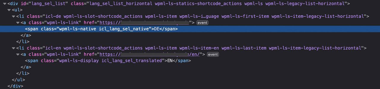
Save the settingsNow insert this to your child-theme functions.php:
add_action('ava_main_header_sidebar', function() {
  echo do_shortcode("[wpml_language_selector_widget]");
});
And now style it via WPML – Languages – Custom language switchers
DOM will look like this then:
 May 24, 2024 at 5:33 pm #1445573
In reply to: Hide WMPL Flags
on WPML – Languages – there is in the options : “Menu language switcher ” Add a new one.
Then you see the options for that menu you chooseif the switchers are not inside a menu – you can scroll down a bit and have : “Custom language switchers” mark it and customise it there.
i do not have an enfold setting with header on the left and WPML – so i can not test it for you.
if that position does not belong to these settings:try: https://kriesi.at/support/topic/wpml-language-switcher-8/#post-695476
but: i think these filters and action hooks are deprecated now. on : class-avia-wpml.php lines 86 to 110 there are more options to influence. i think a mod should instruct you with these new “options”
or read this for more info: https://wpml.org/documentation/theme-compatibility/enfold/#enfold-language-switcher
May 24, 2024 at 5:13 pm #1445570What font do you like to upload?
long time ago – and with some changes ( for example the possibility to upload variable fonts ) you can read here a more detailed instruction:
https://kriesi.at/support/topic/host-web-font-yourself-some-info/#post-1364066
And: a tip if it is realy neccessary to have a specific italic typeface.May 24, 2024 at 3:03 pm #1445539In reply to: Hide WMPL Flags
Hehe…they send me back to you.
“Hi there.
Of course, I am happy to help.
The switchers that you have at the top of your site are not served by WPML directly but by the AVIA builder that comes with the Enfold theme.
I’m attaching a screenshot below so that you can see the code of that content part and you will see it is AVIA-related.
You will see multiple “avia” words in there.
I am not sure if avia builder or the enfold theme has the possibility to show the language names instead of the language flags, I would recommend that you check this with their support team here:
https://kriesi.at/support/”However, this seems like a forgotten part on your end, that the Hide the flags in Theme options – Header is unavailable with this menu layout…
Can you still help?:)
May 24, 2024 at 2:28 pm #1445536Thank you! The Advanced Styling panel worked perfectly. The column looks off centre, with the first two columns jammed up on the left and the third column far over on the right. What’s an easy solution that looks correct on desktop, tabloid and mobile? Can the second column be nudged to the right a bit only when it’s not displayed full width?
-
This reply was modified 1 year, 10 months ago by
-
AuthorSearch Results
-
Search Results
-
I would like to implement a two column layout with an imagine in the right column; however, no matter what size I use to define the image, there are boarders all around the imagine. I would like to remove the boarders from the top, left, and right so that the image, essentially, fills up all of the space of the column.
I can’t seem to figure out how to do that and need some help/direction.
on some reasons it might be nice to have that position on top of the widgets.
i see on sidemap.php that filter : avf_sidebar_positioncan i have a functions.php snippet to change that position?
( i mean – without having a child-theme sidebar.php )Topic: Video on mobile
Hello
I would like to play videos on mobile in the original video window with the option to click on fullscreen. But with or without the “show fullscreen button” enabled, the video only plays in fullscreen. (all videos under: Our Work)
I don’t want it on Autoplay, because they are music videos and I need to hear the sound when the video starts playing.
On the homepage I have 2 videos on autoplay, they play the video in the original video window and on fullscreen when that fullscreen button is clicked.
Why does this only work with autoplay enabled? Is there a way to change that?

