
-
AuthorPosts
-
May 17, 2024 at 8:14 am #1444031
Dear Support Team
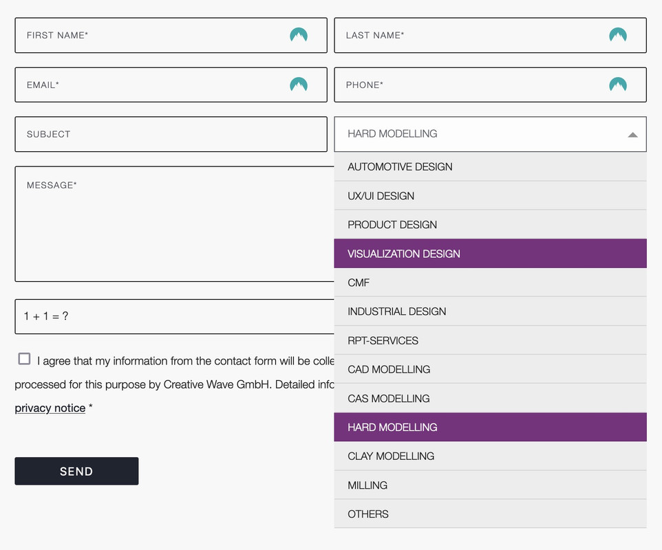
on the following contact page http://neu2024.creative-wave.com/contact/ there is a drop-down menu in the contact form: “I’m interested in”: when you open the menu, a bar in purple appears as a selection marker. in addition, the text here is not on “uppercase”. see screenshot http://neu2024.creative-wave.com/support/drop-down.png
How can I modify this?
1. highlight bar in orange
2. font of the selection menu items in “uppercase”Many thanks for your support
best regards, DianaMay 18, 2024 at 11:05 pm #1444407Hey Diana,
For #2 the selection menu items in “uppercase” due to this custom css, try to find the text-transform and remove:

if you can’t find it try adding this CSS in your Enfold Theme Options ▸ General Styling ▸ Quick CSS field:#top #main .avia_ajax_form .select { text-transform: none !important; }For your first question, the background color is set by your browser, it is blue on my computer:

When I search stackoverflow.com I’m not able to find any working solutions, most people say that it is not possible, I tried for almost an hour but didn’t find one.Best regards,
MikeMay 22, 2024 at 12:38 am #1445022you can only influence the select box ( as check boxes, radio buttons etc. ) by replacing the original html by a different html structure.
put this to your child-theme functions.php:
( it is specific to your form – because the selector for that form element is given by the ID: #element_avia_6_1
on other form elements it might be a different ID )function style_select_options(){ ?> <script> window.addEventListener("DOMContentLoaded", function () { (function($) { $('.avia_ajax_form #element_avia_6_1').addClass('custom-select'); })(jQuery); var x, i, j, l, ll, selElmnt, a, b, c; /* Look for any elements with the class "custom-select": */ x = document.getElementsByClassName("custom-select"); l = x.length; for (i = 0; i < l; i++) { selElmnt = x[i].getElementsByTagName("select")[0]; ll = selElmnt.length; /* For each element, create a new DIV that will act as the selected item: */ a = document.createElement("DIV"); a.setAttribute("class", "select-selected"); a.innerHTML = selElmnt.options[selElmnt.selectedIndex].innerHTML; x[i].appendChild(a); /* For each element, create a new DIV that will contain the option list: */ b = document.createElement("DIV"); b.setAttribute("class", "select-items select-hide"); for (j = 1; j < ll; j++) { /* For each option in the original select element, create a new DIV that will act as an option item: */ c = document.createElement("DIV"); c.innerHTML = selElmnt.options[j].innerHTML; c.addEventListener("click", function(e) { /* When an item is clicked, update the original select box, and the selected item: */ var y, i, k, s, h, sl, yl; s = this.parentNode.parentNode.getElementsByTagName("select")[0]; sl = s.length; h = this.parentNode.previousSibling; for (i = 0; i < sl; i++) { if (s.options[i].innerHTML == this.innerHTML) { s.selectedIndex = i; h.innerHTML = this.innerHTML; y = this.parentNode.getElementsByClassName("same-as-selected"); yl = y.length; for (k = 0; k < yl; k++) { y[k].removeAttribute("class"); } this.setAttribute("class", "same-as-selected"); break; } } h.click(); }); b.appendChild(c); } x[i].appendChild(b); a.addEventListener("click", function(e) { /* When the select box is clicked, close any other select boxes, and open/close the current select box: */ e.stopPropagation(); closeAllSelect(this); this.nextSibling.classList.toggle("select-hide"); this.classList.toggle("select-arrow-active"); }); } function closeAllSelect(elmnt) { /* A function that will close all select boxes in the document, except the current select box: */ var x, y, i, xl, yl, arrNo = []; x = document.getElementsByClassName("select-items"); y = document.getElementsByClassName("select-selected"); xl = x.length; yl = y.length; for (i = 0; i < yl; i++) { if (elmnt == y[i]) { arrNo.push(i) } else { y[i].classList.remove("select-arrow-active"); } } for (i = 0; i < xl; i++) { if (arrNo.indexOf(i)) { x[i].classList.add("select-hide"); } } } /* If the user clicks anywhere outside the select box, then close all select boxes: */ document.addEventListener("click", closeAllSelect); }); </script> <?php } add_action('wp_footer', 'style_select_options');after that for quick.css:
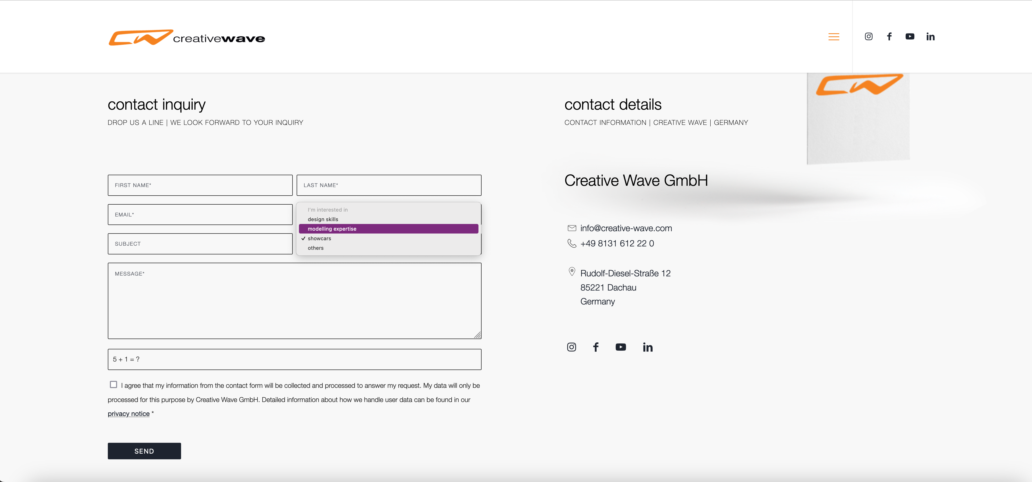
/*the container must be positioned relative:*/
.custom-select {
  font-family: inherit;
  text-transform: uppercase;
}

.custom-select select {
  display: none !important;
}

#top .select-selected {
  background-color: var(--enfold-main-color-bg);
  border-color: var(--enfold-main-color-primary);
  border-width: 1px;
  height: 41px;
  font-size: 12px;
  color: var(--enfold-main-color-primary);
  opacity: 0.7
}

/*style the arrow inside the select element:*/
.select-selected:after {
  position: absolute;
  content: "";
  top: 18px;
  right: 10px;
  width: 0;
  height: 0;
  border: 6px solid transparent;
  border-color: #666 transparent transparent transparent;
}

/*point the arrow upwards when the select box is open (active):*/
.select-selected.select-arrow-active:after {
  border-color: transparent transparent #666 transparent;
  top: 12px;
}

/*style the items (options), including the selected item:*/
.select-items div,
.select-selected {
  color: #FFF;
  padding: 2px 15px 2px;
  border: 1px solid transparent;
  border-color: transparent transparent rgba(0, 0, 0, 0.1) transparent;
  cursor: pointer;
  user-select: none;
}

/*style the items (options), including the selected item:*/
.select-selected {
  padding: 5px 15px 2px;
}

/*style items (options):*/
.select-items {
  position: absolute;
  background-color: #ddd;
  top: 100%;
  left: 0;
  right: 0;
  z-index: 99;
  font-size: 12px
}

/*hide the items when the select box is closed:*/
.select-hide {
  display: none;
}

.select-items div:hover, .same-as-selected {
  background-color: #7d2a7e;
  color: #fff !important;
}
Looks then this way – but you can now style each option and pseudo states to your needs:
-
This reply was modified 1 year, 1 month ago by
Guenni007.
May 22, 2024 at 6:58 pm #1445204May 22, 2024 at 10:40 pm #1445236May 24, 2024 at 10:34 am #1445490Thank you very much for this detailed description and your truly brilliant support
May 24, 2024 at 8:11 pm #1445617Hi,
Thanks for the kind words :-)
Please let us know if you should need any further help on the topic, or if we can close it.
Best regards,
Rikard-
This reply was modified 1 year, 1 month ago by
Rikard.
May 28, 2024 at 9:47 am #1446814This is solved. You can close this topic. Thanks
-
This reply was modified 1 year, 1 month ago by
-
AuthorPosts
- The topic ‘contact form drop-down list background colour’ is closed to new replies.