-
AuthorSearch Results
-
June 24, 2024 at 1:08 pm #1458017
In reply to: Rounded edge
Hey Zaccc,
Please try the following in Quick CSS under Enfold->General Styling:
.av-brd06i-eaef0e2e0dabaa7c6f27ce812c6e77b7 {
  border-top-left-radius: 10px;
  border-bottom-left-radius: 10px;
}

.av-9ur522-fdab728712108834cfbf06903464edf4 {
  border-top-right-radius: 10px;
  border-bottom-right-radius: 10px;
}

.av-36owea-e30845402d9141e0a7985ef614696b1e, .av-tyhgy0-5f148e6f7c4f2268fc5e80a8daae4d58 {
  border-radius: 10px;
}
Best regards,
RikardJune 24, 2024 at 1:05 pm #1458016In reply to: The Events Calendar Pro – prevent auto scroll to top
Hi Mike,
thanks a lot! Works like a charm. Awesome support as always!
Feel free to close the topic.
Greets
MarcoJune 24, 2024 at 12:32 pm #1457974In reply to: Fullwidth Submenu – Onepage Dotsmenu
Hi Mike,
thank you. It seems to work but somehow I cannot change the color of the icons. I tried to insert the color code in this part of the css:
#top .dotsmenu .av-subnav-menu li a:before {
 display: inline-block !important;
 font-size:30px;
 color: #fff;
}
but nothing changes.
Regards
DanielaJune 23, 2024 at 10:15 pm #1457399In reply to: Header button beside burner menu and search icon
Hi,
Try this CSS in your Enfold Theme Options ▸ General Styling ▸ Quick CSS field:@media only screen and (max-width: 767px) { .responsive #top #wrap_all .main_menu { position: relative; height: 66px; } .responsive #top .av-logo-container .avia-menu { width: 100%; display: flex; justify-content: center; } .responsive #top .logo { height: 54px !important; width: 100%; display: flex; justify-content: center; } }Please ensure to copy the code from the forum and not an email notification so the symbols are not converted.
After applying the css, please clear your browser cache and check.Best regards,
MikeJune 23, 2024 at 7:07 pm #1457369In reply to: Header button beside burner menu and search icon
Hi,
Thanks for the feedback, the issue is that the example link is using a normal menu and you are using a mobile burger menu for your desktop, these are two different menus.
Whe I checked your site I found no “Book Now” button so I created a new one for you, and added the required custom class menu-item-avia-special cta which was disabled on your site, and then I added this css:.html_burger_menu_active #header .avia-menu .menu-item-avia-special.cta { display: block !important; }and Guenni007’s solution works great, thanks for sharing Guenni007!

you will need to adjust the button url as I didn’t know the like you wanted.Best regards,
MikeJune 23, 2024 at 6:21 pm #1457354In reply to: Changes to right sidebar header
Hi,
To change this so it only works on screens larger than 768px I changed the code to this, which also adds some body margin so it won’t overlap the page content, and I make the menu items closer and I adjusted the social icons, please check.function create_a_sidebar_header_with_burger_menu() { ?> <script> document.addEventListener('DOMContentLoaded', function() { // Check if the HTML element has the "wp-toolbar" class if (document.documentElement.classList.contains('wp-toolbar')) { return; // Exit the script if "wp-toolbar" class is found } // Check if the screen width is larger than 768px if (window.innerWidth < 768) { return; // Exit the script if the screen width is less than 768px } // Create the main toolbar div const toolbar = document.createElement('div'); toolbar.id = 'right-toolbar'; // Create the inner content divs for (let i = 1; i <= 3; i++) { const contentDiv = document.createElement('div'); contentDiv.className = 'toolbar-content'; contentDiv.id = 'content' + i; toolbar.appendChild(contentDiv); } // Append the toolbar to the body document.body.appendChild(toolbar); // Add the CSS styles const style = document.createElement('style'); style.innerHTML = ` #right-toolbar { position: fixed; right: 0; top: 0; width: 100px; height: 100%; background-color: #f8f8f8; display: flex; flex-direction: column; justify-content: space-between; align-items: center; padding: 20px 0; box-shadow: -2px 0 5px rgba(0, 0, 0, 0.5); z-index: 999; } #content1 .main_menu { position: relative; } .toolbar-content { width: 80px; height: 100px; background-color: #f8f8f8; margin-bottom: 10px; border-radius: 5px; display: flex; justify-content: center; align-items: start; } .toolbar-content:last-child { margin-bottom: 0; } .rotated-logo { transform: rotate(90deg); transform-origin: center; } #content2 .logo { float: none; position: relative; left: unset; height: unset; } #content3 .social_bookmarks { /*transform: rotate(90deg);*/ transform-origin: center; } .html_header_top.html_header_sticky #main { padding-top: 0; } #av_section_1 { height: 100vh; } #menu-item-shop,#menu-item-search { display: none; } #top #content1 .av-small-burger-icon { transform: scale(1); } .html_cart_at_menu.html_main_nav_header #top .main_menu .menu>li:last-child { padding-right: 0; margin-right: 0; } .avia-menu.av_menu_icon_beside { padding-right: 0; margin-right: 0; border-right-width: 0; border-right-style: none; } .html_av-overlay-side-classic #top .av-burger-overlay li a { border-bottom-style: none; } @media only screen and (min-width: 768px) { .responsive #top #content1 .av-main-nav .menu-item-avia-special.av-burger-menu-main { display: block!important; } #top #content1 .av-main-nav > li.menu-item { display: none!important; } .html_av-overlay-side #top .av-burger-overlay li { margin: 0; height: 50px; } #content1 .av-main-nav-wrap { float: right; } } #header { visibility: hidden; } body { margin-right: 100px } #content3 { height: 300px; } #top .social_bookmarks li { display: inline-block; clear: both; margin-bottom: 10px; } `; document.head.appendChild(style); // Move the logo to #content2 and rotate it const logo = document.querySelector('.avia-standard-logo'); if (logo) { const content2 = document.getElementById('content2'); content2.appendChild(logo); logo.classList.add('rotated-logo'); } // Move the menu to #content1 const menu = document.querySelector('.main_menu'); if (menu) { const content1 = document.getElementById('content1'); content1.appendChild(menu); } // Move the social bookmarks to #content3 const socialBookmarks = document.querySelector('.social_bookmarks'); if (socialBookmarks) { const content3 = document.getElementById('content3'); content3.appendChild(socialBookmarks); } }); </script> <?php } add_action( 'wp_footer', 'create_a_sidebar_header_with_burger_menu', 99 );
Best regards,
MikeJune 23, 2024 at 3:43 pm #1457129Hey reqonsult,
It looks like that is how long it takes your server to serve the video. I see your site also has many CORS errors for your fonts before the video loads, this could be slowing your site down as it has the also deal with these. It looks like you may have built the site on a temp domain and the fonts are still loading from there, try checking this.
But nonetheless the video loads quickly when I check, if you want to hide the fallback image on desktop for this one page try this css:@media only screen and (min-width: 768px) { #top.page-id-94 .avia-slideshow .avia-slide-wrap { background-image: none !important; } }Please ensure to copy the code from the forum and not an email notification so the symbols are not converted.
After applying the css, please clear your browser cache and check.Best regards,
MikeJune 23, 2024 at 3:12 pm #1457068In reply to: Topics without underlines
Hey reqonsult,
Try this CSS in your Enfold Theme Options ▸ General Styling ▸ Quick CSS field:#top #aufeinenblick .custom-color-heading a { text-decoration: none; }After applying the css, please clear your browser cache and check.
Best regards,
MikeJune 23, 2024 at 1:13 pm #1456986In reply to: back button to previous page
Hey lelouxwebdesign,
In your sidebar add a Custom HTML widget with this code:
<a href="javascript:history.back()">Go Back</a>

then in the post sidebar you will see a “Go Back” link

you can style it as you wish and clicking it will send the visitor to the last page they viewed.
If you want to use a button, you can create a buton with the shortcode wand and use this as the manual link:javascript:history.back()

[av_button label='Go Back' icon_select='yes' icon='ue831' font='entypo-fontello' button_type='' link='manually,javascript:history.back()' link_target='' download_file='https://' attachment='' attachment_size='' downloaded_file_name='' size='large' position='center' label_display='' title_attr='' size-text='' av-desktop-font-size-text='' av-medium-font-size-text='' av-small-font-size-text='' av-mini-font-size-text='' margin='' margin_sync='true' padding='' padding_sync='true' av-desktop-margin='' av-desktop-margin_sync='true' av-desktop-padding='' av-desktop-padding_sync='true' av-medium-margin='' av-medium-margin_sync='true' av-medium-padding='' av-medium-padding_sync='true' av-small-margin='' av-small-margin_sync='true' av-small-padding='' av-small-padding_sync='true' av-mini-margin='' av-mini-margin_sync='true' av-mini-padding='' av-mini-padding_sync='true' color_options='' color='theme-color' custom_bg='#444444' custom_font='#ffffff' btn_color_bg='theme-color' btn_custom_grad_direction='vertical' btn_custom_grad_1='#000000' btn_custom_grad_2='#ffffff' btn_custom_grad_3='' btn_custom_grad_opacity='0.7' btn_custom_bg='#444444' btn_color_bg_hover='theme-color-highlight' btn_custom_bg_hover='#444444' btn_color_font='theme-color' btn_custom_font='#ffffff' btn_color_font_hover='white' btn_custom_font_hover='#ffffff' border='' border_width='' border_width_sync='true' border_color='' border_radius='' border_radius_sync='true' box_shadow='' box_shadow_style='0px,0px,0px,0px' box_shadow_color='' animation='' animation_duration='' animation_custom_bg_color='' animation_z_index_curtain='100' hover_opacity='' sonar_effect_effect='' sonar_effect_color='' sonar_effect_duration='1' sonar_effect_scale='' sonar_effect_opac='0.5' css_position='' css_position_location=',,,' css_position_z_index='' av-desktop-css_position='' av-desktop-css_position_location=',,,' av-desktop-css_position_z_index='' av-medium-css_position='' av-medium-css_position_location=',,,' av-medium-css_position_z_index='' av-small-css_position='' av-small-css_position_location=',,,' av-small-css_position_z_index='' av-mini-css_position='' av-mini-css_position_location=',,,' av-mini-css_position_z_index='' id='' custom_class='' template_class='' av_uid='' sc_version='1.0' admin_preview_bg='']
Best regards,
MikeJune 23, 2024 at 11:57 am #1456907reqonsult
ParticipantA video has been defined as the background element in the header. An image has been defined as an alternative for mobile devices. Now we have noticed that when opening the page (for example in the browser on a desktop device) it always takes about 1 second until the image disappears and the video appears or starts. Why? Thanks.
June 23, 2024 at 11:51 am #1456903In reply to: center logo on desktop and mobile
Hi,
Great, I’m glad that Mike could help you out. Please let us know if you should need any further help on the topic, or if we can close it.
Best regards,
RikardJune 23, 2024 at 11:39 am #1456887Topic: Topics without underlines
in forum EnfoldParticipantHello, how can I display these topics (Portfolio, Impact, Szenarien e. g.) without underlining, even though they remain linked? Thank you.
June 22, 2024 at 10:04 pm #1455912In reply to: Changes to right sidebar header
Hi,
This is quite tricky but perhaps this might get you started and you can adjust further to suit. Using a Menu And Logo Position of Logo left & menu right, & a sticky header with no topbar – If you are not using a child theme you could use the WP Code plugin then add a new snippet, in the top right corner use the PHP snippet as the code type:

and ensure that it is activated, then add this code and save.function create_a_sidebar_header_with_burger_menu() { ?> <script> document.addEventListener('DOMContentLoaded', function() { // Check if the HTML element has the "wp-toolbar" class if (document.documentElement.classList.contains('wp-toolbar')) { return; // Exit the script if "wp-toolbar" class is found } // Create the main toolbar div const toolbar = document.createElement('div'); toolbar.id = 'right-toolbar'; // Create the inner content divs for (let i = 1; i <= 3; i++) { const contentDiv = document.createElement('div'); contentDiv.className = 'toolbar-content'; contentDiv.id = 'content' + i; toolbar.appendChild(contentDiv); } // Append the toolbar to the body document.body.appendChild(toolbar); // Add the CSS styles const style = document.createElement('style'); style.innerHTML = ` #right-toolbar { position: fixed; right: 0; top: 0; width: 100px; height: 100%; background-color: #f8f8f8; display: flex; flex-direction: column; justify-content: space-between; align-items: center; padding: 20px 0; box-shadow: -2px 0 5px rgba(0, 0, 0, 0.5); z-index: 999; } #content1 .main_menu { position: relative; } .toolbar-content { width: 80px; height: 100px; background-color: #f8f8f8; margin-bottom: 10px; border-radius: 5px; display: flex; justify-content: center; align-items: center; } .toolbar-content:last-child { margin-bottom: 0; } .rotated-logo { transform: rotate(90deg); transform-origin: center; } #content2 .logo { float: none; position: relative; left: unset; height: unset; } #content3 .social_bookmarks { transform: rotate(90deg); transform-origin: center; } .html_header_top.html_header_sticky #main { padding-top: 0; } #av_section_1 { height: 100vh; } #menu-item-shop,#menu-item-search { display: none; } #top #content1 .av-small-burger-icon { transform: scale(1); } .html_cart_at_menu.html_main_nav_header #top .main_menu .menu>li:last-child { padding-right: 0; margin-right: 0; } .avia-menu.av_menu_icon_beside { padding-right: 0; margin-right: 0; border-right-width: 0; border-right-style: none; } .html_av-overlay-side-classic #top .av-burger-overlay li a { border-bottom-style: none; } @media only screen and (min-width: 768px) { .responsive #top #content1 .av-main-nav .menu-item-avia-special.av-burger-menu-main { display: block!important; } #top #content1 .av-main-nav > li.menu-item { display: none!important; } #content1 .av-main-nav-wrap { float: right; } } #header { visibility: hidden; } `; document.head.appendChild(style); // Move the logo to #content2 and rotate it const logo = document.querySelector('.avia-standard-logo'); if (logo) { const content2 = document.getElementById('content2'); content2.appendChild(logo); logo.classList.add('rotated-logo'); } // Move the menu to #content1 const menu = document.querySelector('.main_menu'); if (menu) { const content1 = document.getElementById('content1'); content1.appendChild(menu); } // Move the social bookmarks to #content3 const socialBookmarks = document.querySelector('.social_bookmarks'); if (socialBookmarks) { const content3 = document.getElementById('content3'); content3.appendChild(socialBookmarks); } }); </script> <?php } add_action( 'wp_footer', 'create_a_sidebar_header_with_burger_menu', 99 );Please ensure to copy the code from the forum and not an email notification so the symbols are not converted.
This should give you a sidebar header with the burger menu, logo & social icons like this:

and the burger menu should open like this:

It probably needs some more css, but perhaps you can give it a try.Best regards,
MikeJune 22, 2024 at 7:43 pm #1455721In reply to: center logo on desktop and mobile
Hey Rolf,
Try this CSS in your Enfold Theme Options ▸ General Styling ▸ Quick CSS field:@media only screen and (max-width: 767px) { .responsive #top .logo.avia-standard-logo { left: 37%; position: relative; } } @media only screen and (min-width: 768px) and (max-width: 989px) { .responsive #top .logo.avia-standard-logo { left: 43%; position: relative; } } @media only screen and (min-width: 1200px) { .logo.avia-standard-logo { left: 20%; } }Please ensure to copy the code from the forum and not an email notification so the symbols are not converted.
After applying the css, please clear your browser cache and check.Best regards,
MikeJune 22, 2024 at 6:31 pm #1455620In reply to: Fullwidth Submenu – Onepage Dotsmenu
Hey Daniela,
I recommend creating a dotsmenu as described in our documentation and create the simple custom menu in the element:

with the custom class dotsmenu:

then to use entypo-fontello icons, go to your icon element and hover over the icons that you want to use and the chrcode will show, always drop the first “U”, so the code that you will use for this screenshot will be \e804

Then use this css, at teh bottom you will see the six icons for the six menu items in my example, add more if you wish:#top .dotsmenu { background: transparent; position: fixed!important; right: 10px; top: 50%!important; transform: translateY(-50%); border: none!important; max-width: 30px!important; } #top .dotsmenu .av-subnav-menu > li { display: inline!important; margin: 10px !important; } #top .dotsmenu .av-subnav-menu li a { max-width: 40px; max-height:45px; border-radius:0; overflow:hidden; padding: 0 !important; border: none!important; background: transparent; } #top .dotsmenu .av-subnav-menu li a .avia-bullet { display: none !important; } #top .dotsmenu .av-subnav-menu li a .avia-menu-text { visibility: hidden; } @media only screen and (max-width: 767px) { .responsive #top .dotsmenu { background: transparent; position: fixed!important; right: 0; top: 50%!important; transform: translateY(-50%); }} #top .dotsmenu .av-subnav-menu li a:before { display: inline-block !important; font-size:30px; color: #fff; } #top .dotsmenu .av-subnav-menu li:nth-child(1) a:before { content: '\e804'; font-family: 'entypo-fontello'; } #top .dotsmenu .av-subnav-menu li:nth-child(2) a:before { content: '\e82a'; font-family: 'entypo-fontello'; } #top .dotsmenu .av-subnav-menu li:nth-child(3) a:before { content: '\e83d'; font-family: 'entypo-fontello'; } #top .dotsmenu .av-subnav-menu li:nth-child(4) a:before { content: '\e8b3'; font-family: 'entypo-fontello'; } #top .dotsmenu .av-subnav-menu li:nth-child(5) a:before { content: '\e8d2'; font-family: 'entypo-fontello'; } #top .dotsmenu .av-subnav-menu li:nth-child(6) a:before { content: '\e8b9'; font-family: 'entypo-fontello'; }This is the result:

Best regards,
MikeJune 22, 2024 at 4:31 pm #1455475Topic: center logo on desktop and mobile
in forum Enfoldhallorolf
ParticipantJune 22, 2024 at 3:58 pm #1455433In reply to: EventOn Plugin Conflict
Hey LesleyJean,
Thank you for your patience, unfortunately my research finds that the EventOn plugin doesn’t work well with Enfold. Unfortunately this is not one of our supported plugins, we suggest trying the Events Calendar plugin.
We are not able to support all plugins and our support scope is limited.
If you would like to request support for this plugin as a feature, the Dev Team has opened a new Github Feature Request for users to place requests and follow them as the Dev Team reviews them.
Thank you for your patience and understanding.Best regards,
MikeJune 22, 2024 at 3:20 pm #1455356In reply to: The Events Calendar Pro – prevent auto scroll to top
Hey Marco,
Thank you for your patience and the link to your page, when the tribe event pagination is clicked the page reloads with the new content, this is why the page shows at the top like any new page would when you use a link to a different page.
To get the scroll position when the pagination button is clicked and then after the page reloads go back to that position add this code to the end of your child theme functions.php file in Appearance ▸ Editor:function adjust_scroll_position_when_tribe_events_pagination_is_used() { ?> <script> document.addEventListener('DOMContentLoaded', function () { function storeScrollPosition() { localStorage.setItem('scrollPosition', window.scrollY); } function scrollToStoredPosition() { const scrollPosition = localStorage.getItem('scrollPosition'); if (scrollPosition) { window.scrollTo({ top: parseInt(scrollPosition, 10), behavior: 'smooth' }); localStorage.removeItem('scrollPosition'); } } const paginationLinks = document.querySelectorAll('.pagination-tribe_events a'); paginationLinks.forEach(link => { link.addEventListener('click', storeScrollPosition); }); scrollToStoredPosition(); }); </script> <?php } add_action( 'wp_footer', 'adjust_scroll_position_when_tribe_events_pagination_is_used', 99 );Please ensure to copy the code from the forum and not an email notification so the symbols are not converted.
Best regards,
MikeJune 22, 2024 at 11:46 am #1455094In reply to: help please
Hi,
Thanks for the update. Should we close this topic for now then?
Best regards,
RikardJune 22, 2024 at 10:56 am #1455031In reply to: Missing Rumble Icon – Header
Hi,
Great, I’m glad that Ismael could help you out. Please let us know if you should need any further help on the topic, or if we can close it.
Best regards,
RikardJune 22, 2024 at 8:23 am #1454857In reply to: Header button beside burner menu and search icon
go to your dashboard – menu and insert as last item your wanted link as individual Link
place in your main menu – you can see besides each menu item a little arrow to edit a menu-item.
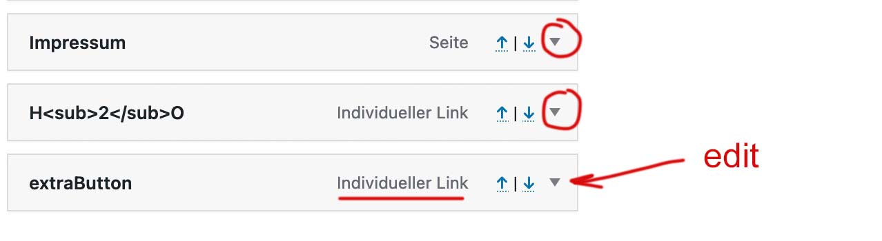
edit that last item and insert to the css input field: menu-item-avia-special cta
the cta is only to style it without influencing other menu-items with the same class menu-item-avia-special
maybe mark allready the menu item style to button.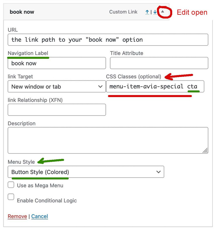
If you do not have a css input field – look on top right corner of the menu Options page: a lot of wordpress option windows got there a slide out :
on menu options slide-out you now can mark to show css attributes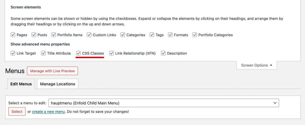
because of that first class – it will stay visible even if burger menu is active !
see extraButton (book now) in use: https://webers-testseite.de/
with:.menu-item-avia-special.cta a .avia-menu-text { color: #FFF !important; border: 2px solid purple !important; border-radius: 7px !important; background-color: #d935d9 !important; }June 21, 2024 at 2:08 pm #1453865In reply to: Changes to right sidebar header
Hi,
If you only want to change the width, then you can try CSS like this:
.html_header_sidebar #top #header {
  width: 400px;
}
Best regards,
RikardJune 21, 2024 at 12:02 pm #1453720In reply to: Mobile responsiveness of Testimonial Element
Hey Ivana,
Please try the following in Quick CSS under Enfold->General Styling:
@media only screen and (max-width: 767px) {
  .responsive #top .av-large-testimonial-slider.avia-testimonial-wrapper .avia-testimonial {
    padding: 0;
  }
  #top .av-large-testimonial-slider .avia-testimonial-meta .avia-testimonial-image {
    width: 100%;
  }
  #top .av-large-testimonial-slider .avia-testimonial-meta-mini {
    text-align: center;
  }
}
Best regards,
RikardJune 21, 2024 at 9:50 am #1453613In reply to: Different Logo on Mobile
Topic can be closed.
June 21, 2024 at 6:34 am #1453440In reply to: icon list – break with “read more”
Hey Sabine,
Thank you for the inquiry.
There is no option for this by default but we can create a script for the read more link. Please add the content in the icon list with this format:
<p class="av-icon-list-content">
    Lorem ipsum dolor sit amet, consectetur adipiscing elit. Sed do eiusmod tempor incididunt ut labore et dolore magna aliqua.
    <span class="av-icon-list-more-text">Ut enim ad minim veniam, quis nostrud exercitation ullamco laboris nisi ut aliquip ex ea commodo consequat. Duis aute irure dolor in reprehenderit in voluptate velit esse cillum dolore eu fugiat nulla pariatur.</span>
    <a href="#" class="read-more">Read more</a>
</p>
Add this script in the functions.php file:
function ava_custom_script_read_more()
{
    ?>
    <script>
        (function ($)
        {
            function avToggleContent()
            {
                $('.av-icon-list-read-more').click(function(event) {
                    event.preventDefault();
                    $(this).prev('.av-icon-list-more-text').slideToggle();
                    $(this).text(function(i, text){
                        return text === "Read more" ? "Read less" : "Read more";
                    });
                });
            }

            $(document).ready(function ()
            {
                avToggleContent();
            });
        })(jQuery);
    </script>
    <?php
}
add_action('wp_footer', 'ava_custom_script_read_more');
Then include this code in the Quick CSS field:
.av-icon-list-content .av-icon-list-more-text {
    display: none;
}

.av-icon-list-content .av-icon-list-read-more {
    display: inline-block;
    margin-top: 5px;
    color: blue;
}

.av-icon-list-content .av-icon-list-read-more:hover {
    text-decoration: underline;
    cursor: pointer;
}
Best regards,
IsmaelJune 21, 2024 at 5:56 am #1453398In reply to: Missing Rumble Icon – Header
Hi,
Thank you for the inquiry.
Did you add this css code?
#top #header .social_bookmarks .av-social-link-rumble a {
    background: url(rumble_image_url) center center no-repeat;
    background-size: contain;
}
What happens when you remove the css modification for the rumble social icon?
Best regards,
IsmaelJune 21, 2024 at 3:20 am #1453217Topic: Mobile responsiveness of Testimonial Element
in forum Enfoldweb4smallbusiness
ParticipantGood morning
I have just built a website for a client and whilst he is happy with the website, he doesn’t like the mobile responsiveness of the Testimonial Slider (large). On a desktop it looks great, but on the mobile, there is a large margin on either side and also the photo does not appear centred and the name is also off centre.
I tried changing the font size for a mobile device but that didn’t seem to work.
Is there a quick CSS code that I can add that would reduce the margin size on all the testimonials throughout the website and that would centre the image and the name.
See below for link to website and also screenshots of the testimonial element and how they appear on a mobile device.
Thank you very much
IvanaJune 20, 2024 at 11:49 pm #1452981Topic: Video not showing on ipad
in forum Enfoldcondonp
ParticipantDear Sirs,
i have a website at https://www.peter-test1.co.uk/testimonials/. Here there is a video using mp4 format. It works on desktop but on ipad I get an error message “media error ” Can you please help.
June 20, 2024 at 7:25 pm #1452700Hi,
Great, I’m glad to hear that things are working as they should again. Please let us know if you should need any further help on the topic, or if we can close it.
Best regards,
RikardJune 20, 2024 at 5:32 pm #1452567 -
AuthorSearch Results
-
Search Results
-
A video has been defined as the background element in the header. An image has been defined as an alternative for mobile devices. Now we have noticed that when opening the page (for example in the browser on a desktop device) it always takes about 1 second until the image disappears and the video appears or starts. Why? Thanks.
Topic: Topics without underlines
Hello, how can I display these topics (Portfolio, Impact, Szenarien e. g.) without underlining, even though they remain linked? Thank you.
Good morning
I have just built a website for a client and whilst he is happy with the website, he doesn’t like the mobile responsiveness of the Testimonial Slider (large). On a desktop it looks great, but on the mobile, there is a large margin on either side and also the photo does not appear centred and the name is also off centre.
I tried changing the font size for a mobile device but that didn’t seem to work.
Is there a quick CSS code that I can add that would reduce the margin size on all the testimonials throughout the website and that would centre the image and the name.
See below for link to website and also screenshots of the testimonial element and how they appear on a mobile device.
Thank you very much
IvanaTopic: Video not showing on ipad
Dear Sirs,
i have a website at https://www.peter-test1.co.uk/testimonials/. Here there is a video using mp4 format. It works on desktop but on ipad I get an error message “media error ” Can you please help.

