Forum Replies Created
-
AuthorPosts
-
Hi,
To remove the border, Please try this code in the General Styling > Quick CSS field or in the WordPress > Customize > Additional CSS field:.container_wrap { border-top-style: none !important; border-top-width: 0px !important; }For your other issue, I see that you have a couple of jQuery errors that look like plugin conflicts. Please try disabling your plugins. If that resolves the issue, reactivate each one individually until you find the cause.
Best regards,
MikeHi,
I believe you had a minor glitch, I deactivated all of your plugins and assigned your blog page to a test page in the theme options and them assigned your blog page to the same test page in WordPress, which free’ed up your “Blog” page and allowed it to load in the advanced layout builder.
But there is no elements or content on the page, it is a blank page.
The posts you see on your Blog page is from the Enfold Theme Options > Blog Layout, which is set to “List Layout”
If you wish to add elements or content to your page, please be sure to go to Enfold Theme Options > Blog Layout and choose “Use the advance layout editor to build your own blog layout (simply edit the page you have chosen in Enfold->Theme Options as a blog page)” as Blog Style.I enabled all of your plugins and theme settings back to the way they were, and your Blog page can still be opened in the advanced layout builder.
Please take a look and let us know if we can help further.Best regards,
MikeDecember 15, 2018 at 8:41 pm in reply to: Anchor Links within Main Nav Menu Not Working Properly & Old Customized Scripts #1045711Hi,
Sorry for the late reply, I believe the issue is that the links include a “/” for example if you are on the page and paste in:
your-site.com/in-the-news#press-releases it goes to the tab but not as:
your-site.com/in-the-news/#press-releasesI found this same issue on quite a few stackoverflow questions about WordPress 1, 2, 3
Two solutions I found are to remove the trailing slash via programmatically, or though the Permalink Settings
Best regards,
MikeHi,
Thank you for the login, you are getting a couple of jQuery errors, which seems to point to plugin conflicts, can I disable your plugins temporary? Rarely some plugins may not retain their settings when they are disabled.Best regards,
MikeHi,
I stand corrected, Ismael has created a plugin from his original code, no other plugins are needed for it to work.

Please download from here:
https://www.dropbox.com/s/741o1cuvcojrk8h/enfold-recaptcha.zip?dl=0
and install as a plugin.
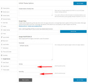
Then go to the Enfold > Google Services panel and put your public and site key in the respective fields, and save.

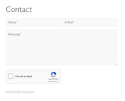
It will automatic show on your contact form, the submit button will be hidden until the Google Captcha is checked.Best regards,
MikeHey Lyntex,
Which demo would you like to install? It looks like you have tried to install the default demo, but many of the images are not included with that demo. What webhost are you using? Some webhosts have security settings that don’t play well with our demo importer, but we can assist with a manual install if you can include ftp access in the Private Content area. Please not that installing a demo typically overwrites your current content.Best regards,
MikeHey P3T3R_0ne,
I believe that this will correct the issue:#top.events-archive .container_wrap_first .container:first-child { min-height: 100vh !important; }but I was unable to reproduce the page in your screenshot to test. When testing you may wish to set the code to 80vh so it doesn’t create a over sized page.
Best regards,
MikeHey dbtpath,
Can you please include a admin login in the private content area so we can take a closer look.Best regards,
MikeHi,
It was Google Captcha (reCAPTCHA) by BestWebSoft, but it doesn’t seem to work anymoreBest regards,
MikeHi,
To change the subtext location adjust the “transform: translate(2%,-50%) !important;” in the code above.
To ensure that your adjustment only effects your iPad 2 in landscape mode, please add your new rule to this media query:@media only screen and (min-device-width: 481px) and (max-device-width: 1024px) and (orientation:landscape) { /* For landscape layouts only */ }Then ensure to clear your browser cache.
Best regards,
MikeHi,
Thanks for the login, I added the recaptcha shortcode to your contact form to show the element, but you are getting this jQuery error:Uncaught ReferenceError: jQuery is not defined at createCaptcha ((index):279) at (index):287I can’t see your functions.php because the editor is hidden.
While researching any additional steps needed to get it to work I found this post from Ismael who wrote the script:
We can’t recommend the same script before because of DSGVO or GDPR. Please try Sucuri or Wordfence to protect your site from third party scripts or spams ~ How Sucuri Helped us Block 450,000 WordPress Attacks in 3 Months
I see that you already have Sucuri installed, perhaps the article has some tips for using it more effectively?
I’m not sure that you will want to continue with the recaptcha.Have you considered Contact Form 7, I found that there is a addon Contact Form 7 Honeypot which looks like it would be very effective.
Best regards,
MikeDecember 14, 2018 at 2:07 pm in reply to: Editor Unexpected Error After WordPress 5.0 and Enfold 4.5.1 #1045258Hi
@goldengate415, thanks that is a great tip.Best regards,
MikeDecember 14, 2018 at 2:05 pm in reply to: Dragging Elements in Advanced Layout Editor after Update to 5.0 #1045255Hi,
@Smartin2808 since you are in the need of a solution ASAP, I would recommend installing the Classic Editor plugin, or downgrading to WordPress 4.9 with the WP Downgrade plugin.Best regards,
MikeHi,
Do you mean the phrase “Ready to be seen?” is overlapping?
Please see the screenshot in Private Content area.Best regards,
MikeDecember 14, 2018 at 4:10 am in reply to: How to create a separate shop page for separate products #1045105Hi,
Glad we were able to help, we will close this now. Thank you for using Enfold.For your information, you can take a look at Enfold documentation here
For any other questions or issues, feel free to start new threads under Enfold sub forum and we will gladly try to help you :)Best regards,
MikeHi,
This looks right to me for what you are trying to do. Please let us know if it works for you.Best regards,
MikeHi,
The dev team would like to take a closer look, does your web-host have a staging site option, so we can test on a copy of your site?Best regards,
MikeDecember 14, 2018 at 3:20 am in reply to: Editor Unexpected Error After WordPress 5.0 and Enfold 4.5.1 #1045099Hi,
Yes, it is very strange, we look forward to hearing what WP Engine finds.Best regards,
MikeDecember 13, 2018 at 2:11 pm in reply to: How to create a separate shop page for separate products #1044886Hi,
For the sold out ribbon, Please try this code in the General Styling > Quick CSS field or in the WordPress > Customize > Additional CSS field:.page-id-12652 span.soldout { background: url(https://buyacsgo.com/wp-content/uploads/2017/04/product-soldout.png) !important; color: transparent !important; width: 85px !important; height: 85px !important; border-radius: 0 !important; padding: 0 !important; z-index: 50 !important; }Best regards,
MikeDecember 13, 2018 at 12:52 pm in reply to: Enfold – Enable previous and next post navigation #1044865Hi,
Glad we were able to help, we will close this now. Thank you for using Enfold.For your information, you can take a look at Enfold documentation here
For any other questions or issues, feel free to start new threads under Enfold sub forum and we will gladly try to help you :)Best regards,
MikeHey m,
Please try:.homepagebig p { font-size: 100px!important; font-weight: bold; }Best regards,
MikeHey laptophobo,
I believe that the Google recaptcha does or was working with this codeBest regards,
MikeHi,
Please see the screenshot in Private Content area, for what I see between 768px and 1023px, in Chrome dev tools. Perhaps the WordPress > Customizer is favoring another media query instead, I would need to investigate further, but Chrome, Firefox, & Edge are displaying it correctly. Are you using the Chrome browser? I would recommend testing with it instead. This article will help a lot with learning how to use it and I’m sure there are some great videos on YouTube also.Best regards,
MikeDecember 13, 2018 at 6:02 am in reply to: Enfold – Enable previous and next post navigation #1044700Hi,
Glad we could help, unless there is anything else we can help with on this issue, shall we close this then?Best regards,
MikeDecember 13, 2018 at 5:57 am in reply to: How to create a separate shop page for separate products #1044695Hi,
I see your product sliders have a top & bottom margin of 30px, to remove, Please try this code in the General Styling > Quick CSS field or in the WordPress > Customize > Additional CSS field:#top.page-id-12652 .avia-content-slider { margin: 0px !important; }For your sold out badge, is the issue that it is black, or that it is round instead of a ribbon?
Best regards,
MikeDecember 13, 2018 at 5:39 am in reply to: Enfold 4.5 Theme Update "Update Failed: Download failed. A valid URL was not pro #1044691Hi,
The error “Download failed. A valid URL was not provided” is because you are using Enfold 4.4.1, please see this post on updating.For text being white on white, do you mean the “preview” of the text element, or the text element it self?
Please see the screenshot in Private Content area.
I believe this is because you are using Enfold 4.4.1 with WordPress 5, but there is a similar issue with Enfold 4.5.1, where a error message shows in the preview window.
The dev team is working on this now, and the temp solution is the use the Classic Editor plugin.Best regards,
MikeHi,
Thanks for the feedback, but I’m not sure that I see the horizontal lines. Please see the screenshots in Private Content area.
If these are not the lines, please include a screenshot.Best regards,
MikeHi,
It looks like when I edited my answer our site tried to add a link, please try this code:#top div.woocommerce-message { border-color: #8BAF5B !important; background-color: #E0F1B5 !important; color: #4F5F39 !important; } ul.woocommerce-error { background-color: #F0DCDB !important; color: #941210 !important; }Best regards,
Mike -
AuthorPosts
