Forum Replies Created
-
AuthorPosts
-
Hi,
Glad Günter was able to help, we will close this now. Thank you for using Enfold.For your information, you can take a look at Enfold documentation here
For any other questions or issues, feel free to start new threads under Enfold sub forum and we will gladly try to help you :)Best regards,
MikeHi,
That is a good tip, so the Stripe is not needed? Please add a screenshot here to help other users, To add a screenshot please try using https://postimages.org/ and pasting the image URL in your post.Best regards,
MikeHi,
I was not able to login, the message is “Ongeldige gebruikersnaam”, please check.Best regards,
MikeFebruary 27, 2019 at 7:09 am in reply to: Unstable website. I suspect is due to CCS code addition #1072169Hi,
I tried to find the two masonry boxes that have the border issue, but I don’t see it. Please link to the page directly in the Private Content area. Perhaps a screenshot would be nice too, you can add screenshots by uploading your images to a service such as postimages.org and pasting the html code or the link given in your post.Best regards,
MikeHi,
I found that I didn’t see the price error because of your Quick CSS. Now I see the error is in your woocommerce price suffix I then found that this is added in your settings woocommerce > tax > Price display suffix where you have this entered:{price_including_tax}, {price_excluding_tax}I removed this and it is now solved.
Please clear your browser cache and check.I also removed your price css so that it won’t get used by mistake someday:
.price .woocommerce-Price-amount.amount:nth-child(1),.price .woocommerce-Price-amount.amount:before{
display:none!important;
font-size:15px;
}
.price{
    font-size:0px!important;
}
Best regards,
MikeHi,
Thank you for the FTP access, I renamed your current theme to “enfold-old” then I uploaded the new “enfold” and checked that your site is working correctly. Please also check for yourself.
Once you are happy you, (or I) can delete the “enfold-old” via ftp, (not the WP theme page)
Should for some reason you wish to roll-back to the old version, it’s easy to do, simply rename the new “enfold” to “enfold-new” via ftp and then rename “enfold-old” to “enfold” then refresh your page.This didn’t seem to help with the link issue, I will try to research this some more, in the meantime please check your site and let us know if you have any errors from updating the theme.
Best regards,
MikeFebruary 27, 2019 at 5:44 am in reply to: The Events Calendar Plugin – Insert Theme Shortcode – Not Working #1072158Hi,
Thank you for the FTP access, but I couldn’t login to your WordPress, but I went ahead and renamed your current theme to “enfold-old” then I uploaded the new “enfold” and checked that your site is working correctly. Please also check for yourself.
Once you are happy you, (or I) can delete the “enfold-old” via ftp, (not the WP theme page)
Should for some reason you wish to roll-back to the old version, it’s easy to do, simply rename the new “enfold” to “enfold-new” via ftp and then rename “enfold-old” to “enfold” then refresh your page.I found that your shortcode button now shows on your Events Calendar page, but please check the site and let us know.
Best regards,
MikeFebruary 27, 2019 at 5:22 am in reply to: Update Enfold theme to newest version via FTP & maintaining earlier adjustments #1072156Hi,
I see that you are using Enfold v4.0.1 for this version there was only one contact.php file and not a folder, so to bring your site up to date, I renamed your current theme to “enfold-old” then I uploaded the new “enfold” and checked that your site is working correctly. Please also check for yourself.
Once you are happy you, (or I) can delete the “enfold-old” via ftp, (not the WP theme page)
Should for some reason you wish to roll-back to the old version, it’s easy to do, simply rename the new “enfold” to “enfold-new” via ftp and then rename “enfold-old” to “enfold” then refresh your page.I then checked your child theme functions.php and added the function to override the contact form element, you didn’t have this in place, but you did have the other script to replace the breadcrumb title.
I then activated your child theme, and see the breadcrumb titles are being replaced, and your contact form gave the successful message, but you will have to check that email has the correct text.
Please check your site and contact form and let us know if we should delete the old theme.
Best regards,
MikeHi,
@emmegigrafica
Glad to hear, shall we close this then?Best regards,
MikeHey dewittnp,
Thank you for the FTP access, I renamed your current theme to “enfold-old” then I uploaded the new “enfold” and checked that your site is working correctly. Please also check for yourself.
Once you are happy you, (or I) can delete the “enfold-old” via ftp, (not the WP theme page)
Should for some reason you wish to roll-back to the old version, it’s easy to do, simply rename the new “enfold” to “enfold-new” via ftp and then rename “enfold-old” to “enfold” then refresh your page.Best regards,
MikeFebruary 27, 2019 at 4:35 am in reply to: Enfold 4.5 Theme Update "Update Failed: Download failed. A valid URL was not pro #1072144Hi,
@dewittnp
Thank you, I replied to your new thread, please check.Best regards,
MikeFebruary 27, 2019 at 4:16 am in reply to: Remove Highlighting from Main Menu Link for Posts #1072139Hi,
To have “Destinations” highlighted when on any post, instead of the “Blog” please try this css:#top.single-post .avia-menu li.current-menu-item { background-color: transparent !important; border: 0px solid #ffffff!important; border-radius: none !important; } #top.single-post #header .av-main-nav > li.current-menu-item > a .avia-menu-text, #top.single-post #header .av-main-nav > li.current-menu-item > a .avia-menu-subtext { color: #ffffff !important; } #top.single-post .avia-menu li.menu-item-mega-parent { background-color: #f2f3ff; border: 1px solid #ffffff!important; border-radius: 100px !important; } #top.single-post #header .av-main-nav > li.menu-item-mega-parent > a .avia-menu-text, #top.single-post #header .av-main-nav > li.current-menu-item > a .avia-menu-subtext { color: #109bc5 !important; }This should also work for new post as long as you keep the same menu structure, that is we are targeting the menu-item-mega-parent instead of the current-menu-item
Best regards,
MikeFebruary 27, 2019 at 3:52 am in reply to: How to remove the rounded corners of a Grid Element #1072129Hi,
I took another look at your gallery on your home page, but the conrers on your image don’t seem to be rounded.
Assuming that I’m looking at the right images, and their not rouned, have you tried clearing your browser cache?
Please post a screenshot of what you are seeing, you can use https://postimg.cc and post the link here.Best regards,
MikeHi,
I was able to login to your site and set “Twenty Seventeen” as the theme to bring your site back up, but you have a warning that your PHP is out of date, I didn’t see where to update it at, so please ask your webhost to update to PHP v7
Then try activating Enfold again, it should work.Best regards,
MikeHi,
Thanks for the screenshots, did you want the title and breadcrumbs to disappear on scroll? I thought it was just the topbar to hide. In my tests the title and breadcrumbs are visible below the header, Please see the screenshot in Private Content area.
It seems there is a visible difference between Chrome mobile test and iPhone, unfortunately I don’t have a iPhone.Best regards,
MikeHi,
It’s worth a try, Please include FTP access in the Private Content area, so I can update for you.Best regards,
MikeFebruary 26, 2019 at 2:25 pm in reply to: Enfold 4.5.4. does not show masonry_gallery in the events calendar #1071791February 26, 2019 at 2:05 pm in reply to: The Events Calendar Plugin – Insert Theme Shortcode – Not Working #1071772Hi,
The dev team believes they have a fix now, if you include admin login & FTP access I can install it for you.Best regards,
MikeHi,
That is odd, which browser are you using? OS?
I’m using Chrome on Win10 and don’t see this, Please see the screenshot in Private Content area.Best regards,
MikeFebruary 26, 2019 at 7:01 am in reply to: Product Subcategory Pages Should Look Like Product Categories #1071648Hi,
Glad we were able to help, we will close this now. Thank you for using Enfold.For your information, you can take a look at Enfold documentation here
For any other questions or issues, feel free to start new threads under Enfold sub forum and we will gladly try to help you :)Best regards,
MikeFebruary 26, 2019 at 7:00 am in reply to: Misplaced scroll-down arrow on 100% color section #1071646Hi,
Glad we were able to help, we will close this now. Thank you for using Enfold.For your information, you can take a look at Enfold documentation here
For any other questions or issues, feel free to start new threads under Enfold sub forum and we will gladly try to help you :)Best regards,
MikeFebruary 26, 2019 at 6:59 am in reply to: Scrolling the page background images jittering in IE and Edge #1071644Hi,
Glad we were able to help, we will close this now. Thank you for using Enfold.For your information, you can take a look at Enfold documentation here
For any other questions or issues, feel free to start new threads under Enfold sub forum and we will gladly try to help you :)Best regards,
MikeHi,
Thanks for sharing your solution, I’m glad it’s sorted out now.
I assume we can close this now, but I like to ask. Shall we close this then?Best regards,
MikeFebruary 26, 2019 at 6:55 am in reply to: Problem with uploading a gif file and with the function after uploading #1071640Hi,
Glad we were able to help, we will close this now. Thank you for using Enfold.For your information, you can take a look at Enfold documentation here
For any other questions or issues, feel free to start new threads under Enfold sub forum and we will gladly try to help you :)Best regards,
MikeHi,
This is odd because on my install the links work and I can highlight the test in the flip box, but I can’t in yours.
You have this javascript error:"mixpanel" object not initializedMy research shows that Mixpanel is an analytics platform, are you using this? can you disable this?
Best regards,
MikeFebruary 26, 2019 at 5:44 am in reply to: Widget Enfold Mailchimp newsletter signup not work #1071627Hi,
The ALB, is our advanced layout builder. Currently we found a issue that the MailChimp Widget and shortcodes are not working in widgets on pages that were not built with our builder. I’m thinking this could also be true for widgets in the footer.
Try creating a test page built with the builder, not a woocommerce page, that has a sidebar that would show the MailChimp Widget.
If this doesn’t work then also try disabling your plugins.Best regards,
MikeHi,
Glad the css helped, we are having a issue with shortcodes working in widgets right now, so this could be related, we will know better once this is solved. I don’t recall seeing shortcodes in the category description field before, so I’m not sure if it’s supposed to work, so you could be right.
In some of the sites I tested, the widgets with shortcode worked on pages that were built with the advanced layout builder, so you could create a test page that has a sidebar to see if it works.Best regards,
MikeFebruary 26, 2019 at 5:18 am in reply to: Enfold 4.5.4. does not show masonry_gallery in the events calendar #1071623Hi,
@digiplace
The dev team believes they have a fix for this and it should be available in a couple of days, I just have to wait for it to merge on GitHub. If you include ftp access we could try it out, or would you prefer to wait for it to be included in the next update?Does your webhost offer staging sites?
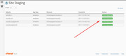
Please check your webhost to see if you have the one click staging site option, this is a option in most cPanels to create a staging clone of your site so we can test on it and your site will stay up and running.Here are some screenshots of what it would look like:

Best regards,
MikeHi,
Sorry for the late reply, I didn’t see your post.
So I took a look at the header being in the middle of the page, and added some css to the script to account for this, I also added some css to the script to fix the breadcrumbs.
So I have moved all of the css to the script for better control, but for now it only works on screens up to 550px, it will have to be adjusted for above that (tablets), but we’ll see if we can get it to work for mobiles first.
I also added a transition so that it won’t be jerky.
Here’s the script:function custom_script(){ ?> <script> (function ($) { $(window).scroll(function() { var width = $(window).width(), height = $(window).height(); var scroll = $(window).scrollTop(); if ((width <= 550)) { if (scroll >= 100) { $("#header_meta").css({'height': '0','min-height': '0','transition': 'height 1s ease-out','overflow': 'hidden'}); $(".responsive #top #wrap_all #header").css({'top': '-10px','position': 'fixed'}); $("#main .title_container").css({'margin-top': '10px','position': 'fixed','z-index': '50'}); } else { $("#header_meta").css({'height': '61px','min-height': '61px'}); $(".responsive #top #wrap_all #header").css({'top': '10px','position': 'fixed'}); $("#main .title_container").css({'margin-top': '100px','position': 'fixed','z-index': '50'}); } } else {} }); })(jQuery); </script> <?php } add_action('wp_footer', 'custom_script');Give it a try and let me know what you think.
Best regards,
MikeFebruary 25, 2019 at 2:18 pm in reply to: Erhöhter Spam über Kontaktformular trotz «Captcha darstellen» #1071288Hi,
Glad we were able to help, we will close this now. Thank you for using Enfold.For your information, you can take a look at Enfold documentation here
For any other questions or issues, feel free to start new threads under Enfold sub forum and we will gladly try to help you :)Best regards,
Mike -
AuthorPosts