
-
AuthorPosts
-
January 15, 2019 at 3:09 pm #1054139
Hello,
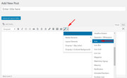
I have a tab section in my project and only have 4 tabs. As the titles are quite long, I would like to increase the section that shows each tab title so the title don’t move to the next line but are shown in just one line.
Pls see attached screenshot
Thanks NoraJanuary 15, 2019 at 3:14 pm #1054144Hey NoraGTS,
I was only able to see the maintenance mode page. Can you please check?
Best regards,
Jordan ShannonJanuary 15, 2019 at 3:31 pm #1054149sorry, turned it off now!
January 15, 2019 at 7:05 pm #1054280Hi NoraGTS,
I’m seeing the maintenance mode too.
Can you give us temporary admin access to your website in the private content box below, so that we can have a closer look?
Best regards,
VictoriaJanuary 17, 2019 at 11:20 am #1054934Hello,
Could you access the page yet?I also wanted to know on my HOME Page: I have 3 anchors set for my main menu on top. Depending on what page I’m on, the menu item corresponding with that page turns white. But on the HOME PAGE the word HOME but also the other sections on the HOME page are turning white. I would rather only have the specific section I’m on turning white – just as you have it here in your demo: https://kriesi.at/themes/enfold-one-page-portfolio/
THANKS Nora
January 18, 2019 at 8:08 pm #1055652Could you check out the page yet?
I would also like to know how to get rid of the scroll to top button.
Thanks NoraJanuary 19, 2019 at 7:25 am #1055788Hi,
Sorry for the late reply, I took a look at your tab section and to add custom css to it I added the custom ID “hometab”
then I removed the line brake from the first two tabs. Then I added this css to your Quick CSS:#hometab .av-tab-section-tab-title-container .av-section-tab-title { width: 25% !important; } #hometab .av-tab-section-tab-title-container .av-inner-tab-title,#hometab .av-tab-section-tab-title-container .av-tab-arrow-container { width: 100% !important; }To make your main menu items only show as white when they are in their sections on the homepage, I changed your “Home” link to a custom link with the hash “#top” this allows it to be the current menu item on the page load, then I added the gray color for the other menu items when they are not in their sections. You already had the white color for the “current menu item”, so all together it works well now.
Please clear your browser cache and check.Best regards,
MikeJanuary 19, 2019 at 12:20 pm #1055844That’s great Mike – thanks so much.
One more question: Is it possible to get the 4 tab words such as BASISANALYSE bigger? How can I increase the font size for those?
And second: Do you have any idea how to get rid of the BACK TO TOP button. I don’t need that anymore.
THANKS SO MUCH.January 19, 2019 at 3:43 pm #1055871Hi,
To remove the scroll to top button, I corrected your Quick CSS code to reflect this:#scroll-top-link { display: none !important; }It is now gone, but you may need to clear your browser cache.
To make your tab headlines larger, I added this css to only effect those headlines, the default setting was 1em, so this makes it 2em, but feel free to adjust to suit, such as 1.5em#top.home #hometab h1.av-special-heading-tag { font-size: 2em !important; }Best regards,
MikeJanuary 20, 2019 at 12:12 pm #1056142Sorry Mike, I didn’t explain it correctly. I didn’t mean to increase the size of the HEADLINE itself, but of the words in the upper tab section.
Please see Screenshot attached.January 20, 2019 at 4:51 pm #1056184Hi,
Sorry, I added this css to make the font bigger starting at the laptop size and up, this way at mobile and tablet it will stay small enough for the screen:@media only screen and (min-width: 998px) { #hometab .av-tab-section-tab-title-container .av-inner-tab-title { font-size: 1.2em !important; } }Please feel free to adjust to suit, and please clear your browser cache.
Best regards,
MikeJanuary 20, 2019 at 5:02 pm #1056188AWESOME – THANKS!
Last question: you took off the back to top button. Turns out I would like to keep it for the smartphones. How do I adapt that script?
THANKS NoraJanuary 20, 2019 at 5:32 pm #1056198Hi,
Please replace it with this:@media only screen and (min-width: 767px) { #scroll-top-link { display: none !important; } }Best regards,
MikeJanuary 21, 2019 at 6:50 pm #1056847Thanks so much.
Is it possible to add a favicon item next to my contact information. Eg. an email icon next to my email address?
THANKS NoraJanuary 22, 2019 at 2:57 am #1056988Hi,
I added the email icon next to your email address as an example, first I went to a post using the classic editor and use the shortcode wand to get the icon:
then I choose the icon and changed the size to 20px:
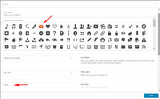
the tool gave the shortcode for the icon:
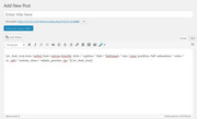
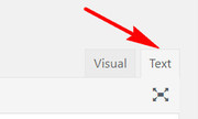
you could use the shortcode as is, but I want to remove the left alignment, so I used this code:[av_font_icon icon='ue805' font='entypo-fontello' size='20px'][/av_font_icon]I then pasted it in your text editor in the “text” tab, not the visual tab:
Please give this a try if you want to add more icons.Best regards,
MikeJanuary 22, 2019 at 9:22 am #1057112Thanks so much.
I have a weird new problem: When I go to eg TEAM in the top menu, and then click in the top menu on KRYPTOWÄHRUNG, it jumps correctly to my HOME page again, but not to KRYPTOWÄHRUNG – it jumps to the anchor above.
Do you know how to solve this problem?
THANKS NoraJanuary 23, 2019 at 4:36 am #1057553Hi,
I have researched this and found that it may be a result of the scroll script firing before the page is fully loaded, others found using the plugin Page scroll to id delayed the script a few seconds and solved the issue. Please give this a try.Best regards,
MikeJanuary 23, 2019 at 9:02 am #1057630Thanks, I installed it and it works, however now it scrolls too far down so you cannot read the headline of the anchor section, or the upper part of it. Do you know what I could do to get it further up?
THANKS NoraJanuary 23, 2019 at 10:36 am #1057661So I put in an empty text called eg. <div id=”gold”></div> – according to my anchors. So now the anchor also shows the upper part.
HOWEVER: Now the anchors don’t highlight the corresponding menu item on my home page. So if I jump to KRYPTOWÄHRUNG, it jumps to the correct section, but highlights another menu item on top. Also, if I just scroll down it doesn’t highlight HOME in my menu on top, then CBCI SYSTEM as the next section, but KRYPTOWÄHRUNG.
That’s so weird.January 23, 2019 at 4:23 pm #1057786I also have a problem on my mobile version:
1. The hometab issue, with increasing the space between the tab items – can we void this only for the smartphone version because it looks all screwed up and overlapped.
2. Kontakt cannot be clicked at in the menu, because it has submenu items.
3. Is there a way to highlight the according page in the menu – so I can see in the menu on what page I am?
Thanks NoraJanuary 23, 2019 at 10:36 pm #1057959I could solve a couple of issues. What remains is:
1. So I put in an empty text called eg. <div id=”gold”></div> – according to my anchors. So now the anchor also shows the upper part.
HOWEVER: Now the anchors don’t highlight the corresponding menu item on my home page. So if I jump to KRYPTOWÄHRUNG, it jumps to the correct section, but highlights another menu item on top. Also, if I just scroll down it doesn’t highlight HOME in my menu on top, then CBCI SYSTEM as the next section, but KRYPTOWÄHRUNG.
That’s so weird.2. ON MOBILE VERSION: Is there a way to highlight the according page in the menu – so I can see in the menu on what page I am?
Thanks NoraJanuary 24, 2019 at 6:44 am #1058034Hi,
For the according titles, right now the title becomes darker and a arrow shows under the active item, what kind of highlighting did you want, and would it be in addition to this?For your main menu items, I found that the “Page scroll to id” plugin, that you have installed, added classes to the menu that worked well for on-page anchors and for page-to-page linking, so I wrote this css to disable the theme actions and use the plugin:
#top #header .av-main-nav > li.current-menu-item > a{color:#b1b6c3 !important; }
#top #header .av-main-nav > li.current-menu-item > a .avia-menu-text, #top #header .av-main-nav > li.current-menu-item > a .avia-menu-subtext{color:#b1b6c3 !important;}
.av-main-nav li:hover .avia-menu-fx, .current-menu-item > a > .avia-menu-fx, .av-main-nav li:hover .current_page_item > a > .avia-menu-fx{opacity: 0 !important;  visibility: hidden !important; }

a.mPS2id-clicked span.avia-menu-fx,a.mPS2id-highlight span.avia-menu-fx {
    background-color: #4875cf !important;
    opacity: 1 !important;
    visibility: visible !important;
}
#top #header .av-main-nav > li > a.mPS2id-clicked .avia-menu-text,#top #header .av-main-nav > li > a.mPS2id-highlight .avia-menu-text {
    color: #ffffff !important;
}
#top.page-id-3344 #header .av-main-nav > li > a.mPS2id-clicked .avia-menu-text,#top.page-id-3344 #header .av-main-nav > li > a.mPS2id-highlight .avia-menu-text {
    color: #4875cf !important;
}
a.mPS2id-clicked-first span.avia-menu-fx,a.mPS2id-highlight-first span.avia-menu-fx {
    background-color: #4875cf !important;
    opacity: 0 !important;
    visibility: hidden !important;
}
#top #header .av-main-nav > li > a.mPS2id-clicked-first .avia-menu-text,#top #header .av-main-nav > li > a.mPS2id-highlight-first .avia-menu-text {
    color: #b1b6c3 !important;
}
I added it to your WordPress > Customize > Additional CSS because it typically overrides theme css very well.
Please clear your browser cache and check.Best regards,
MikeJanuary 24, 2019 at 12:41 pm #1058123Thanks so much.
But somehow the menu has changed.
DESKTOP VERSION:
I had the menu items that showed the according page, so eg. the menu item NEWS when being on the NEWS page highlights in WHITE with a blue underlining. I do have that now only, but as soon as I start scrolling, the highlighting and the underline disappears, and you don’t see on what page you currently are. How can I change that?AND: On my HOME page shouldn’t HOME be highlighted in white when the ohter anchors on HOME are not active?
MOBILE VERSION: Is there a way to highlight the according page in the menu – so I can see in the menu on what page I am? So if I go to NEWS and look up the menu again, NEWS is in a different color than the rest of the menu items – so I see on what page I’m on?
THANKS SO MUCH FOR ALL THE HELP. I REALLY APPRECIATE IT!
January 24, 2019 at 3:03 pm #1058170Hi,
I made an adjustment to the menu items for “News” & “Kontakt” so now they stay highlighted when scrolling down.
The “team” was white on white so I added your blue to it, let me know if it’s ok.
Please clear your browser cache and check.“Home” was causing some trouble with the other menu items, it wants to always be on, I will try to work on it some more.
For the mobile menu, sorry I misunderstood, so what color do you want the “News” & “team” & “Kontakt” menu color? Then are all white right now, if not a color I think we can add the line under the active mobile menu item.
But please note that for the other mobile menu items: you have to scroll to the top of the page to see the mobile menu, so “CBCI-SYSTEM” “WIE WIR ARBEITEN” & “KRYPTOWÄHRUNGEN” can’t highlight, because you will always be at the top.
Best regards,
MikeJanuary 24, 2019 at 4:15 pm #1058213Would it be possible for NEWS to have the lower blue underlinke on click, just like KONTAKT ? Because right now it’s up.
And the submenu items IMPRESSUM und DATENSCHUTZ under KONTAKT, would they also stay highlighted when clicked?
One weird thing, when I scroll down the menu item KRYPTOWÄHRUNG starts highlighting to early.How did you set all this, somewhere in the style sheet or can I look it up somewhere?
MOBILE: OK, I understand the problem. What would I have to add if I wanted the current page highlighted in #4875cf ?
THANKS SO MUCH!January 25, 2019 at 7:35 am #1058505Hi,
The “News” header is “Transparent header with frame”
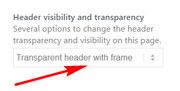
The “KONTAKT” header is “No transparency”
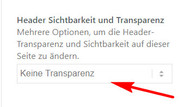
Please choose matching header options for both pages to match.
I corrected the submenu items IMPRESSUM und DATENSCHUTZ under KONTAKTFor mobile menu I created the highlighting you asked for, Please clear your browser cache and check.
While working on the highlighting for the mobile menu, I discovered that at the screen width that the slider changes the image the menu creates an error as if the ID for KRYPTOWÄHRUNG is hit, I believe that this is related to the scroll error and the original anchor error with KRYPTOWÄHRUNG. I don’t know your slider plugin very well, so can you look in the slider for any hash tags or ID’s or links that are in your slider layers, or titles. Please see the screenshot of the one causing the error. We could solve a lot of issues if we find it.
Otherwise I can write some css to solve this mobile menu error, but not for the full size menu early scroll down error.Best regards,
MikeJanuary 25, 2019 at 9:45 am #1058575Thanks for your help.
I could solve the probelm with the anchor for KRYPTO!
I still have the following troubles:
1. TEAM: When I scroll down, is it possible to have the word TEAM in the menu turn white like the others? But only on scroll down?
2. My mouse-overs were gone. So I set it again in extended styling to #4875cf. Now on some pages it works, on others it doesn’t. On NEWS, TEAM, IMPRESSUM, DATENSCHUTZ it doesn’t work. Is this due to the fact that the TRANSPARENT HEADER is kicking in on these pages? Is there a way to get the MOUSE-OVER to #4875cf on these pages as well?
3. HOME doesn’t highlight or shows a mouse-over whatsoever?
4. ON MOBILE: Thanks for the coloring of the active page. How did you do that? Do I need to set a clone to be able to click on HOME and KONTAKT or is there a way to avoid the double naming in the menu?THANKS NOra
January 25, 2019 at 9:59 am #1058581IN ADDITION TO THE PREVIOUS MESSAGE:
I have tried a different version of my current project with a flyout menu and would like to know, how I can set the menu itmes in a different color when being on that particular page or section (I set anchor on my HOME page).
So if I click on eg. NEWS and then look up the menu again, the word NEWS is in #4875cf – so the user knows immediately on what page he is on.
ON MOBILE: In this case I didn’t have to set a clone and can still click on HOME and KONTAKT with a submenu item. Why is that?January 25, 2019 at 6:39 pm #1058854Thanks for your help.
I could solve the probelm.
I still have the following troubles:
1. TEAM: When I scroll down, is it possible to have the word TEAM in the menu turn white like the others? But only on scroll down?
2. HOME doesn’t highlight or shows a mouse-over whatsoever?
3. ON MOBILE: Do I need to set a clone to be able to click on HOME and KONTAKT or is there a way to avoid the double naming in the menu?On my other setup (wordpress2) I got the active pages to be highlighted when on that page. But now on HOME I have all anchors highlighted at the same time. See access info below.
January 26, 2019 at 12:39 am #1058964Hi,
Glad to hear that you solved the anchor problem with KRYPTO, do you mind explaining what you found? Just because it eluded me for so long I’d like to know what I missed.
Did you decide not to use the other site and menu? It looks like we are starting over with a different menu?Best regards,
Mike -
AuthorPosts
- The topic ‘Tab Section – increase space for tab title’ is closed to new replies.