Forum Replies Created
-
AuthorPosts
-
Hi,
I believe that it can show limited text shortcodes, like headlines because it is a text field, but you can open a new post and use the shortcode wand to test. CategoryTinymce along with other Tinymce addons are not going to get the shortcode wand, they are not compatible.Best regards,
MikeHi,
Please try this code in the General Styling > Quick CSS field or in the WordPress > Customize > Additional CSS field:@media only screen and (max-width: 767px) { .flex_column.av_one_half.flex_column_div.av-zero-column-padding.avia-builder-el-11 { z-index: 0 !important; } }After applying the css, Please clear your browser cache and check.
Best regards,
MikeFebruary 17, 2020 at 11:37 am in reply to: Active menu indicator and separator between menu items aren't display #1185162Hi,
Glad we were able to help, we will close this now. Thank you for using Enfold.For your information, you can take a look at Enfold documentation here
For any other questions or issues, feel free to start new threads in the Enfold forum and we will gladly try to help you :)Best regards,
MikeFebruary 16, 2020 at 11:33 pm in reply to: Add icon list on all pages of my website, including product page? #1185032Hi,
It looks like you were missing a bracket, please try this:add_action('ava_before_footer', 'ava_before_footer_mod'); function ava_before_footer_mod() { if(!is_page(array(662))) { echo do_shortcode("[MY OWN SHORTCODE]"); } }if you want to add more pages add a comma and the next number like this:
if(!is_page(array(206,644))) {Best regards,
MikeHi,
Thank you for the video it helps show what you are seeing, but I don’t see this on Safari. Does your site use any content delivery networks (CDN)? If so I could be seeing a different set of files because I’m in a different part of the world.
You could ask your webhost to clear any server cache and CDN, which could take 24 hrs, and then clear your cache and history again and check.Best regards,
MikeFebruary 16, 2020 at 10:48 pm in reply to: new icon instagram on social profile and bottom like others #1185025Hi,
Sorry for the late reply, sorry for the confusion, when I suggested to disable smush lazy load I meant as a test to see if your problem was resolved, which was, restore your logo, if it didn’t help then it is fine to enable. But if your problem was resolved then you probably do not want to enable.
When I see your site today your logo is visible was it related to the plugin?Best regards,
MikeHi,
Glad we were able to help, we will close this now. Thank you for using Enfold.For your information, you can take a look at Enfold documentation here
For any other questions or issues, feel free to start new threads in the Enfold forum and we will gladly try to help you :)Best regards,
MikeHey rokhead,
Sorry for the late reply, I had not used Incarnation, but from reading your description and viewing your link, Enfold doesn’t have a built-in way to display a page in a grid layout. But I was able to achieve this with a plugin Add Category to Pages

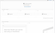
this is the backend view were each “blog post” element is displaying a single page pulling the featured image, title, read more link and custom excerpt:
After installing the plugin I created 3 categories for pages, adding one page to each category, ensuring the pages had featured images and custom excerpts. Custom excerpts must be used if you have built the pages with the Advanced Layout Builder, the “excerpt” field is typically at the bottom of the page, and to turn it on click on the “screen options” tab at the top of the screen:
Then in the blog post element choose “Display entries from a custom taxonomy” + Grid Layout + “Title and Excerpt + Read More Link”
under the styleing tab I choose one for “Blog Grid Columns” and no Pagination, but I guess you could also choose 3 “Blog Grid Columns” with 3 entrys from the same page category for a similar result.Best regards,
MikeHi,
Please try this code in the General Styling > Quick CSS field or in the WordPress > Customize > Additional CSS field:#top.page-id-2864 .main_color .avia-builder-el-77 .avia-color-theme-color.avia-button { background-color: #ffffff; border-color: #ffffff; border-style: solid; } #top.page-id-2864 .main_color .avia-builder-el-77 .avia-color-theme-color.avia-button:hover { background-color: #24305e; border-color: #24305e; border-style: solid; color: #ffffff; } #top.page-id-2864 .main_color .avia-builder-el-77 .avia-color-theme-color.avia-button > span.avia_iconbox_title { color: #24305e; } #top.page-id-2864 .main_color .avia-builder-el-77 .avia-color-theme-color.avia-button:hover > span.avia_iconbox_title { color: #ffffff; }this css only works with the one button you linked to above and uses the temp class “avia-builder-el-77” but this could change if you move elements around on your page. Please try adding custom classes to your buttons, which will not change:
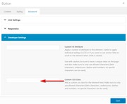
and you can use the same custom classes for all of the buttons with the same style, such asblue-hoverBest regards,
MikeHi,
I believe from your description this is due to the first element has no padding or margin on the top or left and the last item has no padding or margin on the top or right.
So to achieve this:

try some css like this:article.slide-entry { box-shadow: 1px 1px 30px 3px #cccccc !important; border: 1px solid #eeeeee !important; } .slide-entry.av_one_third,.slide-entry.av_one_third.first { margin-left: 2% !important; margin-right: 2% !important; margin-top: 2% !important; width: 28% !important; }please adjust this for your site, if you need further help then please include a link to your page.
Best regards,
MikeHi,
Thank you for the link, to apply this to your site please try this code in the General Styling > Quick CSS field or in the WordPress > Customize > Additional CSS field:.flex_column.av_one_third { webkit-transition: -webkit-transform .15s cubic-bezier(.4,0,.2,1); transition: -webkit-transform .15s cubic-bezier(.4,0,.2,1); transition: transform .15s cubic-bezier(.4,0,.2,1); transition: transform .15s cubic-bezier(.4,0,.2,1), -webkit-transform .15s cubic-bezier(.4,0,.2,1); } .flex_column.av_one_third:hover { -webkit-transform: scale(1.1); transform: scale(1.1); }While this does work, I recommend that to add a custom class to the 3 columns and add that to your css so that the css won’t be working on all 1/3 columns.
After applying the css, Please clear your browser cache and check.Best regards,
MikeHey schweg33,
Thank you for the link, I have taken a look at your page, and find that your white color in “Herzlich willkommen” comes from this custom code:/*Farbsection Breite*/ #top.home #av_section_1 > div.container { background-color: #ffffff !important;So you can change that color code in your child theme stylesheet or in your Enfold Theme Options > General Styling > Quick CSS field, I’m not sure which place it is at on your site.
If you can not find it the Please try this code in the General Styling > Quick CSS field or in the WordPress > Customize > Additional CSS field:#top.home #wrap_all #main #av_section_1 > div.container { background-color: #ECF2E0 !important; }and adjust the color code to suit, After applying the css, Please clear your browser cache and check.
Best regards,
MikeHey traypup,
Sorry for the late reply, I normally use fontello and it will convert your svg into fonts, I see that FlatIcon has the “collection” area if you sign up with them, perhaps this is the same function. You could also try IcoMoonBest regards,
MikeHi,
Sorry for the late reply, I have taken a look at your “giving” page on both desktop and mobile. The fullwidth sub-menu is not designed to be sticky for mobile, that’s why it’s disabled by default. There have been modifications to try to achieve this and is why you are getting the jumping and it is breaking away from the “sticky_placeholder” the “blue area”.
I tried recreating your page and found that without modifications the sub-menu can stick to the top with this javascript at the end of your functions.php file in Appearance > Editor:function custom_script(){ ?> <script> (function($){ $(document).ready(function(){ var scroll_start = 0; var startchange = $('#sub_menu1'); var offset = startchange.offset(); if (startchange.length){ $(document).scroll(function() { scroll_start = $(this).scrollTop(); if(scroll_start > offset.top) { document.getElementById('sub_menu1').classList.add('sticky-top'); } else { document.getElementById('sub_menu1').classList.remove('sticky-top'); } }); } }); })(jQuery); </script> <?php } add_action('wp_footer', 'custom_script');and this css:
.sticky-top {
    position:fixed!important;
    top:0!important;
    z-index:10000!important;
}
please see the screencast in the Private Content area.
I’m not sure where the modifications are on your site, but if you can remove them then this should work for you on Enfold v4.7.3
It looks like you are using v4.5.7, so that could be another factor.Best regards,
MikeFebruary 15, 2020 at 10:15 pm in reply to: Replace Icon Box or Icon List icons with images? #1184868Hi,
Thank you for the login, I took a look at the icon file that you uploaded and found that the correct code for the icon is\e800with the font-family “herz” so I changed this in your Quick CSS and in your child theme stylesheet.
I also changed your padding-left from 8px to 18px so the icon would not overlap your text.
Please clear your browser cache and check.Best regards,
MikeFebruary 15, 2020 at 9:46 pm in reply to: Active menu indicator and separator between menu items aren't display #1184857Hey Empatica,
Thank you for the login, your menu items didn’t contain the span class “avia-menu-fx” which is how the active menu indicator is shown, but once I set the “Leader Theme Menú principal” to one of your menus these were added.
Please check now your menu is working correctly now.Best regards,
MikeHey Funk86,
Sorry for the late reply, the blog layout can be changed at Enfold Theme Options > Blog Layout > Blog Layout
I’m not sure how your plugin “WPJobManager” would change this.Best regards,
MikeFebruary 15, 2020 at 1:46 pm in reply to: Add icon list on all pages of my website, including product page? #1184733Hi,
Below I have linked to two updated files, please move them to your
\wp-content\themes\enfold\lang\ via FTP and save your original files for fallback.
https://www.dropbox.com/sh/st1yefvuahvv7sg/AAChKsCgkCTI9yXv8_XGWOK8a?dl=0this example adds “!is_page” so add the pages you don’t want it to show on
https://pastebin.com/vPvJ0Pym
Best regards,
Mike-
This reply was modified 2 years, 1 month ago by
Yigit.
February 14, 2020 at 11:56 pm in reply to: Add icon list on all pages of my website, including product page? #1184631Hi,
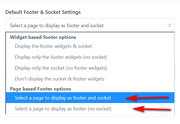
I see that your site language is french, when you edit your option for the footer page do you see two options for the footer like this:
The french language file had a couple of errors so this could be another one.Best regards,
MikeHi,
If you add a snippet to your parent theme functions.php then it will be lost on your next update, that holds true for any file you edit.
You could use a plugin like: My Custom FunctionsBest regards,
MikeHi,
A child theme is recommended by WordPress and Enfold, and it is included with EnfoldBest regards,
MikeHey bramblejam,
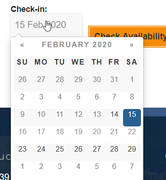
Thanks for the link, please try this css#footer { z-index: 0; } .datepicker.datepicker-dropdown { z-index: 50; }Expected results
Best regards,
MikeFebruary 14, 2020 at 12:38 pm in reply to: Create a dropdown menu on regular button in the page (not menu) #1184467Hi,
That is because this is not your thread, it belongs tokilimatsBest regards,
MikeHi,
I recommend using a child theme, Read about using a Child ThemeBest regards,
MikeHi,
It looks like the social icons are shortcode in a text widget, if this is correct please try recreating them from scratch and then use a “Custom HTML” widget.Best regards,
MikeFebruary 13, 2020 at 1:31 pm in reply to: Create a dropdown menu on regular button in the page (not menu) #1184127Hi,
Thanks for the login, but I see that you have 3 errorsUncaught SyntaxError: Unexpected token '<'it looks like line brakes in your scripts<br />
Please see the screenshot in Private Content area.Best regards,
MikeHi,
When I check the testing site is working correctly, the live site still has thehttp://sswim.ruerrors
I believe the error is outside of the theme files, so it remains when you try to overwrite the live site.
I would delete the live site, theme, WordPress, & directory, then install WordPress again clean from scratch, then upload a new clean version of Enfold, from scratch. Then export the one layerslider slide from the test site and import into the clean site and add it to the homepage.Best regards,
MikeFebruary 13, 2020 at 12:51 pm in reply to: Add icon list on all pages of my website, including product page? #1184123Hi,
When you select a page to use as a footer the current socket is included, so you only have to use the Advanced Layout Builder to create a new footer on the page.
I tested the ava_before_footer hook and it was added to every page, store, product, checkout. I think this is a better hook for you. So this shortcode is just a grid row which is colored yellow and green so it will stand out on the pages so you can test.
Try adding this code to the end of your functions.php file in Appearance > Editor: https://pastebin.com/jPBP0ZEH
If you like the placement then replace with your shortcode.Best regards,
Mike-
This reply was modified 2 years, 1 month ago by
Hi,
@Illingco, what I meant was that adding a blank space into the Quick CSS changes the css by one blank space, thus the theme writes a new file. You can copy the function into your theme’s functions.php, as I posted it.
If you don’t feel comfortable doing this, please include an admin login and FTP access in the Private Content area and we could assist.
@goldengate415, this seems to occur on some servers, we have not been able to recreate.Best regards,
MikeFebruary 13, 2020 at 11:31 am in reply to: dynamic-avia causes over usage on server…it's enough. Care to solve please? #1184106 -
This reply was modified 2 years, 1 month ago by
-
AuthorPosts