Forum Replies Created
-
AuthorPosts
-
Hi,
Thank you for your patience, I’m not sure what this could be, I have asked the rest of the team for advice.Best regards,
MikeHi,
Try adding this code to the end of your child theme functions.php file in Appearance ▸ Editor:function ajax_not_found_text() { ?> <script> (function($){ setInterval(function () { $('#searchform .ajax_search_response .av_ajax_search_entry.ajax_not_found .av_ajax_search_content .av_ajax_search_title').text(function(index, text) { return text.replace('Entschuldigung, aber kein Eintrag erfüllt Deine Suchkriterien', 'Entschuldigung, nicht gefunden'); }); }, 50); })(jQuery); </script> <?php } add_action('wp_footer', 'ajax_not_found_text');adjust the Entschuldigung, nicht gefunden text to suit
Best regards,
MikeHi,
Thank you for your patience, please try this code in the General Styling ▸ Quick CSS field or in the WordPress ▸ Customize ▸ Additional CSS field:#top.home #av-layout-grid-1 { z-index: 5; } #top.home #av_section_2 { z-index: 1; }the expected results:

Best regards,
MikeHi,
To change the mobile search icon size try this css:@media only screen and (max-width: 767px) { .responsive #top #wrap_all .menu-item-search-dropdown > a { font-size: 12px !important; } }and adjust to suit.
To stop the search form from submitting with the enter key, try adding this code to the end of your child theme functions.php file in Appearance ▸ Editor:function custom_script() { ?> <script> (function($) { $('#menu-item-search').click(function(){ setTimeout(function(){ $("form").attr('onSubmit', 'return false'); },500); }); })(jQuery); </script> <?php } add_action('wp_footer', 'custom_script');As for the search field on the iPhone view zooms in, this is the iPhone itself and we can not change.
Best regards,
MikeMay 4, 2022 at 12:56 pm in reply to: Enfols multilanguage site using child and parents sub-directories on WP basis #1350465Hi,
Sorry to confuse you, I said that I wouldn’t use the multisite option in the installer, not that you couldn’t use it for multilanguage purposes, this is different.
Yigit said above, “create separate installation for each language” in sub directories.
So at this point you would create 4 sub-directories in your Public html then use the WordPress installer to install WordPress in each of those sub-directories, as the screenshot above, then add a language switcher widget to the header to each of the 4 installs that link to each of the sites.Best regards,
MikeHi,
As I understand your question, you have added the Google Adsense code to your site and enabled Auto Ads, and your screenshot shows an Adsense Ad, but you want a different size?
You should use the Ad Settings Preview in your Google Adsense account to adjust how the ads will look on your site.
There is no place in the theme to edit the ads because the Google Adsense code scans your site and places the ads automatically, read more here: About Auto ads

I don’t use Google Adsense so there are probably a lot more settings that you can change in your Google Adsense account to adjust how the ads will look on your site, I recommend looking for some tutorials on youtube to see how to make these customizations.Best regards,
MikeMay 3, 2022 at 5:32 pm in reply to: Remove closing area and enlarge images on mobile at ajax portfolio preview #1350366Hi,
Glad to hear, your css looks good, I’m glad you sorted this out.
If you have any further questions please create a new thread and we will gladly try to help you. Thank you for using Enfold.Best regards,
MikeHi,
I don’t know about the smash balloon plugin, but it sounds like you have a few sites displaying the same Instagram account, I recommend trying to disable all of these and wait 24 hours for Instagram to refresh, then try the simple Enfold widget to see if will display. I suggest this one because it doesn’t use any API. If this doesn’t work please disable and I will try again on my demo site, hopefully after Instagram stops giving the error: Instagram returned error 429 (= Too Many Requests) the Enfold widget should work for you, then you can try the smash balloon plugin on your other site and see if it works again.
I’m not sure if Instagram has some limitation on the number of requests that can be made to your account, but it sounds like there might be based on the error message. Try checking with Instagram to see if there is.Best regards,
MikeHi,
Thanks for sharing Guenni007, Vera, if you have any further questions please create a new thread and we will gladly try to help you. Thank you for using Enfold.Best regards,
Mike** Update **
If you find that the lightbox does not start with the first image of the gallery order you can try this script instead:function text_link_to_gallery_lightbox() { ?> <script type="text/javascript"> (function($) { $(document).on('click', '.text_to_lightbox a', function(event) { event.preventDefault(); var linkTarget = $(this).attr('href'); $(linkTarget).find("a.first_thumb:first").click(); }); })(jQuery); </script> <?php } add_action('wp_footer', 'text_link_to_gallery_lightbox');This is the reasoning behind the change.
-
This reply was modified 3 years, 10 months ago by
Mike. Reason: behavior reported in another thread
Hi,
Please try this code in the General Styling ▸ Quick CSS field or in the WordPress ▸ Customize ▸ Additional CSS field:#top #searchform .ajax_search_response h4 { letter-spacing: 0.10em !important; padding-bottom: 10px; } #top #searchform .ajax_search_response { padding-bottom: 10px; }adjust the padding-bottom & letter-spacing to suit.
After applying the css, please clear your browser cache and check.Best regards,
MikeHi,
Thanks for the feedback, yes these banners created with bannerboo don’t scale, I noticed these in another thread you had, they are created in an iframe with many elements and each element has a height & width position of absolute.
To scale correctly the elements should have the positions set to relative, an iframe must be changed at the source.
The only solution I can think of is to use media queries to hide this banner at the smaller screen sizes and display a standard image banner instead.Best regards,
MikeHey Vera,
Please try this solution.Best regards,
MikeHi,
Glad to hear, try changing the top and bottom padding to zero from 10px with this css:#top #menu-item-search .av_ajax_search_entry { padding: 0px 16px; }If that is too close together try changing the top and bottom padding to 5px like this:
#top #menu-item-search .av_ajax_search_entry {
    padding: 5px 16px;
}
try adjust the number to suit.
After applying the css, please clear your browser cache and check.Best regards,
MikeHi,
Thanks for your feedback, I tested the cooper-hewitt zip that I linked above on my demo site closer and it seems that each of the font files have the same font-weight of 400, which is odd, so I believe that when you try to use bold by changing the font-weight to 700 it was making it blurry, I believe this was also messing up the way the font manager works, if you see our documentation on Managing font variants the font family should show with its variants like this:

but this font was not, so I tried zipping each variant on it’s own and uploading them one at a time as shown in our documentation on File Structure, note in this screenshot that they all have the same font-weight:

then I created a test page with spans and custom classes to test the fonts:<span class="cooperhewitt-thin">Cooper Hewitt - thin</span> <span class="cooperhewitt-light">Cooper Hewitt - light</span> <span class="cooperhewitt-book">Cooper Hewitt - book</span> <span class="cooperhewitt-medium">Cooper Hewitt - medium</span> <span class="cooperhewitt-semibold">Cooper Hewitt - simibold</span> <span class="cooperhewitt-bold">Cooper Hewitt - bold</span> <span class="cooperhewitt-heavy">Cooper Hewitt - heavy</span>and added this css for the custom classes:
.cooperhewitt-thin {
	font-family: 'cooperhewitt-thin-webfont';
	font-weight: 400;
	font-size: 70px;
	line-height:70px;
	color: #000;
}
.cooperhewitt-light {
	font-family: 'cooperhewitt-light-webfont';
	font-weight: 400;
	font-size: 70px;
	line-height:70px;
	color: #000;
}
.cooperhewitt-book {
	font-family: 'cooperhewitt-book-webfont';
	font-weight: 400;
	font-size: 70px;
	line-height:70px;
	color: #000;
}
.cooperhewitt-medium {
	font-family: 'cooperhewitt-medium-webfont';
	font-weight: 400;
	font-size: 70px;
	line-height:70px;
	color: #000;
}
.cooperhewitt-semibold {
	font-family: 'cooperhewitt-semibold-webfont';
	font-weight: 400;
	font-size: 70px;
	line-height:70px;
	color: #000;
}
.cooperhewitt-bold {
	font-family: 'cooperhewitt-bold-webfont';
	font-weight: 400;
	font-size: 70px;
	line-height:70px;
	color: #000;
}
.cooperhewitt-heavy {
	font-family: 'cooperhewitt-heavy-webfont';
	font-weight: 400;
	font-size: 70px;
	line-height:70px;
	color: #000;
}
and this is the result:

please give this a try.Best regards,
MikeHi,
Glad we were able to help, if you have any further questions please create a new thread and we will gladly try to help you. Thank you for using Enfold.Best regards,
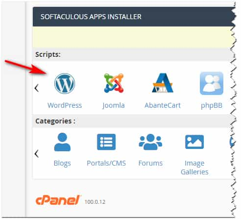
MikeMay 1, 2022 at 6:34 pm in reply to: Enfols multilanguage site using child and parents sub-directories on WP basis #1350123Hi,
The app-installer ▸ Wp icon ▸ insatall now should bring you to a screen like this:

from there add your subdirectory that you added in your Public html.
you will need to add a new user name and password because this will be a stand-alone install, to make it easy for your self you can use the same login that you use on your master site.
you don’t need to set anything in “advanced options”.
I don’t have experience with the multisite option, so I wouldn’t use this, but perhaps it would be good for you, try looking on YouTube for some tutorials.Best regards,
MikeMay 1, 2022 at 1:54 pm in reply to: Enfols multilanguage site using child and parents sub-directories on WP basis #1350117Hi,
Thanks for your question,
1: yes you will need to install WordPress again in the sub-directory
2: they are saying that you are downloading the zip to your computer and extracting it, then in your FTP client one side shows your computer and the other side shows your web host.There is an easier way if you are using cPanel on your webhost, what webhost are you using?
does your webhost look a little like this:

or do you see this:
If so you can choose your subdirectory in the install wizard and let the installer set up the database and files for you
just make sure not to install in the same directory as your first WordPress site or it will be overwritten.Best regards,
MikeHey Vivienne,
Thanks for the feedback but I’m not able to reproduce this with Enfold v4.9.2.1, this version is like you stsated above:

but the the MailChimp widget works correctly on my test site:

I also tested the MailChimp element and it also works:

Perhaps you are using a child theme with a custom header.php or footer.php and you need to update those to the current version, or perhaps you have some other modification, or you are trying to use the MailChimp widget in some function?
In a clean install the MailChimp widget is working in my tests, try testing in a clean environment such as a staging site to see if you can reproduce the error, if so please open a new thread by logging into the support forum, you have posted this to an email form and is not the correct place, this is the correct place.Best regards,
MikeHi,
Glad we were able to help, if you have any further questions please create a new thread and we will gladly try to help you. Thank you for using Enfold.Best regards,
MikeMay 1, 2022 at 12:00 am in reply to: Top of page hidden by header ribbon on mobile – but only on one page! #1350096Hey Shari,
Thanks for the link to your page and the screenshot, please try this code in the General Styling ▸ Quick CSS field or in the WordPress ▸ Customize ▸ Additional CSS field:@media only screen and (max-width: 454px) { .html_header_top.html_header_sticky #top.page-id-1471 #wrap_all #main { padding-top: 126px !important; } }After applying the css, please clear your browser cache and check.
Best regards,
MikeHi,
Glad Ismael could help, if you have any further questions please create a new thread and we will gladly try to help you. Thank you for using Enfold.Best regards,
MikeHi,
Glad Nikko was able to help, if you have any further questions please create a new thread and we will gladly try to help you. Thank you for using Enfold.Best regards,
MikeHi,
Glad we were able to help, if you have any further questions please create a new thread and we will gladly try to help you. Thank you for using Enfold.Best regards,
MikeApril 30, 2022 at 11:42 pm in reply to: Remove closing area and enlarge images on mobile at ajax portfolio preview #1350087Hey fkm,
Thanks for the link to your site and the screenshot, please try this code in the General Styling ▸ Quick CSS field or in the WordPress ▸ Customize ▸ Additional CSS field:#main .ajax_controlls { display: none; } #top #main .portolio-preview-list-image, #top #main .portolio-preview-list-image img { border: none; margin: -1px; } @media only screen and (max-width: 767px) { .responsive #top #wrap_all #main .portfolio_preview_container.open_container { width: 101vw !important; position: relative !important; left: calc(-50vw + 50%) !important; } }Best regards,
MikeHey koomo,
Thanks for the link to your page, from what I see the Select People is given the background color by the plugin when the toggle is opened, this seems to be the correct behavior, but if you want to remove it try this code in the General Styling ▸ Quick CSS field or in the WordPress ▸ Customize ▸ Additional CSS field:.yith-booking--simple-style .yith-wcbk-people-selector--opened .yith-wcbk-people-selector__totals { background: none !important; color: #484848; }to show the dropdown selections try this css:
.yith-wcbk-people-selector--opened .yith-wcbk-people-selector__fields-container {
    position: relative;
}
After applying the css, please clear your browser cache and check.
the expected results:

Best regards,
MikeHi,
Glad Nikko was able to help, I disabled the debug mode, please check. Shall we close this thread then?Best regards,
MikeHi,
Glad we were able to help, if you have any further questions please create a new thread and we will gladly try to help you. Thank you for using Enfold.Best regards,
MikeHey NThiem,
Thanks for the link to your site and for the screenshots, Please try this code in the General Styling ▸ Quick CSS field or in the WordPress ▸ Customize ▸ Additional CSS field:#top .av_minimal_header #header_main { border: 1px solid rgba(0,0,0,0.25); }Feel free to adjust the color to suit, after applying the css, please clear your browser cache and check.
Best regards,
MikeApril 30, 2022 at 10:04 pm in reply to: Enfold Theme – Instagram Side Bar Widget Not Working #1350074Hey gfriend70,
I’m not sure why you are getting this error, I tested by adding an Instagram HTML embed below your widget and it is working, when I try adding a Instagram widget to my test site I get this error: Instagram returned error 429 (= Too Many Requests).
But your site just gives this error: Instagram has returned invalid data.
I’m not sure why we would get different error messages except that my demo site has no plugins and is in the US?Best regards,
Mike -
This reply was modified 3 years, 10 months ago by
-
AuthorPosts
