Forum Replies Created
-
AuthorPosts
-
Hi,
Glad we were able to help, if you have any further questions please create a new thread and we will gladly try to help you. Thank you for using Enfold.Best regards,
MikeHi,
Glad Yigit could help, if you have any further questions please create a new thread and we will gladly try to help you. Thank you for using Enfold.Best regards,
MikeApril 14, 2023 at 12:30 am in reply to: Link to an accordion’s tab scrolls too much down and hides the tab’s title #1404424Hi,
If you are using the custom class link-to-accordion then this should work:function anchor_offset_with_slow_scroll() { ?> <script> (function($) { $('a.link-to-accordion[href*=#]:not([href=#])').click(function() { if (location.pathname.replace(/^\//,'') == this.pathname.replace(/^\//,'') && location.hostname == this.hostname) { var target = $(this.hash); target = target.length ? target : $('[name=' + this.hash.slice(1) +']'); if (target.length) { $('html,body').animate({ scrollTop: target.offset().top - 100 //offsets for fixed header }, 1000); return false; } } }); }(jQuery)); </script> <?php } add_action('wp_footer', 'anchor_offset_with_slow_scroll');If not then please add the class to the test link Comparing WPML
Best regards,
MikeApril 14, 2023 at 12:18 am in reply to: Need to display a hamburger for the secondary menu for mobile #1404423Hey guychalk,
Thanks for your question but this is not a feature and would not be easily achieved.
I see that on mobile your secondary menu is at the top and the link text is large, two options that I can think of would be to decrease the font size to make the links easier to read, or make each link full width so the links are stacked instead of side-by-side. If you would like help to achieve one of these let us know.Best regards,
MikeApril 14, 2023 at 12:02 am in reply to: White Screen of Death – when activating Enfold theme #1404420Hi,
Does this occur when you activate the parent theme or the child theme or both?
What webhost are you using, is it a managed webhost with a “must-use” or “drop-in” cache plugin?
If so ask your webhost to disable the must-use plugin and clear the server cache and leave the plugin disabled for now. Are you also using a CDN? If so try disabling and clearing.
Object-oriented caches can serve damaged files and be hard to clear.Best regards,
MikeHi,
Thank you for your patience, I changed the original sub-menu code to this and it seems to have corrected the issue, please clear your browser cache and check.add_action('ava_after_main_container', 'ava_after_main_title_mod'); function ava_after_main_title_mod() { if(is_product()) { echo do_shortcode("[av_submenu which_menu='' menu='58' position='center' sticky='aviaTBsticky' color='main_color' mobile='disabled' mobile_switch='av-switch-768' alb_description='' id='' custom_class='' template_class='' av_uid='av-ldyiqu1t' sc_version='1.0'] [av_submenu_item title='Élément 1 de menu' button_style='' link='' linktarget='' av_uid='av-gb0n7' sc_version='1.0'] [av_submenu_item title='Élément 2 de menu' button_style='' link='' linktarget='' av_uid='av-bn1kr' sc_version='1.0'] [/av_submenu]"); } }Best regards,
MikeApril 13, 2023 at 11:30 pm in reply to: Link to an accordion’s tab scrolls too much down and hides the tab’s title #1404417Hi,
You will need to add a custom class to the links to your accordion toggles or we could have it work only on certain pages.Best regards,
MikeHi,
Thanks for the login, I found that you had an un-closed “p” tag at the beginning of your copyright, this created an error wrapping your social icons in the same tag, I removed it for you and now your socket looks like my examine. Please clear your browser cache and check.Best regards,
MikeApril 13, 2023 at 11:19 pm in reply to: Need to add a banner just to the homepage with a width of 100% #1404414Hi,
Glad Guenni007 could help, thank you Guenni007, if you have any further questions please create a new thread and we will gladly try to help you. Thank you for using Enfold.Best regards,
MikeApril 13, 2023 at 5:14 pm in reply to: text block, if i change font size i get more line spacing?… #1404374Hi,
Glad we were able to help, if you have any further questions please create a new thread and we will gladly try to help you. Thank you for using Enfold.Best regards,
MikeHi,
It looks like you have added the social icon in the copyright field, please remove and use the Social Icons toggle instead
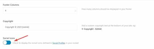
Then try this CSS in your Enfold Theme Options ▸ General Styling ▸ Quick CSS field:#top #socket .social_bookmarks { float: none; margin: auto; position: relative; align-items: center; display: flex; justify-content: center; }this is the expected result:

Best regards,
MikeApril 13, 2023 at 11:53 am in reply to: Z-index for column in grid row, not working on Ipad #1404333Hi,
Glad Ismael could help, if you have any further questions please create a new thread and we will gladly try to help you. Thank you for using Enfold.Best regards,
MikeApril 13, 2023 at 3:13 am in reply to: Link to an accordion’s tab scrolls too much down and hides the tab’s title #1404297Hey Marina,
Thanks for your patience and the link to your site, Try adding this code to the end of your child theme functions.php file in Appearance ▸ Editor:function anchor_offset_with_slow_scroll() { ?> <script> (function($) { $('a[href*=#]:not([href=#])').click(function() { if (location.pathname.replace(/^\//,'') == this.pathname.replace(/^\//,'') && location.hostname == this.hostname) { var target = $(this.hash); target = target.length ? target : $('[name=' + this.hash.slice(1) +']'); if (target.length) { $('html,body').animate({ scrollTop: target.offset().top - 100 //offsets for fixed header }, 1000); return false; } } }); }(jQuery)); </script> <?php } add_action('wp_footer', 'anchor_offset_with_slow_scroll');Please ensure to copy the code from the forum and not an email notification so the symbols are not converted.
Best regards,
MikeHi,
Thanks for your patience and the link to your site, I see that you are using the WordPress ▸ Settings ▸ Reading ▸ Posts page to set the page that displays your blog posts, this uses the default WordPress blog loop and nothing added to the page “blog” will show.
We recommend using the theme option Enfold Theme Options ▸ Where Do You Want To Display The Blog instead to select your “blog” page and then you can use the Advanced Layout Builder elements to show the blog.
But first let’s decide how you want to show your posts, you can use a grid style or list style. There are other options within these options but this will be a start. I created two test pages below for you to review and check the backend, you can also read our Blog Element documentationBest regards,
MikeHi,
Thanks for your patience, to show the portfolio title on hover try this CSS in your Enfold Theme Options ▸ General Styling ▸ Quick CSS field:.grid-content { margin-top: -54px; } .grid-entry:hover .grid-content { opacity: 1; } .grid-content { opacity: 0; }After applying the css, please clear your browser cache and check.
Best regards,
MikeHey bemodesign,
Thank you for the link to your site, do you want both the copyright and icon centered on separate lines or centered next to each other on the same line?Best regards,
MikeHey goldieslongbeach,
Try this CSS in your Enfold Theme Options ▸ General Styling ▸ Quick CSS field:#top nav .social_bookmarks { float: right; }After applying the css, please clear your browser cache and check.
Best regards,
MikeHey goldieslongbeach,
Try this CSS in your Enfold Theme Options ▸ General Styling ▸ Quick CSS field:.av_seperator_small_border .av-main-nav > li > a > .avia-menu-text { border-color: #ab966a; }Please ensure to copy the code from the forum and not an email notification so the symbols are not converted.
After applying the css, please clear your browser cache and check.Best regards,
MikeHi,
Oh I see, I was looking at the wrong menu. try this CSS in your Enfold Theme Options ▸ General Styling ▸ Quick CSS field:#av_section_1 .flex_column.el_after_av_one_fourth.avia-builder-el-last { z-index: 0; position: relative; } .menu-meniu-categorii-container ul.sub-menu { position: relative; left: 100%; top: -42px; height: 42px; background-color: #fff; } .menu-meniu-categorii-container .menu-item-has-children { height: 42px; } .menu-meniu-categorii-container .menu-item-has-children:not(:hover) ul.sub-menu { display: none; }After applying the css, please clear your browser cache and check.
Best regards,
MikeHi,
Thanks for the feedback, I see what you mean but I don’t see any errors in the browser console, will the form submit if it has no required fields?Best regards,
MikeHi,
I see on your site when editing the element you get this error:/wp-admin/admin-ajax.php 404 (Not Found)I’m not sure what could be causing this, but you could try checking your webhost error logs.
I’m unable to reproduce this on my test demo linked below as I don’t get this 404 error, I have included the screenshots of editing the element in the backend.Best regards,
MikeHi,
In the screenshot it looks like you have added code into the Custom Class field of the button:

please don’t do this as this field is only for class names.
We don’t have a way to add woocommerce shortcodes into buttons, instead add the shortcodes for woocommerce buttons into a code block element, or a text block, or if you are editing a product page using the Advanced Layout Builder use the Product Purchase Button element.Best regards,
MikeApril 13, 2023 at 12:33 am in reply to: text block, if i change font size i get more line spacing?… #1404285Hi,
Thanks for the link to your site, in your text element you have 8 extra div’s, perhaps you copied them in error, please go to the text element and click the text tab:

But please note that you have set the option at Enfold Theme Options ▸ Advanced Styling ▸ P to a font size 15px that will override the text element font size:

so you should remove this customization first so you can choose the font size of text elements individually.
Or you could try this CSS in your Enfold Theme Options ▸ General Styling ▸ Quick CSS field:#top #main.all_colors .avia_textblock p { font-size: 30px; }adjust the number to suit, after applying the css, please clear your browser cache and check.
Best regards,
MikeHi,
Thanks for the link to your page, for the top grid row element you would try this CSS in your Enfold Theme Options ▸ General Styling ▸ Quick CSS field:@media only screen and (max-width: 767px) { .responsive #top #wrap_all #main .av-flex-cells .no_margin.av-zero-padding { display: block; margin: 0; height: auto !important; overflow: hidden; padding-left: 8% !important; padding-right: 8% !important; } }but the background image with the hat will also need this css:
@media only screen and (max-width: 767px) {
#av-layout-grid-1 > div.flex_cell.av-gridrow-cell.av_one_half.no_margin.avia-builder-el-4.el_after_av_cell_one_half.avia-builder-el-last.av-zero-padding > div > div > div {
	    padding: 230px 8%;
}
}
Please see the screenshot in the Private Content area of the expected results.
Best regards,
MikeHi,
Glad to hear that you have this sorted out, if you have any further questions please create a new thread and we will gladly try to help you. Thank you for using Enfold.Best regards,
MikeApril 12, 2023 at 11:33 pm in reply to: Gravity Forms “Add Form” not appearing on classic editor when Enfold installed #1404280Hi,
Thanks for your patience, the Dev Team writes since there isn’t a CSS selector we can use to check if Gravity Forms is active, we suggest the following workaround, add this code to the end of your child theme functions.php file in Appearance ▸ Editor:function ava_gravity_forms_mod() { if ( is_plugin_active( 'gravityforms/gravityforms.php' ) ) { echo '<style> #postdivrich_wrap.avia-hidden-editor #postdivrich { visibility: visible; } #postdivrich_wrap.avia-hidden-editor #postdivrich .wp-editor-tabs, #postdivrich_wrap.avia-hidden-editor #postdivrich #insert-media-button, #postdivrich_wrap.avia-hidden-editor #postdivrich #wp-content-editor-container { display: none; } </style>'; } } add_action('admin_head', 'ava_gravity_forms_mod');This is how it looks after adding this code to the functions.php file:

Best regards,
MikeApril 12, 2023 at 11:27 pm in reply to: Change From Slight Opacity on Linked Image Hover to Black & White Image #1404279Hi,
Glad we were able to help, if you have any further questions please create a new thread and we will gladly try to help you. Thank you for using Enfold.Best regards,
MikeHi,
Thanks for your patience and the link to your site, unfortunately, some web browsers do not allow autoplay with sound, so while the video is set to autoplay with sound it can not override the browser defaults, so you can not force this. You could try using the built-in LayerSlider or another slider plugin which may have a “hack” around this but the browsers try to block this with each update.Best regards,
MikeHey churchillalexander43,
Thank you for your patience, please note that we don’t recommend using the Elementor builder plugin with the Enfold theme as it may conflict with the built-in Advanced Layout Builder (ALB).
You can use the ALB to customize single product pages using the elements and you can see an example in our demo here and here.
If you want to use the same layout for multiple products then you can save it as a template and apply it to each product.

Please note that the Advanced Layout Builder for products will not work with all WooCommerce Extensions.Best regards,
MikeApril 12, 2023 at 12:05 pm in reply to: href link to #tabsection unwanted arrives @bottom from other #tab-id-2 #1404212Hi,
Thanks for the login, I found that you were adding a page content shortcode in a text element in a tab section and it was showing an error that this shortcode is not supported there:

to correct I added a new standard editor page 7238 for page content shortcode linked below and this works correctly, please check.Best regards,
Mike -
AuthorPosts