Forum Replies Created
-
AuthorPosts
-
January 23, 2026 at 6:41 am in reply to: Burger and Social Media icons position on Mobile view #1494208
Hey bemodesign,
Thank you for the inquiry.
This css code should help — make sure to add it at the very bottom of the previous modifications.
@media only screen and (max-width: 767px) {

  /* Add your Mobile Styles here */
  .responsive #top #wrap_all .main_menu {
    display: flex;
    position: absolute;
    flex-direction: row-reverse;
    justify-items: center;
    align-items: center;
  }
}
Best regards,
IsmaelJanuary 23, 2026 at 6:37 am in reply to: When is 7.1.4 Available? Enfold: Cross Site Scripting (XSS) vulnerability #1494207Hey Jody,
Thank you for hte inquiry.
This has been fixed in the latest version of the theme (7.1.3). Please make sure to upgrade to the latest version.
Patchstack team XSS vulnerability report: column and cell link fixed
Best regards,
IsmaelHi,
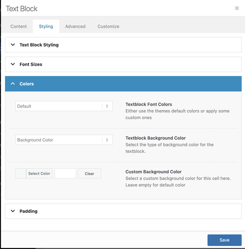
There is no color picker in the text editor by default. If you need to change the color of specific text, you’ll either have to switch to the Code editor and use inline styling, or configure the Styling > Colors options.
Best regards,
IsmaelHey ricedean,
Thank you for the inquiry.
You can try this filter in the functions.php file:
add_filter( 'avf_masonry_loop_entry_content', 'avf_masonry_loop_entry_content_mod', 10, 4 );

function avf_masonry_loop_entry_content_mod( $content, $entry, $entries, $key ) {
    $is_sold = get_post_meta( $entry->ID, 'sold', true );

    if ( $is_sold ) {
        $content .= '<span class="av-masonry-sold-overlay">SOLD</span>';
    }

    return $content;
}
Then add this css code:
.av-masonry-entry {
    position: relative;
}

.av-masonry-sold-overlay {
    position: absolute;
    top: 50%;
    left: 50%;
    transform: translate(-50%, -50%);
    font-size: 48px;
    font-weight: 900;
    letter-spacing: 2px;
    text-transform: uppercase;
    color: #ff0000;
    background: none;
    z-index: 10;
    pointer-events: none;
}
You’ll need to add a custom field named “sold” to each entry.
Best regards,
IsmaelHi,
Thank you for the info.
The Advanced Layout Builder (ALB) is loading correctly based on our check (see private field). Is this happening on a specific page? Please provide the page URL in the private field.
Best regards,
IsmaelHi,
Yes, you can place the code in the Enfold > General Styling > Quick CSS field or in the style.css file. Let us know the result.
Best regards,
IsmaelJanuary 22, 2026 at 6:09 am in reply to: Code Block with CSS Animation Only Works on One Specific Page #1494158Hi,
Thank you for the update.
It displays the same in Safari, but we noticed that the words are not wrapping. Please edit the inline style and set the white-space property to wrap. You may also need to adjust the line-height if the sentence wraps onto a second line.
Best regards,
IsmaelHey Anne,
Thank you for the inquiry.
For the home page, you can use this css code.
.home .flex_cell {
    border-width: 24px !important;
    border-right-width: 0 !important;
    border-bottom-width: 0 !important;
    border-style: solid !important;
    border-color: #fff !important;
}

.home .flex_cell:last-child {
    border-right-width: 24px !important;
}
Let us know the result.
Best regards,
IsmaelHi,
Thank you for the inquiry.
The notice above is not critical and should not affect how the site works, but we’re not yet sure why it’s there. As a temporary workaround, you can set WP_DEBUG_DISPLAY to false to hide the warning.
To update the theme to the latest version, go to your Themeforest account, download the theme package manually and then upload it to your server via FTP. Please refer to the following documentation for more information.
— https://kriesi.at/documentation/enfold/theme-update/#update-via-ftp
Let us know the result.
Best regards,
IsmaelHi,
Thank you for the update.
The Advanced Layout Builder (ALB) is loading correctly based on our check. We also created a test page using the ALB — links are provided in the private field.
Best regards,
IsmaelHey ariane1001,
Thank you for the inquiry.
Custom layouts are a separate post type, so you’ll need to import those as well. The builder also relies on specific custom fields, so please make sure all custom fields or meta info attached to the posts are transferred too. Let us know the result.
Best regards,
IsmaelHey Sonno,
Thank you for the inquiry.
You can use this css code to control the height of the slider.
#top .avia-fullwidth-slider, #top .avia-fullwidth-slider ul li {
    height: 50vh;
}
We recommend adding a Custom CSS Class name to the slider element and adjust the css rule accordingly so it applies only to this specific slider.
— https://kriesi.at/documentation/enfold/add-custom-css/
Make sure the size of the selected thumbnail is appropriate to the size and aspect ratio of the modified slider.
Best regards,
IsmaelJanuary 22, 2026 at 5:40 am in reply to: accessibility review shows multiple main landmarks #1494152Hi,
We checked it again today, and the footer page now contains a div element instead of main. Please try to connect to a different network and then check it again.
Best regards,
IsmaelHi,
Thank you for the inquiry.
Would you mind providing a screenshot of the issue? You can share the solution here in this thread. Did you use the Advanced > Responsive > Element Visibility settings?
Best regards,
IsmaelHi,
Yes, you’ll need to minify the file only when compression is enabled in the theme. We’ll forward this to our channel. For now, please keep the modification in the file.
Best regards,
IsmaelHi,
Thank you for the update.
You’ve interchanged “i” with “e” in the username. We’re able to log in, but the account doesn’t have admin rights, so we’re not able to edit the page or access the dashboard. Please set the user role to admin or provide another admin account.
Best regards,
IsmaelHi,
Thank you for the update.
In icon_circles.js file, you’ll find event listeners for mouseenter and mouseleave. You can duplicate those and change the events to mouse clicks. If you need help implementing this, we recommend hiring a freelance developer or contact our partner, Codeable.
— https://kriesi.at/contact/customization
Hope this helps.
Best regards,
IsmaelHi,
Many of the users here have WP Rocket or WP Fastest Cache installed based on the older threads we encountered — just make sure that compression in the theme is not enabled if you choose to use the compression options provided by the plugin. Let us know if you need more information.
Best regards,
IsmaelHi,
This code should fix the issue — you just need to supply your own password toggle images (eye-closed.svg, eye-open.svg).
— https://kriesi.at/support/topic/missing-eye-icon-on-login-page/#post-1494007
Best regards,
IsmaelHi,
Thank you for the update.
Unfortunately, we won’t be able to determine what needs fixing if we can’t inspect the site. We recommend creating a clone of the site on a subdomain so we can check it separately from the live site — screenshots will also help.
Best regards,
IsmaelHi,
Thank you for the update.
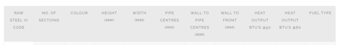
You can add this css code to adjust the heading row.
#top .main_color .avia-data-table .avia-heading-row th {
    background: #ebebeb;
}
Result:
Let us know if you need more info.
Best regards,
IsmaelHi,
Thank you for your understanding. Let us know if you have more questions. Have a nice day.
Best regards,
IsmaelHi,
Thank you for the update.
Did you change the login or admin URL? We tried to access the default URLs, but they redirect to a 404 error page. Please include the custom login URL in the private field.
Best regards,
IsmaelJanuary 21, 2026 at 5:43 am in reply to: accessibility review shows multiple main landmarks #1494117Hi,
Thank you for the update.
The footer page or section is now wrapped in a div element. Please try to purge the cache before checking the page.

Best regards,
IsmaelJanuary 20, 2026 at 6:05 am in reply to: accessibility review shows multiple main landmarks #1494090Hey sky19er,
Thank you for the inquiry.
The second main element is coming from the footer page. You may need to adjust this with a custom script added to the functions.php file.
add_action('wp_footer', function () {
    ?>
    <script>
        jQuery(document).ready(function ($) {
            var $main = $('#footer-page .container main');

            if ($main.length) {
                $main.replaceWith(function () {
                    return $('<div>', {
                        html: $main.html(),
                        class: $main.attr('class'),
                        id: $main.attr('id')
                    });
                });
            }
        });
    </script>
    <?php
}, 999);
Best regards,
IsmaelHi,
Thank you for updating the login info.
We found a header.php file in the child theme. Have you tried disabling this template temporarily or replacing it with the latest version from the parent theme?
Best regards,
IsmaelHi,
Thank you for the update.
Are you referring to the h1 in the Text Block element? The font size is added as an inline style, so you’ll need to remove it or override it with custom css.
<span style="font-family: montserrat, sans-serif; font-size: 64px;">Passerelles et Compétences</span>Example:
@media only screen and (max-width: 767px) {

  /* Add your Mobile Styles here */
  section.av_textblock_section.av-mfe046ge-53ca3090203dd5a03e44d0f3d1765a66 .avia_textblock h1 span {
    font-size: 42px !important;
  }
}
Best regards,
IsmaelHey torture4,
Thank you for the inquiry.
We saw an error in the browser console in a compressed file, which might be the reason the maps are not showing. After deactivating the “WP-Optimize – Clean, Compress, Cache plugin”, the error goes away and the map displays correctly. Have you tried deactivating the compression from the mentioned plugin?
Best regards,
IsmaelHi,
Thank you for the update.
It’s probably a style conflict between the theme and one of the plugins. Did you apply the suggestions from the previous thread and try the ones we suggested here?
.woocommerce .woocommerce-form-login .show-password-input {
    position: absolute;
    top: 0.8rem;
    right: 1.2rem;
    cursor: pointer;
}
Best regards,
IsmaelJanuary 20, 2026 at 5:37 am in reply to: Code Block with CSS Animation Only Works on One Specific Page #1494084 -
AuthorPosts
