Forum Replies Created
-
AuthorPosts
-
this is always a problem – to have a clickable link over a clickable background-image.
and especially for that case – because the hover effect is correlatet to the link of the background.
If you now hover a link inside that container – the hover focus is lost.you can see what i mean if you use:
.referenzen .grid-content a {
  pointer-events: auto;
}
but your link there is not clickable anyway – because
we have here multiple issues – you declared the links inside to lightbox links ( inline popup ) so – both links in your last container are no popup – external page links ( and if lightbox – they had to be iframe popups)yes – checked now and see comment above – i had to go an look if that filter is still present
if you do not like to strip the excerpts try in child-theme functions.php :
function my_avf_masonry_loop_entry_content($loop_excerpt, $entry) {
  $loop_excerpt = $entry->post_excerpt;
  return $loop_excerpt;
}
add_filter('avf_masonry_loop_entry_content', 'my_avf_masonry_loop_entry_content', 10, 2);
but i do not know if the “wordpress” excerpts are included by that. The Enfold Excerpts are influenced by that snippet
Edit : tested – but it does not work anymore – i had to inspect the loop
I had also presumed by mistake that it was only defined for mobile devices by default in enfold theme. The hovering effect is obviously difficult to achieve.
Since he wrote about tablets in the introductory text above, I was stuck on this track. – Actually, it should have worked that way on the devices themselves.
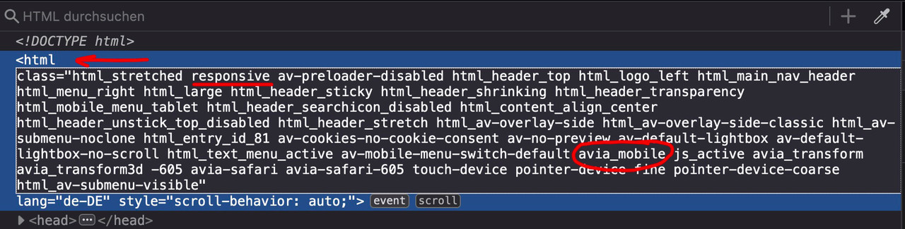
Oddly enough, however, a combined solution seems to be defined there by default. Because on my iPad Pro, there was indeed no effect to be observed from the CSS ( with avia_mobile ) code.
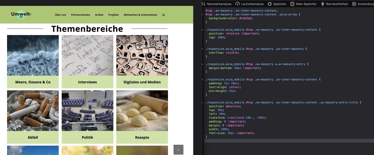
So now I’m implementing the Media Query only. Give it a try.Also tausche nur den eingesetzten css Code im Quick Css aus gegen:
(ändere je nach Bedarf diese Grenze 989px aus unter der das gelten soll)/**** Farbdefinitionen überall ****/ #top .av-masonry.description-below .av-inner-masonry-content, #top .av-masonry.description-below .av-inner-masonry-content .avia-arrow { background-color: #cde5a5; } /****** hover Verhalten abschalten für den responsiven Fall ********/ /****** bei Querformat iPad Pro 12,9inch = 1367px / bei iPad Pro 11inch = 1195px ********/ /****** bei Querformat iPad 10,2inch = 1081px / etc. pp ********/ @media only screen and (max-width: 989px) { .responsive #top .av-masonry.description-below .av-inner-masonry-content { position: relative !important; top: 100%; opacity: 1 !important; animation: none !important; transform: none !important; } .responsive #top .av-masonry.description-below .av-inner-masonry { overflow: visible; } .responsive #top .av-masonry.description-below a.av-masonry-entry { margin-bottom: 60px !important; } .responsive #top .av-masonry.description-below .av-inner-masonry-content { padding: 5px 10px; text-align: center; min-height: 65px } .responsive #top .av-masonry.description-below .av-inner-masonry-content .av-masonry-entry-title { position: absolute; top: 50%; left: 50%; transform: translate(-50% , -50%); padding: 0 !important; margin: 0 !important; width: 100%; font-size: 18px !important; } }siehe hier mal : https://webers-testseite.de/gallery/
PS: die Seite nutzte ich schon einmal als testseite, daher liegt da noch ein anderer hoverstyle zu grunde. Farben etc. – ist aber für dein hover state Aspect nicht relevant.here you can see a live screenshot even on my ipad mini 3 ( iOS 12.5.7):

if it works there then the newer iOS will do it too!
Edit:
ABER – du hast recht – ich muss hineinschauen, ob es nicht doch von der Screenweite abhängig gesetzt ist in Enfold.
Denn auf meinem iPad Pro wird es noch mit dem Hover Anfangsstyle gezeigtAuf iPhones sollte es aber so auch schon funktionieren.
But – please, this only replaces the behaviour on mobile devices. This happens when the descriptions are permanently displayed because the hover effect cannot be effective. So that these overlays do not cover a main part of the image, they are moved here below the images.
If you also want to use it on the desktop with small screen widths, we have to remove the class avia_mobile from the code and put the whole thing in a media query, e.g. only up to 767px.
i guess that this is not the solution – that was a suggestion – but he said that this does not solve the problem.
i can not test it because the only device with iOS 12.5.7 is my ipad mini 3 – and the testpage is even in portrait mode with normal menu.PS: on iphone you had to erase the device cache via Settings – Safari – Clear History and Website Data
i can not see the custom class – did you save it after entering the class?
when entering the code without that custom class on my developer tools to test if it works
(Emulation is ipad)
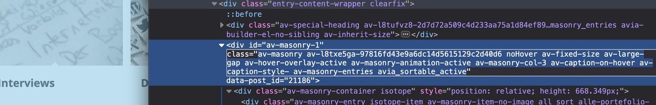
For those masonries – on ipad and bigger tablets it might be nice to position the caption ( that is on mobile always visible ) beneath the image – and not as overlay style.
Maybe it is best to give a custom class to that masonry – to always use that setting on demand.
f.e. description-below
and: because it is only wanted on mobile devices ( with no hover )#top .av-masonry.description-below .av-inner-masonry-content, #top .av-masonry.description-below .av-inner-masonry-content .avia-arrow { background-color: #cde5a5; } .responsive.avia_mobile #top .av-masonry.description-below .av-inner-masonry-content { position: relative !important; top: 100%; } .responsive.avia_mobile #top .av-masonry.description-below .av-inner-masonry { overflow: visible; } .responsive.avia_mobile #top .av-masonry.description-below a.av-masonry-entry { margin-bottom: 60px !important; } .responsive.avia_mobile #top .av-masonry.description-below .av-inner-masonry-content { padding: 5px 10px; text-align: center; min-height: 65px } .responsive.avia_mobile #top .av-masonry.description-below .av-inner-masonry-content .av-masonry-entry-title { position: absolute; top: 50%; left: 50%; transform: translate(-50% , -50%); padding: 0 !important; margin: 0 !important; width: 100%; font-size: 18px !important; }October 7, 2023 at 11:06 am in reply to: Blog page in portrait orientation iPhone 14 max pro sticks #1421726sorry – part of another participant question -;)
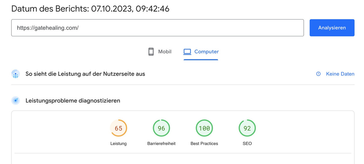
October 7, 2023 at 9:49 am in reply to: Blog page in portrait orientation iPhone 14 max pro sticks #1421724Your website is not so performance hungry as you beleave. So first try to use Enfolds merging options on performance tab.
i prefer to use css merging and javascript minification.
your page now is without these performance optimizations at:
 October 7, 2023 at 9:35 am in reply to: Blog page in portrait orientation iPhone 14 max pro sticks #1421723
i think that the additional classes inside text-block element will come from a plugin. If you search for those extemely specific class like : min-h-[20px] i only found that tailwind css from https://tailpress.io/
Did you build the site on an existing installation – and possibly change the theme to Enfold afterwards?
The loading of jQuery in the footer could be set on Enfold on the settings page: performance
This is of course possible, but then you have to take into account that the scripts that need jQuery are loaded afterwards. This can be achieved, for example, by first not loading the scripts in the head area and then setting a correspondingly higher priority number for the function.Next: do you really need jQuery Migrate ? – same on performance tab
October 7, 2023 at 8:01 am in reply to: Blog page in portrait orientation iPhone 14 max pro sticks #1421718does that stick behavior persist if you deactivate your WP Optimizer? – after that refresh all cachings and merging files on enfold and test it.
Try deactivating all plugins – and reactivating one by one. And inspect when the behavior turns back.
(https://kriesi.at/support/topic/experiencing-hick-up-hiccup-when-scrolling/)
________where does that html layout come from inside text-block element?
a lot of classes inside (flex flex-grow flex-col gap-3 or min-h-[20px]) but i could not find any rules on those classes.
( is that tailwind css ? where are the rules for it? )
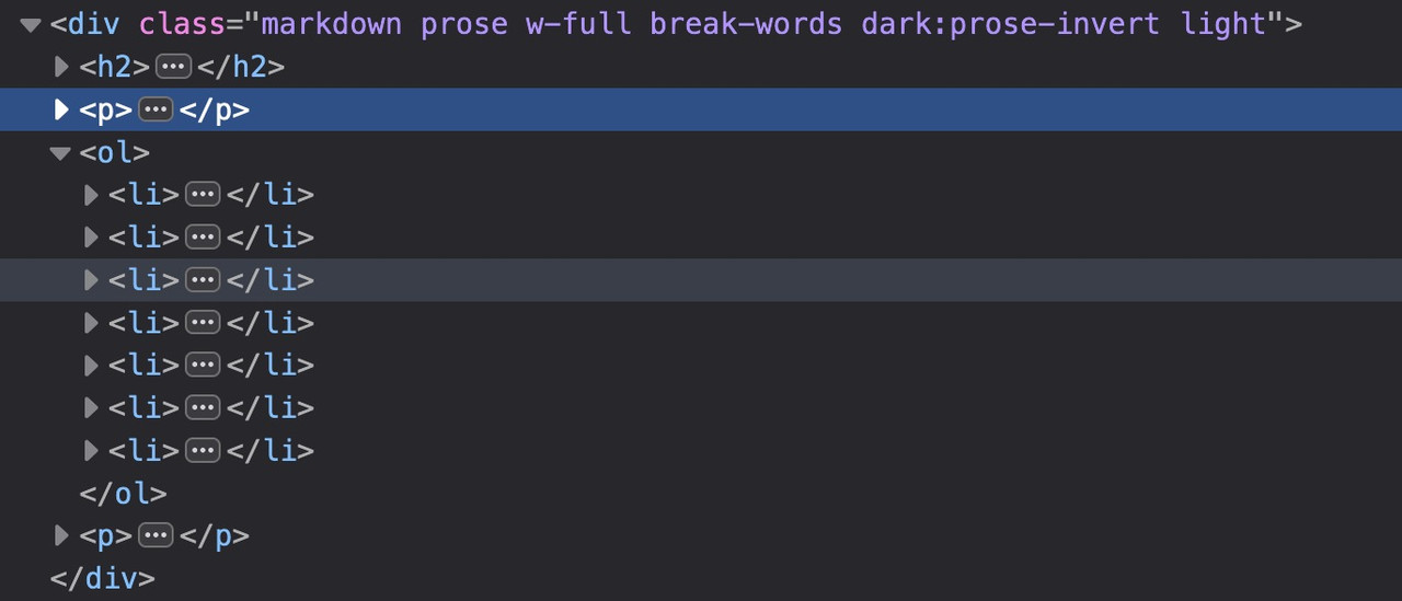
see the DOM : https://gatehealing.com/helpful-resources/on that page i do not understand the ol (ordered list ) settings – why not one ol – and let the numbers grow on return key
next: i see some errors on jQuery is not defined – this often happens when you are loading jQuery in your Footer but try to load other scripts in the head or before that jQuery load that needs the jQuery Sources.
ich wünschte ich wüsste wie man eine mouse hover an mobilen Endgeräten haben könnte.
Den gibt es nämlich nicht. touch screens habe sowas nicht. Problem der touch event wird als hover gewertet und aktiviert den Status.Standardmäßig sollte es aber bei Enfold so sein, das in dem Fall die Captions dauerhaft angezeigt werden. Willst Du das unterbinden?
Dann könntest du ( sorry als Participant / Boardteilnehmer ist wohl duzen angesagt ) diese Elemente die durch das hovern hineinfahren einfach ausblenden mit display none..responsive.avia_mobile #top .av-masonry:not(.av-caption-style-overlay) .av-masonry-entry.av-masonry-item-with-image .av-inner-masonry-content { display: none }diese klasse: avia_mobile wird bei allen mobilen Endgeräten an html gesetzt.
by the way – we had to be more selective on that – because otherwise the page f.e.: https://umwelt-magazin.eu/portfolio-item/wirtschaft-2/ will do that too. And on a full overlap this is not recommendable
so better replace the css with:
(because we do not want to make this happen on full overlay caption).av-masonry:not(.av-caption-style-overlay) .av-masonry-entry.av-masonry-item-with-image .av-inner-masonry-content { width: calc(100% - 20px); margin: 10px; }October 6, 2023 at 4:15 pm in reply to: Neues Symbol “mein Konto” lässt sich nicht entfernen #1421667da musst du mal in den Einstellungen bei Woocommerce nachschauen ob es dort eine Option hat in das Menu einen solchen Punkt einzusetzen.
Man kann aber auch einen weiteren Menu Punkt hinzufügen über das Filter : ava_inside_main_menu – eventuell mal in die child-theme functions.php reinschauen. Wahrscheinlich aber, hat Woocommerce so eine Option.
Sonst unter Menu – Hauptmenü siehst du den Punkt wahrscheinlich nicht oder?_________
You will need to check the Woocommerce settings to see if there is an option to add such an item to the menu.
You can also add another menu item via the filter: ava_inside_main_menu – you may need to look in the childtheme functions.php. Woocommerce probably has such an option.
Otherwise you probably do not see the point in Menu – Main Menu, do you?October 6, 2023 at 4:04 pm in reply to: Hamburger Menu only on Startpage – all other normal text-link ,enu #1421665Yes of course:
function custom_burger_menu_active( $active, $context ){ if(is_page(array( 3, 81))){ return true; } return $active; } add_filter('avf_burger_menu_active', 'custom_burger_menu_active', 10, 2 );Abdeckung durch das weiß unten beim Hovern:
.av-fixed-size .av-masonry-entry .av-inner-masonry-content,
.av-caption-on-hover .av-masonry-item-with-image.av-masonry-entry .av-inner-masonry-content,
.av-flex-size.av-caption-on-hover-hide .av-masonry-entry.av-masonry-item-with-image .av-inner-masonry-content {
  width: calc(100% + 2px);
}
aber eventuell sieht es sogar eleganter aus, wenn du da einen Abstand wählst.
Denn der weiße Hintergrund und dann das weiße Overlay … ?.av-fixed-size .av-masonry-entry .av-inner-masonry-content, .av-caption-on-hover .av-masonry-item-with-image.av-masonry-entry .av-inner-masonry-content, .av-flex-size.av-caption-on-hover-hide .av-masonry-entry.av-masonry-item-with-image .av-inner-masonry-content { width: calc(100% - 20px); margin: 10px; }
PPS: eigentlich sollte das Overlay auf einem mobilen Endgerät bereits geöffnet sein ! ( nicht auf kleinen screens aber auf echten physikalischen Endgeräten)
Enfold hat für mobile Endgeräte im html oben explizit Klassen eingeführt.
Wenn du mit einem Mobile Phone die Seite öffnest, dann ist automatisch avia_mobile als Klasse an html also als Selector z.B. dann:
.responsive.avia_mobile …
das kannst du dann also nutzen um die Elemente explizit für Handy und Co zu stylen. Problem: der hover style ist on touch aktiv.just a short info on media querries : there are not only media query for screen width but also for orientation:
so you can have something like this:
@media only screen and (max-width: 989px) and (orientation: landscape) {
…
}
PS: the opposite is “portrait”
you can have aspect-ratio or resolution etc.e.g.: for retina displays:
@media
(-webkit-min-device-pixel-ratio: 2),
(min-resolution: 192dpi) {
    /* Retina-specific stuff here */
}
October 6, 2023 at 10:11 am in reply to: Hamburger Menu only on Startpage – all other normal text-link ,enu #1421592use that filter : avf_burger_menu_active
function custom_burger_menu_active( $active, $context ){
  if( is_page(3) ) {
    return true;
  }
  return $active;
}
add_filter('avf_burger_menu_active', 'custom_burger_menu_active', 10, 2 );
change the is_page to your homepage id or use is_home( ) or is_frontpage( )
(yes there are differences between them – wheather the landing page is blog page or static page ;)Nice – but maybe it is best to select the div by its active state – because not always the first toggle is opend at start:
function custom_header_code() {
?>
<script type="text/javascript">
    document.addEventListener('DOMContentLoaded', (event) => {
      if (window.innerWidth <= 768) {
        const div = document.querySelector('div.active_tc');
        const p = document.querySelector('.activeTitle');
        if(div || p) {
          div.classList.remove('active_tc');
          p.classList.remove('activeTitle');
        }
      }
    });
</script>
<?php
}
add_action( 'wp_head', 'custom_header_code' );
and if you really want to have it only on mobile devices – you can have that without screen width detection.
function custom_header_code() {
if(wp_is_mobile()){
?>
<script type="text/javascript">
window.addEventListener("DOMContentLoaded", function () {
        const div = document.querySelector('div.active_tc');
        const p = document.querySelector('.activeTitle');
        if(div || p) {
          div.classList.remove('active_tc');
          p.classList.remove('activeTitle');
        }
});
</script>
<?php
}}
add_action( 'wp_head', 'custom_header_code' );
only if you choose the selector activeTitle – the symbol in front will be set to closed ( + )
ok – the page with version 4.5.2. does not have this option (so it has all these -webkit- prefixes included).
The default on 5.6.6 is: modern browsers only. – So the missing vendor prefixes could have been a reason.Isn’t the most logical explanation that something changed in the Enfold code between those two versions? Probably something having to do with either burger menu or with logo/menu settings or with mobile settings.
see here an excerpt of legacy-enfold.css :
/*
	Contains vendor prefixed CSS rules that have been removed from core files because no longer needed
	Cannot be minified because old rules are removed !!!!
	@source			enfold/css
	@since 5.6.3
*/

…
.av-burger-menu-main{
	-webkit-transition: padding 0.3s ease-out;
}

.av-hamburger--spin-r .av-hamburger-inner::after {
	transition: bottom 0.1s 0.34s ease-in, -webkit-transform 0.3s cubic-bezier(0.55, 0.055, 0.675, 0.19);
}

.av-hamburger--spin-r.is-active .av-hamburger-inner {
	-webkit-transform: rotate(-225deg);
}

.av-hamburger--spin-r.is-active .av-hamburger-inner::after {
	-webkit-transform: rotate(-90deg);
	-webkit-transition: bottom 0.1s ease-out, -webkit-transform 0.3s 0.14s cubic-bezier(0.215, 0.61, 0.355, 1);
}

#av-burger-menu-ul li a{
	-webkit-transition: none;
}

#top #wrap_all #av-burger-menu-ul > li{
	-webkit-transition: opacity 0.3s ease-out, top 0.3s ease-out, left 0.3s ease-out;
	-webkit-transform: translate3d(0,0,0); /*fixes disapearing in ios*/
}

.avia_desktop.avia-safari #top #wrap_all #av-burger-menu-ul > li {
	-webkit-transform: none;
}

.html_av-overlay-side .av-burger-overlay-scroll{
	-webkit-transform: translateX(350px); transform: translateX(350px);
	-webkit-transition: all 0.5s cubic-bezier(0.75, 0, 0.25, 1);
}
etc. etc. …
these are all concerning to hamburger – and a lot more
___________
What happend if you use not the smaller hamburger icon?-
This reply was modified 2 years, 6 months ago by
Guenni007.
did you see the download link in: https://kriesi.at/support/topic/icon-box-numbers-icons/#post-1421348
Link: https://webers-webdesign.de/numbers.zipEdit here – because topic closed already:
html body [data-av_iconfont="numbers"]::before {
  font-family: 'numbers';
  font-weight: bold !important;
  font-size: 1.6em;
  position: relative;
  left: -5px
}
to center the numbers !
By the way – the plain numbers could be styled to white icon colored background on the enfold albs itself.
Or by custom css and quick css rules.Edit – the download above includes Numbers on backgrounds. This is easier to handle then to have additional css.
you can download here an uploadable numbers font iconset i made from myriad bold fonts:
one sans-serif and one serif font (myriad and times)
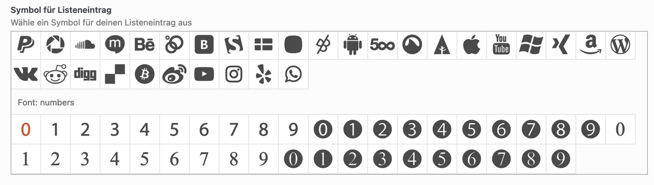
and if you like to adjust font-weight and size:
#top .avia-font-numbers, body .avia-font-numbers, html body [data-av_iconfont="numbers"]::before { font-family: 'numbers'; font-weight: bold !important; font-size: 1.6em; }yes – that is the way – and although this can be done very quickly with e.g. Illustrator with the font of your choice, you can also find free icons.
You can download them as svg and upload them to Fontello. Just drag them into the Custom Icons field.see here f.e. a free iconset – you can download each as svg.
https://www.flaticon.com/free-icon-font/2_8986257PS: i tested that font – Unfortunately, the glyphs there are not properly prepared. Therefore, in such a case, one takes an intermediate step via the icomoon app (link). Upload this svg there and then download the set. The svg contained in the zip can then be uploaded to fontello. They have the correct size now.
you can see here that my old ipad 3 mini (iOS 12.5.7 – that last one i could install on that device) caused some troubles on newer alb element like the before/after image.
https://kriesi.at/support/topic/enfold-options-page/see my comment here on apples philosophy to handle older devices:
https://kriesi.at/support/topic/enfold-options-page/#post-1406649on newest Enfold there is that new option on “Show Advanced Options” see what is there on “Old Browser Support”
Try the option “Support old Browsers”
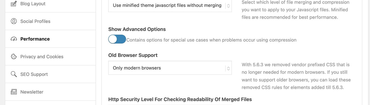
in the option “only modern Browsers” all f.e. -webkit- prefixes will not be there
– and that might be necessary css for the older iOS 12.5.7 on your iPhoneTest that – but do not forget to refresh all cache and or merged files by enfold
-
This reply was modified 2 years, 6 months ago by
-
AuthorPosts