Forum Replies Created
-
AuthorPosts
-
She probably copied the code from the DOM ( as mike said ). Of course, the pre and code tags have been copied as well.
If you just activate it within the browser and then press copy, the copy succeeds without the wrapper.As Participant as you are – no private content for me.
by the way – I have been using the Page as Footer option a lot lately. You have all the enfold elements at your disposal to create a style for this area.
May i see your “figma link” ?Mit welchem Programm beurteilst du das .
ich habe mal hier Google font page und Illustrator Vergleich:
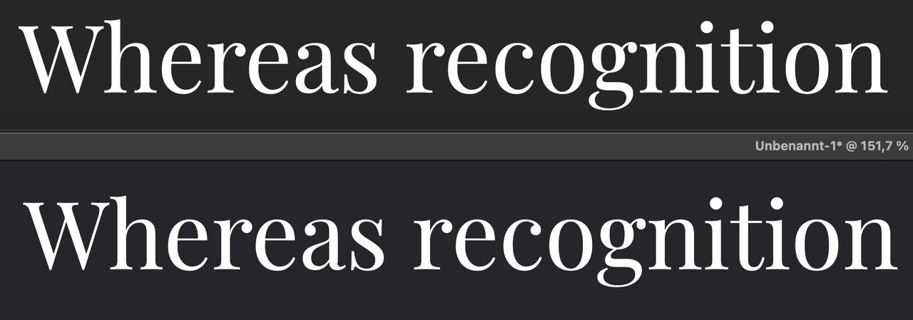
ich sehe keinen großen Unterschied.
PS: welcher Browser ?
Da kann es im Rendering auch schon mal Unterschiede geben.hast du die Display oder die normal genommen?
Wenn normal – hast du die Playfair_9pt oder Playfair_144pt genommen?Ein wenig off-topic:
wenn man so einen variablen Font mal installiert hat ( ich habe sicherheitshalber dann beide statische und variable eingebunden) dann wählt man bei Enfold unter Fonts zunächst den statischen als Standard aus, und kann dann per @supports regel diese ersetzen , wenn der User Browser das unterstützt.
z.B.
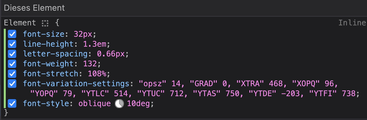
@supports (font-variation-settings: normal) {
  body.roboto {
    font-family:'roboto-flex';
  }

  #top.roboto h1,
  #top.roboto h2,
  #top.roboto h3,
  #top.roboto h4,
  #top.roboto h5,
  #top.roboto h6 {
    font-family:'roboto-flex';
    font-weight:500;
 }

 #top.roboto .title_container .main-title,
  #top.roboto tr.pricing-row td,
  #top.roboto  .portfolio-title,
  #top.roboto .callout .content-area,
  #top.roboto .avia-big-box .avia-innerbox,
  #top.roboto .av-special-font,
  #top.roboto .av-current-sort-title,
  .html_elegant-blog #top.roboto  .minor-meta,
  #top.roboto #av-burger-menu-ul li {
    font-family:'roboto-flex';
    font-weight:400;
 }
}
um dann die Einstellungen für ein spezielles Element herauszufinden, kann man dieses sich in den Developer Tools der Browser anschauen.
Sehr schön kann dies der firefox – dort gibt es oben rechts den Tab : Schriftarten
Hier zieht man dann die Regler des variablen Fonts solange bis man das gewünschte Ergebnis hat.
( wie immer – click to enlarge the images )
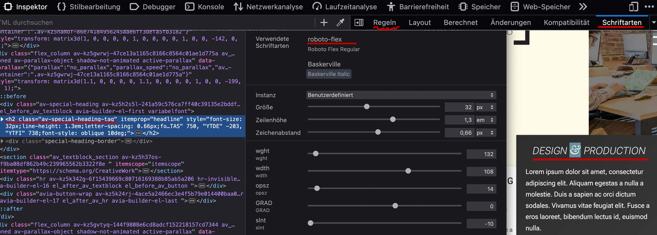
Ist man zufrieden, wechselt man zum Reiter : “Regeln” und kann dann am Element ablesen was man ins Quick css übernehmen muss:
kleinen Moment:
zunächst – OSX : beim Packen mit Standard Tools von OSX werden in das zip file zusätzliche Files unsichtbar mit hinzu gepackt.
BetterZip hat deshalb die Funktion : für Windows packen.hier ist jetzt mal RethinkSans mit (400,500,700) : download: RethinkSans.zip
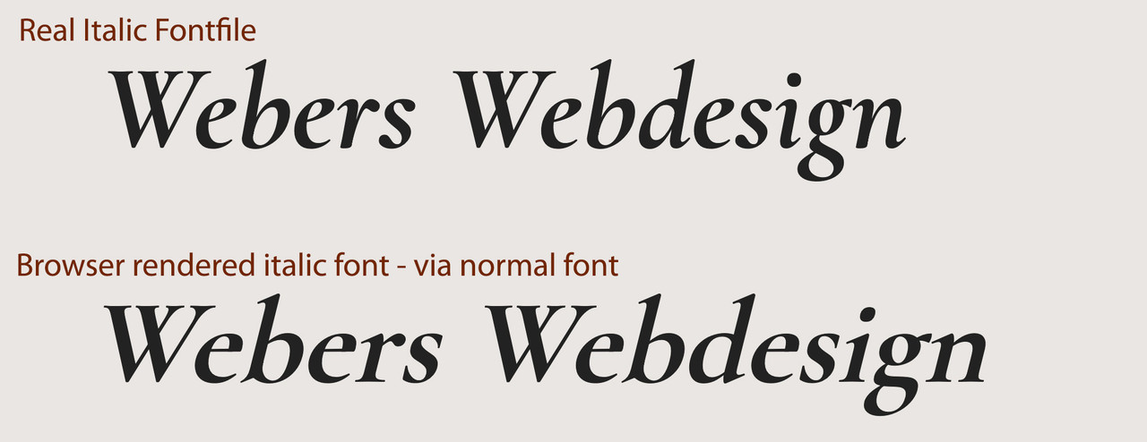
wenn Du dir die Schriftschnitte mal in Google Font anschaust, dann siehst du das die italic wirklich nur eine slanted Schrift ist somit sich italic und der vom Browser generierte italic Font sich kaum unterscheiden werden. Daher ließ ich die Schriftschnitte weg. ( Manche Serifen Schriften unterscheiden sich erheblich bei gerade und italic – dann macht es Sinn)
Da woff2 das bessere Format ist ( weil brotli Kompression ) ist es mit im zip file und wird gemäß Enfold auch bevorzugt geladen.
Hier wäre der variable Font: download: RethinkSans Variable.zip
Lösche also mal alle Schrift Vorkommnisse – auch in der Media Library vorher – und lade dann diese hoch : ich empfehle Dir nur die Statischen Fonts.
Kannst aber probieren nur den variablen zu nehmen.sieht dann so aus:
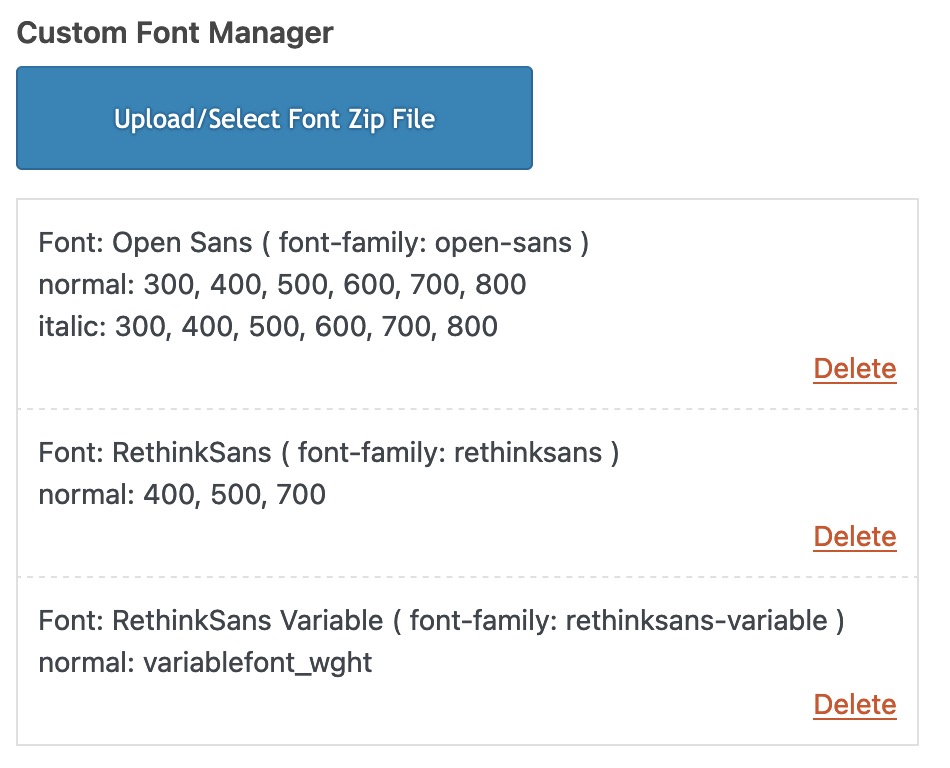
Du siehst dort auch wie die font-family dann anzusprechen ist. ( In klammern dahinter)
December 13, 2023 at 6:25 am in reply to: Bring an Image (or column) to the Front (of a Color Section with SVG Divider) #1427949yes – that might help
ps: if you like to have an animated svg waves – download: Waves
because your divider is not standard enfold divider – i guess you know how to install custom svg dividers.see: https://weber.tips/
-
This reply was modified 2 years, 3 months ago by
Guenni007.
eventuell reicht schon:
might already be enough:@media only screen and (max-width: 767px) { .avia-gallery-thumb { display: flex; flex-flow: row wrap; justify-content: flex-start; } } @media only screen and (max-width: 495px) { .avia-gallery-thumb a { flex: 1 1 100%; width: unset !important; } }just change the 495px to a width you like to have the one column layout
Prinzipiell geht es variable Schriftschnitte zu laden! Dabei solltest du um den Font-Manager von Enfold zu nutzen, jedoch beide getrennt hochladen.
Wenn du dir allerdings den Browser Support ansiehst: https://caniuse.com/variable-fonts nur die IE’s und Opera mini nicht mitmachen.Ich würde mich also eventuell nur für den Upload des variablen fonts entscheiden. Im Zweifel werden dann bei älteren Browsern die Fall-Back Fonts geladen ( helvetica etc. ).
Wenn Du mir sagst, um welche schrift es geht , dann könnte ich genauere Anweisungen geben.
PS: aus Performance Gründen überlege dir – ob du wirklich alle Schriftschnitte benötigst. Wenn du also von vornherein weißt, das du für Headings nur die 700er benötigst, und bei dem body text nur 300, 400, 700 – dann würde ich nicht alle hochladen und eventuell dann doch die statischen Fonts hochladen.
Zusammengenommen könnten die dann vom zu ladenden Dateivolumen geringer sein, als der variable font.December 12, 2023 at 8:54 am in reply to: How to get rid of curved arrow on linked images, and allow image title to show #1427833this is GDPR info (DSGVO) – you can click the third green button “Ablehnen” : Reject/Decline. This means that you do not agree to the use of cookies. Only those that are essential.
_________
PS: maybe this would be a nice to have feature. Like in Image Galleries to have here an optional Tooltip over the images.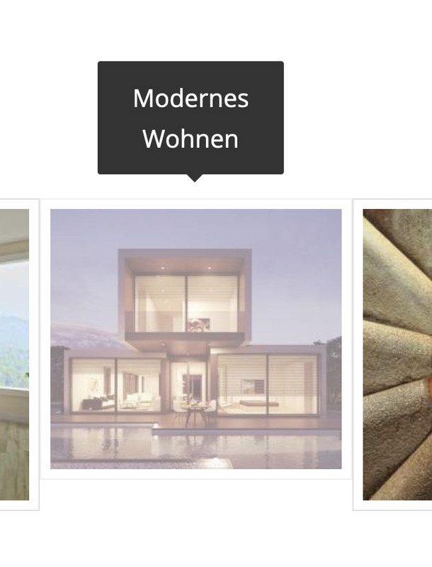 December 12, 2023 at 1:37 am in reply to: How to get rid of curved arrow on linked images, and allow image title to show #1427821
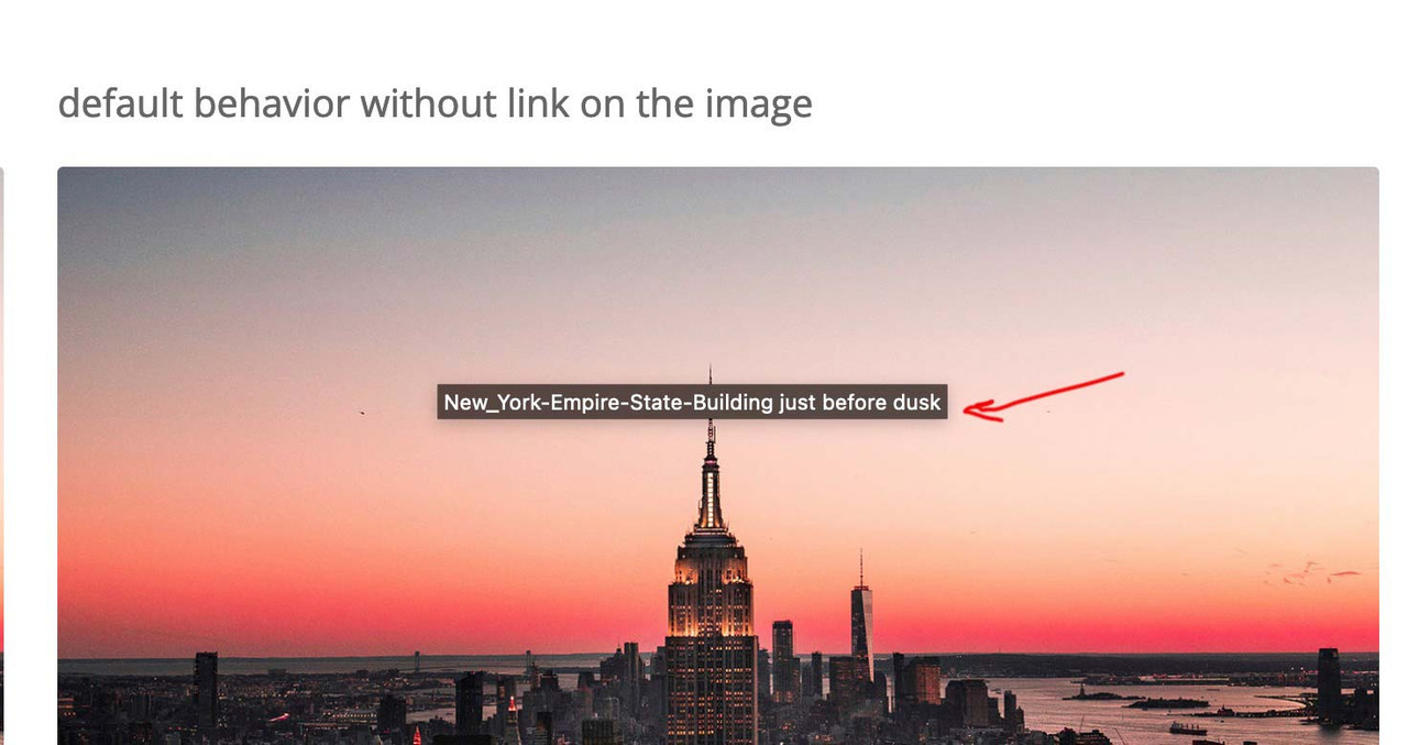
that title you see on the image from: https://kriesi.at/support/topic/how-to-get-rid-of-curved-arrow-on-linked-images-and-allow-image-title-to-show/#post-1427817 – is a “tooltip” and – you can not influence that. It is part of the standard behavior of all browsers – and position is dependent on where your mouse rests over the image. ( The title tag from DOM i used for inserting it to overlay – is part of enfold source code ).
did you follow the link of my test-page? there you have the title tag on that position you like
see: https://webers-testseite.de/image-title-to-hover/December 12, 2023 at 1:09 am in reply to: How to get rid of curved arrow on linked images, and allow image title to show #1427817SEO remains unaffected, as the title tag was there before and is still there after the code. The visibility has only changed. Apart from that, from a SEO point of view, the alt tag on the image is more important than the title tag.
you are talking about those title tags showing on hovering an image for a while:
 December 11, 2023 at 9:01 pm in reply to: How to get rid of curved arrow on linked images, and allow image title to show #1427808
by the way – i tested this function first – and this works on developer tools – but only the mutationObserver is working the correct way.
(function($) {
  $('.avia-image-container.show-title').each(function() {
      var imgLabel = $(this).find('.avia_image').attr('aria-label').replace(/\-|_/g, " ");
      $(this).find('.image-overlay-inside').append('<span class="overlay-title">'+imgLabel+'</span>');
  });
})(jQuery);
December 11, 2023 at 5:33 pm in reply to: How to get rid of curved arrow on linked images, and allow image title to show #1427796it would be nice to have the title inside that span.image-overlay-inside
This would be easy if the overlay exists from the beginning ( on page load) . On avia.js – we see – it is generated viaif(!overlay.length)
having a whole child-theme avia.js seems to be a way – but we can use mutationObserver to see when it is added to DOM – and then insert the title.in my test case i gave a custom class to the image alb element : show-title
now i can observe these classes if there is a new node added – and if so – add some html to it ( btw. i use the aria-label from the anchor – because if you set a custom title to the image alb this will be better to have)function transfer_label_to_overlay(){ ?> <script> (function($) { var target = document.querySelectorAll(".show-title"); var observers = []; // configuration of the observer var config = { attributes: true, childList: true, subtree: true }; for (var i = 0; i < target.length; i++) { // create an observer instance observers[i] = new MutationObserver(function(mutations) { mutations.forEach(function(mutation) { $(mutation.addedNodes).find(".image-overlay-inside").each(function() { var imgLabel = $(this).closest('.avia_image').attr('aria-label').replace(/\-|_/g,' '); $(this).append('<span class="overlay-title">'+imgLabel+'</span>'); }); }); }); // pass in the target node, as well as the observer options observers[i].observe(target[i], config); } })(jQuery); </script> <?php } add_action('wp_footer', 'transfer_label_to_overlay');now for quick css:
.avia_transform .show-title a:hover .image-overlay {
  opacity: 1 !important;
  background-color: rgba(255,255,255,0.1);
}
/*** styling the title is up to you ****/
.overlay-title {
  display: inline-block;
  position: absolute;
  top: 50%;
  left: 50%;
  transform: translate(-50%, -50%);
  z-index: 500;
  font-size: 16px;
  line-height: 24px;
  font-family: var(--enfold-font-family-body);
  color: var(--enfold-main-color-heading);
  text-shadow: 1px 1px 3px #333;
  background-color: rgba(255,255,255,0.8);
  padding: 0 20px 5px;
  border-radius: 5px;
}
( if you do not want the hover image behind the title set the pseudo-class to display : none)
.show-title .image-overlay-inside::before {
  display: none;
}
see: https://webers-testseite.de/image-title-to-hover/
left hand – no custom class : show-title – right hand: with custom-class.December 11, 2023 at 10:58 am in reply to: How to get rid of curved arrow on linked images, and allow image title to show #1427758but: what you see on images with no link is not an enfold feature – this is standard behavior of wordpress images and the title tag.
Now we had to find a way to show the titles on images that are linked to ? what – lightbox or always – even if they link to other targets?December 10, 2023 at 9:32 am in reply to: Include customer recommendations on two different pages with same data #1427679I think you need to be more specific about your plan so that we can give you some advice.
Which data should be accessed and what should be achieved in each case?have a look at this – maybe it is still working:
https://kriesi.at/support/topic/quick-way-to-add-infinite-scroll/#post-681490hm ?
some thoughts on custom scripts via functions.php
you can do that:
function custom_script(){
?>
<script type="text/javascript">
(function($) {
  $(window).on('load', function(){
    $('.open-popup-link').trigger('click');
  });
})(jQuery);
</script>
<?php
}
add_action('wp_footer', 'custom_script');
Maybe – i think it will be enough to just wait til DOM is loaded and not the whole page
so this could therefore be sufficientfunction custom_script(){ ?> <script type="text/javascript"> window.addEventListener("DOMContentLoaded", function () { (function($) { $('.open-popup-link').trigger('click'); })(jQuery); }); </script> <?php } add_action('wp_footer', 'custom_script');But
did you really got that class on the anchor?
Lets say you got a button as trigger for the inline popup loading. And you gave a custom class to that button element – the class will be at the button wrapper – not the anchor!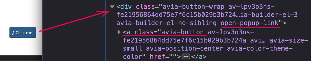
so the selctor must be different:
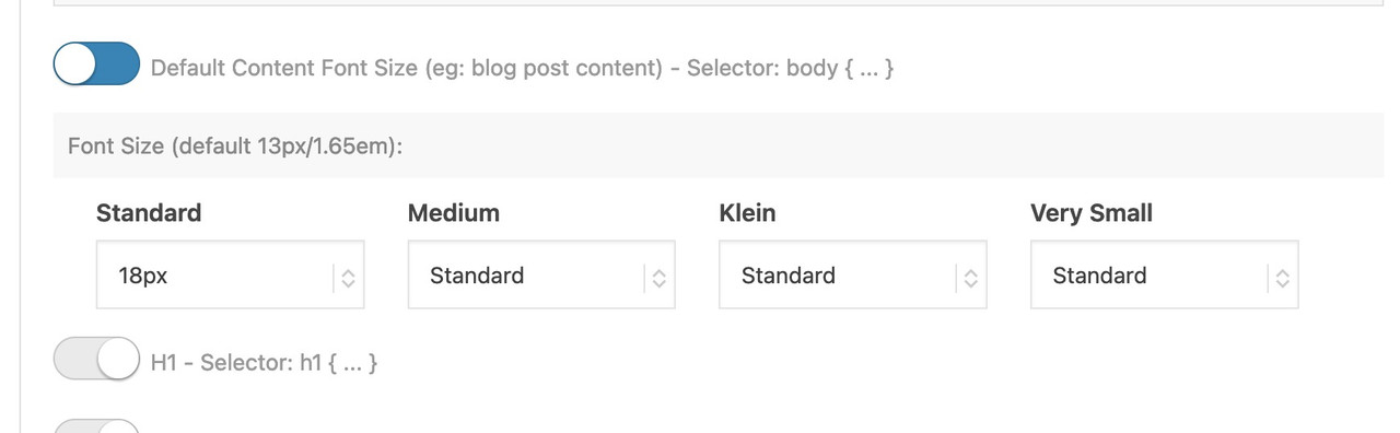
function custom_script(){ ?> <script type="text/javascript"> window.addEventListener("DOMContentLoaded", function () { (function($) { $('.open-popup-link a').trigger('click'); })(jQuery); }); </script> <?php } add_action('wp_footer', 'custom_script');unter Allgemeines Styling – gibt es den Tab ganz am Ende: “Typography”. ( vielleicht sollte man das im deutschen dann doch Typografie nennen)
dort den ersten Switch mal umlegen und das gewünschte dann setzen:
 December 7, 2023 at 11:28 am in reply to: Difference in size for transparent and non-transparent logo #1427433
it’s ok for me – the css code is now not in there ( earlier when I looked he was inside ) – and the one logo on privat is now again bigger than in the other page.
but now to synchronize it is only:
span.logo.avia-standard-logo { padding: 10px !important; }keep in mind that the
jQuery(window).load(function(){is deprecated, you now have to use:
jQuery(window).on('load', function(){December 7, 2023 at 8:20 am in reply to: Difference in size for transparent and non-transparent logo #1427411I am always happy when the solution is in place – but there is no feedback at all. ;)
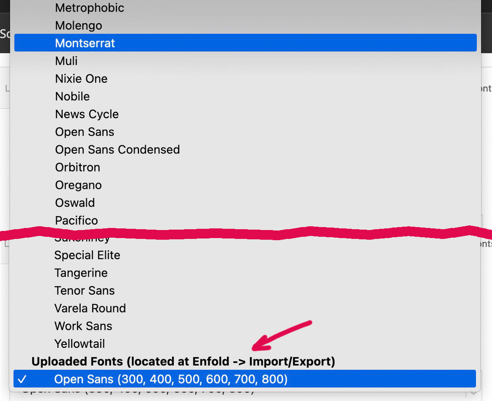
OK – seems to be solved.again – if the belgium domain with your nick is the page you are talking about: i do only see an open-sans font uploaded. – No Montserrat.
If you hamper google font support by the theme on GDPR reasons (DSGVO) in the functions.php the choice of the Montserrat Font from Drop-Downlist (except the fonts on the bottom: uploaded fonts ) will have no effect.
what kind of link did you enter on the input field?
try :https://www.youtube.com/watch?v=_Xbn6nNAIwci think the black bars are part of your video itself.
the video only got 2:3 aspect ratiosee here your video – croped to a 16/9 video :
https://webers-testseite.de/responsive-bg-video/( i will remove it after you have seen the issue)
-
This reply was modified 2 years, 4 months ago by
The drop-down menu at Advanced styling to choose the font that should be loaded – did you scroll to the bottom of that list and choose your Montserrat Font from there?
the manual uploaded Fonts are placed at the end of the drop-down list!
________
btw. is that .be page the page it concerns? – i do not see any uploaded Montserrat there.December 5, 2023 at 5:08 pm in reply to: Difference in size for transparent and non-transparent logo #1427232on the one installation you got :
span.logo.avia-standard-logo {
  padding: 10px !important;
}
span.logo a img {
  padding: 10px;
}
two times padding. The privat installation does not have that setting.
put this to your child-theme functions.php:
add_filter('avf_debugging_info', 'remove_debugging_info', 10, 1); function remove_debugging_info($info) { return false; }on my test environment – this is standard behavior.
if there are no entries there is no masonry shown.
Only an element ( here it is a heading ) got the class: el_before_av_masonry_entriesi recommend to use now the svg dividers – instead of the slanted option for the color sections.
the slanted option is only available for bottom styling.
The svg dividers you can set both top and bottom for the same color-section
_________for that behavior the parallax settings are set on the last tab (advanced) of the elements (columns)
I recommend not to set the first option (Parallax – default setting – used for all screen sizes (no media query)) and start with the next two options on Parallax Rules. ( And for the Column Position this is the same recommendation.)
Parallax – for large screens (wider than 990px – Desktop)
Parallax – for medium sized screens (between 768px and 989px – eg: Tablet Landscape)for mobile devices with narrow screen widths, it often makes no sense to set a parallax effect, as you hardly notice the background anyway.
Parallax – for small screens (between 480px and 767px – eg: Tablet Portrait)
Parallax – for very small screens (smaller than 479px – eg: Smartphone Portrait) -
This reply was modified 2 years, 3 months ago by
-
AuthorPosts