Forum Replies Created
-
AuthorPosts
-
maybe it has to do with your non existing certificates. Your page is only in http mode to view. But maybe a security setting or plugin hampers to load unsecure sources. Or your Content Security Header settings.
by the way: https://securityheaders.com/?q=http%3A%2F%2Finvebiwp.weblink.it%2Fcontatti%2F&followRedirects=on
Where did you insert those CSPs ? And did you do it the correct way?
on the demo https://kriesi.at/themes/enfold-2017/ I can also see the Twitter icon in Chrome. Without seeing your page – no chance to give advice.
If there is a link on private content area – you had to wait for a mod. SorryWenn es deine Internetseite betrifft, die sich hinter deinem Nick verbirgt, dann sind es hautpsächlich deine Bilder, die deiner Beachtung würdig sein sollten.
Mal davon abgesehen, das es gar keinen Sinn macht Bilder hochzuladen, die mehr als 2560px ( das ist eine Media-Library Grenze die WordPress selbst hat) groß sind. Dadurch tauchen Bilder auf, die dann WordPress auf diese Grenze herunter rechnet und mit dem addendum -scaled abspeichert.
schau dir den Bericht auf Gtmetrix mal an: Link
Es it garantiert nicht das Pseudo-Element was du oben anführst. ( Es sei denn es hat dort Hintergrundbilder oder ähnliches per css mit drin.)Es werden auch viele kleinere Bilder (in den Dimensionen nicht vom Dateivolumen) hochscaliert, was auch Zeit benötigt.
Zur Info bezüglich der Art wie Enfold mit hochgeladenen Bildern neue Formate errechnet. : https://kriesi.at/support/topic/enfold-image-bigger-than-original/#post-1355204
Dort findest du dann auch ein Snippet mit dem man den Kompressionslevel von Enfold beim Upload der Bilder reduzieren kann. Und wie man mit der Nutzung von temporär installierten Plugins die anderen Bildformate erneut recalculieren läßt.Meine Empfehlung : bevor du die Bilder hochlädst, berechne Sie neu in einem Grafikprogramm auf eine Größe, die auch später Verwendung finden könnte.
Wenn man sich die “most common browser viewing sizes” ansieht, sollte man mit 1920px meist auskommen.hier mal ein Bildvergleich eines deiner Bilder – schau ob sich das wirklich lohnt, hochaufgelöste Bilder im Web zu nutzen ;)
https://webers-testseite.de/bildvergleich/have you tried the troubleshoot hint on docu:
https://kriesi.at/documentation/enfold/openstreetmaps-leaflet-maps/#troubleshoot
using the plugin js or downloading the latest js from leaflet?Yes Mike – but i can not decide it because either your red arrow shows the superflous Bracket – or the blue arrow shows a too early set closing bracket.
Which one is to remove now. My guess is that the former (blue) is more likely to be removed.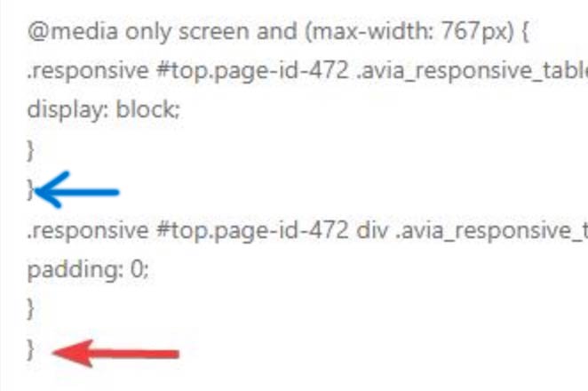
Further down there is also nesting of media querries, and I’m not sure if that works.
A bracket was opened, then new media query statements follow without closing the first one – after the insertions there is a closing bracket – but I don’t think that works. (maybe it works, because the parameters are the same).February 29, 2024 at 7:48 am in reply to: Color Section Diagonal Board Now Working with Video Background #1435825and is that always the case with your other sections? that the following section overlaps the previous one? Then you do not need this procedure. It’s a pity that the other participants always make such a secret of the pages they want to discuss. We would have reached our goal more quickly. Creating an external shadow (in relation to the svg) is easier. However, a box shadow is not useful here.
i gave a custom class to the section with the bg video : shadowinside
#top .avia-section.shadowinside .avia-divider-svg.avia-divider-svg-bottom svg {
  overflow: visible !important;
}
#top .avia-section.shadowinside .avia-divider-svg.avia-divider-svg-bottom path {
  filter: drop-shadow(0 3px 10px #000)
}
see example page on the bottom
although not all svg-dividers are suitable for this. There must be a certain height for the filling space. For example, the shadow cast at the top of the section would not work well, e.g. the separator “split” – or “Book”
i have a different fill color for that sperators that you can better see what i mean.so for this type of shadow casting it is good if the svg has a certain height of the not to fill space there to keep the shadow inside and is not cut off.
see here the height x is too small for the shadow.

an svg like this is better suited for this purpose:
svg Link
and comparison to the original tilt from enfold: https://i.postimg.cc/CLHtkX0t/svg-difference.jpgAfter erasing the snippet – did you refresh enfold merging – or delete Cachings ( Browser Caching, maybe any other caching tools)
What if you erase that snippet. The normal behavior is exactly what you try to achive.
What is the reason for that existing snippet in your functions.php?Bei dem Nick ausgesonnen, nehme ich mal an ich kann dir auch deutsch antworten:
Diese Fehler kann sind durch die vielen Media Querries entstanden. Eine Klammer die aufgeht – muß auch wieder geschlossen werden.
Da ich nicht weiß, was du mit deinen Regelen bewerkstelligen wolltest, kann ich auch nicht entscheiden ob der Fehler ein vorzeitiges Schließen der Klammer ist, oder eine überflüßig gesetzte Klammer ist.
Im Beispiel oben ob diese Regel nur unterhalb von 767px gelten soll oder eben generell:.responsive #top.page-id-472 div .avia_responsive_table .avia-data-table td, .responsive #top.page-id-472 div .avia_responsive_table .avia-data-table th { padding: 0; }Davon ist abhängig ob die Klammer oben zu früh geschlossen wurde, oder ob die andere zu viel ist. etc.
Da die Fehler mannigfaltig sind, empfehle ich alle zu entfernen. Die jenigen die leicht als korrekt zu erkennen sind wieder einzufügen. Also die nicht in media-querries gesetzt sind und auf/zu gehen.Und dann neu zu überdenken, was gemacht werden muss.
PS: um solche Fehler in Zukunft zu vermeiden; immer die Regeln, die du neu hinzufügen willst ganz an das Ende der Quick css zu setzen – niemals so zwischen drin reinzuschmeißen. Das birgt in sich Fehler Quellen. Dann am Ende – sortieren und die Media-Querries zusammenführen.
Ansonsten musst du eventuell auf die Hilfe eines Mods hoffen, der sich einloggt, und die verschiedenen Möglichkeiten durchspielt.
__________
With the nickname ausgesonnen, I assume I can also answer you in German:
These errors can be caused by the many media queries. A bracket that opens – must also be closed again.
Since I don’t know what you wanted to achieve with your rules, I can’t decide whether the error is a premature closing of the bracket or a bracket that was set superfluously.
In the example above whether this rule should only apply below 767px or in general:.responsive #top.page-id-472 div .avia_responsive_table .avia-data-table td, .responsive #top.page-id-472 div .avia_responsive_table .avia-data-table th { padding: 0; }It depends on whether the bracket at the top was closed too early, or whether the other one is too much, etc.
Since the errors are manifold, I recommend removing all of them. The ones that are easy to recognize as correct should be reinserted. So the ones that are not set in media-querries and open/close.And then rethink what needs to be done.
PS: to avoid such mistakes in the future; always put the rules you want to add at the end of the quick css – never throw them in between. This is a source of errors. Then at the end – sort and merge the media queries.
Otherwise, you may have to hope for the help of a mod who logs in and runs through the various options.
the problem seems to be that all pages do only reload. So there must be a setting in his installation that overrides the default behavior ( namely to redirect to the homepage ).
this is hard to say – because i do not know where to close an opended media query on your code, because I don’t know whether these errors occurred because you inserted a new media query rule into an existing one or simply forgot to put a closing bracket.
So i can’t tell you whether you should remove it where i wrote “closed too early?” (because then the bracket at “or an additional superfluous bracket” would be correct. Or just remove that bracket ( at “closed too early?”) . That depends on the intention of what you want to achieve. Both leads to a working code but do different things.
in other words :
i do not know if you like to have:@media only screen and (max-width: 767px) { .responsive #top.page-id-472 .avia_responsive_table .avia-data-table tr:first-child th { display: block; } .responsive #top.page-id-472 div .avia_responsive_table .avia-data-table td, .responsive #top.page-id-472 div .avia_responsive_table .avia-data-table th { padding: 0; } }or that:
@media only screen and (max-width: 767px) { .responsive #top.page-id-472 .avia_responsive_table .avia-data-table tr:first-child th { display: block; } } .responsive #top.page-id-472 div .avia_responsive_table .avia-data-table td, .responsive #top.page-id-472 div .avia_responsive_table .avia-data-table th { padding: 0; }etc.
_______So, if I no longer knew exactly what belonged to which intention, I would first remove everything. Then reinsert the ones that are unproblematic (opening and closing brackets that are clear ) and then add the media queries step by step.
btw. even if you are opening a media query – but have some other media querries inside that open and close correctly – a following closing bracket then have no effect.
see here some code of your css ( those rules that are correct are erased here )
@media only screen and (max-width: 767px) { .responsive #top.page-id-472 .avia_responsive_table .avia-data-table tr:first-child th { display: block; } } /**** closed too early ? ******/ .responsive #top.page-id-472 div .avia_responsive_table .avia-data-table td, .responsive #top.page-id-472 div .avia_responsive_table .avia-data-table th { padding: 0; } } /**** or an additional superfluous bracket ******/ @media only screen and (max-width: 767px) { #top .avia-icongrid.av-flex-cells.av-break-989 .av-icon-cell-item { flex: 1 1 100%; } .avia-icongrid-flipbox .av-icon-cell-item .avia-icongrid-front .avia-icongrid-inner, .avia-icongrid-flipbox .av-icon-cell-item .avia-icongrid-flipback .avia-icongrid-inner { padding: 0 3em; } .all_colors h3 { line-height: 1.3; /* Adjust the value to increase or decrease spacing */ } .keinspace span { display: block; /* Ensure the span is treated as a block element */ margin-top: 0px; /* Adjust margin-top to reduce space */ font-size: 0.7em; /* Adjust the font size smaller */ color: #6F6571; /* Change the text color to grey */ } .avia-cookie-consent { width: 100%; position: fixed; background-color: #009BDD; z-index: 999; color: rgba(255,255,255,0.9); padding: 1.1em; text-align: center; opacity: 1; visibility: visible; transition: all 0.3s ease-in-out; overflow: hidden; } .avia-cookie-consent-button, .avia-cookie-info-btn, .avia-cookie-hide-notification, .avia-button { background-color: white !important; color: black !important; } /**** missing closing curly bracket ******/ /***** some media querries inside here - that are correctly opend and close so the following closing has no effect to that before *******/ .av-burger-menu-main.menu-item-avia-special { display: block; } } /**** additional superfluous bracket ******/It is therefore best to avoid nesting media queries and possibly combine the same ones.
There are a lot of single@media only screen and (max-width: 767px) {In most cases it happens with media-query instructions. A bracket that is forgotten to be closed or one that is set too much.
here is one extra – or before the closing media query bracket is set to early?
.responsive #top.page-id-472 div .avia_responsive_table .avia-data-table td, .responsive #top.page-id-472 div .avia_responsive_table .avia-data-table th { padding: 0; } }next here is an opening bracket – with no closing ( i do not know if all the rest should be inside the media query – or if you like to close directly after that)
@media only screen and (max-width: 767px) {
	#top .avia-icongrid.av-flex-cells.av-break-989 .av-icon-cell-item {
		flex: 1 1 100%;
	}
.av-burger-menu-main.menu-item-avia-special { display: block; } }I would like to go to the start page by clicking on the logo.
this is standard behavior of Enfold setting ( WordPress on general). So if this is not the case there had to be something ( maybe allready in your functions.php) that hampers this action.
So what is exactly on your code in the XXXX part. Or just get rid of that entry. And have a look what happens then.
February 27, 2024 at 5:51 pm in reply to: Masonry: AND rule for category selection returns no results #1435624Actually, you have already described it in sufficient detail above. Just to be on the safe side, there are posts that belong to both categories.
As you can see here on an example page, I chose the “and” in the logic, and in fact only those posts are listed that belong to both categories. So I cannot confirm this behavior.https://webers-testseite.de/blog/
I will now test the masonry element you mentioned underneath. …
You can see that the Masonry also shows the same posts as the blog post element. ( of course the sorting option no longer makes sense here )
PS: btw. i want to test the magazine element too – but it does not have that logic option. Maybe a good idea to have it here too.
February 26, 2024 at 10:32 pm in reply to: Color Section Diagonal Board Now Working with Video Background #1435498In the meantime, I prefer to have my custom SVGs in a folder: /wp-content/uploads/dynamic_avia/avia_custom_shapes
this is a default folder for custom svg dividers – but you have to create it yourself.
Now we just register the custom svg files – add this to your functions.php of the child theme:function custom_avf_custom_svg_shapes( array $custom_shapes ) { $custom_shapes = array( 'tilt-with-shadow' => array( 'key' => 'tilt-with-shadow', 'title' => __( 'Tilt with Shadow', 'avia_framework' ), 'has_width' => true, 'has_flip' => true, 'filename' => 'tilt-with-shadow' ), ); return $custom_shapes; } add_filter( 'avf_custom_svg_shapes', 'custom_avf_custom_svg_shapes', 10, 1 );this svg you can find at:
https://webers-testseite.de/wp-content/uploads/tilt-with-shadow.svgif you click to the svg now : you can see the black fill of the svg – that is the trick on svg-dividers all path ( polygones, circles etc. ) that has no fill color in the svg get the color you set on the alb.
February 26, 2024 at 10:19 pm in reply to: Color Section Diagonal Board Now Working with Video Background #1435497This is more difficult than you think. Because a shadow cast on these svg dividers would be directed outwards. But that would mean casting a shadow upwards over the film. If I understand you correctly, however, the shadow should be directed downwards; but that means an inset shadow on the svg itself, and only on one edge.
It is possible – albeit with some effort – by creating a custom SVG divider. To do this, you should familiarize yourself a little with how to integrate them into the general process.
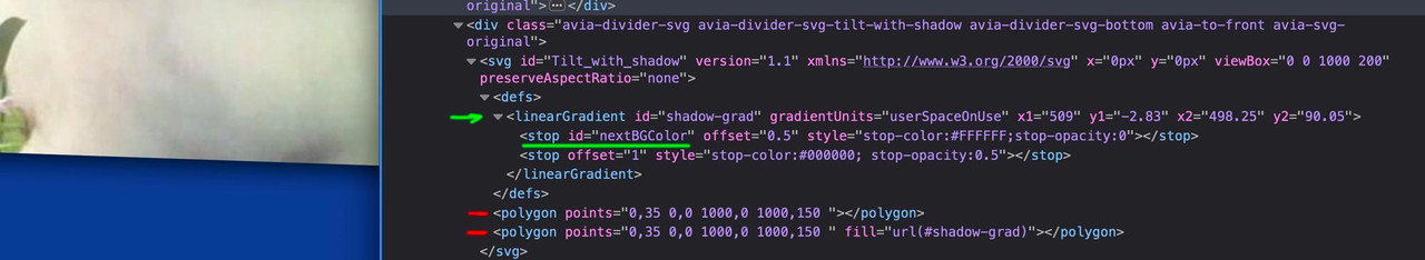
If you take a look at the example page with developer tools, you will see how it works.
The svg has two identical polygons (red), but I fill one of them with a gradient (green arrow) that goes from black to white; however, the white only has 0% coverage at the end. This white must later be replaced by the color of the following section via the ID of the stop-color using quick css.in my example page i gave to the section a custom class to better select that svg:
( benefit is now that we can select from outside the inner gradient ).avia-section.shadow-special #nextBGColor { stop-color: #083a96 !important; }next : how to have custom svg dividers …
February 26, 2024 at 7:02 am in reply to: Color Section Diagonal Board Now Working with Video Background #1435387you tried to do it with slanted border – but try with svg separator instead and check the mark “bring to front”

But both are not present now!
neither this: https://sample-page.li/wp-content/themes/enfold/style.css
nor that https://sample-page.li/wp-content/themes/enfold-child/style.cssFebruary 23, 2024 at 5:33 pm in reply to: Mime type error with Post CSS Files still a problem #1435237if i test my page on : https://securityheaders.com/?q=https%3A%2F%2Fwebers-webdesign.de&followRedirects=on
you can read the description of:
x-content-type-options: X-Content-Type-Options stops a browser from trying to MIME-sniff the content type and forces it to stick with the declared content-type. The only valid value for this header is “X-Content-Type-Options: nosniff”.
So your advice is to change the mime types for those generated post css to : text/css
but as far i can see on : class-post-css-management.php – line 919:
return '<style type="text/css">' . $this->new_ln . $rules . '</style>' . $this->new_ln;isn’t this responsible for those css settings?
__________
i set the filter ( avf_post_css_create_file ) now on one of my testinstallations to true ( only then files are generated inside dynamic-avia folder) – and switched of merging.
On dev tools i checked if i find some text/html in DOM – but nothing to find.February 23, 2024 at 5:21 pm in reply to: Accordion Slider – Stop allowing all images to show in slider #1435234If you use the same function name more than once (ava_custom_script_group_lightbox), an error is also displayed – but with a different message. Function names must be unique.
btw. i would have finished the variable setting with a semicolon – but as said above – no error on using it without.
var accordion = $('.accordion-lightbox-group') ;and your layerslider got the id 8? and nomenklatura is there a bit different #layer_slider_X
on default the first on a page will have : #layer_slider_1
the next #layer_slider_2so you can have:
@media only screen and (min-width: 768px) {
  #layer_slider_1{
    display: none!important;
  }
}

@media only screen and (max-width: 767px) {
  #layer_slider_2{
    display: none!important;
  }
}
check your page with developer tools which ID those sliders have.
_______
or you can have both videos in one layerslider and choose there the visibility.
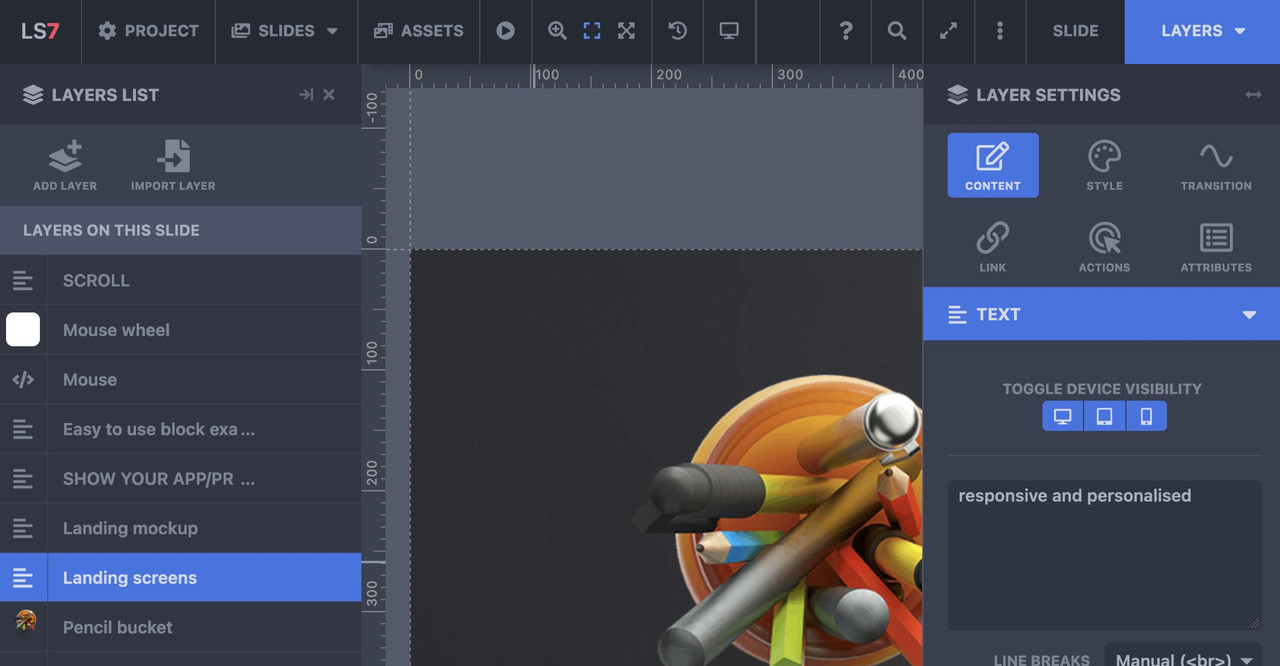
you have on each layer on the right side the tabs of layersettings – and on content tab you can set the layervisibility for desktop, tablett, mobile “toggle device visibility”
oh sorry – then I misunderstood your request. To me it sounds like you want to see the icons inside the mobile menu as well (hamburger menu). – The above way is a quick and easy way to have this for small social icon lists. I didn’t see that these are hidden below. of 479px.
__________
or try to preserve the social-bookmarks on the same place – because even on 280px screenwidth ( most mobile phones got 320px and more ) the logo does not overlap that area:
@media only screen and (max-width: 989px) {
  .responsive.av-burger-overlay-active #top #header .main_menu .social_bookmarks a {
    color: #FFF;
  }
/** if you had changed the phone-info input field - see at bottom of my message **/
  .phone-info .header-meta-mail {
    display: none;
  }
}

@media only screen and (max-width: 479px) {
  .responsive #top #wrap_all .main_menu .social_bookmarks {
    display: block !important;
  }
  .responsive #top #wrap_all .main_menu .avia-menu .av-burger-menu-main {
    border-color: #1b5289;
    padding-right: 15px;
    margin-right: 5px;
    border-right-width: 1px;
    border-right-style: solid;
    transition: border-color 0.2s ease-in-out;
  }
}
but i guess you have to change then a bit your phone-info input field. The standard behavior of enfold between 768px and 989px here in your setting is to show the burger icon and the social-bookmarks besides each other and to hide header_meta social bookmarks, so the “of mail” is obsolete on top then.
maybe you can do this:
<div><a href="tel: +31595729729">Bel 0595 729 729</a><a class="header-meta-mail" href="https://noorderwindbewindvoering.nl/contact/#contactformulier"> of mail</a></div>
– and with that class we can hide it on demandor in my opinion better – just to add the binding word to e-mail bookmark without link:
<div><a href="tel: +31595729729">Bel 0595 729 729</a><span class="header-meta-mail"> of mail</span></div>February 23, 2024 at 4:53 pm in reply to: Accordion Slider – Stop allowing all images to show in slider #1435227i could not test it now if it works – but the code from : https://kriesi.at/support/topic/accordion-slider-stop-allowing-all-images-to-show-in-slider/#post-1435166 does not lead to a functions.php error on my end here – means – the syntax is o.k.
February 23, 2024 at 3:16 pm in reply to: Accordion Slider – Stop allowing all images to show in slider #1435214yes – where is the leading:
function ava_custom_script_group_lightbox()on : link
February 22, 2024 at 7:40 pm in reply to: Accordion Slider – Stop allowing all images to show in slider #1435150You could set the grouping manually, using custom classes in combination with scripts in functions.php; in general, however, it is sufficient to keep the corresponding elements within a color section. And then set a new section for the next element.
Unfortunately I can’t see your page to give better advice.put this to your quick css:
@media only screen and (max-width: 989px) { .responsive.av-burger-overlay-active #top #header .main_menu .social_bookmarks a { color: #FFF; } }but: do not forget on avf_header_setting_filter_mod to add the class to header!
(preserve the a space on the first class that is added)$header['header_class'] .= " av_header_transparency";and conditional for search is :
is_search( )add_filter('avf_header_setting_filter', 'avf_header_setting_filter_mod', 9999, 1); function avf_header_setting_filter_mod($header){ if ( is_archive() || is_singular('post') || is_search() ) { $header['header_transparency'] = 'header_transparency'; $header['header_class'] .= " av_header_transparency"; } return $header; }What happens if you declare that page (blue) as start page on : Enfold (Child) – Theme Options – Frontpage Settings ?
February 20, 2024 at 5:32 pm in reply to: clear thin border to the right of each label on my menu #1434927No, not as the opposite, but in all corners. However, this property can also be intended for one corner each.
-
AuthorPosts