Forum Replies Created
-
AuthorPosts
-
but all downloads of that page you mentioned https://kriesi.at/documentation/enfold/icon/#download-fontello-or-flaticon-icons-included-in-enfold-demos are zip files that could be uploaded directly to enfold on enfold-child – import/export – Iconfont Manager
i tested it with the medical zip – and it works with no problem.
You had to upload that zip file without unpacking that file.The assumption is that it could be due to a plugin. Could it be the VFB Pro plugin that is not interacting properly?
To find out, I would first deactivate all plugins, then regenerate all caching (browser caching as well as Enfold Merging). Check whether this is still the case with the images. If the problem is no longer present, reactivate one plugin after the other and check when the error occurs again.PS: on trying to insert a media file to your text editor – are there any errors in the console that you can post here.
Just open the dev Tools of your browser – and open the console log. See if there are errors when trying to insert a media file.for those videos – best would be to have as selector a custom class if you like.
the best Way is to enter the aspect ration values to the element itself.
To show you for that page – that it is possible: – the aspect ratio of your video is on that: 1500/844 = 1.78.avia-video.av-7fxcr-5428f1f56eaafaaab4a35f67598764cf, .avia-video.av-lt51yanl-0fcc2bc8059b72cc4fbc0bf7e143adfe { padding-bottom: 178%; }that is what happens (calculation of that padding-bottom value) if you enter those correct ratios to the Element:
 March 12, 2024 at 11:23 pm in reply to: Audio Playlist showing Artist Name and current track with Quotation Marks #1437104
i can not believe that the other three shows no marks – and one does.
Anyway try that snippet in your child-theme functions.php from: https://pastebin.com/k0f385TJcan you please test that snippet!
if you like to have 4 columns – just change it.if you like to show the blog – then the context is not archive – it is index then ;)
PS: alb element = advanced layout builder element : if you use that – the element itself got some options to define the thumbnail size which is used.
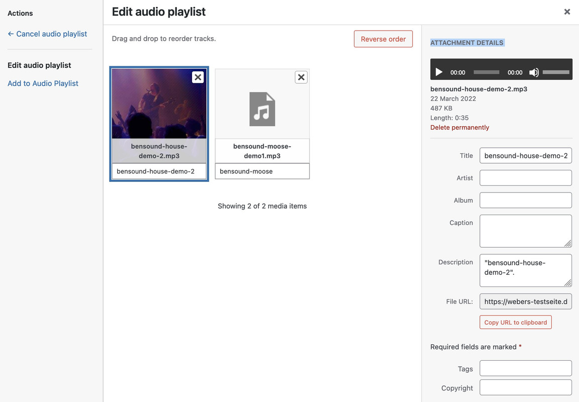
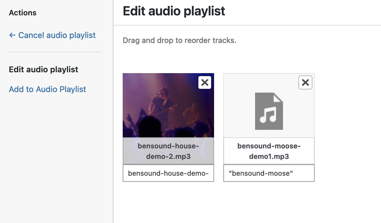
but, as I suspected, you are not using this optionMarch 12, 2024 at 5:41 pm in reply to: Audio Playlist showing Artist Name and current track with Quotation Marks #1437072what do you see if you click on the first mp3 Commercial on the right side at “Attachment Details” then.
Especially on Title
 March 12, 2024 at 10:21 am in reply to: the same error occurs: “Uncaught TypeError: Cannot read properties of undefined #1437027
on Enfold : where did you load your jQuery in the header or have you set to load jQuery in the footer?
hasClass belongs to jQuery – but if you load jQuery later than there will be this error. Maybe your plugin has the option too – to load the scripts later.so you are not using the alb element “blog posts” to show the content – but you have declared a page on : Enfold Child – Theme Options : “Where Do You Want To Display The Blog”. – and on Enfold Child – Blog Layout – you set the blog Layout to “Grid Layout”
try in your child-theme functions.php:
add_filter("avf_post_slider_args", function($atts, $context) {
  if( $context == "index" ) {
    $atts['type']  = 'grid';
    $atts['columns']  = 3;
    $atts['preview_mode'] = 'custom';
    $atts['image_size'] = 'entry_with_sidebar';
  }
  return $atts;
}, 10, 2);
other contexts in this could be : archive or tag – you can change the columns here too
March 12, 2024 at 8:53 am in reply to: Audio Playlist showing Artist Name and current track with Quotation Marks #1437019And you are realy shure that you haven’t set it with Quotationmarks?
Open that element and maybe make a screenshot as i do.
the default quotationmarks in the playlist belongs to mediaplayer of wordpress – and could be deleted by that known snippet:
https://pastebin.com/k0f385TJBut on top – these comes from Title and Description field of the media library.
Wow – thank you on that!
By the way – it only looks like the countdown if the css in question is loaded. If you have selected “Load only used elements (recommended)” in enfold options – and you have never used it in your installation – then the corresponding css is not loaded. Simply create a draft page somewhere on which the countdown is used.
Web-safe fonts are fonts that can adapt to any browser on any device. By using these types of fonts, web designers and developers ensure that the intended font will always display properly on a web page, even if these fonts aren’t installed on the user’s computer.
Since this was clear to me, I honestly didn’t read any further about your explanation there. There are quite a few more that could be listed here. But Copperplate does not belong here.
here is the official W3C List:
https://www.w3schools.com/cssref/css_websafe_fonts.phpAnd main point is – no img tag is used – images are background-images.
please show me your page. If you can not make it public – you had to wait for a mod.
Do you realy mean spacings ? those spaces between words? or do your mean line-breaks set by
<br>
this is a known issue but not on enfold – it is a wordpress “feature” ;)To avoid that Enfold got this extra button on text editor:
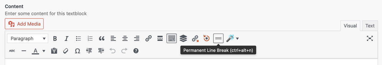
it is then set as :
<br class="avia-permanent-lb" />can you put this in your child-theme functions.php:
function insert_a_whatsapp_button() { ?> <script> (function($){ $( '#top' ).append('<div class="whatsapp-button"><a href="https://wa.me/3483883844?text=Salve,%20vorrei%20chiedere%20informazioni" target="_blank"><img width="80" height="80" src="https://srgl.it/aom/wp-content/uploads/2024/03/whatsapp_img-80x80.png" class="image wp-image-864 wa_img attachment-thumbnail size-thumbnail" alt="" style="max-width: 100%; height: auto;" decoding="async" srcset="https://srgl.it/aom/wp-content/uploads/2024/03/whatsapp_img-80x80.png 80w, https://srgl.it/aom/wp-content/uploads/2024/03/whatsapp_img-36x36.png 36w, https://srgl.it/aom/wp-content/uploads/2024/03/whatsapp_img.png 149w" sizes="(max-width: 80px) 100vw, 80px"></a></div>'); $('.whatsapp-button').css({ "position": "fixed", "bottom": "120px", "right": "20px", "z-index": "500", }) })(jQuery); </script> <?php } add_action('wp_footer', 'insert_a_whatsapp_button');now you can see on that example page – that i can influence the inline svg logo to have different fill colors if the header is transparent.
in this case i do not use the transparency logo on enfold options. – i just switch the fill color for that case:
.html_header_transparency #header:not(.header-scrolled) .fillColor {
  fill: #FFF;
}
by the way – on your page – i wouldn’t try to set the svg dimension via height – because this is calculated by the shrinking script.
just set a width ( absolute value).logo svg { /*** margin-top: 10px; ***/ /*** padding: 10px; ***/ width: 350px; /*** height: auto; ***/ }so get rid of margin-top, padding and height
If this is really the case, I think it would be better to include only platform-independent fonts in the list of Websafe fonts.
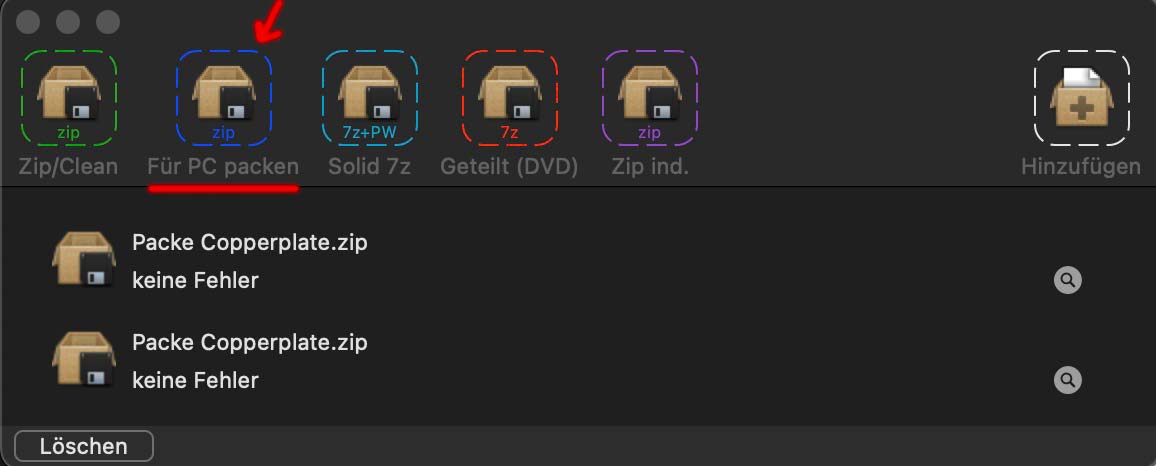
Next : BetterZip f.e. has a drop bar – you can there select the option to zip for PC ( that means no hidden Mac Files )
by the way Elsner & Flake got a copperplate with font-weight: 300, 500, 700
So try to upload that Font via : Custom Font Manager ?
how did you transform f.e. the ttf or otf files to web-fonts?
My Copperplate here is the Pro Version and otf files.you can do that f.e. on : https://transfonter.org/
i think ttf and woff2 would be sufficiant.by the way: https://similarfont.io/2-google-fonts-similar-to-copperplate
first : i do not see your custom class in the dom: image_no_stretch
second: maybe this is not the Element for you to use. It is the avia-fullscreen-slider
it is just the feature that the full-screen slider has the full height.next: the fullscreen slider has no images as slides – the image is set as background-image to the li !
( so no img tag to select )maybe better to use instead the fullwidth easy slider !
but this is not a pure svg file – it has an embedded image file ( as data:image/png;base64 ) – the advantage of svg is the vectorbased curves.
The embedded Image in your file is superflous. Here is a cleaned version of your logo:
https://webers-testseite.de/gonowjets.svgyou see on the xml code of that svg a group class : fillColor
so you can now colorize that logo via quick css:.fillColor { fill: #FFF; }see in action on : https://webers-testseite.de/gonowjets-2/
with:#top .logo svg { width: 300px; }ps: the svg does not shrink with the header because it fits with the given width even in the shrinked header.
if you do not set the svg width – it will shrink but then it is very big of course.you can do that inline like your color setting:
<h3>
   <a href="https://site.com/portfolio-item/east-point-lighthouse-n-j-photography-hot-spot/">
      <span style="color: #ffff00; text-transform: uppercase"><strong>EAST POINT LIGHTHOUSE</strong></span>
   </a>
</h3>
or globaly:
#top .avia_textblock h3 strong {
  text-transform: uppercase !important;
}
if you do like to have it only on some h3 – you had to use a custom-class
have you activated the TinyPNG with a valid API Key?
On my test – it has reduced a webp from 870kb to 279kb ( Dimension: 4032 × 3024 )March 6, 2024 at 11:58 pm in reply to: Disabling WP block editor and enabling Enfold Advance Layout Builder #1436556first – goto Enfold Options – Theme Options – Select Your Editor : “Use WP Classic Editor”
you can add to child-theme functions.php:
function trigger_alb_on_load(){
?>
<script>
window.addEventListener('DOMContentLoaded', function() {
(function($){
      setTimeout(function() {
        $("#avia-builder-button").trigger('click');
      }, 300);
})(jQuery);
});
</script>
<?php
}
add_action('admin_head-post-new.php', 'trigger_alb_on_load');
and if you like to change the editor even on widgets:
add_filter( 'use_widgets_block_editor', '__return_false' );Yes – but do replace both files – logo for transparency headers and the other one.
do you have that logo as svg file? Vectorbased Files are sharper even on small dimensions
If not – what Font is the base for it? (the G and E and T and S will not be there on default – but it is much easier to make an svg of that – if we know the source font.try this first instead:
function link_to_gallery_first_item_in_lightbox() {
?>
<script type="text/javascript">
window.addEventListener("DOMContentLoaded", function () {
(function($) {
  $('.link_to_lightbox a').addClass('no-scroll');
    $(document).on('click', '.link_to_lightbox a', function(event) {
        event.preventDefault();
        var linkTarget = $(this).attr('href');
        $(linkTarget).find("a.first_thumb").click();
    });
})(jQuery);
});
</script>
<?php
}
add_action('wp_footer', 'link_to_gallery_first_item_in_lightbox');
If you have installed a plugin like “Page scroll to id” – then we had to adjust it too.
the button is there too!
It turns out to be very complex if you first want to open the gallery preview in the modal window, and then the items with the next click.
Example Page :
give to the button element a custom class f.e.: link_to_lightbox and link to an ID.
( or if you got many links inside to perform : give that class to a parent-elment (f.e. color-section) )place your galleries on your page (preferably behind your other content on the site.)
Style them as lightbox galleries!
those galleries must have now a unique ID (that corresponds with your link ID’s) and a custom class: mfp-hideput this to your child-theme functions.php:
function link_to_gallery_first_item_in_lightbox() { ?> <script type="text/javascript"> (function($) { $(document).on('click', '.link_to_lightbox a', function(event) { event.preventDefault(); var linkTarget = $(this).attr('href'); $(linkTarget).find("a.first_thumb").click(); }); })(jQuery); </script> <?php } add_action('wp_footer', 'link_to_gallery_first_item_in_lightbox');and you like to show the gallery first in the lightbox – and then on next click the first gallery-item or does the button click start to show in lightbox the first item – then on click left/right the next images?
see for example: https://webers-testseite.de/hidden-gallery/
allthough there is no such font-style for sanchez – browser rendering could simulate a 700 Style.
just set it in your quick css to do so for headings.
see on google and developer tools change – on top 400 style – on bottom 700 via css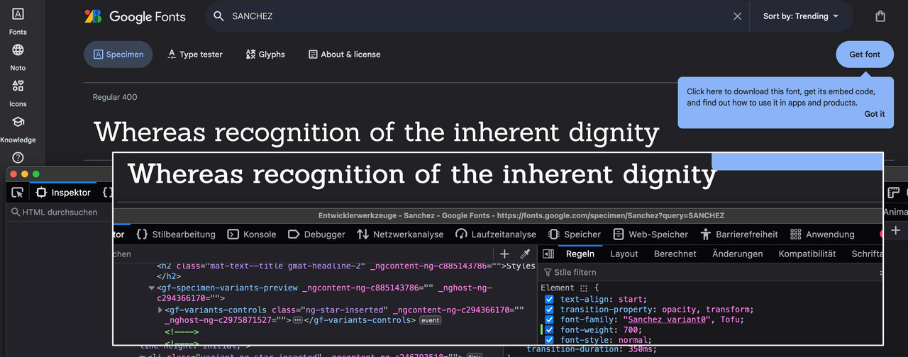
but i do not find any webp on your installtion
on alb settings – try to use the option to have no recalculted image – but to use “No Scaling (Original Width X original height)
even on chrome – if you use the recalculated images it uses the jpgs instead. Do you use for webp any additonal image plugin etc. ? -
AuthorPosts