Forum Replies Created
-
AuthorPosts
-
have a look at https://en-gb.wordpress.org/plugins/tablepress/
it might be interesting because it can handle excel tables or csv etc.you can use f.e. keka (download) to compress or : you can still download a little app i wrote. it is a shell-script. Just unzip that file and place the app to your desktop.
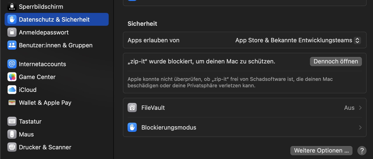
Now you can drag&drop files or folders to that icon. If you do not enter a new name – the generated zip will be named as the source file or folder:https://webers-testseite.de/zip-it.zip
because it is then an app from the internet you had to allow it on OSX the first time to execute.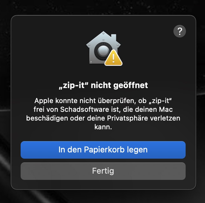
(sorry these are screenshots from my german OSX Mac.)
do not move to bin – klick the gray button and then open : system preferences – Data protection and security and on Security allow the app to open anyway.
see here how i made that automator app: https://kriesi.at/support/topic/how-to-submit-and-use-custom-fonts/#post-1470903
the downloaded app will have now an included icon and it will look like this :

see here for keka usage: https://kriesi.at/support/topic/trouble-importing-tff-or-woff-fonts/#post-1492002
_____________ :lol
PS: That’s only because I’m lazy. For example, I also created an Automator app that converts an mkv with dts sound into an mkv with ac3 sound via ffmpeg. Without remuxing the video ;)because your css is merged – i can not say where you set this rule – but this might be the reason for it:
it is in this css block – with comment:/**handles:avia-module-blog**/ /* ====================================================================================================================================================== #Blog Styles ====================================================================================================================================================== */#top .fullsize .template-blog .post .entry-content-wrapper { text-align: justify; font-size: 1.15em; line-height: 1.7em; max-width: 800px; margin: 0 auto; overflow: visible; }if you do not find it – you can overwrite that rule by higher selectivity:
#top #wrap_all .fullsize .template-blog .post .entry-content-wrapper {
  text-align:  left;
}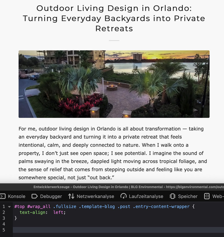
Can you post a link to the page in question?
It will then be easier to advise you on which method to use to place the widget (which hook to use) and which CSS is required.
(follow Rikards link above)/* ==== Header widget area Logo left, Menu right Logo right, Menu Left Logo center, Menu above ==== */ add_action( 'ava_after_main_menu', 'enfold_customization_header_widget_area' ); function enfold_customization_header_widget_area() { dynamic_sidebar( 'header' ); } /* ==== Header widget area ============ Logo left, menu below ==================================== */ add_action( 'ava_main_header', 'enfold_customization_header_widget_area' ); function enfold_customization_header_widget_area() { dynamic_sidebar( 'header' ); }after that create your new widget-area on :

_______________________
if you like to have the widget-area always nearby the logo – it might be better to use a filter to place the widget area:
See here a different solution with a widget area inside logo container ;)
https://basis.webers-testseite.de/
tell me – if this is what you like to have – and if your header setting is in this way.See snippets and basic css for that on: https://webers-testseite.de/fiorettipau/
i inserted to that widget-area a html widget – (copy&pasted html code from an enfold button-row)
Of course, you have to adapt the CSS to your header configuration. And you may also need to set a responsive behaviour.f.e. if you got a shrinking header – you had to decide f.e. if you set the widgettitle to display none on header-scrolled.
how did you insert that image to your page? as image element – or inside a text-block element or via masonry gallery etc. pp.
why do i ask this : if you can separate these images to different sections – then they will not group together. And you can set the responsive visibility on the section.but if you have the images inside a common section then –
see: https://webers-testseite.de/munford-lightbox/sadly for that setting of some images are grouped – some are not ( the layout image is a lightbox image too) the solution of Mike does not work here
Don’t worry, the script only runs if groups are actually set on the page, otherwise the script will abort.
Thank you – but I recommend using the unscaled images
f.e.:
http://www.interior-collection.de/wp-content/uploads/2025/12/IMG_7870-1.jpg : 135kb
http://www.interior-collection.de/wp-content/uploads/2025/12/IMG_7870-1-529×705.jpg : 285kb (imgSize: masonry – 705×705)so better resolution but less file size.
background on that : search for : avf_jpeg_quality
e.g: https://kriesi.at/support/topic/enfold-creating-images-larger-than-the-orginal/#post-1488786One thing is that your images you use are not wide enogh to fill the column width.
you can test my suggestion on placing this to your quick css for that section on that page:
#top.postid-3536 #av_section_3 .av-masonry-image-container img {
  width: 100%;
}
or use the non scaled images ( original sizes ) : No Scaling (Original Width X Original Height)
the css above is the rule from enfold – if you do not want that the width will be set by that – you had to overwrite this rule in quick css.
and it was only a suggestion what could happen on masonries on wide screens. So now i can see your masonry .After the grid container – you got that section with the masonry.
On Gallery Style – what are your settings there: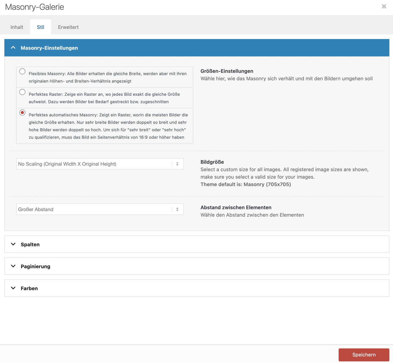
i do not really know what you mean by “falls apart” but there is a setting on wide screens in masonry-entries.css:
@media only screen and (min-width: 1800px)
{
	.responsive.html_stretched .av-masonry-col-flexible .av-masonry-entry,
	.responsive.html_av-framed-box .av-masonry-col-flexible .av-masonry-entry{
		width: 16.6%;
	}
	.responsive.html_stretched .av-masonry-col-flexible .av-masonry-entry.av-landscape-img,
	.responsive.html_av-framed-box .av-masonry-col-flexible .av-masonry-entry.av-landscape-img{
		width: 33.2%;
	}
}
so if you do not like to have that for (extreme) wide screens – you have to overwrite it by css in your quick css.
sorry – no private content for me – i’m participant as you are.
i thought it was your belgium site on spitsdesign
PS: it is hard to inspect it with DEV Tools – because you merged the css.
PPS: if you just use the minified Versions – this seems to be a better performance on modern browsers. – and it is easier to inspect.for the bar under the images try:
.avia_transform #top .avia-fullwidth-portfolio .grid-content, .avia_transform #top .avia-fullwidth-portfolio .grid-entry-title, .avia_transform #top .avia-fullwidth-portfolio .avia-arrow { background-color: var(--enfold-main-color-primary) !important; /* ==== or any color you like === */ } .avia_transform #top .avia-fullwidth-portfolio .grid-entry-title{ color: #FFF }if you only want to get rid of that white overlay – but show on hover the little round icon – try:
.avia_transform .avia-fullwidth-portfolio a .image-overlay {
  background-color: transparent !important;
  opacity: 1 !important;
}
.avia_transform .avia-fullwidth-portfolio a .image-overlay-inside {
  opacity: 0 !important;
}
.avia_transform .avia-fullwidth-portfolio a:hover .image-overlay-inside {
  opacity: 0.8 !important;
}
December 31, 2025 at 10:27 am in reply to: LayerSlider translation into German does not work #1493610by the way : this is only for standalone Plugin of LayerSlider.
maybe i find some time to adjust that snippets to the included Layerslider in the new year.December 30, 2025 at 9:47 pm in reply to: LayerSlider translation into German does not work #1493597this is i think the best option to handle the lang files:
it is a only manual patch vor those lang files of LayerSlider.
Or automatic after Plugin Update
Just uploading the lang-files to /wp-content/plugins/LayerSlider/assets/locales folderYou will have than a button on the LayerSlider Admin bar:
/* ========================================================================
 * LayerSlider: Patch for Select Option of lang files
 * Auto-copies language files from uploads to plugin directory
 * Auto-removes language files that were deleted from uploads
 * Auto-patches after plugin updates
 ======================================================================== */

// 1. Patch-Function
function child_theme_patch_layerslider_template() {

    if (!defined('LS_ROOT_PATH')) {
        return false;
    }

    $template_file = LS_ROOT_PATH . '/templates/tmpl-plugin-settings.php';

    // Check both locations
    $plugin_locales_dir = LS_ROOT_PATH . '/locales';
    $upload_dir = wp_upload_dir();
    $custom_locales_dir = $upload_dir['basedir'] . '/layerslider/lang';

    if (!file_exists($template_file)) {
        return false;
    }

    // Create custom locales directory if it doesn't exist
    if (!is_dir($custom_locales_dir)) {
        wp_mkdir_p($custom_locales_dir);
    }

    // SYNC language files (copy new/updated, delete removed)
    child_theme_sync_language_files($custom_locales_dir, $plugin_locales_dir);

    // Find available languages (now from plugin directory after sync)
    $available_languages = child_theme_get_available_languages($plugin_locales_dir);

    if (empty($available_languages)) {
        return false;
    }

    $content = file_get_contents($template_file);

    // language names
    $language_names = [
        'de_DE' => 'Deutsch',
        'de_DE_formal' => 'Deutsch (Sie)',
        'de_CH' => 'Deutsch (Schweiz)',
        'de_CH_informal' => 'Deutsch (Schweiz, Du)',
        'de_AT' => 'Deutsch (Österreich)',
        // add lang names needed for your uploaded lang files
    ];

    // protected default languages
    $protected_languages = ['auto', 'en_US', 'fr_FR', 'hu_HU', 'uk'];

    $modified = false;

    // PART 1: Adding missing languages
    $new_options = '';
    foreach ($available_languages as $locale) {
        if (strpos($content, 'value="' . $locale . '"') !== false) {
            continue;
        }

        $language_name = isset($language_names[$locale]) ? $language_names[$locale] : $locale;
        $new_options .= "\n\t\t\t\t\t\t<option value=\"" . $locale . "\" <?php echo ( \$custom_locale === '" . $locale . "' ) ? 'selected' : ''?>>" . $language_name . "</option>";
        $modified = true;
    }

    if (!empty($new_options)) {
        $search = '<option value="auto" <?php echo ( $custom_locale === \'auto\' ) ? \'selected\' : \'\'?>><?php _e(\'Site default\', \'LayerSlider\') ?></option>';
        $replace = $search . $new_options;
        $content = str_replace($search, $replace, $content);
    }

    // PART 2: Removing languages that no longer exist
    foreach ($language_names as $locale => $name) {
        if (in_array($locale, $protected_languages)) {
            continue;
        }

        if (strpos($content, 'value="' . $locale . '"') !== false && !in_array($locale, $available_languages)) {
            $pattern = '/\s*<option value="' . preg_quote($locale, '/') . '"[^>]*>.*?<\/option>/';
            $new_content = preg_replace($pattern, '', $content);

            if ($new_content !== $content) {
                $content = $new_content;
                $modified = true;
            }
        }
    }

    if (!$modified) {
        return true;
    }

    // Save
    file_put_contents($template_file, $content);

    return true;
}

// 2. IMPROVED: Sync language files (copy new + delete removed)
function child_theme_sync_language_files($source_dir, $target_dir) {

    if (!is_dir($source_dir) || !is_dir($target_dir)) {
        return false;
    }

    $copied = 0;
    $deleted = 0;

    // PART 1: Copy new/updated files from source to target
    $source_files = glob($source_dir . '/LayerSlider-*.{mo,po}', GLOB_BRACE);

    // Get list of locales in source directory
    $source_locales = [];
    if ($source_files) {
        foreach ($source_files as $source_file) {
            $filename = basename($source_file);
            $target_file = $target_dir . '/' . $filename;

            // Extract locale from filename
            preg_match('/LayerSlider-([^\.]+)\./', $filename, $matches);
            if (isset($matches[1])) {
                $source_locales[] = $matches[1];
            }

            // Copy if doesn't exist or is newer
            if (!file_exists($target_file) || filemtime($source_file) > filemtime($target_file)) {
                if (copy($source_file, $target_file)) {
                    $copied++;
                }
            }
        }
    }

    // Remove duplicates
    $source_locales = array_unique($source_locales);

    // PART 2: Delete files from target that don't exist in source
    $target_files = glob($target_dir . '/LayerSlider-*.{mo,po}', GLOB_BRACE);

    // Protected locales (never delete these - they're from the plugin itself)
    $protected_locales = ['en_US', 'fr_FR', 'hu_HU', 'uk'];

    if ($target_files) {
        foreach ($target_files as $target_file) {
            $filename = basename($target_file);

            // Extract locale from filename
            preg_match('/LayerSlider-([^\.]+)\./', $filename, $matches);
            if (!isset($matches[1])) {
                continue;
            }

            $locale = $matches[1];

            // Skip protected locales
            if (in_array($locale, $protected_locales)) {
                continue;
            }

            // If this locale is NOT in source directory, delete it from target
            if (!in_array($locale, $source_locales)) {
                if (unlink($target_file)) {
                    $deleted++;
                }
            }
        }
    }

    return ['copied' => $copied, 'deleted' => $deleted];
}

// 3. Helper function
function child_theme_get_available_languages($locales_dir) {
    $languages = [];

    if (!is_dir($locales_dir)) {
        return $languages;
    }

    $files = glob($locales_dir . '/LayerSlider-*.mo');

    if (!$files) {
        return $languages;
    }

    foreach ($files as $file) {
        $filename = basename($file, '.mo');
        $locale = str_replace('LayerSlider-', '', $filename);
        if (!empty($locale)) {
            $languages[] = $locale;
        }
    }

    return $languages;
}

// 4. Insert button in dashboard
function child_theme_layerslider_add_sync_button() {
	$screen = get_current_screen();
	if (!$screen || strpos($screen->id, 'layerslider') === false) {
	    return;
	}
	?>
	<script type="text/javascript">
	    jQuery(document).ready(function($) {
	        setTimeout(function() {
	            if ($('.ls-sync-languages-button').length > 0) {
	                return;
	            }

	            var $settingsButton = $('.ls-open-plugin-settings-button');

	            if ($settingsButton.length === 0) {
	                return;
	            }

	            var syncUrl = <?php echo wp_json_encode(add_query_arg('ls_sync', '1', admin_url('admin.php?page=layerslider'))); ?>;

	            var $syncButton = $('<a>', {
	                href: syncUrl,
	                class: 'ls-button ls-sync-languages-button',
	                html: '<?php echo addslashes(lsGetSVGIcon("globe")); ?>'
	            });

	            $settingsButton.before($syncButton);

	        }, 500);
	    });
	</script>

	<style>
	.ls-sync-languages-button:hover {
	    color: #fff;
	    background: #54575f;
	    border-color: #0000;
	    transition: opacity 0.2s;
	}
	</style>
	<?php
}
add_action('admin_footer', 'child_theme_layerslider_add_sync_button');

// 5. MANUAL TRIGGER
function child_theme_layerslider_manual_sync() {
    if (!isset($_GET['ls_sync']) || $_GET['ls_sync'] != '1') {
        return;
    }

    if (!current_user_can('manage_options')) {
        wp_die('No permission');
    }

    $success = child_theme_patch_layerslider_template();

    $redirect_url = admin_url('admin.php?page=layerslider');

    if ($success !== false) {
        $redirect_url = wp_json_encode(add_query_arg('ls_synced', '1', $redirect_url));
    } else {
        $redirect_url = wp_json_encode(add_query_arg('ls_sync_failed', '1', $redirect_url));
    }

    wp_redirect($redirect_url);
    exit;
}
add_action('admin_init', 'child_theme_layerslider_manual_sync', 1);

// 6. AUTO-PATCH after plugin update
function child_theme_layerslider_after_update($upgrader_object, $options) {
    if ($options['action'] !== 'update' || $options['type'] !== 'plugin') {
        return;
    }

    if (!isset($options['plugins'])) {
        return;
    }

    foreach ($options['plugins'] as $plugin) {
        if (strpos($plugin, 'layerslider') !== false || strpos($plugin, 'LayerSlider') !== false) {
            // Run patch automatically after LayerSlider update
            child_theme_patch_layerslider_template();
            break;
        }
    }
}
add_action('upgrader_process_complete', 'child_theme_layerslider_after_update', 10, 2);
December 30, 2025 at 12:46 am in reply to: LayerSlider translation into German does not work #1493575can you send me your german lang file please?
– thanks in advance –
– if you do not like to post it here on public – send me an e-mail (links are under my avatar or nick)December 29, 2025 at 10:57 pm in reply to: LayerSlider translation into German does not work #1493574here we go – Edit: i think this is the better way to do it :
https://kriesi.at/support/topic/layerslider-translation-into-german-does-not-work/#post-1493597
________________________
(just for standalone plugin – not for the included layerslider)/** * LayerSlider: Auto-Patch for Select Option of lang files */ // 1. Daily auto-patch function child_theme_layerslider_auto_patch() { if (!defined('LS_ROOT_PATH')) { return; } // Check only once a day $last_check = get_option('layerslider_patch_last_check', 0); if (time() - $last_check < DAY_IN_SECONDS) { return; } child_theme_patch_layerslider_template(); update_option('layerslider_patch_last_check', time()); } add_action('admin_init', 'child_theme_layerslider_auto_patch', 999); // 2. Patch-Function function child_theme_patch_layerslider_template() { $template_file = LS_ROOT_PATH . '/templates/tmpl-plugin-settings.php'; $locales_dir = LS_ROOT_PATH . '/locales'; if (!file_exists($template_file) || !is_dir($locales_dir)) { return false; } // Find available languages $available_languages = child_theme_get_available_languages($locales_dir); if (empty($available_languages)) { return false; } $content = file_get_contents($template_file); // language names $language_names = [ 'de_DE' => 'Deutsch', 'de_DE_formal' => 'Deutsch (Sie)', 'de_CH' => 'Deutsch (Schweiz)', 'de_CH_informal' => 'Deutsch (Schweiz, Du)', 'de_AT' => 'Deutsch (Österreich)', // add lang names needed for your uploaded lang files ]; // protected default languages $protected_languages = ['auto', 'en_US', 'fr_FR', 'hu_HU', 'uk']; $modified = false; // PART 1: Adding missing languages $new_options = ''; foreach ($available_languages as $locale) { if (strpos($content, 'value="' . $locale . '"') !== false) { continue; } $language_name = isset($language_names[$locale]) ? $language_names[$locale] : $locale; $new_options .= "\n\t\t\t\t\t\t<option value=\"" . $locale . "\" <?php echo ( \$custom_locale === '" . $locale . "' ) ? 'selected' : ''?>>" . $language_name . "</option>"; $modified = true; } if (!empty($new_options)) { $search = '<option value="auto" <?php echo ( $custom_locale === \'auto\' ) ? \'selected\' : \'\'?>><?php _e(\'Site default\', \'LayerSlider\') ?></option>'; $replace = $search . $new_options; $content = str_replace($search, $replace, $content); } // PART 2: Removing languages that no longer exist foreach ($language_names as $locale => $name) { if (in_array($locale, $protected_languages)) { continue; } if (strpos($content, 'value="' . $locale . '"') !== false && !in_array($locale, $available_languages)) { $pattern = '/\s*<option value="' . preg_quote($locale, '/') . '"[^>]*>.*?<\/option>/'; $new_content = preg_replace($pattern, '', $content); if ($new_content !== $content) { $content = $new_content; $modified = true; } } } if (!$modified) { return true; } // Back up and save file_put_contents($template_file . '.backup-' . date('Y-m-d-His'), file_get_contents($template_file)); file_put_contents($template_file, $content); return true; } // 3. helper function function child_theme_get_available_languages($locales_dir) { $languages = []; $files = glob($locales_dir . '/LayerSlider-*.mo'); if (!$files) { return $languages; } foreach ($files as $file) { $filename = basename($file, '.mo'); $locale = str_replace('LayerSlider-', '', $filename); if (!empty($locale)) { $languages[] = $locale; } } return $languages; } // 4. Automatically patch after plugin update function child_theme_layerslider_after_update($upgrader_object, $options) { if ($options['action'] !== 'update' || $options['type'] !== 'plugin') { return; } if (!isset($options['plugins'])) { return; } foreach ($options['plugins'] as $plugin) { if (strpos($plugin, 'layerslider') !== false || strpos($plugin, 'LayerSlider') !== false) { delete_option('layerslider_patch_last_check'); child_theme_patch_layerslider_template(); break; } } } add_action('upgrader_process_complete', 'child_theme_layerslider_after_update', 10, 2); /** * END of LayerSlider: Auto-Patch for Select Option of lang files */Summary of the final solution:
✅ Upload language files to /LayerSlider/assets/locales/
✅ Automatic patch after 24 hours
✅ Automatic patch after plugin updates
✅ when needed: delete_option(‘layerslider_patch_last_check’); – for immediate patchthese snippets will inspect each day – if there are additional lang files for LayerSlider
PS: You can force the patcher by temporarily inserting the following to your child-theme functions.php:
delete_option('layerslider_patch_last_check');
after that goto Layerslider Dashboard and : Plugin Updates – Re-Check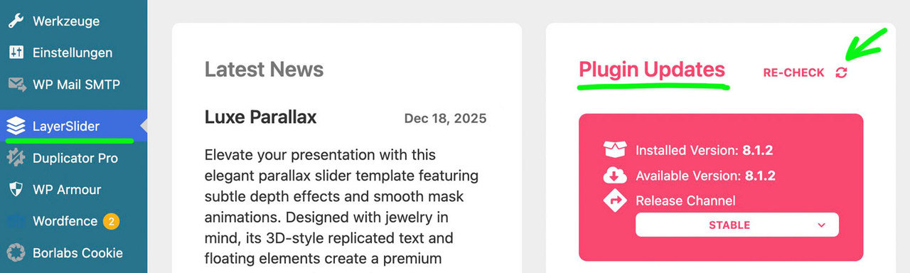 December 29, 2025 at 3:02 pm in reply to: LayerSlider translation into German does not work #1493566
If you have a license for a standalone plugin, you can remove the included Layerslider. Since I already had some projects beforehand, I used the removal option mentioned above.
Since the projects are not stored in the plugin folder, they can be retained.______
I’m looking for a child theme solution that is update-proof, but that doesn’t seem to be as easy as I initially thought.
I thought I could read the language files in the locales folder and then automatically add the newly found languages to the select menu. And do so in such a way that an auto-patch is performed even after a plugin update.BTW: maybe you offer your translation to KreaturaMedia – maybe they will include that files.
December 29, 2025 at 6:42 am in reply to: LayerSlider translation into German does not work #1493554i have this stand alone Version too – because i do have some Licenses for Layerslider.
so this seems to be very similar to Herb. I decided to completely remove theme plugin files ( and keep slides ) option.but – i do not have a proper child-theme solution for that now – maybe i find a way to do that.…
December 28, 2025 at 10:39 pm in reply to: LayerSlider translation into German does not work #1493548on tmpl-plugin-settings.php add your edited language manually – and upload it to the assets/templates folder via ftp
<select name="ls_custom_locale" data-confirm="<?= __('The selected language has been changed. Reload the page to apply the new language?', 'LayerSlider') ?>">
	<option value="auto" <?php echo ( $custom_locale === 'auto' ) ? 'selected' : ''?>><?php _e('Site default', 'LayerSlider') ?></option>
	<option value="en_US" <?php echo ( $custom_locale === 'en_US' ) ? 'selected' : ''?>>English (United States)</option>
	<option value="fr_FR" <?php echo ( $custom_locale === 'fr_FR' ) ? 'selected' : ''?>>Français</option>
	<option value="de_DE" <?php echo ( $custom_locale === 'de_DE' ) ? 'selected' : ''?>>Deutsch</option>
	<option value="hu_HU" <?php echo ( $custom_locale === 'hu_HU' ) ? 'selected' : ''?>>Magyar</option>
	<option value="uk" <?php echo ( $custom_locale === 'uk' ) ? 'selected' : ''?>>Українська</option>
</select>
then you find your language in the drop down.:
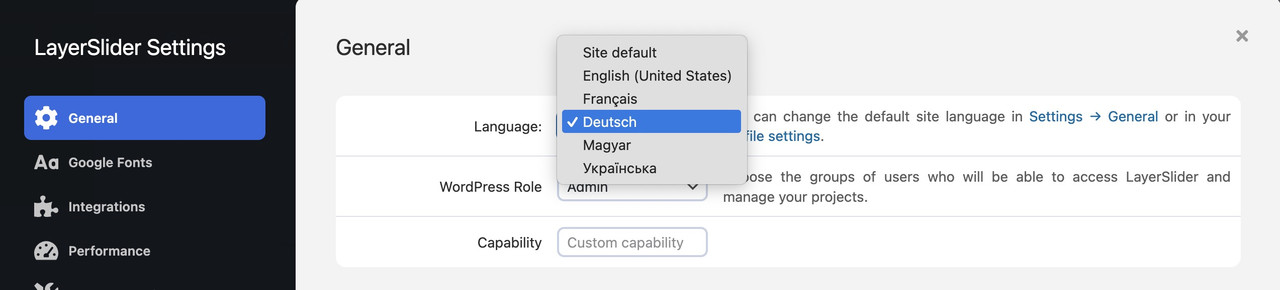
a reload of the page will then switch to your lang files
i inserted in that drop-down list my german lang option:
i only tested it with some of the translations – f.e.:
may i ask you what is behind your “avia_gallery_image_order” – because this seems to be your custom function name – and not the filter that is used by enfold. So could you give more info about that function?
December 24, 2025 at 10:26 am in reply to: spacing / padding around partner logo element when displayed as a grid #1493483although you have the grid the different “images” are placed in a slide-loop and the slides are numbered – starting at number 1 from left to right – to to bottom : slide-loop-1, slide-loop-2, slide-loop-3 etc.
so you can address the “image” via that class – why i do note it as “image” these are background-images – no img tag here !
So a padding will not bring you to your wanted result.but try f.e.:
#top .avia-logo-grid .slide-entry-wrap .slide-loop-6 .av-partner-fake-img {
  background-size: 80% !important;
  background-position: center;
  background-color: inherit;
}
if you want it for only that element – give a custom ID or class to the partner-logo element.
e.g. with my-custom-class#top .avia-logo-grid.my-custom-class .slide-entry-wrap .slide-loop-6 .av-partner-fake-img { background-size: 50% !important; background-position: center; background-color: inherit; }if you use a jpg for that slide – change the background-color to the background of that jpg.
December 23, 2025 at 9:17 am in reply to: Subject: Favicon not showing in Google SERP despite following all forum recommen #1492764is it caused by board soft that there is a usage of an entity in your link notation?
(because you are not using the code tag to post that, i can not say if it is the reason for it.)the quotes you set are all straight double quotes :
<link rel="icon" type="image/x-icon" href="https://mysite.com/favicon.ico">
<link rel="shortcut icon" type="image/x-icon" href="https://mysite.com/favicon.ico">
and try both entries via wp_head
Have you solved the problem? If so, could you please report here how you did it?
well – for the size i see in your merged styles :
#top #wrap_all .av-inherit-size .av-special-heading-tag {
  font-size: 1em;
}
because it is the merged version i do not see – if it is a quick css made rule.
f.e. for the heading “NOTRE ENGAGEMENT” inside color-section : #engagement
these rulesets are made inline ( inside the element options ) ( they are listed in a post-….css file ).avia-section.av-2ah6ew-59724389008986c8623645d2779db077 { background-color: #0984a9; background-image: unset; } #top #wrap_all .av-special-heading.av-ma6kesg8-158f508a9a89994cebab9c80a4c731f0 .av-special-heading-tag { font-size: 40px; }for the heading “ACTUALITÉ” inside color-section : #actualite this is not done.
so the standard property is used:.main_color { background-color: var(--enfold-main-color-bg); }and this is for your page #fff
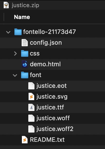
i guess – only delete the former zip file and reupload that zip again will fix it on enfold justice demo.
what ismael is trying to show you is – if you inspect the demo page with dev Tools you see the place to download the woff2 :
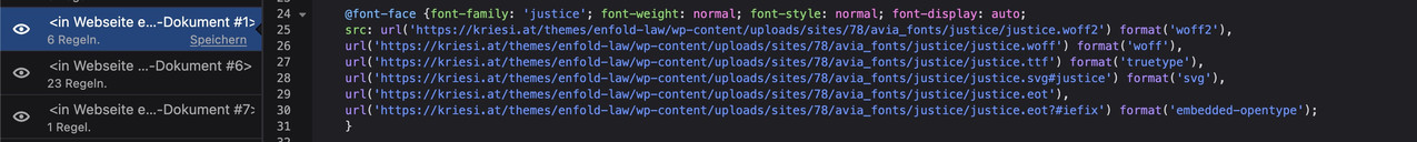
but allthough it is listed there the link does not exist:
https://kriesi.at/themes/enfold-law/wp-content/uploads/sites/78/avia_fonts/justice/justice.woff2these icon-fonts are on the docu page too:
https://kriesi.at/documentation/enfold/icon/#download-fontello-or-flaticon-icons-included-in-enfold-demoshttps://kriesi.at/documentation/enfold/wp-content/uploads/sites/22/2022/08/justice.zip
including the woff2 :
As far as i can see : https://www.microsoft.com/en-us/download/details.aspx?id=106087
You can download it from Microsoft – but the included Eula Text is not clear enought if a web-font usage is allowed.If you own that font – maybe you should be clear what you like to use as font-weight. Even the normal Aptos got a lot of different font-weights (regular, light, semibold, bold, extrabold, black). My recommendation is to use a selection only on performance reasons – f.e. (light, regular, bold)
To have a better modern browser support – take the ttf files and convert them to woff2. (f.e. on https://transfonter.org/)
Put all font-weights (ttf and woff2) in a folder f.e. “Aptos” – and zip that folder for uploading it to the enfold font-manager.
After that – you can choose that font at the end of the drop-downlist for Body font and headings.Aptos from Adobe or from Microsoft ? Serif or Sans Serif ?
If it is from Adobe – does your customer own the rights to use it for web?try a combination of both filters:
function avf_masonry_entry_content_mod($content, $entry, $config) {
    // Remove all br tags within <ul>...</ul> blocks
    $content = preg_replace_callback('/<ul[^>]*>.*?<\/ul>/is', function($match) {
        return str_replace(['<br>', '<br/>', '<br />'], '', $match[0]);
    }, $content);

    // Reduce duplicate/multiple br tags outside of ul tags to a single one
    $content = preg_replace('/(<br\s*\/?>\s*){2,}/i', '<br>', $content);

    return $content;
}
add_filter('avf_masonry_entry_content', 'avf_masonry_entry_content_mod', 10, 3);

function my_avf_masonry_loop_entry_content($loop_excerpt, $entry) {
  $loop_excerpt = strip_tags( ($entry->post_excerpt) , '<br><ul><li><strong>'  );
  return $loop_excerpt;
}
add_filter('avf_masonry_loop_entry_content', 'my_avf_masonry_loop_entry_content', 10, 2);
with these snippet you can now insert to excerpt input field:<strong>Validation & Calibration</strong><br> <ul> <li>Supply and exhaust air volumes</li> <li>Room pressure differential</li> <li>Pressure gauges and monitors</li> <li>Air changes per hour</li> <li>Incubators and scales</li> <li>Refrigerators and freezers</li> </ul> -
AuthorPosts