Forum Replies Created
-
AuthorPosts
-
set the maintenance mode – to your home page
logged in (maybe as admin only – i did not test this) you can reach every page – but logged out all visitors will be only able to load the frontpage
you can increase your font-size for that.
#avia2-menu .menu-item a { font-size: 14px; }one of the logo graphic could not be found:
…/wp-content/uploads/2024/07/Logo-xyz-350x85px_w.pngwhy don’t you use a svg for that too?
then the knife:
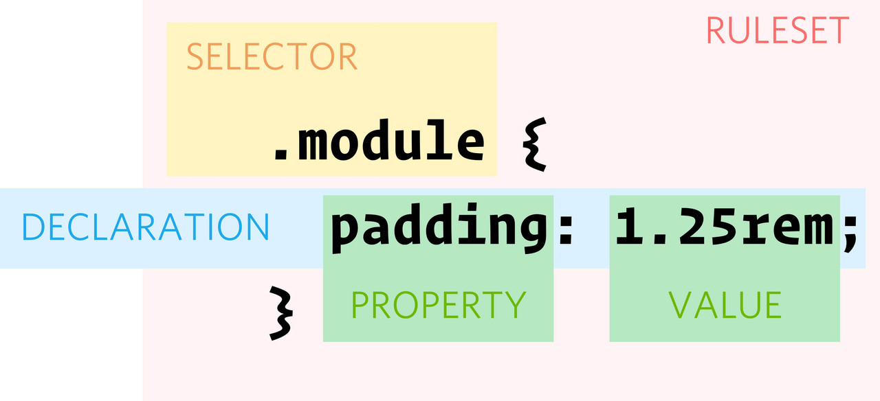
#top .avia-menu.av_menu_icon_beside { border: none !important; }Yes – that’s right, the rule set will not be able to override other rules, but whether it is applied itself depends on the specificity. For CSS, it’s important that the selector you want to work has more specificity.
Your custom class is unique, but if there is a rule with an ID, and it concerns to the same element, it will win the competition.
more points – higher Selectivity.
here is a calculator : https://specificity.keegan.st/- !important always wins, unless several selectors have received an !important.
- Inline styles (e.g. <h1 style=”color: red;”></h1>) = 1000 points
- CSS IDs (e.g. #container, #header) = 100 points
- Pseudo-classes/elements (e.g. :nth-of-type) = 10 points
- CSS classes (e.g. .alert, .js) = 10 points
- HTML elements (e.g. h1, p, blockquote ) = 1 point
by the way : these are not meant as a combination – the blur only works with background-color –
so if you like to use that backdrop-filter – then you had to remove the gradient setting.
Then adjust the blur amount to your needsf.e. : here is a usage of pseudocontainer after – and combination of outline and inset shadow
https://webers-testseite.de/grid-rows/
This looks like a frame around a painting that casts a shadow on the picture.
Of course, it is always best if we can see the object in question. I realize that people don’t always want pages to become public here.
Regarding my question about the selector: errors could creep in here. Your rule set includes the element to which it is to be applied.
On your post there is only the declaration – not the complete ruleset – selector is missing
For someone who has only started 8 topics, I probably wrongly assumed that I was dealing with a newbie. I apologise for that. Some users come here as beginners , others are very experienced – so there is no need to be snarky here, as no one posts an expertise of their skills here, we can never know at what level we must answer. My question about the selectors used in the rule you applied also went unanswered, so unfortunately I can’t help you further.
borders are always inside the container.
so maybe show me your code with selectors to inspect. The screenshot i do not see – as a participant.see on top: https://webers-testseite.de/grid-rows/
or try :
remove the background-image – and your settings for:#top .av_header_transparency .header_bghtml.html_header_transparency #top #header:not(.av_header_transparency) .header_bg { background-color: rgba(0,0,0,0.7) !important; -webkit-backdrop-filter: blur(8px); backdrop-filter: blur(8px); } html.html_header_transparency #top .av_header_transparency .header_bg { background-color: rgba(0,0,0,0.4) !important; -webkit-backdrop-filter: blur(5px); backdrop-filter: blur(5px); }this is a kind of frosted glas effect – it blurs the background with a given overlay color.

you like to have a transparency header – on scroll the transparency goes to a given background-color.
the transparency header should have an overlay pattern?or do you only like to have f.e. :
(Remove the pattern image)#top .av_header_transparency .header_bg { opacity: 0.7; filter: alpha(opacity=70); } #top .header_bg { -webkit-transition:all 1s ease-in-out; transition:all 1s ease-in-out; background-color: transparent !important; } #top .av_header_transparency .header_bg { background-image:linear-gradient(to top,rgba(0,0,0,0.001) 0%,rgba(0,0,0,1) 70%); background-color:transparent !important; -webkit-transition:all 1s ease-in-out; transition:all 1s ease-in-out }PS : maybe you give that a chance?
Test:html #top #menu-item-search a { transform: translateX(25px) scale(0.6); transform-origin: right; width: 85px !important; } html #top #menu-item-search a { border: 1px solid #FFF !important; font-size: 40px !important; color: #8FCCF7 !important; text-align: center !important; padding: 0px !important; position: relative; top:1px; } html.av-burger-overlay-active #top #menu-item-search a { position: relative; color: #19304D !important; background-color: #27868E !important; border: 1px solid #e1e1e1 !important; } html #top #menu-item-search:hover a { color: #FFF!important; background-color: #237299 !important; border: 1px solid #FFF !important; } html.av-burger-overlay-active #top #menu-item-search:hover a { color: #333!important; background-color: #27868E !important; } #top .avia-search-tooltip .avia-arrow-wrap { top: -20px; right: 35px; } #top .header_color #menu-item-search .avia-tt { background: #237299 !important; } #top .header_color #menu-item-search #searchsubmit { background-color: #399bcb; }by the way – with svg patterns you can create from f.e.:
_____________
this:

and use them as dividers.
look to svg filmstrip code:
<svg version="1.1" id="Ebene_1" xmlns="http://www.w3.org/2000/svg"  x="0px" y="0px" viewBox="0 0 112 200" xml:space="preserve">
	<path d="M0,0v200h112V0H0z M72.57,157.5H39.43c-11.44,0-20.76-8.92-20.76-20.32V63.18c0-11.4,9.32-20.68,20.76-20.68h33.14
	c11.44,0,20.76,9.28,20.76,20.68v74.01C93.33,148.57,84.01,157.5,72.57,157.5z"/>
</svg>
just get rid of svg tag and put instead the content into a group:
<g>
	<path d="M0,0v200h112V0H0z M72.57,157.5H39.43c-11.44,0-20.76-8.92-20.76-20.32v-74c0-11.4,9.32-20.68,20.76-20.68h33.14
	c11.44,0,20.76,9.28,20.76,20.68v74.01C93.33,148.57,84.01,157.5,72.57,157.5z" />
</g>
now create your pattern like this:
<svg id="pattern" viewBox="0 0 6000 200" xmlns="http://www.w3.org/2000/svg" preserveAspectRatio="xMidYMin slice">
	<defs>
		<pattern id="film_strip" x="0" y="0" width="112" height="200" patternUnits="userSpaceOnUse">
			<g>
				<path d="M0,0v200h112V0H0z M72.57,157.5H39.43c-11.44,0-20.76-8.92-20.76-20.32v-74c0-11.4,9.32-20.68,20.76-20.68h33.14
				c11.44,0,20.76,9.28,20.76,20.68v74.01C93.33,148.57,84.01,157.5,72.57,157.5z" />
			</g>
		</pattern>
	</defs>
	<rect x="0" y="0" width="100%" height="100%" fill="url(#film_strip)"></rect>
</svg>
on the pattern tag – transfer the width/height and x/y values of the origin svg tag to it.
on the new svg tag viewport is then in height the same as the pattern – but much bigger in width.
The rect path is now width 100% and filled with the pattern url!see: https://webers-testseite.de/divider-on-sliders/
this procedure is nearby the background-repeat method. because we do not have background images here – instead inline svg.
The “single SVG path” had to be designed in such a way that they could be joined together seamlessly.
PPS: the preserveAspectRatio defines how the svg reacts on screen-width reduction – play a bit on : Linkwhen creating these svgs for the dividers – the opaque area must cover the entire width and be at the top of the svg.
if you have responsive svgs, then the following should be at the top of the svg tag :preserveAspectRatio="none"if you look at the silouette of my home town on my example page, it would be awful if the width remained at 100% but the height could be set variably. in this case i have set:
xml:space="preserve" preserveAspectRatio="xMidYMin meet"Well, it seems to have been a success.
and by colour is meant the background colour of the header – as Mike already suspected?
you can look what selectors the background-color of the header is for. and change it via that page-id of your single page.
#top.page-id-46970 .header_color .header_bg {
  background-color: green
}

#top.page-id-46970 .header_color .container_wrap_meta {
  background-color: green
}
____________________________
or you can change f.e. the variable that is set by enfold options ( like mike above shows )
these colors are for header:
–enfold-header-color-bg
–enfold-header-color-bg2where bg is header background-color – and bg2 is header_meta background-color
you can change these settings via filter for one single page only by:
( because the page / post ID goes to the html as class: html_entry_id_12345 we can use that as selector )
function my_avf_dynamic_css_after_vars($output = ''){
  $output .= "\n";
  /*** Override a defined var for a specific page id*/
  $output .= "html.html_entry_id_46970  {\n";
  $output .=    "--enfold-header-color-bg: #aaa;\n";
  $output .=    "--enfold-header-color-bg2: #aaa;\n";
  $output .= "}\n";
  return $output;
}
add_filter( 'avf_dynamic_css_after_vars', 'my_avf_dynamic_css_after_vars', 10, 1 );
replace the color #aaa to your wanted values.
Once the code snippet has been successfully entered, the page/browser caching must be refreshed.
you find the page-id-xyz or postid-xyz on the body tag. You had to adjust the codes above to your id and wanted colors.
ich verstehe nicht was du vor hattest.
Du nutzt also ein codeblock element um inline css zu platzieren?
innerhalb des Codeblock Element hast du also dann “add codeblock to content” gewählt,
den Code im Inhaltsbereich dann mit<style> .element > .child2 > span { } </style>dort eingefügt. Das ergab dann nicht das gewünschte css rule?
_____________
I don’t understand what you had in mind.
So you are using a codeblock element to place inline css?
within the codeblock element you have selected “add codeblock to content”,
the code in the content area with<style> .element > .child2 > span { } </style>This did not lead to the desired css rule?
__________
ich habe hier mal eingefügt: https://webers-testseite.de/custom-link-to-lightbox/
div > .mfp-close {
 background-color: red !important;
}
und so wird auch das css erstellt.
by the way: you can animate your existing wave by:
but i recommend using my svg files from above – and as custom svg dividers!
because your replaced the mountains svg by your wave:@keyframes move-forever { 0% { transform: translate3d(-100px, 0, 0); } 100% { transform: translate3d(100px, 0, 0); } } .avia-divider-svg.avia-divider-svg-mountains path:nth-of-type(1) { animation: move-forever 15s linear infinite; } .avia-divider-svg.avia-divider-svg-mountains path:nth-of-type(2) { animation: move-forever 25s linear infinite; } .avia-divider-svg.avia-divider-svg-mountains path:nth-of-type(3) { animation: move-forever 5s linear infinite; }on enfold the default place where those svg deviders are saved is:
/wp-content/uploads/dynamic_avia/avia_custom_shapesif you upload those custom dividers to this folder via ftp they are ready to use.
– they only have to be registered for that :
(for child-theme functions.php)
f.e.:function custom_avf_custom_svg_shapes( array $custom_shapes ) { $custom_shapes = array( 'waves-in-motion' => array( 'key' => 'waves-in-motion', 'title' => __( 'Waves in motion', 'avia_framework' ), 'has_flip' => true, 'has_width' => false, // 'attachment' => 16, 'filename' => 'waves-in-motion' ), 'waves-in-motion-2' => array( 'key' => 'waves-in-motion-2', 'title' => __( 'Waves in motion 2', 'avia_framework' ), 'has_flip' => true, 'has_width' => false, // 'attachment' => 17, 'filename' => 'waves-in-motion-2' ), ); return $custom_shapes; } add_filter( 'avf_custom_svg_shapes', 'custom_avf_custom_svg_shapes', 10, 1 );download those files from : https://webers-testseite.de/animated-svgs.zip
Then you can use it like every enfold separator.
On those animated dividers i recommend using it this way :
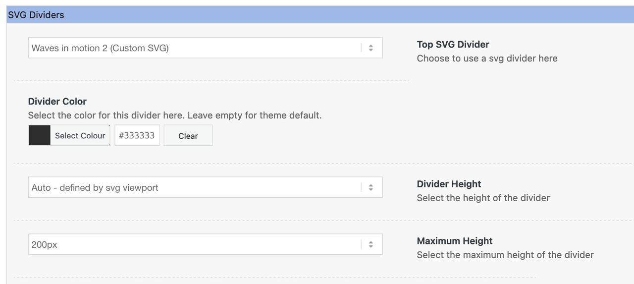
___________________
PS : you can upload those svg files via media library – but then you can determine the svgs via its ID’s for the usage
the ID of each attachment you can find on list view in media library.there are different ways to animate an svg – but you had to prepare the svg first.
my approach on that is to include everything inside the svg itself.The basis of the Enfold separators (but Divi, Elementor etc are no different) is to have a cover area within the svg that forms the connection to the next/previous section. This is then filled with #000 by default, and then replaced with a different colour using the element option.
On your example page, it is set in motion from outside using keyframe animation.
PS : there are plugins listed as code snippet plugins – f.e.: https://en-gb.wordpress.org/plugins/code-snippets/ – then you can use your parent theme and insert those snippets this way.
But my recommendation is to use a child-theme.PS : did you switch in this moment to hamburger from the beginning – a few minutes ago – there was the normal desktop navigation seen.?
PPS: i see now the reason – you have a switch rule for 2000px – my recommendation is to only have hamburger for your navigation:
Enfold Options – Main Menu – Menu Items For Desktop : “Display as Icon”and remove then the rules concerning to that switch point.
After doing this we will see if the problem is solved so far. because your rules do set all menu items to display none – even the #menu-item-search
May I first say that your main navigation is very confusing; due to a lack of space, a second row is opened – and the contrast is suboptimal if you want it that way;)
My recommendation for your site would therefore be to always use the hamburger menu – even with large screen widths.How would you like the search to be displayed in the burger menu?
Only as a magnifying glass – or already as an input field?
See: https://pureinstall.webers-testseite.de/Possible to do both (see link)
make your screen width small to see the hamburger active …
it is all well documented in the docu. You can download the child at docu too: https://kriesi.at/documentation/enfold/child-theme/
If you feel unsure about this, please ask a mod to help you.Maybe backup your page first – to have a fallback option.
After that we can start to have our own custom svg shape dividers.first: have a look at: https://webers-testseite.de/divider-on-sliders/
… next – soon
then I would definitely recommend that no subheadings be accompanied by even the change of column widths.
OK – but it looks good to me
What do you like to change on that?But apart from that, I think the days of tables are outdated. You can see from the examples of Enfold demos that responsive implementation will always remain problematic. This is always particularly noticeable with large tables like yours. Smaller tables up to 4 columns still work somehow, but after that it only remains clear on large screens.
On your example page ( https://colorlib.com/etc/tb/Table_Fixed_Header/index.html ) you can see that responsiveness is not implemented at all and that you have to scroll horizontally.
Yes and the snippets above do only allow to show pages and posts ( so if product is not in that array – it will not be shown)
the first is for having only posts and pages in that ajax search ( that is the menu search icon )
i can not test it because i got no page at the moment with woocommerce .
But with Portfolio it works this way.thanks: didn’t know about that extra filter in portfolio registration
did you try
for ajax search ( thats the menu search) :function avf_ajax_search_query_mod( $search_parameters ){ $defaults = array( 'numberposts' => 5, 'post_type' => array( 'page', 'post' ), 'post_status' => 'publish', 'post_password' => '', 'suppress_filters' => false ); $_REQUEST['s'] = apply_filters( 'get_search_query', $_REQUEST['s']); $search_parameters = array_merge( $defaults, $_REQUEST ); return $search_parameters; } add_filter('avf_ajax_search_query', 'avf_ajax_search_query_mod', 10, 1);and in addition for search resultspage :
function post_types_for_search_results($query) {
  if ( !$query->is_admin && $query->is_search) {
    $query->set('post_type', array('page','post') );
    $query->set('post_status', array( 'publish' ) );
  }
  return $query;
}
add_filter( 'pre_get_posts', 'post_types_for_search_results' );
In this case, your code snippet would be unnecessary.
btw: because of new cpt support in enfold – there is a similar filter for any other cpt: avf_custom_elements_cpt_args – maybe it is possible to use it for specific post-types ( portfolio, product, etc. to have that analog to your code snippet.Where did you try to upload it? it sounds as if someone set the upload_max_filesize to a given value (8388608)
because 8MB = 8388608 Bytesthere are different reasons on that. Maybe you hoster ( because your installation is on your local computer this is not the case ) set a value on default to 8MB or some plugins do – or an entry in htaccess file or php.ini etc. etc.
-
AuthorPosts