Forum Replies Created
-
AuthorPosts
-
December 12, 2024 at 7:53 pm in reply to: SVG Logo: incorrect path color fill in (non-) scrolled header #1473518
have a look inside your svg code – i guess both will have the same st classes ( these are former illustrator standard classes) in the mean-time it is cls. But different name same shit.
if you inspect my test page: https://webers-testseite.de/
i only use my colored svg logo – have unique classes set and the transparency logo isn’t a different one but just different fill:.html_header_transparency #header:not(.header-scrolled) .buchstabe { fill: #FFF; }may i see your page it concerns?
i didn’t implement the script. Thats why i wrote: “Edit: you had to adopt now the scrubbing script to its selectors.”
Your question only referred to customization without additional wrappers. A little work should still be left for you.Edit: now i have implemented that script – but you see – bigger video files do not work – and even the current mp4 with 10sec and less resolution do not work nice ( as the demo too ). So believe me Apple realizes this effect in a different way.
well – put your code block just inside a color-section – that color section set custom class to: special-vids
inside you got your html structure like:<section id="scrubs" class="vid"> <div class="holder"> <video src="/wp-content/uploads/Time-Lapse.mp4" autoplay muted loop playsinline></video> </div> <div class="story"> <div> <h3>In the heart of Wildrise…</h3> </div> <div> <h3>…where the breezes play.</h3> </div> <div> <h3>We embrace the call of the wild each day.</h3> </div> <div> <h3>Untamed places stretch,</h3> </div> <div> <h3>vast and wide.</h3> </div> <div> <h3>Whispering secrets of a world outside.</h3> </div> </div> </section>put this to your child-theme functions.php:
function scrub_preparation_of_color_section() {
?>
<script>
window.addEventListener("DOMContentLoaded", function () {
	(function($){
		$('.avia-section.special-vids ').each(function() {
			var vids = $(this).find('.vid').detach().html();
			$(vids).prependTo($(this));
			$(this).addClass('vid').find('.container').remove();
		});
	})(jQuery);
});
</script>
<?php
}
add_action('wp_footer', 'scrub_preparation_of_color_section');
see: https://webers-testseite.de/scrubbing-videos/
my css on that page is:
.responsive body#top {
    overflow-x: visible;
}

#wrap_all {
    overflow: visible;
}

.avia-section.vid {
  height: 600vh;
  position: relative;
}

.avia-section.vid div.holder {
  position: sticky;
  top: var(--enfold-header-height);
}

.avia-section.vid video {
  width: 100%;
  height: 100vh;
  object-fit: cover !important;
}

.avia-section.vid div.story {
  position: absolute;
  top: 0;
  left: 0;
  width: 100%;
}

.avia-section.vid div.story div {
  height: 100vh;
  display: flex;
  align-items: center;
  justify-content: center;
  text-align: center;
}
but i do not want to style it till the end. have a look how that is made in that video. – and how to handle the other .avia-section
Edit: you had to adopt now the scrubbing script to its selectors. And perhaps a debounce and resize will be needed.you can use the embedded debounce function of enfold:
function ava_add_custom_script(){ ?> <script> (function($){ function b() { // here comes the script … } $(window).on('debouncedresize', function() { b(); }); })(jQuery); </script> <?php } add_action('wp_footer', 'ava_add_custom_script');Can you please post the code you like to insert? Where did you see that effect you like to reproduce?
And where do you like to insert it – as first child in #main or between other alb elements?why do i ask this: if it is first child inside #main you can use that filter: ava_after_main_title
f.e.:
add_action('ava_after_main_title', function() { if ( is_page(49162)){ echo '<section class="vid">'; echo '<div class="holder">'; echo '<video class=" " preload="metadata" autoplay=" " muted=" " playsinline=" " loop=" " controls=" " id="player_27_1266727400_788445252_html5" src="/wp-content/uploads/Time-Lapse.mp4"></video>'; echo '</div>'; echo '</section>'; } });i do not see any white gap on the bottom – neither on dev tools nor on my iPhone.
December 11, 2024 at 9:17 am in reply to: H1 in author and category blogs missed if “only breadcrumbs” in header is used #1473399or if you got h1 headings in content – why not using h2 tag by using the same filter
function avf_title_args_mod( $args, $id ) {
    if ( !is_archive() ) {
        $args['heading'] = 'h2';
    }
    return $args;
}
add_filter( 'avf_title_args', 'avf_title_args_mod', 10, 2 );
December 11, 2024 at 7:51 am in reply to: Customized widget above another widget but only on one page #1473388I usually use this type of notation using a function name to help me remember what the function is supposed to do. However, this also requires a meaningful function name. Something like : insert_widget_before_footer
Note that the function names are separated by an underscore.You can also use a notation that makes a function name superfluous:
add_action('ava_before_footer', function() {
	if (is_page(3416)) {
		dynamic_sidebar( 'maps' );
	}
	dynamic_sidebar( 'CTA-Footer' );
});
Incidentally, there are plugins that build conditional logic into widgets. The standard plugin is complex but powerful; another small plugin is more intuitive to use: https://wordpress.org/plugins/widget-options/
but all these rules the widgets itself and not the widget areas. But f.e. if you have one widget area – you can put in the cta-button and maps widget and determine that the maps widget only is shown on contact page.December 11, 2024 at 7:44 am in reply to: Customized widget above another widget but only on one page #1473386the code breaks because function names should be unique! if you got “avia_above_footer” twice in your child-theme functions.php it will come to conflict.
If you rearange your codesnippet above you see the similarity of your codes:
function avia_above_footer(){
    dynamic_sidebar( 'Maps' );
}
add_action('ava_before_footer','avia_above_footer');
now you see that you can use the same conditional usage of your “ava_after_content”
to avoid having a similar function name you can rename the one function – or simply combine both rules in one function.function avia_above_footer(){ dynamic_sidebar( 'CTA-Footer' ); dynamic_sidebar( 'Maps' ); } add_action('ava_before_footer','avia_above_footer');you can now wrap the one of those lines inside a conditional setting:
function avia_above_footer(){ dynamic_sidebar( 'CTA-Footer' ); if (is_page(3416)) { dynamic_sidebar( 'maps' ); } } add_action('ava_before_footer','avia_above_footer');And maybe you decide to have the burger-menu on top:
#top #header #av-burger-menu-ul { vertical-align: top; padding: 125px 0 !important; }i guess you have that warning on uploading your icons to fontello about compound path.
you can edit your vector based icon f.e. in illustrator – open your svg and look at Object Menu – Compound Path – create
i hope that this will be the names – because i’m working on german versions : Objekt – zusammengesetzter Pfad – erstellen.Working with Pathfinder is not enough. You had to go that way.
________
Mikes Way is to substitute an existing entypo-fontello icon by an image. Big advantage – you can use the icon font to insert even colored svg icons.
see here: https://enfold.webers-webdesign.de/colorized-font-icons/Well enfold provided the option to only show submenu items on hover or on click.
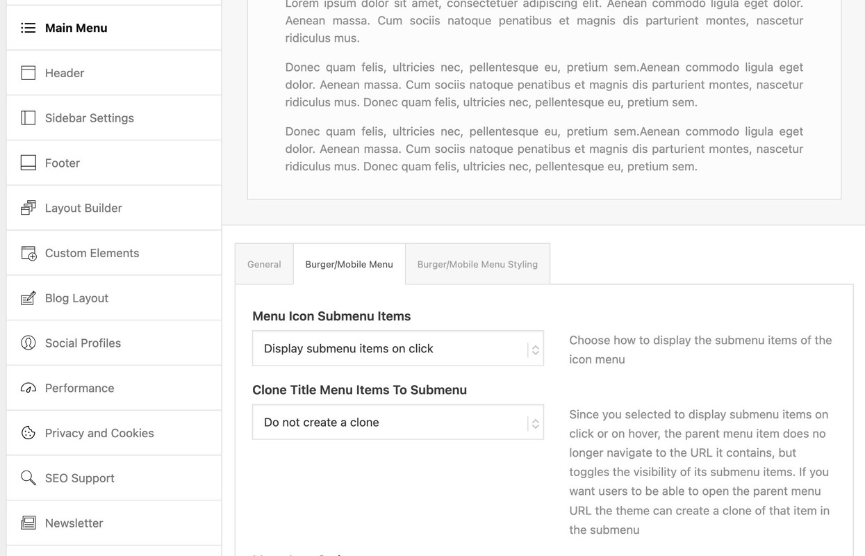
If you choose click we can edit that to only show one toggle open.
then put this to your child-theme functions.php:function only_one_submenu_open_on_burger(){ ?> <script> window.addEventListener("DOMContentLoaded", function () { (function($) { $('body').on( 'click touch', '.av-active-burger-items > a', function () { $(this).parent('li').siblings().removeClass('av-show-submenu'); $(this).parent('li').siblings().find('ul').slideUp( "fast"); }); $('body').on( 'click touch', '.av-active-burger-items .av-width-submenu > a', function () { $(this).closest('.sub-menu').siblings().find('li').removeClass('av-show-submenu'); $(this).closest('.sub-menu').siblings().find('ul').slideUp( "fast"); }); })(jQuery); }); </script> <?php } add_action('wp_footer', 'only_one_submenu_open_on_burger');after doing that i will have a look to your site to optimize if needed.
maybe you can get comfortable with not having all top-level menu items open with a drop down.
You could, for example, only have one of them open at a time. When you click on another one, the one open menu item closes.December 9, 2024 at 9:19 pm in reply to: How to get same styling for normal button and blog-Button (read more button) #1473284https://kriesi.at/documentation/enfold/intro-to-layout-builder/#customization
This is a real good docu – unfortunately, there is too little research being done here
PS : above there are the two lines listed ( 876 and 877 newest Enfold 6.0.8) – but only the 876 has been changed .
but i guess it is easier to replace that little block of those two lines.you have to have a child-theme avia-snippet-sticky-header.js file.
on line 79 there is:
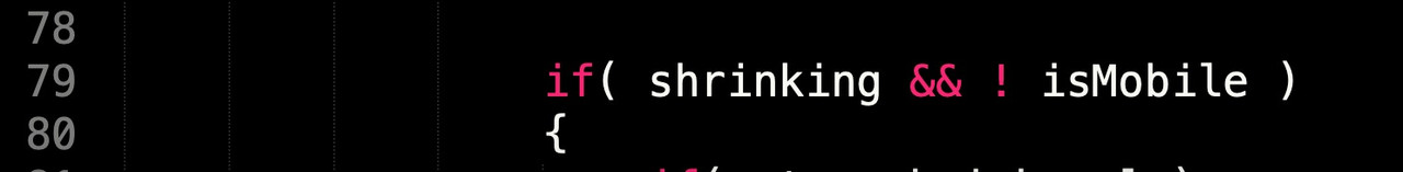
remove that&& ! isMobileso there is only :if( shrinking )if you like to minify your theme script and css files – put both files ( the script itself and the minified script to a js subfolder to your child-theme. The edited script : you can minfy the code at: https://www.toptal.com/developers/javascript-minifier
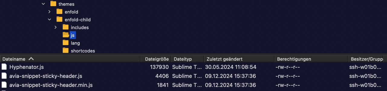
This comes to your child-theme functions.php:
function wp_change_sticky_header_script() {
  wp_deregister_script( 'avia-sticky-header' );

  $vn = avia_get_theme_version();
  $options = avia_get_option();
  $child_theme_url = get_stylesheet_directory_uri();
  $min_js = avia_minify_extension( 'js' );

  $condition  = ( isset( $options['header_position'] ) && $options['header_position'] == 'header_top' );
  $condition2 = ( isset( $options['header_sticky'] ) && $options['header_sticky'] == 'header_sticky' ) && $condition;
  avia_enqueue_script_conditionally( $condition2 , 'avia-sticky-header-child', "{$child_theme_url}/js/avia-snippet-sticky-header{$min_js}.js", array('avia-default'), $vn, true);
}
add_action( 'wp_enqueue_scripts', 'wp_change_sticky_header_script', 100 );
December 9, 2024 at 12:41 pm in reply to: How to get same styling for normal button and blog-Button (read more button) #1473234December 9, 2024 at 12:35 pm in reply to: How to get same styling for normal button and blog-Button (read more button) #1473233maybe this is then the way it works:
ok – try now – change to your needs and transition timings:
/*** ===============================***/
/* Basisstil für alle Weiter Lesen "buttons" */
.more-link {
  display: inline-flex !important; /* Flexbox für zentrierten Inhalt */
  flex-flow: row nowrap;
  justify-content: center; /* Horizontale Zentrierung */
  align-items: center; /* Vertikale Zentrierung */
  font-weight: 800; /* Fettschrift */
  text-align: center !important;
  white-space: nowrap;
  vertical-align: middle;
  user-select: none;
  border: 2px solid #ff3366 !important; /* Rahmenfarbe */
  padding: 0.95rem 2.5rem 0.95rem 2rem !important; /* Innenabstand */
  font-size: 1rem; /* Schriftgröße */
  line-height: 1rem; /* Zeilenhöhe */
  border-radius: 100px !important; /* Abgerundete Ecken */
  color: #ffffff !important; /* Schriftfarbe Weiß */
  font-family: 'Montserrat', sans-serif; /* Schriftart */
  letter-spacing: 0.25px; /* Buchstabenabstand */
  text-transform: uppercase; /* Großbuchstaben */
  background-color: #ff3366; /* Hintergrundfarbe */
  position: relative; /* Für die Animation */
  overflow: hidden; /* Inhalt begrenzen */
  transition: all 300ms ease-in-out; /* Sanfter Übergang */
  width: auto !important;
}

/* Stil für den Text und die Pfeile */
.more-link span {
  display:  inline-flex; /* Flexbox für Text und Pfeile */
  flex: 0 1 auto;
  transition: all 700ms ease-in-out; /* Sanfte Bewegung */
  padding: 0px;
}

.more-link:hover span {
  padding: 0 3px;
}

/* Stil für die Pfeile */
.more-link .more-link-arrow::after {
  content: ">>"; /* Pfeile */
  font-family : inherit;
  opacity: 0; /* Unsichtbar im Standardzustand */
  visibility: hidden;
  position: absolute;
  top: 14px;
  right: 0.5ch;
  color: #ffffff; /* Pfeile in Weiß */
  font-size: inherit;
  font-weight: 800;
  line-height: inherit;
  transition: all 700ms ease-in-out;
}

/* Hover-Effekt für die Pfeile */
.more-link:hover .more-link-arrow::after {
  visibility: visible;
  opacity: 1; /* Pfeile werden sichtbar */

}

.more-link:hover .read-more-text {
  transform: translateX(-1ch); /* Text verschiebt sich leicht nach links */
}
December 9, 2024 at 12:26 pm in reply to: How to get same styling for normal button and blog-Button (read more button) #1473232try it – if it does not work ;) you can delete it afterwards. But default folder for those child-theme ALB elements is “shortcodes”
and if you got this snippet inside your child-theme functions.php they are loaded instead:function avia_include_shortcode_template($paths){ $template_url = get_stylesheet_directory(); array_unshift($paths, $template_url.'/shortcodes/'); return $paths; } add_filter('avia_load_shortcodes', 'avia_include_shortcode_template', 15, 1);December 9, 2024 at 7:22 am in reply to: How to get same styling for normal button and blog-Button (read more button) #1473214with a slightly edited postslider.php as child-theme element you can have this DOM Structure:

lines 876ff
$permalink = '<div class="read-more-link"><a href="' . get_permalink( $the_id ) . '" class="more-link"><span class="read-more-text">' . __( 'Read more', 'avia_framework' ) . '</span><span class="more-link-arrow"></span></a></div>';
$prepare_excerpt = ! empty( $entry->post_excerpt ) ? $entry->post_excerpt : avia_backend_truncate( $entry->post_content, apply_filters( 'avf_postgrid_excerpt_length', $excerpt_length ), apply_filters( 'avf_postgrid_excerpt_delimiter', ' ' ), '…', true, '' );
then it might be possible to have the same effect and a flex will make sense.
this is based on the snippet above. – but you had to be aware that portfolio links are all url links – so the link goes then to the lightbox – and not to the portfolio page.
You could possibly check whether it is an internal link or not.the snippet looks to the anchor – and to its href – if href is an image link – then all stayes as it is – if not …
function lightbox_with_mixed_content_type() {
?>
<script type="text/javascript">
window.addEventListener("DOMContentLoaded", function () {
	(function($){
		$('.mixed-contenttype a').each(function(){
			var anchorLink = $(this).attr('href');
			if (/\.(jpg|png|gif|webp|jpeg)$/.test(anchorLink)) {
				//console.log(anchorLink + " is an image link");
			} else {
				$(this).attr('rel', 'lightbox').addClass('mfp-iframe');
			}
		});
	})(jQuery);
});
</script>
<?php
}
add_action('wp_footer', 'lightbox_with_mixed_content_type', 999);
but as mentioned above – the ajax portfolio grid will not do that .
Dear luleloki – i’m Participant as you are – so i do not see private content area.
yes but i suppose that then the av-masonry-entry is not the right selector too.
What kind of element do you use?
Inspect your page with developer tools and have a look what class the link itself has – on masonry it is av-masonry-entry.On Portfolio Grid – you had choosen the Option : !Open a preview of the entry (known as AJAX Portfolio)” these are totaly different settings. Choose “Open in lightbox” then we can talk about mixed content.
The custom link could be done on the portfolio page itself – via “Additional Portfolio Settings” !etc. Each of those elements need an own solution. – sometimes there had to be a preventDefault or a stopPropagation of the existing event.
maybe you try to find that plugin
It looks like that another plugin or your theme loads an extra copy of the jquery
inspect your site with developer tools and look for “jquery” – perhaps you can hamper that plugin to reload another jquery
December 6, 2024 at 8:16 am in reply to: How to change the “read more” from the blog to a button? #1473076a quick and easy way is to style that link as button :
.more-link {
	padding: 5px 10px !important;
	color: var(--enfold-main-color-button-font) !important;
	background-color: var(--enfold-main-color-primary);
	border-radius: 5px !important;
}

.more-link:hover {
	color: #FFF !important;
	opacity: .9;
	transition: all .4s ease-in-out;
	box-shadow: 1px 1px 5px #333;
}
change colors to your needs
Ismaels solution is the fastest method. But if you like:
Former tips of Günter show me how to get an input field for an apple touch icon via child-theme functions.php:
put this to your child-theme functions.php:
function my_avf_option_page_apple_touch_icon( array $avia_elements = array()){
  $slug = "avia";
  $id = 'favicon';
  $new_element =  array(
      "slug"  => "avia",
      "name"  => __( "Apple Touch Icon", 'avia_framework' ),
      "desc"  => __("Specify an Apple Touch Icon for your site.", 'avia_framework')." <br/>".__("recommended format: .png", 'avia_framework')."<br/>".__("best format will be 180px in square", 'avia_framework'),
      "id"    => "avia_appleicon",
      "type"  => "upload",
      "label" => __( "Use Image as Apple Touch Icon", 'avia_framework' ) );
  $found = false;
  $index = 0;
	foreach( $avia_elements as $key => $element ){ $index++;
	  if( isset( $element['id'] ) &&  ( $element['id'] == $id ) && isset( $element['slug'] ) && ( $element['slug'] == $slug ) ) {
	    $found = true;
	    break;
	  }
	}
	if( ! $found ) {
		$avia_elements[] = $new_element;
	}
	else {
		$avia_elements = array_merge( array_slice( $avia_elements, 0, $index ), array( $new_element ), array_slice( $avia_elements, $index  ) );
	}
  return $avia_elements;
}
add_filter( 'avf_option_page_data_init', 'my_avf_option_page_apple_touch_icon', 10, 1 );

function add_apple_icon_to_header(){
?>
<link rel="apple-touch-icon" href="<?php echo avia_get_option('avia_appleicon'); ?>" type="<?php echo image_type_to_mime_type(exif_imagetype( avia_get_option('avia_appleicon'))); ?>">
<?php
}
add_action( 'wp_head',  'add_apple_icon_to_header', 10);
upload your image to media-library – best would be to name it: apple-touch-icon.png
or if you do not like those automatic stylings name it: apple-touch-icon-precomposed.png
180px in square is best – because iPhones uses those resolutions.December 5, 2024 at 1:49 pm in reply to: Different images for desktop and smartphone portrait #1473011am besten wäre, wenn alle Bilder die gleichen Größen haben!
damit das Bild nicht die folgenden Einstellungen bei großen Screenweiten macht, wäre eine Anpassung des media-query nötig.
(Die Grenze hängt davon ab, wann das Bild beginnt auf die kleiner Screenweite zu reagieren – das hängt von den Bilddimensionen ab und dem min-height Wert)(Das kann man aber auch gut empirisch herausfinden diese Grenze, indem man das Ganze zunächst testet mit einem negativen rechts wert ( right: -80px) und ohne das media-query einsetzt und den Screen solange zusammenschiebt, bis links keine Lücke mehr ist. Diese Breite überträgt man dann als media query Grenze.)
teste mal bitte:
@media only screen and (max-width:1405px) {
  #top .avia-fullwidth-slider .avia-slideshow li img {
    position: absolute;
    left: unset !important;
    top: 0 !important;
    right: -20px !important;
  }

  #top .avia-fullwidth-slider .avia-slideshow li {
  overflow: visible !important;
  height: inherit !important;
  }

  #top .avia-fullwidth-slider .avia-slide-wrap {
    width: 100% !important;
    height: 100% !important;
  }
}
die custom-class befände sich am avia-fullwidth-slider
solltest Du mehrere Bilder unterschiedlich positionieren müssen musst du für jede li gesondert die Positionen setzen li.slide-1; li.slide-2 etc. – also
zusätzlich :#top .avia-fullwidth-slider .avia-slideshow li.slide-1 img { right: 0 !important; } #top .avia-fullwidth-slider .avia-slideshow li.slide-2 img { right: -50px !important; }December 5, 2024 at 12:45 pm in reply to: Different images for desktop and smartphone portrait #1473006ja eben – das betrifft das Rätseln ;)
December 5, 2024 at 12:26 pm in reply to: Different images for desktop and smartphone portrait #1473004ok – post Überschneidung – dann muss ich ein wenig rätseln …
December 5, 2024 at 12:16 pm in reply to: Different images for desktop and smartphone portrait #1473001Da hier nicht soviel slidermäßig passiert – warum das Ganze nicht als Color-Section umsetzen? Als Hintergrundbild hätte man bessere Möglichkeit es responsiv zu positionieren.
Da auch hier nur ein Sliderbild ist. Öffne deinen fullwidth slider und setze bei Styling – Slideshow Background dieses Bild ein ( cover und position right ( center etc . nach deinem Belieben))
danach blendest du die img des sliders aus:
(am besten über eine custom class des sliders.avia-fullwidth-slider.custom-class .avia-slideshow li img { visibility: hidden; }do you have influence on those settings?
on my apache servers i do set this via htaccess file
f.e.<IfModule mod_headers.c> Header set X-Frame-Options "sameorigin" Header set Referrer-Policy "strict-origin-when-cross-origin" Header set X-XSS-Protection "1; mode=block" Header set X-Content-Type-Options "nosniff" Header set Strict-Transport-Security "max-age=31536000; includeSubDomains; preload" Header always set Content-Security-Policy "upgrade-insecure-requests" Header set Cross-Origin-Embedder-Policy "unsafe-none" Header set Cross-Origin-Opener-Policy "same-origin" Header set Cross-Origin-Resource-Policy: "same-site" Header always set Permissions-Policy "geolocation=(), midi=(),sync-xhr=(),accelerometer=(), gyroscope=(), magnetometer=(), camera=(), fullscreen=(self)" </IfModule>Results can be checked here f.e.: https://securityheaders.com/?q=guenterweber.com&followRedirects=on
December 4, 2024 at 8:57 pm in reply to: Hide Post Date for Specific Category in Blog Posts #1472953yes – but it works – hope Günter will include it – because it would simplify many things – as the example above shows – by enabling better selection
-
AuthorPosts
