Forum Replies Created
-
AuthorPosts
-
you can take for alt – description in the code above.
But i don’t know why this does not work for standalone images (not in a gallery)
is there a code similar to that above?March 8, 2017 at 8:28 pm in reply to: [Urgent ] "2" showing in the top left corner of each portfolio item on Chrome #758006They never did, and after a major update it is understandable.
you see that yourself need over 6 hours to reply to my assumption! – allthough it is in your direct interest to solve it (urgent).
You only have to look to one (or 3) threads – they have to serve hundreds of threads.
They have to react on so many postings and requests – be a little bit patient with the support.by the way: i rember it well if in former times ( years ago when i’m forced to work with microsoft operating systems – the support of them was definitly ugly ;)
Nevertheless your welcome.
-
This reply was modified 9 years, 1 month ago by
Guenni007.
try to give it a value on that “Responsive under” most users do input here there max-width of standard enfold setting 1310px
the field under that do the same dimension there and have a look what happensMarch 8, 2017 at 12:29 pm in reply to: [Urgent ] "2" showing in the top left corner of each portfolio item on Chrome #757732Did you use a custom footer.php ?
Have a look into it. Some good hints here on board do place some code to the footer.php. (Facebook scripts etc.) maybe there is a rudiment of former changings in it.And btw. may i ask how you can have the theme installed on your server – and ask the question on a pre-sale forum :wink ;)
March 8, 2017 at 11:31 am in reply to: [Urgent ] "2" showing in the top left corner of each portfolio item on Chrome #757705ok there is a two in your source code (on original Demo Site there is no 2) see here:
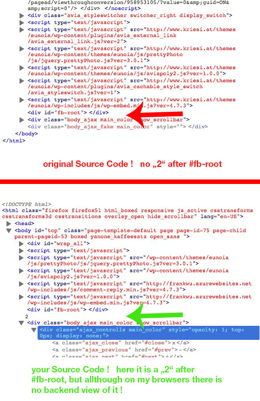
i think it must be a manual input. theres no container at all for that. The 2 is no input by pseudo-classes (before or after)
look at your source code may-be do a search for “fb-root”-
This reply was modified 9 years, 1 month ago by
March 8, 2017 at 11:09 am in reply to: [Urgent ] "2" showing in the top left corner of each portfolio item on Chrome #757695by the way – i do not see your “2” on 3 browsers here on my mac:
 March 8, 2017 at 10:55 am in reply to: [Urgent ] "2" showing in the top left corner of each portfolio item on Chrome #757680
- Yes – you are the only person with urgent problems.
- Did you post this in eunoia concerned thread? – this here is the enfold team
- A hint from Participant to Participant: Link
- Enfold is one of the highest rated Theme – in particular for the forum too.
My two cents to it – if a wordpress/theme installation is compareable to an open-heart surgery there is something wrong with webdevelopment workflow.
Line 4298 – any search option in your code editor?
and here are the other parameters too from line 4284 on.
-
This reply was modified 9 years, 1 month ago by
this effect is called Ken Burns and is included in Layerslider (Advanced Layerslider) (New Version Enfold 4 with LS 6)
it seems you have old Enfold Version less 3.85 – i don’t know if the embeded Layerslider has Ken Burnsunder each slide on top there is a button “show more options”
There you can find Ken Burns – zoom-in or zoom-outsee here a demo site of KreaturMedia (Layerslider) : Link
-
This reply was modified 9 years, 1 month ago by
hm – under Maintenance
es wird dann schon von der Schrift überdeckt, insofern du es wie im Original belassen hast ( parallax effekt)
die andere Lösung ist aber auch nicht kompliziert. Du musst eigentlich nur erstmal den Pfad zu deinem freigestellten Bild ermittlen den oben in den code ersetzen und das ganze dann ins quick css.
Wenn es nicht deine Startseite ist die betroffen ist, dann musst du halt noch die Page ID statt .home nehmen
Der Rest ist dann nur noch Größen Angleichung und Positionierung
the dash is to seperate from jobdescription. !
if you can live with the dash and ad only an icon infront of the link you only need the last css codei think it will be the best if you change the testimonial.php
copy a testimonial.php to your child-theme / shortcodes folder
if this does not exist – create one.
the file to copy is in enfold/config-templatebuilder/avia-shortcodes/and add this to your child-theme functions.php :
add_filter('avia_load_shortcodes', 'avia_include_shortcode_template', 15, 1);
function avia_include_shortcode_template($paths)
{
  $template_url = get_stylesheet_directory();
      array_unshift($paths, $template_url.'/shortcodes/');

  return $paths;
}
now the copy will be used instead of the parent-theme shortcode.
see line : 420/421:
if($link) $output .= "<span class='hidden avia-testimonial-markup-link' {$markup_url}>{$link}</span>"; if($link) $output .= " – <a class='aviablank avia-testimonial-link' href='{$link}' >{$linktext}</a>";here is your “-” that
–delete it to have:if($link) $output .= "<span class='hidden avia-testimonial-markup-link' {$markup_url}>{$link}</span>"; if($link) $output .= " <a class='aviablank avia-testimonial-link' href='{$link}' >{$linktext}</a>";if you like to insert later an icon you can place it then via pseudoclass :before f.e:
.avia-testimonial-link::before {
    content: "\e822 \00a0";
    font-family: entypo-fontello;
}
Result here: Link
Wenn du natürlich willst, dass das Logo mit rausscrollt wie das Heading könntest du mit pseudo-klasse das Bild platzieren.
Hier jetzt mal der Code für die Demoseite von Kriesi:.home .avia-caption-title::before { content: "\00a0"; display: inline-block; position: relative; height: 100px; width: 100%; top: -20px; background: url("http://kriesi.at/themes/enfold-one-page-portfolio/files/2015/02/logo_onepage_portfolio_text2.png"); background-repeat: no-repeat; background-position: top center; background-size: 250px auto; }hier wird also ein Container vor der Überschrift platziert. Der Container hat “keinen” Content (er muss einen haben – sonst wird er nicht angezeigt, daher das Sonderzeichen bei Content (Leerzeile)) – dafür aber ein Hintergrund Bild. Das Hintergrundbild ist dein freigestelltes Logo. Den Pfad musst du natrlich austauschen.
Der Rest ist dann Größe und Platzierung. Das kann ich nicht sehen wie es bei dir passen würde.Der Code oben in deine Quick css hinein.
Der ist jetzt so nur für die (home) Startseite gedacht. Wenn du das auf anderen Seiten benötigst, dann muss man da halt die page id statt home setzen also zB.:
.page-id-123 .avia-caption-title::before { … }was ist das ? Enrique?
Die Demos haben doch andere Namen oder?Ich würde ja gerne helfen – schau mal bitte wie das richtig hieß – die Demo
Edit : aha ich sehe , es ist die One Page Portfolio Demo.
Und du hast auch diese Option mit Header erst sichtbar nach dem scrollen gewählt?
Wenn ich das so lese, dann meinst du garnicht das platzieren im Header Bereich, sondern in dem ersten großen (Vollbildslider) – oberhalb von:
Welcome!
I am Enrique FoldAm einfachsten wäre sicherlich das Bild zu manipulieren. Downloade es und setze dein Bild (Logo) in das Bild hinein.
Denn in einem Slider – wie du gesehen hast gibt es so zunächst keine Möglichkeit ein zusätzliches Bild zu platzieren.-
This reply was modified 9 years, 1 month ago by
seems to be only that feature of “Play by scroll” – but this is a nice feature. So please talk to those people of creature media. The success of layerslider goes deeply with the distribution via themes like Enfold. The awarenesslevel is correlated to it. So Enfold-User (or Users of two or three other premium themes should have all features.
ok – sometimes i’m too confused that i can’t see the wood for trees:
function wp_head_mod() {
echo '<style type="text/css">
body .av-special-heading.modern-right {text-align: right !important}
</style>';
}
add_action('wp_head', 'wp_head_mod');
that works
for example : i have this here for adding css code concerning to admin options dialog.
this stretches the quick css input field to the whole width ( more place to edit)function admin_head_mod() { echo '<style type="text/css"> #avia_quick_css .avia_description {float: none;margin-bottom: 20px !important;padding-left: 0 !important;width: 98%} #avia_quick_css .avia_control {float: left;max-width: 98% !important;width: 98% !important} .avia_footer_links li {float: left;padding-right: 20px} .avia_footer .avia_footer_save {float: left} </style>'; } add_action('admin_head', 'admin_head_mod');is there an equivalent to the question above ?
the difference was !
#header.widget to #header .widget
the spacebar is missing
with no space the class has to be directly on the header container
without space there is a class following the header container.you did it right on the media querry – maybe only a careless mistake
see here the thread of mine with Josue Solution (same as above – only with a better name for that fild (js))
https://kriesi.at/support/topic/shrinking-header-on-ipad-does-not-work/#post-575345
what is the problem – you miss the shrinking behavior on tabletts !
so your options are all good but there has to be a fix for it. I only knew one for ipad – if it works with other tabletts i don’t know.Put this to your functions.php of the child-theme:
function include_custom_js_file() {
   wp_enqueue_script( 'avia-main-child', get_stylesheet_directory_uri().'/js/shrink_fix.js', array('jquery', 'avia-default'), 2, true );
}
add_action( 'wp_enqueue_scripts', 'include_custom_js_file', 100 );
copy the code and call it : shrink_fix.js(function($){ $(document).ready(function() { // avia_header_size function initialization avia_header_size(); }); // required auxiliary function for avia_header_size function av_change_class($element, change_method, class_name) { if($element[0].classList) { if(change_method == "add") { $element[0].classList.add(class_name); } else { $element[0].classList.remove(class_name); } } else { if(change_method == "add") { $element.addClass(class_name); } else { $element.removeClass(class_name); } } } // custom avia_header_size function avia_header_size() { var win = $(window), header = $('.html_header_top.html_header_sticky #header'), unsticktop = $('.av_header_unstick_top'); if(!header.length && !unsticktop.length) return; var logo = $('#header_main .container .logo img, #header_main .container .logo a'), elements = $('#header_main .container:not(#header_main_alternate>.container), #header_main .main_menu ul:first-child > li > a:not(.avia_mega_div a, #header_main_alternate a), #header_main #menu-item-shop .cart_dropdown_link'), el_height = $(elements).filter(':first').height(), isMobile = $.avia_utilities.isMobile, scroll_top = $('#scroll-top-link'), transparent = header.is('.av_header_transparency'), shrinking = header.is('.av_header_shrinking'), topbar_height = header.find('#header_meta').outerHeight(), set_height = function() { var st = win.scrollTop(), newH = 0, st_real = st; if(unsticktop) st -= topbar_height; if(st < 0) st = 0; if(shrinking) // in the original one, there's a !isMobile here { if(st < el_height/2) { newH = el_height - st; if(st <= 0){ newH = el_height; } av_change_class(header, 'remove', 'header-scrolled'); //header.removeClass('header-scrolled'); } else { newH = el_height/2; //header.addClass('header-scrolled'); av_change_class(header, 'add', 'header-scrolled'); } if(st - 30 < el_height) { av_change_class(header, 'remove', 'header-scrolled-full'); } else { av_change_class(header, 'add', 'header-scrolled-full'); } elements.css({'height': newH + 'px', 'lineHeight': newH + 'px'}); logo.css({'maxHeight': newH + 'px'}); } if(unsticktop.length) { if( st <= 0) { if(st_real <= 0) st_real = 0; unsticktop.css({"margin-top":"-"+st_real+"px"}); } else { unsticktop.css({"margin-top":"-"+topbar_height+"px"}); } } if(transparent) { if(st > 50) { //header.removeClass('av_header_transparency'); av_change_class(header, 'remove', 'av_header_transparency'); } else { //header.addClass('av_header_transparency'); av_change_class(header, 'add', 'av_header_transparency'); } } } if($('body').is('.avia_deactivate_menu_resize')) shrinking = false; if(!transparent && !shrinking && !unsticktop.length) return; win.on( 'debouncedresize', function(){ el_height = $(elements).attr('style',"").filter(':first').height(); set_height(); } ); win.on( 'scroll', function(){ window.requestAnimationFrame( set_height )} ); set_height(); } })(jQuery);create in your Child-Theme folder a folder called js and upload that shrink_fix.js to it
after that the shrinking header works as on all desktop-pc
hm – i think on the image you added – click again on the image in the alb options dialog. than you see the options to the image including link behavior.
i found something here on avia.js on line 735
if(outerH > 100)
{

	if(!overlay.length)
	{
		overlay = $("<span class='image-overlay "+span_class+"'><span class='image-overlay-inside'></span></span>").appendTo(link);

	}
	//can be wrapped into if !overlay.length statement if chrome fixes fade in problem
	if(link.height() == 0) { link.addClass(_self.className); _self.className = ""; }
	if(!linkCss || linkCss == 'inline') { link.css({display:'block'}); }
	//end wrap

	overlay.css({left:(pos.left - overlay_offset) + parseInt(current.css("margin-left"),10), top:pos.top + parseInt(current.css("margin-top"),10)})
		   .css({overflow:'hidden',display:'block','height':outerH,'width':(outerW + (2*overlay_offset))});

	if(cssTrans === false ) overlay.stop().animate({opacity:opa}, 400);
}
else
{
	overlay.css({display:"none"});
}
but this does not help you i know
seems to be a matter of image size ( all-inkl is only 116px of height – all others have more) –
i don’t know where the display: none comes from. maybe there is a height limit for that in code.
you can force to show it by:.image-overlay.overlay-type-extern { display: block !important; top: 0; }but as i see you want to get rid off all overlay effects.
Why is a css solution not wanted by you? give a custom class to those images …So to be precise when adding that code every shortcode in the child-theme/shortcodes. folder overwrites the existing one in parent folder?
(I thought i had allready looked into the documentation ? )if so the thread can be closed.
-
This reply was modified 9 years, 1 month ago by
A line break ind
<br/>in alt -tag does not work. So my advice is to get here instead the description. But i don’t know how to adress it.or you goto kriesi itself:
http://kriesi.at/documentation/enfold/enfold-changelog/-
This reply was modified 9 years, 2 months ago by
Maybe you could change it not to alt attribut but to description of image
hm try this in functions.php of your Child-Theme – it will than show the alt tag instead (if there are more lines – i don’t know)
don’t know if this works for standalone Images but for galleries it worksfunction gallery_title_fix(){ ?> <script> (function($){ $(window).load(function() { $('.lightbox-added img').each(function(){ var lin = $(this).attr('alt'); $(this).attr('title',lin); }); }); })(jQuery); </script> <?php } add_action('wp_footer', 'gallery_title_fix');-
This reply was modified 9 years, 2 months ago by
but in your case with the image in front – and only one column set to image right positioning we can select the heading via neighbour selector:
.avia-image-container.avia-align-right + .av-special-heading .av-special-heading-tag {
    text-align: right;
}
but still your png has empty space on the right side (the other images not)
diese Regel würde jedes Heading was ein direkter Nachbar zu einem Bild ist welches rechts platziert ist dementsprechend ändern.
Wenn das nicht gewünscht ist, dann musst du Seitenspezifisch arbeiten (voranstellen von .home als Klasse zB)Hier eine nette Seite wegen der Selektoren: Link
-
This reply was modified 9 years, 2 months ago by
-
This reply was modified 9 years, 1 month ago by
-
AuthorPosts