Forum Replies Created
-
AuthorPosts
-
Try in your child-theme functions.php:
function custom_shrink_factor($shrink_factor){
  $shrink_factor = '95';
  return $shrink_factor;
}
add_filter('avf_header_shrink_factor', 'custom_shrink_factor');
because of avia-snippet-sticky-header.js :
const value = parseInt( shrink_factor );Inserting fractional numbers therefore makes no sense
or rather prevent their creation : Go to Blog Layout – Single Post Options – Disable Single Postnavigation

i contacted kreaturamedia – here is the answer:
Thank you for reaching out to us and for sharing your concerns about using LayerSlider with your current Content Security Policy (CSP) settings. We’re sorry to hear about the challenges you’ve encountered, and we truly understand your desire to implement stricter security measures on your website.
Unfortunately, for technical reasons, LayerSlider relies on inline scripts to function properly. This is a common practice in the WordPress ecosystem, as nearly all plugins, themes, and even WordPress itself make use of inline scripts. While limiting or disallowing inline scripts can offer certain security advantages, they serve an essential purpose, especially for dynamically generated content. Inline scripts are not inherently a security risk.
If you’re looking for a potential solution, you might consider using a third-party optimization plugin. These tools can consolidate and compress scripts, including inline scripts, into external files. This approach could help you achieve a balance between stricter CSP settings and maintaining the functionality of your website.
i asked them if it might be possible to include nonce to their inline scripts. Hope they will answer soon.
Even if it is possible – would it look nice inside a 30% width of a sidebar?
you can use that existing page-content alb shortcode. But using fullwidth elements inside that page will break your widget areaf.e. code:
[av_postcontent link='page,45527']December 20, 2024 at 5:18 pm in reply to: Use code tag for posting snippets … e.g. implementing google tag script #1474072This was intended for my dear colleagues (participants). Unfortunately, known errors are passed on again and again in this way. A code that is actually correct then becomes invalid.
It also makes the work of those who want to help more difficult. Tracking a code in the code tag is hard enough, but having to deal with whether all characters are correct …@ismael – maybe your snippet works with the add_attachment hook too? So to say on uploading new images.
Otherwise i found this snippet that creates title, alt and description by file name source:
(bring the first Letter of each work to uppercase (ucwords) – and removes the hyphens etc )function my_set_image_meta_upon_image_upload( $post_ID ) { // Check if uploaded file is an image, else do nothing if ( wp_attachment_is_image( $post_ID ) ) { $my_image_title = get_post( $post_ID )->post_title; // Sanitize the title: remove hyphens, underscores & extra spaces: $my_image_title = preg_replace( '%\s*[-_\s]+\s*%', ' ', $my_image_title ); // Sanitize the title: capitalize first letter of every word (other letters lower case): $my_image_title = ucwords( strtolower( $my_image_title ) ); // Create an array with the image meta (Title, Caption, Description) to be updated // Note: comment out the Excerpt/Caption or Content/Description lines if not needed $my_image_meta = array( 'ID' => $post_ID, // Specify the image (ID) to be updated 'post_title' => $my_image_title, // Set image Title to sanitized title 'post_excerpt' => $my_image_title, // Set image Caption (Excerpt) to sanitized title 'post_content' => $my_image_title, // Set image Description (Content) to sanitized title ); // Set the image Alt-Text update_post_meta( $post_ID, '_wp_attachment_image_alt', $my_image_title ); // Set the image meta (e.g. Title, Excerpt, Content) wp_update_post( $my_image_meta ); } } add_action( 'add_attachment', 'my_set_image_meta_upon_image_upload' );The mark on “Run as dry run” had to be unchecked if you like to change something to database. That was only a test run for checking if a color could be substituted this way.
by the way – i do not know if this extension does exist for other browsers – but you can install for Firefox this:
https://addons.mozilla.org/en-US/firefox/addon/content-security-policy-gen/
For Chrom Users: https://chromewebstore.google.com/detail/content-security-policy-c/ahlnecfloencbkpfnpljbojmjkfgnmdc?hl=en- Install the “Content Security Policy Gen” extension.
- Visit the website for which you want to generate CSP rules.
- Click on the extension icon in the browser toolbar to initiate the site scan.
The extension will scan the website and generate recommended CSP rules based on the resources present on the site.
Copy the generated CSP rules from the extension’s output.do not forget to add as last the upgrade-insecure-requests ( This is missing from the results )
The firefox seems to be a little bit more detailed. And does not add a report uri to the extension developer ;)Some features are deprecated – like block-all-mixed-content – just remove that. Do not this with upgrade-insecure-requests
without the
script-src 'unsafe-inline'the layerslider does not work – we should ask why
The biggest issue is that a number of plugins inject inline styles or scripts without nonces, which would require unsafe-inline. And that is sad!Do all images got Titles or Descriptions too? – and do they differ from Alt Text?
My question is that there might be a method to generate the alt text from one of the others.By the way – I would probably replace the color in the database – but that’s something I’d hesitate to explain to a non-technical user.Maybe using a plugin https://wordpress.org/plugins/better-search-replace/ will help you.
(my table prefix is not for the public)
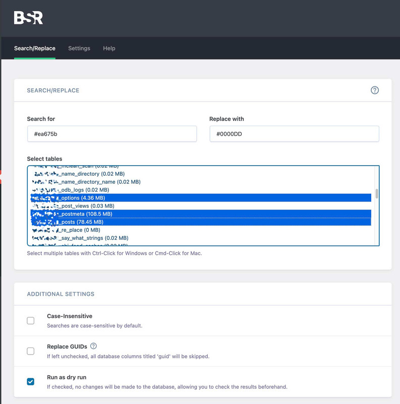
Probably only these 3 tables are affected:
( _options , _postmeta , _posts)after replacement you can deinstall that nice Plugin.
please insert this to your child-theme functions.php:
(maybe a mod knows a shorter way)function replace_one_specific_color(){ ?> <script> window.addEventListener("DOMContentLoaded", function () { (function($) { function colorReplace(findHexColor, replaceWith) { // Convert rgb color strings to hex // REF: https://stackoverflow.com/a/3627747/1938889 function rgb2hex(rgb) { if (/^#[0-9A-F]{6}$/i.test(rgb)) return rgb; rgb = rgb.match(/^rgb\((\d+),\s*(\d+),\s*(\d+)\)$/); function hex(x) { return ("0" + parseInt(x).toString(16)).slice(-2); } return "#" + hex(rgb[1]) + hex(rgb[2]) + hex(rgb[3]); } // Select and run a map function on every tag $('.flex_column, .avia-button').map(function(i, el) { // Get the computed styles of each tag var styles = window.getComputedStyle(el); // Go through each computed style and search for "color" Object.keys(styles).reduce(function(acc, k) { var name = styles[k]; var value = styles.getPropertyValue(name); if (value !== null && name.indexOf("color") >= 0) { // Convert the rgb color to hex and compare with the target color if (value.indexOf("rgb(") >= 0 && rgb2hex(value) === findHexColor) { // Replace the color on this found color attribute $(el).css(name, replaceWith); } } }); }); } // Call like this for each color attribute you want to replace colorReplace("#ea675b", "#0000DD"); })(jQuery); }); </script> <?php } add_action('wp_footer', 'replace_one_specific_color');no – this: https://kriesi.at/support/topic/change-a-color-sitewide/#post-1473933
but: Really now? – I thought we were talking about a few hundred posts that need to be changed. I would change the few things manually. Honestly – it is better to change the background color on generation than to change it afterwards via css or script.
open the column and replace the color.
ok – you can try first the last tip.
Then i will have a look if we can address it by attribute selector.Or do you belong to the buttons?
you can insert your wanted color to : General Styling – Main Content – Primary Color
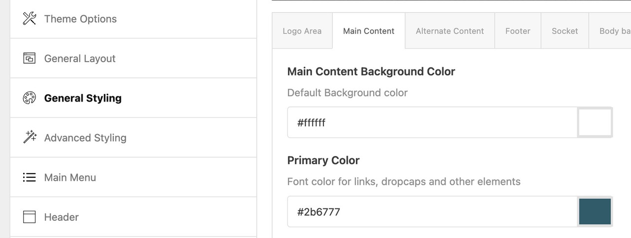
but that will only work if the buttons are on default setting. If they are inserted with custom settings – it will have no effect.
you are talking about the background-color of that flex_column
this does not come from a theme setting – it is set inside the column itself. You can open that column element in the editor mode and change the background-color.

I do not recommend addressing all flex_columns with a global CSS code.
December 18, 2024 at 4:26 pm in reply to: Blog – Selection filters with more than one category #1473908may be this is one you can try – but it is not free – see https://awplife.com/demo/blog-filter-premium/multi-filter-or-logic/
i think the non premium filter doesn’t have this multi filter logic. https://wordpress.org/plugins/blog-filter/
What do you mean by:
All the “.” and capitals were in the right place.
What did you enter to the alt input field f.e.?
December 18, 2024 at 3:58 pm in reply to: Blog – Selection filters with more than one category #1473904as a participant as you are – i do not see content of private field.
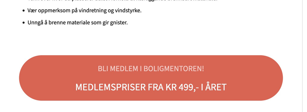
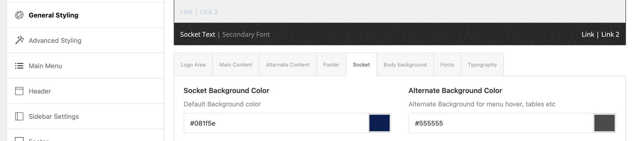
You can see at the bottom that I have used the backcolor: #ea675b
i do not see your setting – i can see that on socket – there is the color: #081f5e
which is then saved from enfold as: –enfold-socket-color-bghave a look at: general styling – socket – Socket Background Color
in the meantime i have some more entries on that in my htaccess file:
<IfModule mod_headers.c>
	Header set Referrer-Policy "no-referrer"
	Header set Referrer-Policy "strict-origin-when-cross-origin"
	Header set X-Frame-Options "sameorigin"
	Header set X-XSS-Protection "1; mode=block"
	Header set X-Content-Type-Options "nosniff"
	Header set Strict-Transport-Security "max-age=63072000; includeSubDomains; preload"
	Header always set Content-Security-Policy "upgrade-insecure-requests"
	Header always set Permissions-Policy "geolocation=(), midi=(),sync-xhr=(),accelerometer=(), gyroscope=(), magnetometer=(), camera=(), fullscreen=(self)"
	Header set Cross-Origin-Embedder-Policy "unsafe-none"
	Header set Cross-Origin-Opener-Policy "same-origin"
	Header set Cross-Origin-Resource-Policy: "same-site"
</IfModule>
with this setting i do not have neither on pagespeed insights nor on lighthouse ( inside chrome browser ) any errors – just warnings.
you can see results here : https://securityheaders.com/?q=webers-testseite.de&followRedirects=on
Although this is criticized, it does not prevent you from receiving the 100 points ;)

i fear that you will block some scripts by script-src ‘self’ on advanced layerslider.
December 18, 2024 at 1:11 pm in reply to: Blog – Selection filters with more than one category #1473897you are not talking about the blog Element of Enfold?
even a conditional logic is present to show post if the got one of those categories or only if they have all of them.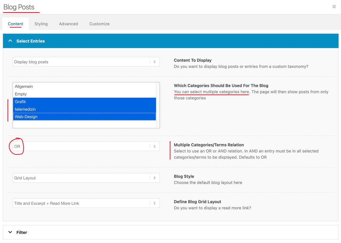 December 18, 2024 at 11:36 am in reply to: How to place a darker background on Fold/Unfold Text Block box #1473892
first – maybe you decide not to have this immense padding of 100px of that cell – because expanding the content will end in a very hight container.
next: set for the background-image position : bottom center.
put this to your quick css and adjust to your needs:#top .av-fold-unfold-container.unfolded { background-color: rgba(0,0,0,0.3); border-radius: 15px; padding: 10px; -webkit-backdrop-filter: blur(3px); backdrop-filter: blur(3px); }if you like to have a semi-transparent white bg – change to rgba(255,255,255,0.6)
but then i would change font color to f.e. #333#top .av-fold-unfold-container.unfolded p { color: #333; }December 18, 2024 at 11:16 am in reply to: color section transparent over another color section #1473889The first color-section : got custom class: bg-fixed
this color-section got the one background-image: substrato_background_page_top – but set it to scroll (background-attachment)
this is for quick css ( maybe we had to adjust later on – please activate that example page again):.bg-fixed { background-size: 0px !important; overflow: hidden; position: relative; -webkit-clip-path: polygon(0 0, 100% 0, 100% 100%, 0% 100%); clip-path: polygon(0 0, 100% 0, 100% 100%, 0% 100%); } .bg-fixed:before { background-image: inherit !important; background-repeat: inherit !important; background-size: cover; background-position: inherit; content: ""; position: fixed; width: 100%; height: 100%; top: 0; left: 0; z-index: -1 !important; pointer-events: none; }Now for the following color-section ( just for that bg-image) with the substrato_separatore.png – that image is 265px heigh –
On Layout Tab : set section height to “Miniumum custom height in px ” to 265px
Open “Margin and Padding” Tab : check “Custom Margins” and enter -260px (Top and Bottom) – this will shift the section to top.
On Styling Tab – “Custom Background Color” and set the slider on the right to minimum (0.01) that is defacto : transparent
Background Image – now your separator – set to scroll – Bottom Center and repeat-x
on Advanced Tab : set a higher z-Index e.g. 2 – and give (if needed) a custom class to that section f.e. shifted-bgIf you got this we will look what to adjust then.
maybe this might be necessary:#top .bg-fixed , #top .shifted-bg { position: relative; }i have installed contact form 7 to nearly all of my enfold installs. They do not load Google Fonts at all. Do you use f.e. google recaptcha in contact forms?
Google Recaptcha is loading extra google fonts (f.e. Roboto or Google Sans.December 17, 2024 at 5:33 pm in reply to: color section transparent over another color section #1473847First: See here a quick takeover of your logo as svg separators – these are set as patterns, so they are not responsive – but fill the entire width with this pattern unit. On element (color section – or column) you can set a height for them. And of course the fill color.
https://webers-testseite.de/bildvergleich/
Second: have a look at this: https://webers-testseite.de/donkey/
The problem with background-attachment: fixed is that a lot of mobile devices do not support it well. So Enfold decided to switch for mobile devices to background-attachment : scroll.One trick was to use the background-attachment: scroll from the beginning setup. We can make then a pseudo-container (before or after anyway) that inherited background-image. Because it is now a seperated container we can set it to position : fixed
We then add a clip path to the actual color section so that the inheriting pseudo-container is only displayed below the parent section.
This is well supported by all browsers and mobile devices. etc. – follow the link above.All is ruled by a custom class for the color-section.
PS: that post is from 2020 – so it might be that inset (0 0 0 0) works now on all browsers for the clip-path. That is much easier to understand and to write down in css code.
But: it will be hard to style with two background-images … i’m afraid we’ll have to go back to your previous solution.
Have a look if this could be a working solution for you – then i will start to explain how:
https://webers-testseite.de/substrato/December 17, 2024 at 9:47 am in reply to: color section transparent over another color section #1473826well – remove that second color section and put this to your quick css:
#top.page-id-238 #av_section_1 {
  background-image: url(https://substratosfera.it/wp-content/uploads/2024/12/substrato_separatore.png), url(https://substratosfera.it/wp-content/uploads/2024/12/substrato_background_top-1.png);
  background-repeat: no-repeat;
  background-position: bottom left, 100% 0%;
  background-size: 130%, contain;
  background-attachment: scroll, fixed;
}
but : if i look to your logo – it might be a good idea to transform the upper part and the lower part as svg to a custom divider ;)
do you have your logo as verctor based file? – post a link pleasewhy is that doubled on that blog page?
what do you mean by: “Only if I enter their urls completely”or try instead:

#top.home #av-layout-grid-1 fieldset {
  display: flex;
  flex-flow: row wrap;
  justify-content: center;
  gap: 5px;
}

#top.home #av-layout-grid-1 fieldset p {
  width: unset;
}

#top.home #av-layout-grid-1 fieldset p:first-of-type {
  width: 50%
}

#top.home #av-layout-grid-1 fieldset p:first-of-type input {
  border: 1px solid #be363c;
  border-radius: 26px 0 0 26px
}

#top.home #av-layout-grid-1 fieldset p .button {
  border-radius: 0 26px 26px 0;
}
and maybe you style that black box a bit too : change background-color and add some css :
.custom-black-box { background-color: rgba(0,0,0,0.3); -webkit-backdrop-filter: blur(8px); backdrop-filter: blur(8px); }try:
#top.home #av-layout-grid-1 fieldset {
  display: flex;
  flex-flow: row wrap;
  justify-content: center;
  gap: 20px;
}

#top.home #av-layout-grid-1 fieldset p {
  width: unset;
}

#top.home #av-layout-grid-1 fieldset p:first-of-type {
  width: 50%
}

#top.home #av-layout-grid-1 fieldset p:first-of-type input {
  border: 1px solid #be363c;
}
is this an option for that special button:

#top.home #av-layout-grid-1 fieldset p .button{ border-radius: 0 26px 26px 0 }i did not compare both css rules , but you should know:
If there are two or more CSS rules that point to the same element, the selector with the highest specificity will “win”, and its style declaration will be applied to that HTML element. Every CSS selector has a position in the specificity hierarchy.

the #top selector has a high hierarchy – so that rule wins – and even by this – the ID wins.

Unfortunately, it is becoming more and more common to set a porperty value to !important in order to enforce a css rule. In many cases, it would only be necessary to adapt the selectors better.
-
AuthorPosts