Forum Replies Created
-
AuthorPosts
-
wie gesagt, ich glaube wenn du nicht die explizit deutsche Version installiert hast, fehlen die lang files. Aber das könntest du nachinstallieren.
Oder einfach eine deutsche drüber installieren.
Sehe gerade, dass die Langfiles einzeln nicht mehr angeboten werden – musst also die komplette WordPress installation laden.
Anleitung: Linkdas mit dem
define('WPLANG', 'de_DE');ist ab Version 4 obsolete. Das wird jetzt im Dashboard umgestellt.yes sorry that was my misunderstanding.
I thought it was one of those Ex-Rules from strict html4 times. Like no block-level element in anchors.
Today we are at html5 – and yes now it is common use to wrap some h, p or div in one a element.
it works – and rendering is safe._________
a handmade site is unbeatable in that and performance reasons – but nevertheless i do not want to go back!
Allthough this oldschool site is responsive – html valide and css3 conform.
from that point the old times are ok Look here https://guenterweber.com/oldschool/
and gtmetrix values like this : https://gtmetrix.com/reports/guenterweber.com/XJVD4Xo5 are never seen on WP Sites
https://developers.google.com/speed/pagespeed/insights/?hl=de&url=guenterweber.com%2Foldschool%2F&tab=desktoptry this too combining Yigits rule:
html {
    -webkit-font-smoothing: antialiased;
}
or as Basilis changing:
* {
    -webkit-font-smoothing: antialiased;
}
see thread here : https://kriesi.at/support/topic/different-font-weight-in-menu-navigation/?bbp_reply_to=717694&_wpnonce=9354f7d078#new-post
and look to the warning:
Use Wisely
For these last two hacks, each character re-rendered will require extra resources so it’s best NOT to use these to render large swaths of copy. Use these on headers and global elements where you will have the most impact, but for the main copy use ‘serif’ or ‘sans-serif’ and let the browser decide.so perhaps you will only do for navigation or important headlines
-
This reply was modified 8 years, 11 months ago by
Guenni007.
have you tried to implement it with standard 400 ?
because google did not allow to get rid of that marked 400er field. Maybe it is necessary:add_filter( 'avf_google_heading_font', 'avia_add_heading_font'); function avia_add_heading_font($fonts) { $fonts['Quicksand'] = 'Quicksand:300,400,700'; return $fonts; } add_filter( 'avf_google_content_font', 'avia_add_content_font'); function avia_add_content_font($fonts) { $fonts['Quicksand'] = 'Quicksand:300,400,700'; return $fonts; }
@Victoria : yes it seem to be right – but this was the way in documentation for activating for headings and for textfields.
btw: the bold is implemented in the 700 – isn’t it – so there might be a mismatch if you are defining a quicksand bold for 300, 700
and a quicksand too for 300, 700-
This reply was modified 8 years, 11 months ago by
May 8, 2017 at 12:42 pm in reply to: Enfold Theme Option – Which file modify footer edition? #789505sorry for my little off topic but your question reminds me to a film sequence of Peter Seller as Inspector Clouseau – the lightswitch question.
Just a bit of humor now: https://www.youtube.com/watch?v=eu8erlaxLAgso now to something completely different:
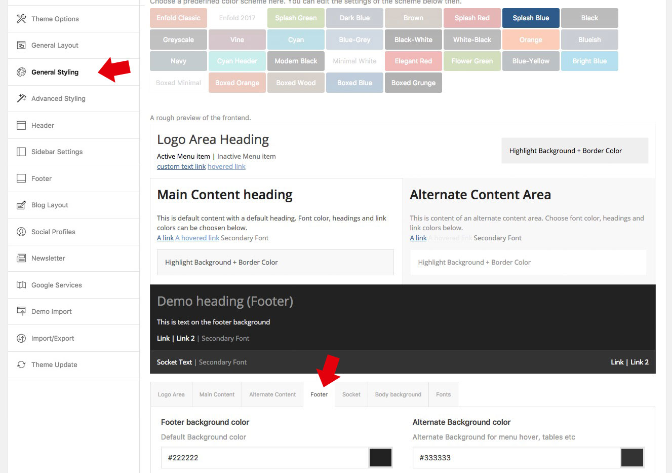
on dashboard – general styling – footer (tab) – be careful the footer is that segment with the widgets in it. The bottom of your site is the “socket” – as you can see in the image above those tabs
well alot of your error codes concerns to structured data – something which seems not to be regarded by that html test tool on w3c.
Long time a lot of wai aria roles aren’t regarded by w3c – so you have to read this with modern eyes!look for example on structured data test tool by goolge: https://search.google.com/structured-data/testing-tool?hl=de#url=https%3A%2F%2Fe-3.de
no errors – no warnings on your site.the other errors are some meta properties . Get familiar with those things too.
something like: “The itemtype attribute must not be specified on elements that do not have an itemscope attribute specified”
Must not be – for me sounds like could be but must not be ( so an error is harsh – a warning seems to be enough) etc.
May 7, 2017 at 3:03 pm in reply to: LayerSlider (PAID) – Requesting an add to Enfold's online documentation #789092on one installation i activated the embeded version with a license key. From this moment on i can use the library to install layerslider demos – even the premium ones – but updates are not working- they are not shown in WP dashboard – Updates.
May 5, 2017 at 6:52 pm in reply to: Change menu-icon when header is set to "Display as icon"? #788609May 5, 2017 at 5:39 pm in reply to: Change menu-icon when header is set to "Display as icon"? #788553the thing with that “icon” is that it is not a static one. there are a lot of svg animated pendents to that what kriesi has choosen – f.e.
https://codepen.io/kyleHenwood/pen/Alaybthis here seems to be a combination of having strokes and setting some additional classes on click event.
see here some examples: https://jonsuh.com/hamburgers/
on avia.js since line 1760 you find those settings
PPS: on that link above to https://jonsuh.com/hamburgers/ you can see a very similar structure of hamburger styling
<div class="hamburger hamburger--spin js-hamburger">
        <div class="hamburger-box">
          <div class="hamburger-inner"></div>
        </div>
</div>
on enfold the structure is:
<span class="av-hamburger av-hamburger--spin av-js-hamburger av-inserted-main-menu">
	<span class="av-hamburger-box">
		<span class="av-hamburger-inner"></span>
			<strong>Menu</strong>
	</span>
</span>
only a av- is before classes so maybe a css transfer brings different possibilities.
so maybe it is easy to replace here with some transfer-
This reply was modified 8 years, 11 months ago by
or:
#top .main_color .wpcf7-not-valid {
    background: rgba(230, 70, 0, 0.3) !important;
}
for you
Kannst du das hier mal probieren:
#top .main_color .wpcf7-not-valid { background: rgba(255, 255, 120, 0.2) !important; }can you please show us a link to that page. I have a message above the input fiield in that case.
is there an example on any demo page of kriesi?
my Wacom3 9×12 worked! as expected.
do you use it with Pc or Mac?
on Settings (this is mac osx):

have you anything changed to standard settings?
if you like to include other files to do the same:
<FilesMatch "\.(?i:(pdf|xls))$">
    # Force File Download
    ForceType application/octet-stream
    Header set Content-Disposition attachment
</FilesMatch>
you know that from the rule concerning to cors :
<FilesMatch "\.(ttf|otf|woff)$"> <IfModule mod_headers.c> Header set Access-Control-Allow-Origin "*" </IfModule> </FilesMatch>-
This reply was modified 8 years, 11 months ago by
try first to set a link with for example:
you see in the link the download=””<a href="https://domain.de/xyz.pdf" download="Aufsatz_ueber_Nettiquette.pdf">Nettiquette</a>this will be the html5 method and it works now on Firefox, Safari, Opera, Chrome : https://webers-testseite.de/kokon/this-is-a-post-with-post-type-link/
Or for a globaly solution: you use this in htaccess file:
<FilesMatch "\.(?i:pdf)$"> # Force File Download ForceType application/octet-stream Header set Content-Disposition attachment </FilesMatch>-
This reply was modified 8 years, 11 months ago by
Dear Mods i tried to set here an ol but there are no numbers seen
- abc
- def
- ghi
there is a css missing like:
#bbpress-forums ol li {
    list-style: outside none decimal;
}
because ol rule does not overwrite li rule
-
This reply was modified 8 years, 11 months ago by
But nevertheless you can do that and look if there are on the frontend any changes if not you can leave the child activated – if so you can reactivate your partent theme.
so what to do-
- download the child-theme from documentation page here
- unzip and upload the folder “enfold-child” to your themes folder (adjacent to enfold folder)
- goto Dashboard – Enfold (this is only for paranoid reasons) – Import/Export and 2nd Button “Export Theme Settings File”
- goto Dashboard – Appearance and activate the Child-Theme.
- Goto Dashboard – Enfold-Child – Import/Export and press the button on top “Import Parent Theme Settings” – ( if there is a message that there are no Parent Settings – upload the parent theme settings file via 3rd Button on Import/Export – “Import Theme Settings File” and choose the file you downloaded on step 3
- have a look if there are changings on your frontend
click to enlarge the image

the Point of your thread will be : “I don’t know which files I have modified”
All Settings and Changings on Enfold Options Dialog you can import via that Button “Import Parent Theme Settings” on Theme Options / Import/Export.But if you have edited functions.php or any other file of your parent-theme – these changings will be not transfered!
So if you want to use a child-theme you have to know that!btw. that is the reason why a use of a child-theme is best. Because you can update the parent theme without loosing those changings on child-theme.
All Changings will be made on Child-Theme FilesMay 2, 2017 at 2:49 pm in reply to: Which file do I need to duplicate for making an own page template? #786390so here on enfold documentation there is a predefined download child-theme: Link
May 2, 2017 at 2:44 pm in reply to: Which file do I need to duplicate for making an own page template? #786386first of all – please make you familiar with using a child theme – there are a lot of advantages.
All changings to that child theme stay even on updating the parent theme was one of those points.A Template is an established term in WordPress.
Templates are the files which control how your WordPress site will be displayed on the Web. These files draw information from your WordPress MySQL database and generate the HTML code which is sent to the web browser.
A Template often is a strict layout and you only could change colors or fonts etc. via css. The layout structure stayes often the same.
Enfold uses advanced layout builder – so you can create page/post wide a different layout – no strict template.
If you have in your mind something like the demos – they only differ in some settings and color-schemes etc. These settings are made with Enfold Options Dialog.
So you can do it via Child-Theme yourself and a bit of code-snippets sometimes.To your other question : there are a lot of possiblities to make your own widget area. And Enfold accomadets your whishes.
It is very simple to register an own widget area. And there was a widget area element on content elements listed.For placing a site-wide widget area – we have to know something more precise input of you
here is something i found on this thematic:
You can’t do this with HTML.
It’s a server-based solution. You have to stream the file so that the browser than triggers the save dialog.I’d advise not doing this. How a user interacts with a PDF should be left up to the user.
And i do agree to that on security reasons. (pdf bomb)
PS: on html5 now it seems to be able to do that . But on the security reasons i stay on my oppinion that it is a “no go” –
Link : https://developers.google.com/web/updates/2011/08/Downloading-resources-in-HTML5-a-downloadbut you can do it with zip files – than the user has the opportunity to have a first look to the downloaded zip file (Antivirus etc.)
-
This reply was modified 8 years, 11 months ago by
Well is this really a question to enfold support? Because the iframe is not an advanced layout builder element. But on googling your question f.e. via: “making iframe responsive” there are a lot of solutions – even pure css ones.
the thing is to use a surrounding container and to define the hight via a padding-bottom of this container.
see here: LinkMay 2, 2017 at 1:00 pm in reply to: Image Lightbox is not working when image is within a Grid Row #786313hey Ismael i tried to achive this “the grid row is out of main” – i can not reconstruct that by only using alb. So how can this be?
by the way – if you have a big site and many pages to come – you can set those layout default values by adding some snippets to functions.php child-theme:
add_action( 'after_setup_theme', 'ava_enfold_builder_layout_mod' ); function ava_enfold_builder_layout_mod(){ add_filter('avf_builder_elements', 'avf_enfold_builder_layout_settings_mod'); } function avf_enfold_builder_layout_settings_mod($elements) { $counter = 0; foreach($elements as $element) { // Layout > Header visibility and transparency if($element['id'] == 'header_transparency') { /** * Available Options * No transparency = * Transparent Header = 'header_transparent' * Transparent Header with border = 'header_transparent header_with_border' * Transparent & Glassy Header = 'header_transparent header_glassy ' * Header is invisible and appears once the users scrolls down = 'header_transparent header_scrolldown ' * Hide Header on this page = 'header_transparent header_hidden ' **/ $elements[$counter]['std'] = 'header_transparent header_scrolldown '; } $counter++; } return $elements; }i think you are talking not about a bug but about one features of enfold.
the header behavior can be set to that what you described. Did you install your page over a demo import. Because on default this is not the standard behavior on headers.
But on each page/post – you can set this feature – look to the right side of your Editor Page there are different Input Fields. The one we are interesting in is layout: on bottom you find the features
By the way a little off topic: IF YOU ARE WRITING IN THIS WAY – it means commonly in internet foren and boards that you are shouting loud and this is seen as rude and considered impolite; – but i believe that you are not wanting to give that impression with your Thread Title
For headings and sloagans this is a common exceptionApril 29, 2017 at 8:43 am in reply to: Buttons auf gleicher Höhe in nebeneinander liegenden Layout-Elementen #784901keine ID die Möglichkeit eine Custom Class zu vergeben siehe bitte hier: http://kriesi.at/documentation/enfold/turn-on-custom-css-field-for-all-alb-elements/
und die Klasse müssen alle Columns die es betreffen soll erhalten (deshalb wäre eine ID auch falsch)Du kannst das in eine Color-Section setzen.
-
This reply was modified 8 years, 11 months ago by
April 28, 2017 at 7:48 pm in reply to: Buttons auf gleicher Höhe in nebeneinander liegenden Layout-Elementen #784781Lol : Rechtschreibfehler dürfen behalten werden!
-
This reply was modified 8 years, 11 months ago by
-
AuthorPosts