Forum Replies Created
-
AuthorPosts
-
if you tried it then the DOM will have there a p-tag with an inline text-align: center!
so we can use this as a selector:.avia-testimonial p[style*="center"] { margin-top: 0; display: inline-block; }see : https://webers-testseite.de/testimonial-styling/
PS: the css code there is only for the other styling of those testimonialslike this: https://kriesi.at/themes/enfold-2017/#best-rated
but you know how to insert those icons – the only problem is to get them centered – allthough you have tried using the text-align feature of the editor?just a question – you are talking about events; you got an events plugin that does not have expiration dates?
Sorry i only read your topic – not the post
there are lot of plugins that can be asumed under events f.e.: https://wp-events-plugin.com/ The Free Plan is good enough for the most possibilities.insert manually the url and save
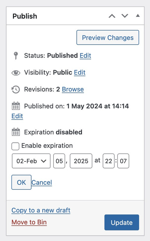
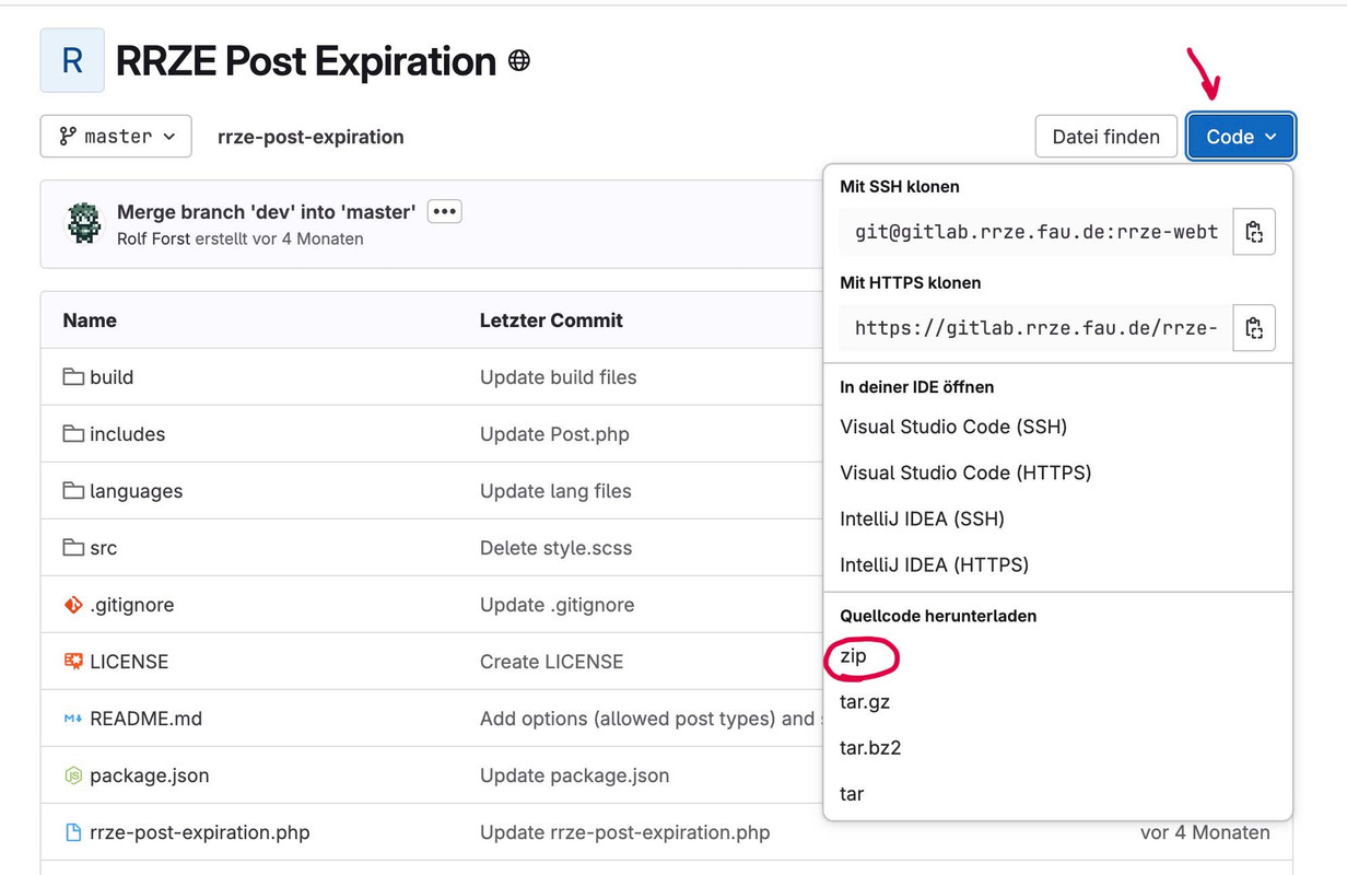
https://october7coalition.com/wp-content/uploads/2024/01/logo_black.pnghave a look at this small plugin: https://gitlab.rrze.fau.de/rrze-webteam/rrze-post-expiration
(GNU General Public License v2.0 or later – so you can use it)you will have then on all posts under publishing the post :

after expiration those post/pages goes to an extra “Expired” State.
PS – there is only the setting for post/pages not for portfolio. BUT only two places in sourcecode can change that to have it for portfolio too.
/includes/main.php (line 86 – add to the array ‘portfolio’ )
and
/includes/settings.php (line40 – add a new line with portfolio)or:
#top.page-id-2 #main{ background: transparent !important; } #top.page-id-2 .main_color, #top.page-id-2 .header_bg, #top.page-id-2 #socket { background-color: rgba(255,255,255,0.6); -webkit-backdrop-filter: blur(5px); backdrop-filter: blur(5px); }What have you inserted to your :
Dashboard – Settings – General : “WordPress Address (URL)”. and “Site Address (URL)”. ?your background-image – is it a svg file?
if you are on an older enfold version update to the newest enfold version – there is in the meanwhile (since 5.6.9) a css to give an absolute width value to svg on body.wp-admin.why does logo image url differ to domanin url?
https://october7coalition.orgon mobile the normal logo (non transparency case ) is shown and this leads to :
https://october7coalition.org/wp-content/uploads/2024/01/logo_black.png
on desktop the transparency logo is shown so the alternate logo inside sub-text is there.
https://october7coalition.com/wp-content/uploads/2024/01/logo_black-300x133.pngthis will hard to get i see:
https://webers-testseite.de/sandy/
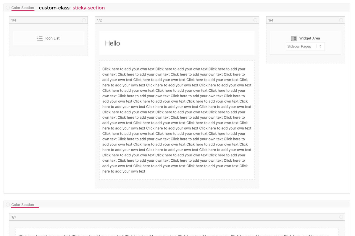
because all three columns are inside the same parent container – the stick will not end when the 1/1 column reaches the top.________
but you can have a page/post without sidebar and use then color-sections – the sidebar then is shown as content element : widget area:
click to enlarge the preview:

see code and example page:
https://webers-testseite.de/sandy-2/you can have on child-theme functions.php :
function add_slug_body_class( $classes ) {
global $post;
  if ( isset( $post ) ) {
    $classes[] = $post->post_type . '_' . $post->post_name;
  }
  return $classes;
}
add_filter( 'body_class', 'add_slug_body_class' );
then a post/portfolio/page will have on body (#top) an additional class f.e.
post_name-of-my-post
portfolio_name-of-my-post
page_name-of-my-postmaybe that helps you to better select.
On your example page it will then be : post_sand-box-postwhy do i include to that class the post-type? because it might be that you have post and a page with same slug – then you can differ between them
if you do not need that – remove the instertion of the post-type:function add_slug_body_class( $classes ) { global $post; if ( isset( $post ) ) { $classes[] = $post->post_name; } return $classes; } add_filter( 'body_class', 'add_slug_body_class' );because of there is only a layout with columns.
So please go and set a 1/1 column below that – to see how enfold handles the rest.the first column now can be select via:
#top.postid-335 .entry-content-wrapper .submenu-col instead of #top.postid-335 .entry-content-wrapper .flex_column.firston your layout there is no parent element that you can give a custom class to. So we had to work with page/post IDs
If you have that on all single posts – than we can select more global as f.e.: single-post etc.PS : there is no slug of the post on default enfold.
you can have both – column sticky and sidebar sticky
.responsive body#top.postid-335 { overflow-x: visible; } #top.postid-335 #wrap_all { overflow: visible; } @media only screen and (min-width: 768px){ #top.postid-335 .entry-content-wrapper { display: flex; justify-content: space-around; align-items: flex-start; } #top.postid-335 .entry-content-wrapper .flex_column.first{ position: -webkit-sticky !important; position: sticky !important; top: 100px; /*** depends on your header-height after scrolling ***/ min-width: 120px; /*** you can have here absolute Values ***/ } #top.postid-335 #main div > .container { display: flex; justify-content: space-around; align-items: flex-start; } #top.postid-335 .sidebar{ position: -webkit-sticky !important; position: sticky !important; top: 60px; /*** depends on your header-height after scrolling ***/ width: 30% !important; /*** you can have here different width than on global settings of Enfold ***/ } }so for that page:
.responsive body#top.postid-335 {
    overflow-x: visible;
}

#top.postid-335 #wrap_all {
    overflow: visible;
}

@media only screen and (min-width: 768px){
  #top.postid-335 .entry-content-wrapper {
    display: flex;
    justify-content: space-around;
    align-items: flex-start;
  }

  #top.postid-335 .entry-content-wrapper .flex_column.first{
    position: -webkit-sticky !important;
    position: sticky !important;
    top: 100px;   /*** depends on your header-height after scrolling ***/
    min-width: 120px;  /*** you can have here absolute or relative Values ***/
  }
}
to be more selectiv using custom classes on some elements.
and keep in mind, that the element is sticky only in its parent container. If the parent container is the same height as the f.e. color-section it looks like the sticky element is fixed inside that container:
https://webers-testseite.de/sticky-elements/
PS: if you break your columns at 990px you had to adjust that media query inside the snippet.see here the example page for sticky sidebar with code : https://webers-testseite.de/sticky-sidebar/
Try to make a screenshot of your enfold layout you like to have. Or describe it better.
On your sandbox the parent element is the entry-content-wrapper
now you like to have the first column to be sticky and the second one scrolls. The sidebar on the right should scroll away too?for that reason on google.maps.marker.AdvancedMarkerElement i use in the meanwhile iframe and google api v3.
I can use async loading of the maps script and style everything on the map – including custom markers myself, or place google buttons on custom place. – but to give here a detailed instruction how to do it … i do not want to give all the knowledge of mine to public ;)https://webers-testseite.de/google-maps-api-v3/
a lot of reading in the docu of google maps api is required on that.
this is just the lato activation by enfold google font support? (just selecting it from the drop down menu – on general styling – fonts)
can you show me that page where it is not changed to the correct lato font?
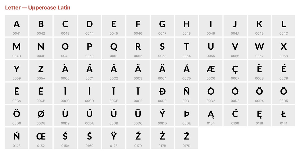
how did you enter those special characters.
Can you try to use the unicode html entity& #262;(without that space between ampersand and #)
Lato is designed by polish Łukasz Dziedzic, so I can hardly imagine that this font is not equipped with diacritical marks.
but reading f.e.: https://stackoverflow.com/questions/51707185/font-lato-bolded-some-czech-characters – it seem that some characters with Caron (Hatschek) are printed bold – instead of normal.but that C with Akut is there :

-
This reply was modified 1 year, 2 months ago by
Guenni007.
February 1, 2025 at 10:37 pm in reply to: Contact Form – center submit button and styling checkbox #1476153try :
#top .button[type="submit"] { position: relative; left: 50%; transform: translateX(-50%) }on mobile less than 767px – is it intentional that the logo is that big?
because the header height and all line-height are set to 80px but your logo is set to 120px.if you like to have an overlapping logo like:

then you need some extra css.
against that squeeze :
@media only screen and (max-width: 767px) { .responsive #top #wrap_all #header .container { width: 97%; max-width: 97%; } #menu-item-shop .cart_dropdown_link { padding: 0 25px; } /* === against that jump on header positioning absolute / fixed === */ .responsive #top #wrap_all #header.av_header_transparency { position: fixed !important; } }for that small images below – there is in relation to its own dimension a big padding (7px for images that are approx. 30px)
so set the padding to a smaller value:#top div .avia-gallery .avia-gallery-big, #top div .avia-gallery img { padding: 2px; }here the big image above is included to that new padding – so that the large image is aligned with the block of small images.
________
I always set my lightbox so that the background does not scroll.
There is now a filter for this which you can set in the child-theme functions.php.add_filter( 'avf_default_lightbox_no_scroll', '__return_true' );Apart from that, I don’t see the reason why these extreme heights are set for mfp-bg and mfp-wrap. The usual values are 1600 to a little over 2000px, why is it twice that in your installation? …
https://github.com/KriesiMedia/enfold-library
on the bottom of that page there is a link under “Online Resources from Third Party Developers”
@Ismael : can you erase from GitHub Library on “Online Resources from Third Party Developers” the
“Disable loading of Google fonts and host them on your on server by Guenni007Disable loading of Google fonts and host them on your on server by Guenni007”
it is a bit deprecated since Enfold Font Manager is established.Don’t get me wrong: the marquee tag is long outdated (and probably the effect too ;)), but you can use a keyframe animation for this element, for example.
F.e. see page and code on that page: https://enfold.webers-webdesign.de/partnerlogo-element/
use instead:
@media only screen and (max-width: 767px) {
  .responsive #top .av-special-heading .av-subheading p {
    font-size: 36px !important;
    line-height: 1.5em !important;
  }
}
because you have set in your css:
@media only screen and (max-width: 767px) {
  body, p, .entry-content {
    font-size: 18px !important;
    line-height: 1.6 !important;
  }
}
it is necessary to do so aswell with !important
what you try to influence on the hamburger script file?
you can deregister the parent script and register child-theme edited files then.
My recommendation is to have the same tree structure as the parent – create a js subfolder in your child-theme directory.if you use the option of enfold to use minified files – you had to upload both files – in your case:
avia-snippet-hamburger-menu.js and avia-snippet-hamburger-menu.min.jsto get the minified version you can use this : https://codebeautify.org/minify-js
put this in your child-theme functions.php :
function wp_change_hamburger_script() { $vn = avia_get_theme_version(); $child_theme_url = get_stylesheet_directory_uri(); $min_js = avia_minify_extension( 'js' ); wp_deregister_script( 'avia-hamburger-menu' ); wp_enqueue_script('avia-hamburger-menu-child', "{$child_theme_url}/js/avia-snippet-hamburger-menu{$min_js}.js", array('avia-default'), $vn, true); } add_action( 'wp_enqueue_scripts', 'wp_change_hamburger_script', 100 );have a look at : https://webers-testseite.de/bemopriv/
the heading had to be styled for responsive case – but I didn’t feel like doing that anymore.the layout is based on a grid-row element
this is the enfold shortcode of the grid-row:
[av_layout_row min_height_percent='percent' min_height_pc='60' min_height='0' border='' fold_type='' fold_height='' fold_more='Read more' fold_less='Read less' fold_text_style='' fold_btn_align='' color='main_color' fold_overlay_color='' fold_text_color='' fold_btn_color='theme-color' fold_btn_bg_color='' fold_btn_font_color='' size-btn-text='' av-desktop-font-size-btn-text='' av-medium-font-size-btn-text='' av-small-font-size-btn-text='' av-mini-font-size-btn-text='' fold_timer='' z_index_fold='' mobile='av-flex-cells' mobile_breaking='' mobile_column_order='' id='' custom_class='full-bg-image' template_class='' aria_label='' av_element_hidden_in_editor='0' av_uid='av-m6f9v8gq' sc_version='1.0'] [av_cell_three_fourth vertical_align='middle' padding=',,,' av-desktop-padding=',,,80px' av-medium-padding=',,,80px' av-small-padding='3' av-small-padding_sync='true' av-mini-padding='20' av-mini-padding_sync='true' background='bg_color' background_color='' background_gradient_direction='vertical' background_gradient_color1='#000000' background_gradient_color2='#ffffff' background_gradient_color3='' src='' attachment='' attachment_size='' background_attachment='scroll' background_position='top left' background_repeat='no-repeat' link='' link_dynamic='' linktarget='' title_attr='' link_hover='' mobile_display='' mobile_col_pos='0' custom_class='' template_class='' av_uid='av-m6f9ukqb' sc_version='1.0'] [av_four_fifth first min_height='' vertical_alignment='av-align-top' space='' row_boxshadow_width='10' row_boxshadow_color='' margin='0px' margin_sync='true' av-desktop-margin='' av-desktop-margin_sync='true' av-medium-margin='' av-medium-margin_sync='true' av-small-margin='' av-small-margin_sync='true' av-mini-margin='' av-mini-margin_sync='true' mobile_breaking='' mobile_column_order='' border='1' border_style='solid' border_color='#000000' radius='15' radius_sync='true' min_col_height='' padding='30' padding_sync='true' av-desktop-padding='' av-desktop-padding_sync='true' av-medium-padding='' av-medium-padding_sync='true' av-small-padding='' av-small-padding_sync='true' av-mini-padding='' av-mini-padding_sync='true' svg_div_top='' svg_div_top_color='#333333' svg_div_top_width='100' svg_div_top_height='50' svg_div_top_max_height='none' svg_div_top_opacity='' svg_div_bottom='' svg_div_bottom_color='#333333' svg_div_bottom_width='100' svg_div_bottom_height='50' svg_div_bottom_max_height='none' svg_div_bottom_opacity='' fold_type='' fold_height='' fold_more='Read more' fold_less='Read less' fold_text_style='' fold_btn_align='' column_boxshadow_width='10' column_boxshadow_color='' background='bg_color' background_color='rgba(0,0,0,0.5)' background_gradient_direction='vertical' background_gradient_color1='#000000' background_gradient_color2='#ffffff' background_gradient_color3='' src='' attachment='' attachment_size='' src_dynamic='' background_position='top left' background_repeat='no-repeat' highlight_size='1.1' fold_overlay_color='' fold_text_color='' fold_btn_color='theme-color' fold_btn_bg_color='' fold_btn_font_color='' size-btn-text='' av-desktop-font-size-btn-text='' av-medium-font-size-btn-text='' av-small-font-size-btn-text='' av-mini-font-size-btn-text='' animation='' animation_duration='' animation_custom_bg_color='' animation_z_index_curtain='100' parallax_parallax='' parallax_parallax_speed='' av-desktop-parallax_parallax='' av-desktop-parallax_parallax_speed='' av-medium-parallax_parallax='' av-medium-parallax_parallax_speed='' av-small-parallax_parallax='' av-small-parallax_parallax_speed='' av-mini-parallax_parallax='' av-mini-parallax_parallax_speed='' fold_timer='' z_index_fold='' css_position='' css_position_location=',,,' css_position_z_index='' av-desktop-css_position='' av-desktop-css_position_location=',,,' av-desktop-css_position_z_index='' av-medium-css_position='' av-medium-css_position_location=',,,' av-medium-css_position_z_index='' av-small-css_position='' av-small-css_position_location=',,,' av-small-css_position_z_index='' av-mini-css_position='' av-mini-css_position_location=',,,' av-mini-css_position_z_index='' link='' link_dynamic='' linktarget='' link_hover='' title_attr='' alt_attr='' mobile_display='' mobile_col_pos='0' id='' custom_class='' template_class='' aria_label='' element_template='' one_element_template='' av_uid='av-t574on' sc_version='1.0'] [av_heading heading='FREEZE FLAT™' tag='h1' style='blockquote modern-quote' subheading_active='subheading_above' show_icon='' icon='ue800' font='entypo-fontello' size='' av-desktop-font-size-title='48' av-medium-font-size-title='42' av-small-font-size-title='36' av-mini-font-size-title='28' subheading_size='' av-desktop-font-size='36' av-medium-font-size='28' av-small-font-size='24' av-mini-font-size='20' icon_size='' av-desktop-font-size-1='' av-medium-font-size-1='' av-small-font-size-1='' av-mini-font-size-1='' color='custom-color-heading' custom_font='#ffffff' subheading_color='#ffffff' seperator_color='' icon_color='' margin='' margin_sync='true' av-desktop-margin='' av-desktop-margin_sync='true' av-medium-margin='' av-medium-margin_sync='true' av-small-margin='' av-small-margin_sync='true' av-mini-margin='' av-mini-margin_sync='true' headline_padding='' headline_padding_sync='true' av-desktop-headline_padding='' av-desktop-headline_padding_sync='true' av-medium-headline_padding='' av-medium-headline_padding_sync='true' av-small-headline_padding='' av-small-headline_padding_sync='true' av-mini-headline_padding='' av-mini-headline_padding_sync='true' padding='10' av-desktop-padding='' av-medium-padding='' av-small-padding='' av-mini-padding='' icon_padding='10' av-desktop-icon_padding='' av-medium-icon_padding='' av-small-icon_padding='' av-mini-icon_padding='' link='' link_dynamic='' link_target='' title_attr='' id='' custom_class='iceglas' template_class='' element_template='' one_element_template='' av_uid='av-m6e7xj5g' sc_version='1.0' admin_preview_bg=''] The Original [/av_heading] [/av_four_fifth][/av_cell_three_fourth][av_cell_one_fourth vertical_align='bottom' padding='' padding_sync='true' av-desktop-padding='' av-desktop-padding_sync='true' av-medium-padding='' av-medium-padding_sync='true' av-small-padding='' av-small-padding_sync='true' av-mini-padding='' av-mini-padding_sync='true' background='bg_color' background_color='' background_gradient_direction='vertical' background_gradient_color1='#000000' background_gradient_color2='#ffffff' background_gradient_color3='' src='' attachment='' attachment_size='' background_attachment='scroll' background_position='top left' background_repeat='no-repeat' link='' link_dynamic='' linktarget='' title_attr='' link_hover='' mobile_display='' mobile_col_pos='0' custom_class='' template_class='' av_uid='av-u4sunr' sc_version='1.0'] [av_video src='https://www.youtube.com/watch?v=W73GdyDSHuU' mobile_image='https://webers-testseite.de/wp-content/uploads/dynamic_avia/avia_video_thumbnails/youtube/W73GdyDSHuU/W73GdyDSHuU.jpg' attachment='49853' attachment_size='full' video_autoplay_enabled='aviaTBvideo_autoplay_enabled' html5_fullscreen='aviaTBhtml5_fullscreen' format='16-9' width='16' height='9' conditional_play='' id='' custom_class='' template_class='' element_template='' one_element_template='' av_uid='av-m6f9u95o' sc_version='1.0'] [/av_cell_one_fourth] [/av_layout_row]But this mockup : https://i.gyazo.com/9aa08ac46047a586058391b52466bdf8.jpg
will need more css. I think it could be reached by grid layout … -
This reply was modified 1 year, 2 months ago by
-
AuthorPosts


