Forum Replies Created
-
AuthorPosts
-
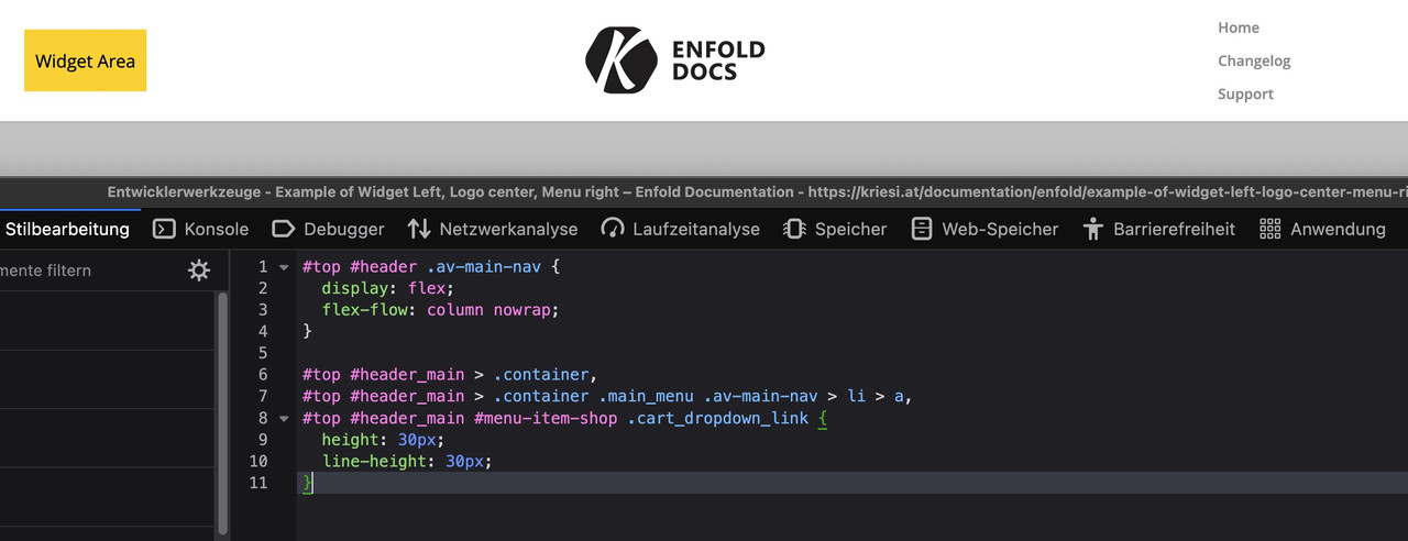
your sketch on the bottom is the non responsive case :
left a widget area – then logo – then main menu on the right ? and then under all that the page content?https://kriesi.at/documentation/enfold/example-of-widget-left-logo-center-menu-right/
setting the nav to:
#top #header .av-main-nav {
  display: flex;
  flex-flow: column nowrap;
}

#top #header_main > .container,
#top #header_main > .container .main_menu .av-main-nav > li > a,
#top #header_main #menu-item-shop .cart_dropdown_link {
  height: 30px;
  line-height: 30px;
}
will put your list-items under each other.
BUT: Can you really recommend something like this?
functions-enfold.php is now inside includes/config-enfold/
I don’t think the child-theme functions.php is affected, and I suspect it’s just a matter of re-organising the administration.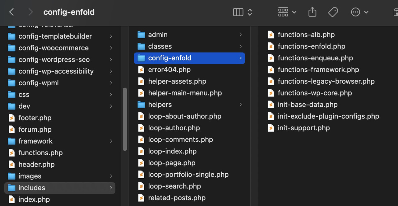
In turn, the functions.php file will retrieve the individual parts from this folder.
Thanks to clarify the usage.
hey ismael : i guess i will better post a new topic – there was that filter avf_default_icons – but because of that new handling of font-icons there has been changed alot. : https://kriesi.at/support/topic/how-to-replace-standard-icons/
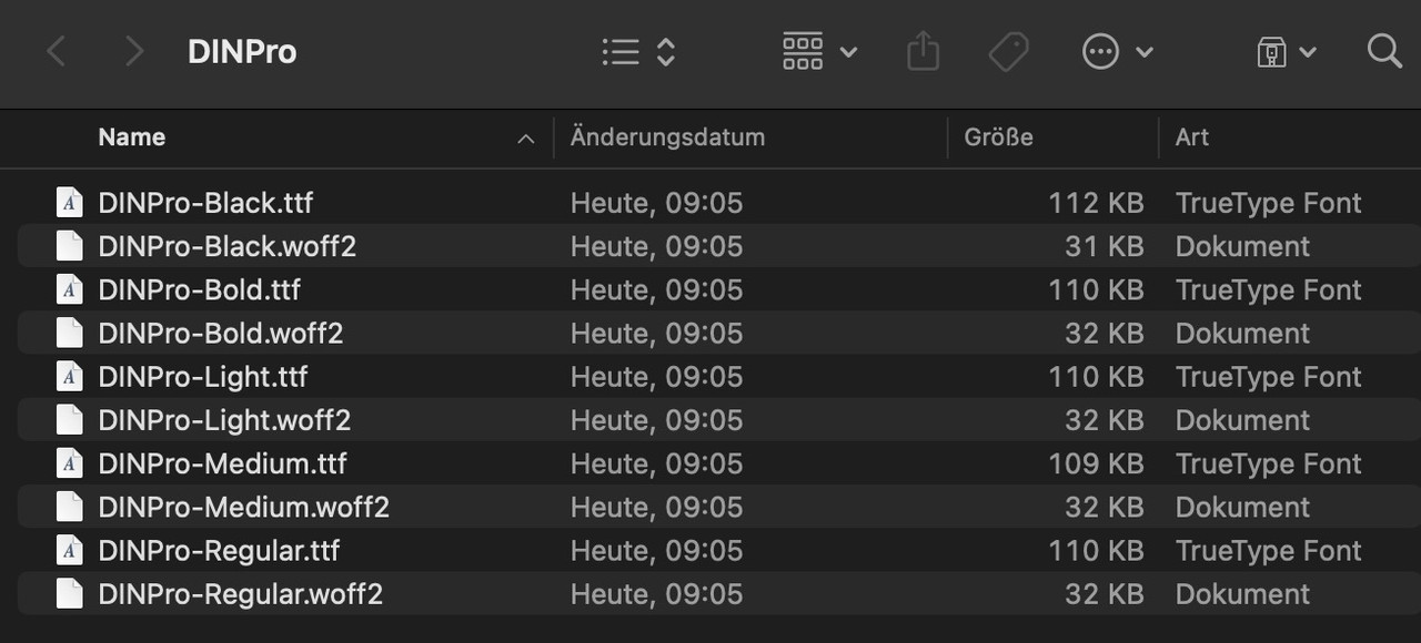
PS: deine zum Upload vorbereiteten Fonts sollten vor allem auch woff2 beinhalten. Moderne Browser können die alle verwerten, und die sind auf Grund der Brotli Kompression viel schneller geladen als ttf.
Daher eventuell schmeiss auch deine Open-Sans mal raus und lade diese hier hoch.: Open_Sans.ziphier ist der Vergleich woff2 zu ttf (Alles jeweils gut 1/3 kleiner)
ok – ich sehe jetzt dein child-theme aktiv.
Wie erklärst du dir, das wenn ich in deiner Privacy die google webfonts erlaube – die schrift dann angezeigt wird?
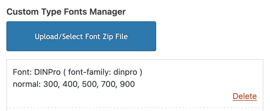
dinpro-light steht oben mit dinpro-light() – da muss was beim generieren schief gelaufen sein. Ausserdem ist in deinen @font-face rules nur die din-alternate-cdnfonts zu sehen.
Man sieht das child-theme natürlich im Source Code – allerdings, nur bei den css und js files die auch davon herrühren: also z.B.<link rel="stylesheet" id="avia-style-css" href="https://marcusjeroch.de/wp-content/themes/enfold-child/style.css?ver=6.0.9" type="text/css" media="all"> <link rel="stylesheet" id="style-name-css" href="https://marcusjeroch.de/wp-content/themes/enfold-child/style.css?ver=6.7.2" type="text/css" media="all">Lass die Nutzung der oberen Webfonts (ausser den Websafe Fonts ausser acht. Lade die gewünschten Schriften hoch.
Also z.B deine DINPro und die OpenSans. Deine Open-Sans sollte funktionieren die ist dort richtig gelistet (allerdings nur als ttf )
Schmeiss deine DINPro aus dem Font Manager raus und lade diese mal hoch: https://webers-testseite.de/DINPro.zip
Die wird dann dort gelistet:
Wähle dann unter General Styling – Fonts diese Schriften aus (bei den Hochgeladenen Schriften unten)
Du benötigst dann nicht mehr die Auflistung in der Privacy – da selbstgehostete Fonts verwendet werden.
all links above go to code that has old
$(window).load(function() {keep in mind that jQuery 3.x it has to be:
$(window).on('load', function(){on that article : Link – do you use any inline code or inline scripts on that page? I had that too on a page where i use a code-block element that is used to add content to that page.
Or have you manually set a tag (span, img etc ) in one of the text-block elements and forgotten to close it correctly?you can find all demos on GitHub Library: Link
download the zip file you need. Extract the xml file of it and look for the needed enfold shortcode of the wanted page — easiest way: search for the page ID as: post_id>206 or finding the home page on that demo search for: CDATA[home]
copy the needed enfold shortcodes from :
<content:encoded><![CDATA[
… here is the avia shortcode inside
]]></content:encoded>
this copied shortcodes you can enter on a new page inserting it to the debug mode input field (activate the debug mode on : Layout Builder – Debug Mode (Backend Only))
save that new page – now you have copied all the layout of the wanted page.You had to edit now that page elements to enter your image/media links inside that code.
February 22, 2025 at 8:10 pm in reply to: Self hosted video shows black border top and bottom. How to remove? #1477658sadly – thats online not so easy. i downloaded that video and on mac just info.:
(and final cut offers that info too)btw: you can enter on that input field 960:414
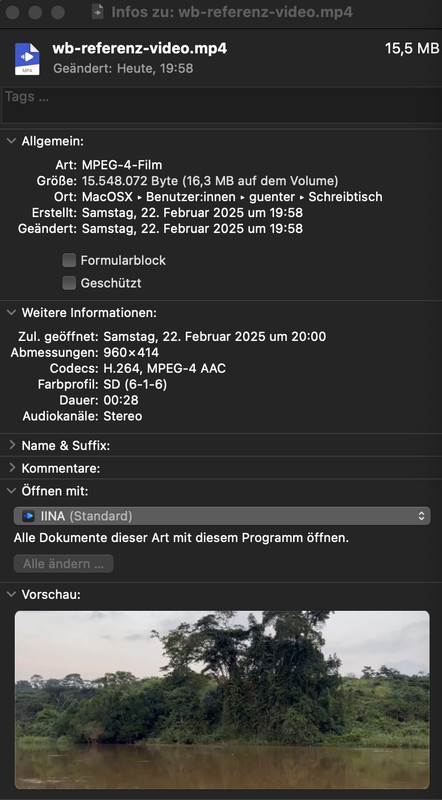
div .mejs-controls .mejs-time-rail .mejs-time-loaded {
  background: #f2d8c4;
}

.main_color .mejs-controls .mejs-time-rail .mejs-time-current {
  background: green !important;
}

.mejs-volume-current, .mejs-volume-handle {
  background: yellow !important;
}

.mejs-volume-total {
  background: #f2d8c4;
  height: 100px;
  width: 10px;
}
February 22, 2025 at 8:03 pm in reply to: Self hosted video shows black border top and bottom. How to remove? #1477656thanks for the links – if you realy like to have it perfect – the aspect ratio is 960:414 = 2.319/1 so your 2.35/1 is not correct. ;)
February 22, 2025 at 7:30 pm in reply to: Self hosted video shows black border top and bottom. How to remove? #1477650html5 video :
(yes send link via e-mail please)div .mejs-controls .mejs-time-rail .mejs-time-loaded { background: yellow; } .main_color .mejs-controls .mejs-time-rail .mejs-time-current { background: green; } .mejs-time-hovered.negative { background: rgba(0,0,0,.9); } .mejs-volume-total { background: darkgoldenrod; height: 100px; width: 5px; } .mejs-controls .mejs-horizontal-volume-slider .mejs-horizontal-volume-total, .mejs-controls .mejs-time-rail .mejs-time-total { background: blue; } .mejs-volume-current, .mejs-volume-handle { background: red; } .main_color .mejs-controls .mejs-volume-button .mejs-volume-slider .mejs-volume-current { background: green; }etc.
i see this in your DOM:

no child just enfold.
next: see if i switch on the usage of google web fonts via your privacy settings:
https://webers-testseite.de/jeroch.mp4on your @font-face rules a lot of open-sans and one Din font:

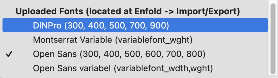
activation of uploaded Fonts : the list of uploaded fonts is at the end of that enfold list:

something went wrong with your uploading ( on that child-theme with dinpro-light ) –
and yes i have seen that on your video the child was activate ( but now the theme itself is in use)
 February 22, 2025 at 6:43 pm in reply to: Self hosted video shows black border top and bottom. How to remove? #1477641
jak – can you post the link to that video?
February 22, 2025 at 6:21 pm in reply to: Self hosted video shows black border top and bottom. How to remove? #1477639and you are shure, that these black bars are not integrated to your video?
on transparency – there will be no breadcrumb – see functions-enfold.php:
if(!empty($transparency)) $header['header_title_bar'] = 'hidden_title_bar';but you can place it via a shortcode –
see snippet and usage on : https://webers-testseite.de/breadcrumbs-shortcode/First of all – your business location is Germany – so you had to be GDPR (DSGVO) compliant.
For that reason – do you have any entrance inside your theme to hamper google font support of the theme. F.e. via a snippet plugin?
like:function my_output_google_webfonts_script( $activate ){ return false; } add_filter( 'avf_output_google_webfonts_script', 'my_output_google_webfonts_script', 10, 1 );
ORfunction enfold_customization_switch_fonts() { global $avia; $avia->style->print_extra_output = false; } add_action( 'init', 'enfold_customization_switch_fonts' );you only uploaded open-sans and din-alternate-cdnfonts
Next question: on your video i see that you are using a child-theme – but on your live site i do not see that you are using it?
ON your Privacy setting : if i accept using Google Web fonts i see:
my recommendation on GDPR compliance : use selfhosted fonts – upload them via font-manager as you did with open-sans.
Then you do not need to mention the google webfont usage hint on privacy.Dear Mercedes salesman, could you please tell me if other cars are just as good and which one I should buy instead? Really now?
Enfold is also a for-profit business. As a participant, I think I’m allowed to say this; I hope you don’t mind.February 22, 2025 at 1:05 pm in reply to: Wo kann ich beim Theme Enfold health coach die Farben Grün ändern? #1477609footer, buttons und andere Elemente sind über diese Grundeinstellungen ( Allgemeines Styling ) gesetzt, aber diese Trenner werden wohl im Element (grid-row und dann die Zellen) gesetzt sein. Auch einige Sections HIntergrundfarben werden wohl im Element festgelegt sein.
Die Textlichen Hervorhebungen sind über :
#top .all_colors u, #top .all_colors span[style*="underline;"] {
  color: #719430;
  line-height: 1.4em;
  font-family: 'caveat',Helvetica,Arial,sans-serif;
  text-decoration: none !important;
  display: inline-block;
}
gesetzt.
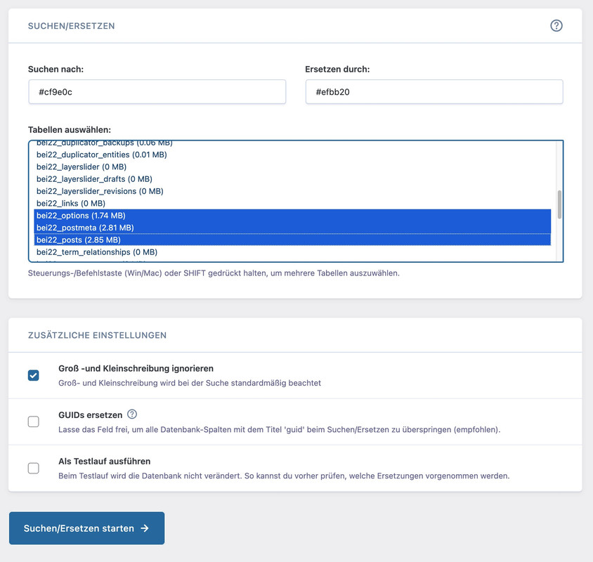
Wenn du eine Liste hast welche Farbe du gegen eine andere austauschen willst, könntest du es auch über die Datenbank machen.
Tools wie https://de.wordpress.org/plugins/better-search-replace/ könnten da helfen.Im Grunde betrifft es wohl nur 3 Tabellen (wobei ich in dem Fall Groß/Kleinschreibung misachten würde):
Refresh all cachings or renew the merging if you have activated that option.
I do not see double arrows.on https://kriesi.at/themes/enfold-2017/elements/magazine/ you want to preserve the bigger image post and have on the smaller images a two column view?
to have:
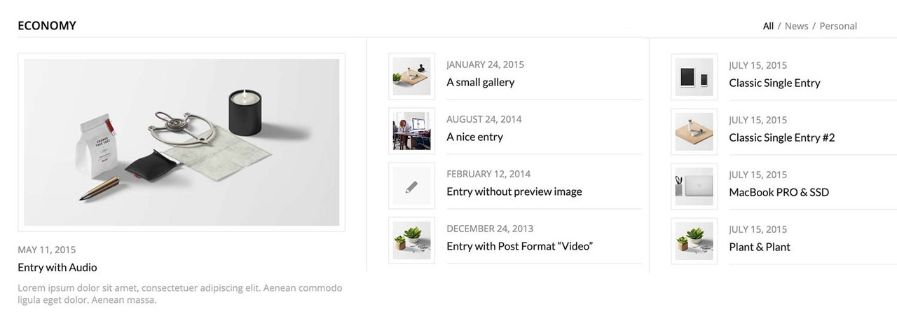
you can have this by css only – but you had to break earlier to responsive case to have enough space for showing the articles with smaller images:
#top .av-magazine-sideshow:before, #top .av-magazine-sideshow:after { display: none; } #top .av-magazine-sideshow { display: flex; flex-flow: row wrap; justify-content: space-between; } #top .av-magazine-sideshow .av-magazine-entry { flex: 0 1 48%; width: unset; }or use the partner/logo element – there is a grid option.
I can reproduce this by frequently narrowing and widening the browser window on smaller screen widths. This increases the calculated height of the column each time.
i think the trouble comes from setting the column height not color-section height of those headings to 100%.
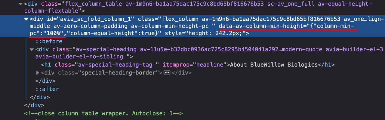
maybe it is best to use here an absolute min-height option: f.e.: 250px
I don’t quite understand the intention behind setting the height of a column. The height of the column depends on the content.
i would set this min-height option to color-section only.i guess that this Carousel is not an Enfold created one. And your problem now is on opening one of those carousel image in lightbox – on navigating to the next inside lightbox – it shows other images from outside the carousel too?
How did you place your carousel to the enfold layout – via shortcode … ?#top #header_meta .sub_menu { padding-top: 10px; }this will end in a same baseline – if you like to have it more centered then use perhaps 9px
Günter hier vom Team hat mir mittlerweile einen wohl bessere Version der Funktion dort unten zukommen lassen.
Unten hat man jetzt :function av_pretty_url(text) { return text.replace(/[ÄÖÜäöüß]/g, function(match) { return { "Ä": "Ae", "Ö": "Oe", "Ü": "Ue", "ä": "ae", "ö": "oe", "ü": "ue", "ß": "ss" }[match]; }) .toLowerCase() .replace( /[^a-z0-9]+/g, "-" ) .replace( /^-+|-+$/g, "-" ) .replace( /^-+|-+$/g, '' ); }hier kannst du wieder die beiden Datein herunterladen – in Version 7 wird das dann wohl eingebaut sein.
und kann dann aus dem child-theme js Ordner gelöscht werden. Die Funktion zum einbinden der Child-theme Datei dann auch.
https://webers-testseite.de/avia-snippet-widget.zipFebruary 9, 2025 at 12:54 pm in reply to: enfold header layout: widget left, logo center, widget right, menu below #1476754it is like Rikard said a Caching Thing – I see that you are running: WP Fastest Cache
have a look on Settings if there is something like if content is changed in frontend – refresh Caching files etc.I recommend disabling these tools as long as the page is not completely finished; they should work when the result is ready.
February 8, 2025 at 9:08 am in reply to: enfold header layout: widget left, logo center, widget right, menu below #1476660when on your example page the widgets contents change ( f.e. below 768px) we have to have that alternativ content.
so put in that widget areas that alternative content – and on wider screens we set them to display none – and on smaller screens vice versa.
by css.there had to be some fine-tuning on very small screens (mobile phones) . but we could do that later …
_____________________________
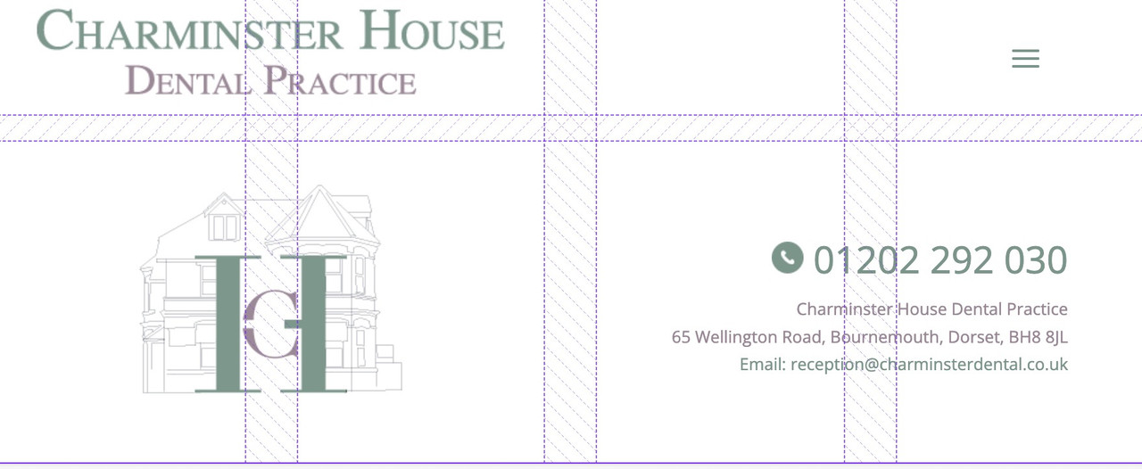
by the way – just for info – you see here on showing the grids in dev tools f.e. below 990px:

first you see the gaps ( 20px 40px)
then you see there are 4 columns and two rows ( all columns have the same width but different height – 1fr = one fraction)
first row: the 3 first grid-cells are filled with that area2 the 4th grid-cell is filled with area4 (“area2 area2 area2 area4”)
last row: first 2 cells filled with area1 – last 2 cells are filled with area3 (“area1 area1 area3 area3”)__________________
info – you do not need to fill every cell you could have f.e. here on first row: “area2 area2 . area4” the dot indicates an empty cell
see here a nice post: https://css-tricks.com/snippets/css/complete-guide-grid/
You do not need to always declare the grid areas – but if you want to change postion for different screensize – then this helps you to better address the different selectors.February 8, 2025 at 9:07 am in reply to: enfold header layout: widget left, logo center, widget right, menu below #1476659remove the flex settings given to you by docu.
maybe test these settings first on dev tools insertion:try:
/*** Naming of the Grid Areas ***/ #header_main #media_image-3 { grid-area: area1; } #header_main #media_image-4 { grid-area: area2; } #header_main #text-3 { grid-area: area3; text-align: right } #header_main div.av-logo-container { grid-area: area4; display: grid; justify-content: center } #header_main { margin: 0; display: grid; gap: 20px 40px; grid-auto-flow: row; grid-template-columns: 1fr 1fr 1fr; grid-template-areas: "area1 area2 area3" "area4 area4 area4"; justify-content: stretch; align-items: center; } #header_main > div { justify-self: center; align-self: center; padding: 0 30px; } @media only screen and (max-width: 1119px) { #header_main { grid-template-columns: 1fr 1fr; grid-template-rows: 0.5fr 1fr auto ; grid-template-areas: "area2 area2" "area1 area3" "area4 area4"; } #header_main #media_image-4 { transform:scale(1.2) } } @media only screen and (max-width: 989px) { #header_main { grid-template-columns: 1fr 1fr 1fr 1fr; grid-template-rows: 0.3fr 1fr; grid-template-areas: "area2 area2 area2 area4" "area1 area1 area3 area3"; } #header_main #media_image-3 { transform:scale(0.8) } #header_main #text-3 { transform:scale(0.8); padding: 0;} #header_main div.av-logo-container {display: grid; justify-content: center; background-color: transparent } #header_main div.av-logo-container { display: block ; } #header_main .av-main-nav-wrap { float: right; padding-right: 50px; } #top #av-burger-menu-ul { padding-top: 120px !important; } } @media only screen and (max-width: 767px) { .responsive #top #wrap_all .main_menu { position: relative; } #header_main #media_image-4 { transform:scale(1); justify-self: start; padding-left: 50px } .responsive #top .logo {display: none;} } -
AuthorPosts