Forum Replies Created
-
AuthorPosts
-
forget about that – use: https://kriesi.at/support/topic/how-to-make-the-text-logo-h1/#post-1479660
no subtext is needed!on shrinking header you need:
#top .logo.text-logo, #top .logo.text-logo a { display: flex; justify-content: left; align-items: center; width: auto; margin: 0 !important; }ok – i found deep in my notes :
but you see on the code : leave the logo input field empty !function change_logo_on_empty_logo_input($logo){ $link = apply_filters( 'avf_logo_link', home_url( '/' ) ); $logo_heading = "my logo title"; // you can have here f.e.: get_bloginfo( 'name', 'display' ) if(empty(avia_get_option('logo'))){ $logo = '<h1 class="logo text-logo"><a href="'.$link.'">'.$logo_heading.'</a></h1>'; } return $logo; } add_filter('avf_logo_final_output','change_logo_on_empty_logo_input');did you test that allready in a combination:
(on W3C it is allowed to have inside h-tag inline elements ( img, span …))PS: https://www.seo-suedwest.de/4490-google-es-ist-ok-das-logo-einer-webseite-als-h1-ueberschrift-auszuzeichnen.html
and
https://www.youtube.com/watch?v=ZKN8B3yeFAQ&t=3192syou can do that via jQuery – but if that is the right way to influence SEO ? – i guess on seo purpose the solution from https://kriesi.at/support/topic/how-to-make-the-text-logo-h1/#post-1479497
is ok.Edit : use the snippet on bottom.
there is only a filter to change the whole logo tag – but the subtext stays at span.
function new_avf_logo_headline($headline) {
  $headline = "h1";
  return $headline;
}
add_filter( 'avf_logo_headline', 'new_avf_logo_headline', 10, 1);
but: that is something different.
you only have the chance then to change it in source-code : function-set-avia-frontend.php line 621:
$sub = "<span class='{$subclass}'>{$sub}</span>";Please don’t be offended by this question. Not everyone on this forum is confident enough to navigate the wealth of Enfold options available.
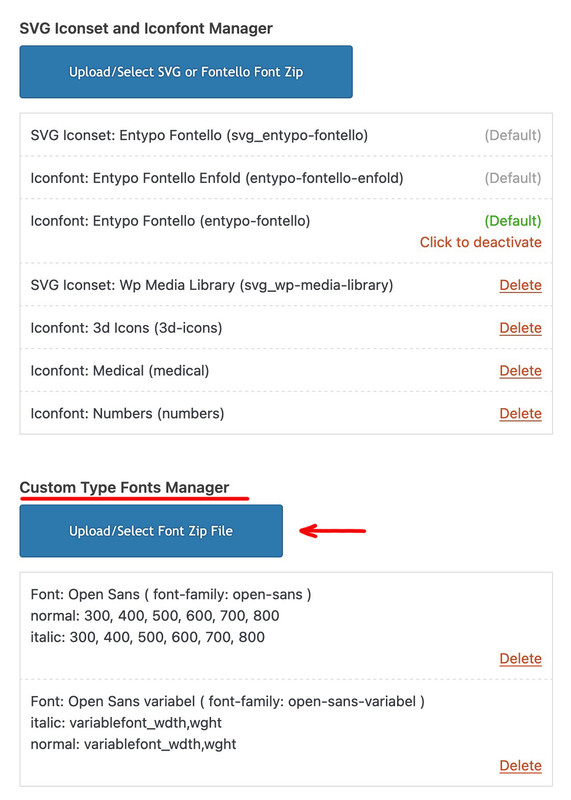
Just to be sure, you are uploading these zip files via the Custom Type Fonts Manager and not via the SVG Iconset and Iconfont Manager. As I see your screenshot, and in the background you can see this field of icon fonts.
Du kannst es mit einem Accordion auch gut hinbekommen ( mit nur einem Toggle ), und hast dann sogar im Element selber Einfluss auf die Animationsgeschwindigkeit. Ausserdem ist der Button ( so du denn einen möchtest ) wahlweise ober- bzw. unterhalb platzierbar.
Zugegeben das ist etwas sehr gestyled – aber hier siehst du mal beide Anwendungen nebeneinander:
https://webers-testseite.de/fold-unfold-toggler/Du kannst bei dem Fold/Unfold überigens den Verlauf wegnehmen; musst dann aber die Höhe so abpassen das ein Zeile nicht angeschnitten wird.
.avia-fold-unfold-section .av-fold-unfold-container::after { background: none !important; }concerning to svg ( that topic is closed ) you asked make svg – so i thought you do not have one.
You can use Illustrator to do so from an image – but this image redrawer is not 100% accurate, it depends mainly on the image and its resolution.By the way – I know this might be a lot of work – but it might help us if your demos were also up to date with the latest Enfold version, at least the big last main demo (unfortunately the one from 2017).
i do not see your page – but if you are using the font icon ( avia-font-entypo-fontello ) then it is as before:
span[data-av_icon="\e859"] {
  color: red !important;
}
if you are using the svg icon ( avia-font-svg_entypo-fontello ) then an inline svg is used – and you have to use fill for the svg path:
span[data-av_svg_icon="basket"] svg { fill: red !important; }as mentioned here you can add html code
you do not need to do that line by line ( but it shows you more clearly what $sub .= happens by means of that dot ) – the dot stands for adding some htmladd_filter('avf_logo_subtext', 'kriesi_logo_addition'); function kriesi_logo_addition($sub) { $sub .= "<h1 class='logo-title'>"; $sub .= "My Website Textlogo"; $sub .= "</h1>"; return $sub; }pay attention on usage of quotes – if you wrap the inserted html by double quotes – you had to use for classes, alt, href, title etc inside it single quotes.
ok – i found the solution.
A size (inline size) can only be measured for block or inline elements. Because Enfold shows the flex_cell as display: table – it could not work.
But we can set to show as display: block with float left – then it works. – see link aboveI’m on a Retina display here and can’t test it under all eventualities – maybe you needed to remove that rule set:
@media only screen and (max-width: 1425px) {
  video {
    object-position: -335px;
  }
}
and find your own media-query setting for it maybe with more conditions like -webkit-min-device-pixel-ratio: 2 or min-resolution: 192dpi
maybe we start with :
@media only screen and (max-width: 875px) { video { object-position:-235px } }if you got a former working child-theme – then the settings belong to this. So if you got ftp access – then upload the enfold theme via ftp – maybe better you rename the existing enfold folder to something like enfold-old, and then upload a complete enfold folder again.
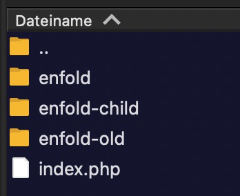
After that test if your installation runs as it should – you can then delete that old folder ( maybe it is not corrupted but hacked )But what seems strange to me is that you can log in to your child theme despite this message.
It’s slowly becoming a paid service ;)
i uploaded it to your page – and added for that inline logo ( it is now not .logo img but .logo svg ) additional code.
It’s a very good approximation – not 100%, but reasonable at the maximum size of 300px (the small circular rings have become circles). This is also not visible in the large png file.
have you tried my petrona files: Link
#as mentioned above
the above problem may have nothing to do with this, but you are aware that the downloaded Petrona.zip contains both static and variable fonts.
have a look if you have enough php memory limit in use for your installation. Or if you got the right file permissions on those folders.
Can you upload mediafiles without problem?see
In general, if an image is to respond to screen width and completely fill the surrounding container, the container height must match the image’s aspect ratio.
you can see what happens if you force your desired behaviour by : object-fit: fill
https://media.kulturbanause.de/2015/07/css-object-fit.htmlif your parent container height is set by the other content – you can have that behaviour but will distort your image.
You can decide to have that image on object-fit: cover and then shift the important parts of the image by object-position.see here an object-fit: fill on “About me” with Eiffel Tower :
https://webers-testseite.de/freelancer/#aboutthe height is determined by the big content on the left side (first flex-cell) – you can not have responsive behaviour on that image by that condition.
if you set on that img now
#about img {
  min-height: 100%;
  object-fit: cover;
  object-position: center;
}
the Eiffel Tower will stay in the middle and container is filled with image – not stretched – but cropped
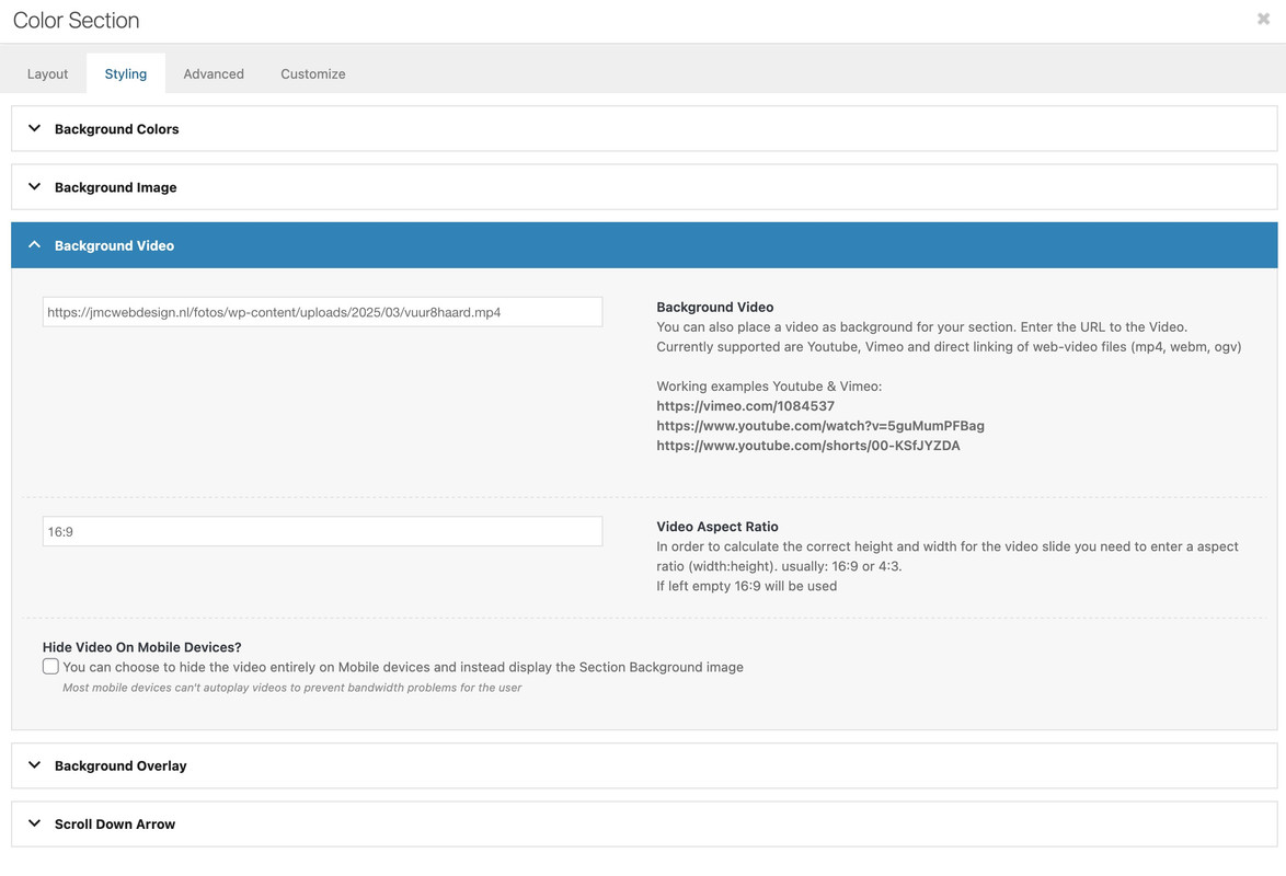
this is the code for your vuur4 page now:
#av_section_1 {
  height: 100vh !important;
}

.responsive #av_section_1 .container {
  max-width: 100%  !important;
  padding:0 !important;
  margin: 0 !important;
}

video {
  position: absolute;
  top: 0;
  left: 0;
  width: 100vw;
  height: 100vh;
  z-index: -1;
  object-fit: cover;
  overflow: visible !important;
}
ps: you can shift the video position by
/* === Keeping the fireplace in view === */ @media only screen and (max-width: 1425px) { video { object-position: -335px; } }can you please make a decision if you like to have boxed layout or not.
You can see on my stretched layout that it is quiet simple to fullfill your needs. – but with boxed layout it is hard to get.
Now you got on you page stretched layout – so see below the css ruleset.this is my layout on that example page with stretched layout:
#footer-page .avia_textblock p { display: flex !important; flex-flow: row nowrap; justify-content: end; } #footer-page .avia_textblock p a { padding: 0 5px; } #footer-page .avia_textblock p img { padding-top: 2px }try ( now just for that post : vuur5 to not have influence from other settings )
hm – boxed content seems to be a bad guy for that. …
try ( now just for that post : vuur5 to not have influence from other settings )
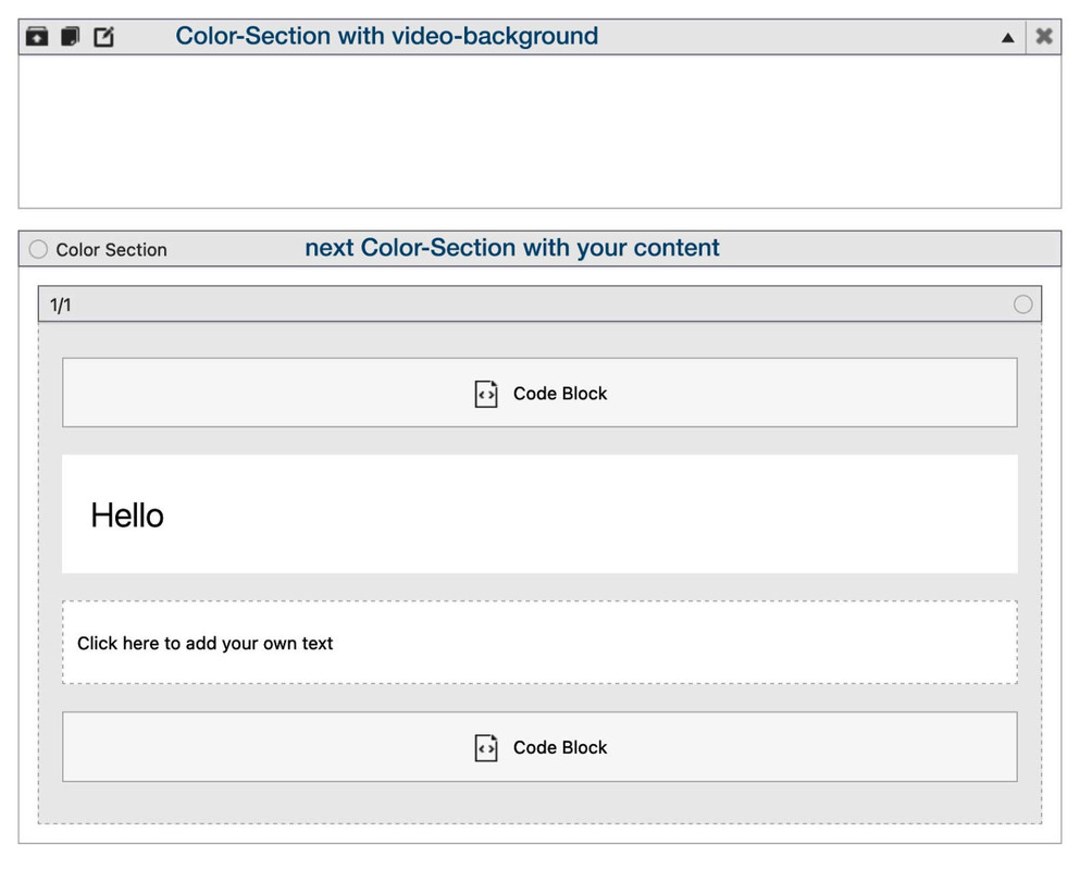
#top.postid-227 #main { overflow: visible !important; } #top.postid-227 #av_section_1 { position: absolute; height: calc(100vh + var(--enfold-header-height)) !important; width: 100vw; left: 0; top: calc(-1 * var(--enfold-header-height)) !important; } #top.postid-227 video { position: absolute; top: 0; left: 0; width: 100%; height: calc(100vh + var(--enfold-header-height)) !important; z-index: -1; object-fit: cover; } @media only screen and (max-width: 1200px) { #top.postid-227 video { left: -250px !important; } } @media only screen and (max-width: 767px) { #top.postid-227 video { left: -350px !important; } }next question: why don’t you use the enfold options on adding video to color-section:
see with css code:
https://webers-testseite.de/vuur/you see your example page – that section scrolls away!
but you set your video container to fixed position:#video-container { position: fixed; top: 0; left: 0; width: 100vw; height: 100vh; z-index: -1; }so this will stay at position
do you like to have this?
#video-container { position: absolute; top: 0; left: 0; width: 100vw; height: 100vh; z-index: -1; } #top #av_section_1 .container { max-width: 100vw !important; margin: 0 !important; top: 0; left: 0 !important; position: absolute; padding: 0 !important; }i can change that for you – but you should think about it if is a good handling of the site if 2/3 of the screen height on mobile devices are #head – and content (#main) only 1/3.
no – only quick css – i only copy paste this changings from dev-tools – so sometimes the browser dev tools change a bit the notation – maybe that is the reason ( f.e. pseudo-elements like before and after will noted on browsers as ::before and ::after allthough it is in quick css :before and :after)
see: https://kriesi.at/support/topic/background-images-in-color-section-dont-show/
where is that page ( name is enough for me )
_________________
ok – your widget content gets bigger – than new settings are needed:
again search for the entries in quick css and change those values:
/* declarations inside these comments had to be changed  */
/* and missing declarations had to be added to the existing ruleset */

@media only screen and (min-width: 768px) and (max-width: 989px) {
  .responsive.html_mobile_menu_tablet.html_header_top #top #main {
    /* padding-top: 420px !important; */
    padding-top: 550px !important;
  }
}

@media only screen and (max-width: 989px) {
  #header .inner-container {
    /* grid-template-columns: 3fr 1fr; */
    /* grid-template-rows: 50px 1fr; */
    /* padding: 20px 0; */
    grid-template-columns: 4fr 1fr;
    grid-template-rows: 160px 1fr;
    padding: 0;
  }
  .responsive.html_header_top #top #main {
    /* padding-top: 400px !important;  change to new value*/
    padding-top: 550px !important;
  }
  #header .inner-container {
    /* margin: 15px 0 0;  so just erase that rule*/
  }

  #header .inner-container .logo a, #header .inner-container .logo img {
    height: 300px !important;
    max-height: 300px !important;
    /* width: auto; */
    width: 300px !important;
    max-width: unset;
  }
}
ps – is that a wise decision to have such a big header area for mobile devices?
I’m a participant like you – so no private content area for me to read. Sorry – you’ll have to wait until the mods get here.
i understand – but what about showing me the demo-page what was the base of your page.
f.e.: https://kriesi.at/themes/enfold-law/practice-areas/#av_section_2 – and my question if it is a background-image or as an image element?What is the benefit of a variable font ( besides very special settings ) : https://fonts.google.com/knowledge/introducing_type/introducing_variable_fonts
but you see on the file-size column that if you really need all font-weights the varible font is less file-size than all the static font-files together.
-
AuthorPosts