Forum Replies Created
-
AuthorPosts
-
April 13, 2025 at 6:10 pm in reply to: Lizenz auf alter Seite nicht deaktivierbar – bitte um Freigabe #1481274
auch keinen Datenbank Zugriff? phpMyAdmin ?
see here a working example: https://webers-testseite.de/mie2/
these are three color-section ( with small padding )
if you do not like to have it full-width just remove that rule:#top .avia-section.grid-layout .container { max-width: 100%; /*! padding: 0; */ }for me the responsive alternative is nicer. you see how it works – the width of the columns is globaly set to : unset – so 1/3 is not working here – the grid-template-columns determines the width now.
On that alternative responsive behaviour – we got two columns then – first with 1part (fraction) the second column with 2parts.
As on former table layout we can make a “colspan” if we fill those grid-cells this way:grid-template-areas: "feld2 feld1" "feld3 feld3";it is like this on former table layout:
<table>
	<tbody>
		<tr>
			<td>feld2</td>
			<td>feld1</td>
		</tr>
		<tr>
			<td colspan="2">feld3</td>
		</tr>
	</tbody>
</table>
but now you can have a very flexible layout with responsive options
PS: The advantage of a layout like this is that it can be styled with media queries. Try it with tables (this is a remnant from the old days)April 12, 2025 at 9:04 am in reply to: Overlay on a column that contains a photo in the background #1481220if you need to do it that way with background-images in columns: give a custom-class to those columns f.e. : with-bg-overlay
and use the psuedo-container before for that:#top .flex_column.with-bg-overlay::before { content: ""; position: absolute; display: block; top: 0; left: 0; width: 100%; height: 100%; background-color: rgba(0,0,0,0.3); visibility: visible; z-index: -1; }see both variants again on: https://webers-testseite.de/adamad/
PS there is a declaration with backdrop-filter – so you can blur the effect – but that is optional.PPS: see responsive behaviour on both cases !
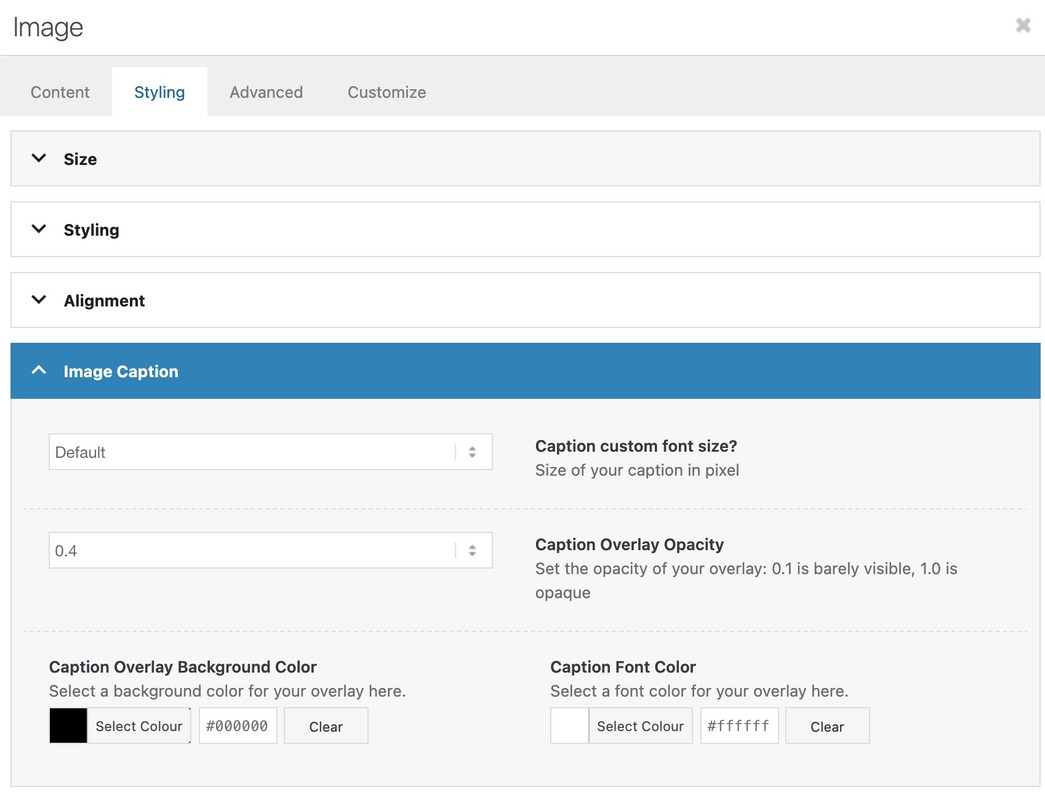
April 12, 2025 at 8:49 am in reply to: Overlay on a column that contains a photo in the background #1481219i would have made it with images inside the columns – and use the caption setting to have text over the image. In this case there will be an automatic overlay – – on image styling tab then you can set the options for that overly:
What version they are updating from? 7.x ?
My Enfold Installation run on most on php8.3 some are running allready 8.4.4April 8, 2025 at 10:11 pm in reply to: Overlay on a column that contains a photo in the background #1481026see here an example page: https://webers-testseite.de/adamad/
i use for it a color-section with custom class: slanted-background – let the content determine the height.
this color-section contains the columns and is set with a svg-divider ( tilt ) – bring it back and maybe flip.the next color-section got the same color as the svg-divider
then :
#top .slanted-background .avia-divider-svg-tilt.avia-divider-svg-bottom,
#top .slanted-background .avia-divider-svg-tilt.avia-divider-svg-bottom svg {
  height: 75% !important;
}
#top .slanted-background .flex_column img {
  box-shadow: 5px 5px 10px -3px #333;
}
You can use the height setting (here 75%) to determine the degree of incline.
but isn’t it a simple section / section boundary – with shiftet content elements?
see f.e.: the Church Demo: https://kriesi.at/themes/enfold-church/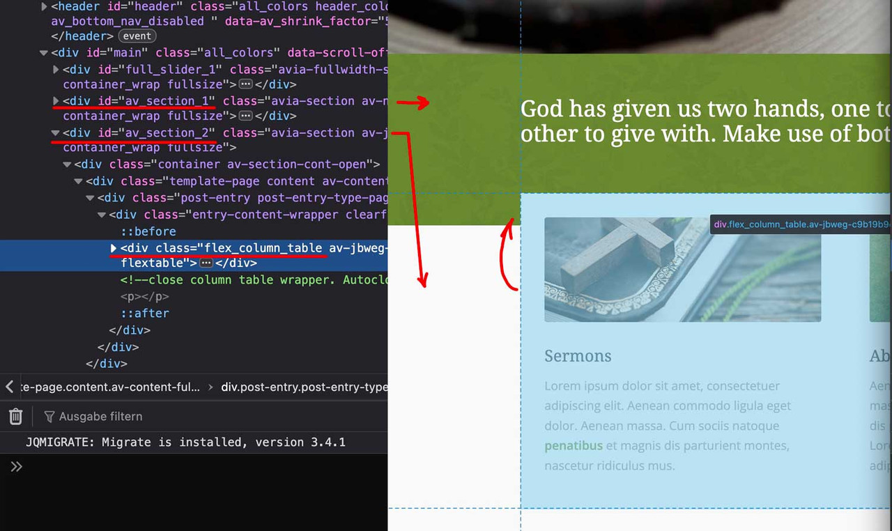
you see both color-sections – and the content of the second one is shifted with negative top margin.
this can be done ( in this case the first column ) on row-settings – row margins:
because the columns are set to equal height – the value of only -60px goes to flex_column_table – but you can use even relative values like -50%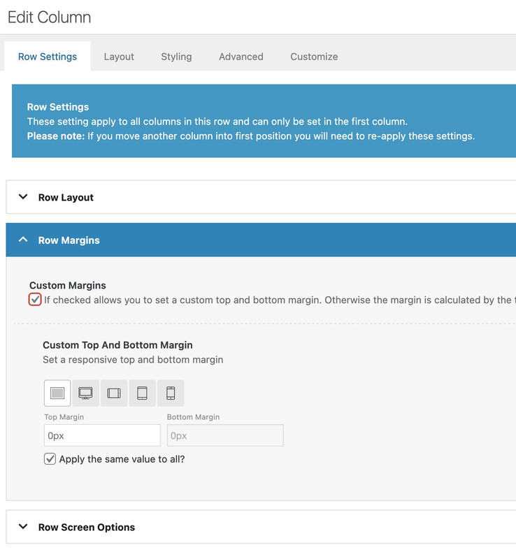
put your partner/logo element in a color-section ( do not insert another element to it )
give a custom class to that color-section – f.e.: full-partners
then place inside your quick css:.responsive #top #wrap_all .full-partners .container { width: 100%; max-width: 100%; padding: 0; }April 7, 2025 at 8:58 am in reply to: how to have on a specific page a different style ( boxed, stretched, framed) #1480920Thanks Ismael – that worked – except for av-framed-box
maybe the other way roundEdit: that worked – setting to framed layout on enfold options (General Layout) – and change for all otheres to stretched ( or boxed ) layout.
add_action( 'template_redirect', function() {
    global $avia_config;
    if ( is_admin() ) {
        return;
    }
    if ( !is_page(2466) ) {
        $avia_config['box_class'] = 'stretched';
    }
});
many thanks again – that is as usual via child-theme functions.php the best solution.
See page 2466 : https://webers-testseite.de/impressum/-
This reply was modified 1 year ago by
Guenni007.
April 7, 2025 at 7:15 am in reply to: how to have on a specific page a different style ( boxed, stretched, framed) #1480909Not for me – I just opened a new thread because the old one was closed.
April 7, 2025 at 12:29 am in reply to: how to have on a specific page a different style ( boxed, stretched, framed) #1480898I don’t think it’s such a common feature. That’s why I don’t think it’s necessary to include something here. There is this solution above, and whoever can install something like this will also remember to check for significant changes in the header during updates.
April 6, 2025 at 5:21 pm in reply to: how to have on a specific page a different style ( boxed, stretched, framed) #1480878if you know a different child-theme solution – that would be a good contribution.
well – as far as i can see – this solution given to you is based too on changing things in header.php:
https://kriesi.at/support/topic/preloader-on-2-pages-loading-issues/#post-1480524
my recommendation is only to use not the parent header.php but a copy of header.php inside your child-theme root directory.
by this – an update will not overwrite the changings.However, since header.php is one of those files that is often affected by changes to the Enfold site, you need to keep track of whether you need to repeat this procedure with a new copy.
If you have received a functions.php child theme solution from Enfold, it would be nice if you would post it.
you can see here a working example page of my impressum page on a test installation:
https://clean.webers-testseite.de/impressum/
All other pages do not have a preloader.on header.php the original line is:
$preloader = avia_get_option( 'preloader' ) == 'preloader' ? 'av-preloader-active av-preloader-enabled' : 'av-preloader-disabled';did you removed ( or commented out ) that line – and replaced it ?
try :
if (is_page(array(1147,945))) {
	$preloader = 'av-preloader-active av-preloader-enabled';
} else {
	$preloader = 'av-preloader-disabled';
}
PS – it is just a different way to write the array – you can use yours aswell.
But: maybe it is better to have that option in enfold activated globaly – to have the oportunity to style it – and then remove that setting on all other pages then your array is set to if not logic.
if (!is_page(array(1147,945) )){ $preloader = 'av-preloader-disabled'; } else { $preloader = 'av-preloader-active av-preloader-enabled'; }you have on those post-types different classes on body tag ( or #top).
so you can differ by :
#top.page
#top.single-portfolio
#top.single-postso try:
.responsive #top.page { font-size: 13px !important; } .responsive #top.single-post { font-size: 16px !important; } .responsive #top.single-portfolio { font-size: 19px !important; }ja die Schriften werden jetzt auch über https geladen. Eventuell ziert sich Safari mit mixed-content besonders.
ich sehe du hast die Enfold Option des Merging bei css und js eingestellt. Hast du das mal neu generieren lassen?
Unter Performance – ganz unten.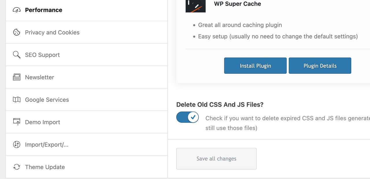
Im Übrigen wird deine Seite in meinem Desktop Safari auch nicht mit der Schrift dargestellt.
eventuell liegt es am mixed-content. Denn deine schriften werden über http geladen.
Deshalb gehe mal in die Media Library – Listenansicht : im Suchenfeld mal zip eingeben.
jetzt alle Vorkommen von dieser Schrift löschen.
Dann zum Font-Manage gehen und dort auch die Schrift nochmal löschen.
jetzt mein Schrift zip mal hochladen.Mal sehen ob es was bringt.
PS : auf meiner Seite habe ich das jetzt wieder auf Roboto gestellt.bitte lies den vorherigen Text von mir – den habe ich bearbeitet.
https://enfold.webers-webdesign.de/PS; warum css code setzen?
Definiere doch einfach über die Enfold Optionen unter Allgemeines Styling – Schriften deine Headings mit dem Font.
PS: der font-family name wird dir im Übrigen im Font-Manager angezeigt: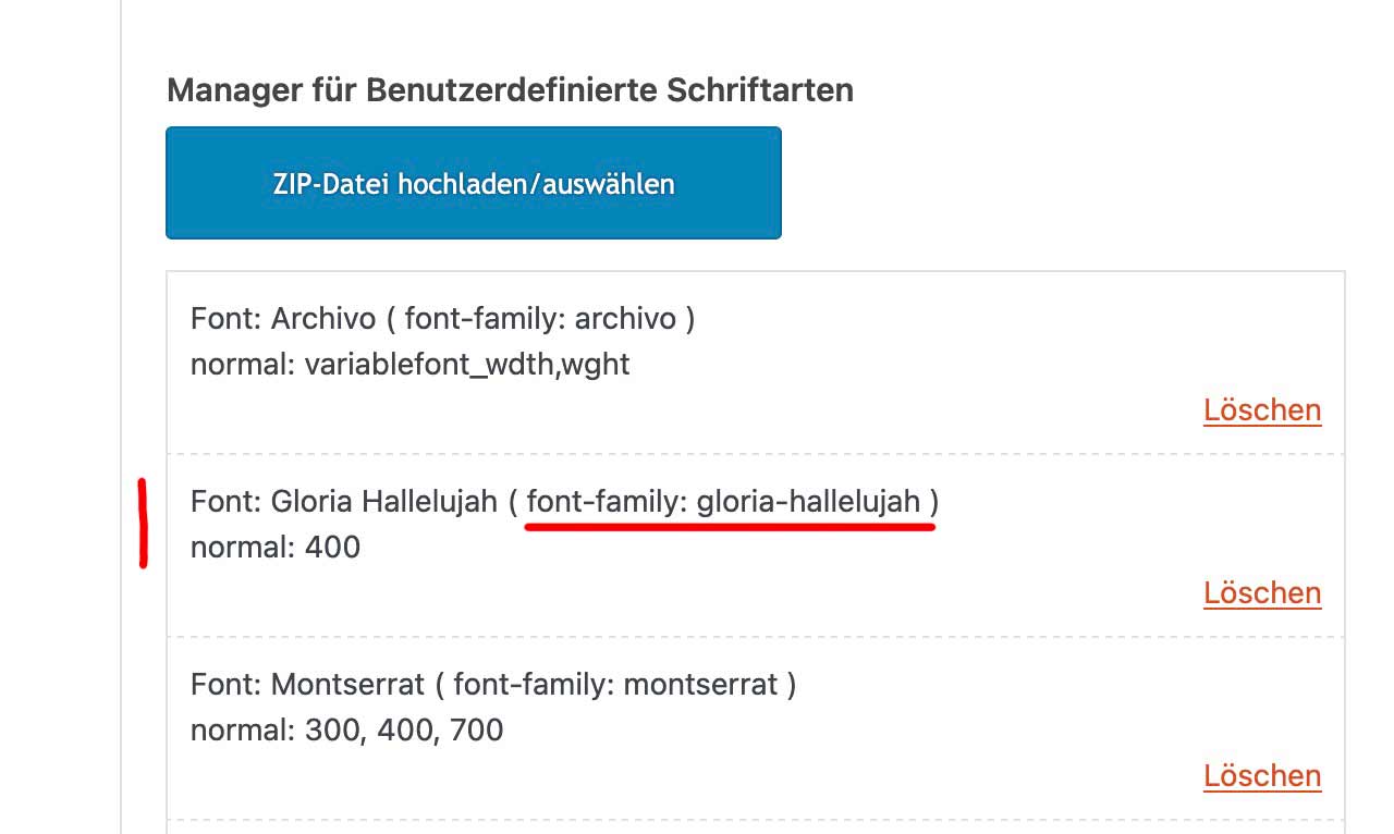
Es muss was anderes bei dir sein, da der Font so wie ich ihn anbot ohne Probleme auf meinem iPhone angezeigt wird.
Bitte lade mal meinen Font hoch stattdessen. Ich sehe immernoch deinen Font _ der im Übrigen via http geladen wird.kannst Du mal stattdessen dieses zip nutzen. Lösche deinen hochgeladenen font und entferne im Font-Manager den font. Ich habe da auch die woff2 fonts integriert. Eventuell kommen die mobilen Endgeräte damit besser zurecht.:
see section on top : https://webers-testseite.de/flexed/
( the other way is for more komplex styling – thats gridlayout )April 1, 2025 at 7:58 pm in reply to: Changes in child theme css file (style.css) do not show up #1480595So why not follow the recommendation and use custom.css instead?
The problem, of course, is that the height of a responsive background will always be smaller on a mobile phone. So unless you want to reduce the size of the logo by the same amount, “nailing” the logo to a specific position will not work. I have already tried to achieve this by using values relative to the screen width.
test this :
#top .html5-video .overlay { position: absolute; width: 25vw !important; height: 21.25vw; min-width: 140px; min-height: 119px; max-width: 411px; max-height: 349px; padding:15px; top: 80px; left: 50px; } @media only screen and (max-width:767px) { #top .html5-video .overlay { top: 20px } }just remove those
  border-radius:20px;
  background-color:rgba(0,0,0,0.1);
  backdrop-filter:blur(6px)
so it is only for that selector:
#top .html5-video .overlay {
  position:absolute;
  width:25vw !important;
  height:21.25vw;
  min-width:140px;
  min-height:119px;
  max-width:411px;
  max-height:349px;
  top:12vw;
  left:8vw;
  padding:15px;
}
April 1, 2025 at 10:54 am in reply to: Changes in child theme css file (style.css) do not show up #1480568Next – on dashboard – themes : how many enfold installations you see there?
there had to be only the enfold child – and the enfold theme ( and not so important the standard wordpress themes)April 1, 2025 at 10:51 am in reply to: Changes in child theme css file (style.css) do not show up #1480567if you are using a child-theme – the child-theme style.css could be used – but isn’t it much easier to use the quick css of your enfold child – general styling – quick css
Quick CSS
Just want to do some quick CSS changes? Enter them here, they will be applied to the theme. If you need to change major portions of the theme please use the custom.css file or the Enfold Child theme.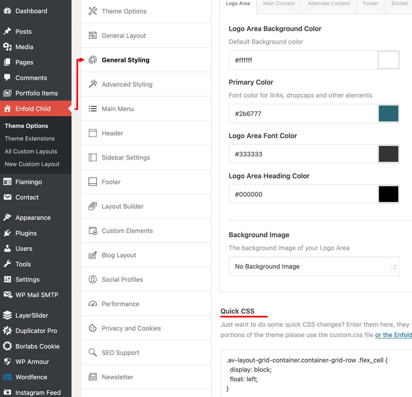
ok – sometimes the value had to be set to important – if another rule is set the same way.
there is inside one of your css:.responsive .container { max-width: 1310px !important; }so you had to change that one selector to :
.responsive #top #wrap_all .html5-video .container {
  max-width: 100% !important;
  width: 100%;
  padding:0;
}
March 31, 2025 at 3:55 pm in reply to: Changes in child theme css file (style.css) do not show up #1480533if you open that parent style.css :
/*
* PLEASE DO NOT EDIT THIS FILE!
*
* This file is only in your themefolder for WordPress to recognize basic theme data like name and version
* CSS Rules in this file will not be used by the theme.
* Instead use the custom.css file that is located in your themes /css/ folder to add your styles.
* You can copy a style rule from any of your css files and paste it in custom.css and
* it will override the original style. If you just want to add small css snippets you might also
* want to consider to add it to the designated CSS option field in your themes backend at: Theme Options->General Styling
*/or use the quick css input on enfold (child) options page.
https://webers-testseite.de/html5-video-fanlokbun-2/
test my example page on your phone if it is working there.I’m not sure if there’s anything else I can tell you, other than what you can see on the page.
On top ? Well it is the first color-section on that page. If you like to have it behind header – then you had to choose the enfold transparency option for the page.Color-Section with custom-class: html5-video ; inside that color-section a code-block element and column (custom-class: overlay) with your image (logo). The width of that column is ruled by css.
If you do not need an overlay for your video – then put inside only the codeblock element.
-
This reply was modified 1 year ago by
-
AuthorPosts