Forum Replies Created
-
AuthorPosts
-
By the way: a lot of very specific changings here on support are little snippets that comes to child-theme functions.php
On general they can be applied via : Dashboard – Appearance – Theme Editor.
There is a list of child-theme files on the right side – click on functions.phpi always have on this file ( just add snippets here – the first line has to be untouched here ):
function admin_head_mod() {
  echo '<style type="text/css">
  #avia_quick_css .avia_description {float: none;margin-bottom: 20px !important;padding-left: 0 !important;width: 98%}
  #avia_quick_css .avia_control {float: left;max-width: 98% !important;width: 98% !important}
  .avia_footer_links li {float: left;padding-right: 20px}
  .avia_footer .avia_footer_save {float: left}
  .avia_reset {pointer-events: none !important }
  </style>';
}
add_action('admin_head', 'admin_head_mod');
this file maximises the quick css input field to the whole width – for me it is to narrow to use it with nice haptik
And it deactivates the Reset button – because some unexperienced users have pressed that button accidentally and lost all quick css data and enfold settings.-
This reply was modified 6 years, 10 months ago by
Guenni007.
First : the place of advanced styling should work. i always use quick css for this because i like to have all changings on one place.
Second : After setting up on Advanced styling – did you refresh the merged files in Enfold ( Enfold-Child / Performance / ) ?
Third : Did you cleared all cache ( The browser cache can sometimes be very persistent.)On General : The use of child-theme
A child-theme uses all settings of the parent theme and is for having not lost settings when updating the parent theme.
Most Settings (CSS) on Child-Theme are loaded after the parent theme css files – so on caskading rules the later one are the one that works ( if the rules are more or equal specific than parent rules)
there is one child-theme file ( the functions.php ) that did not overwrite parent theme but will add rules to it on general ( rules can be forced in there to overwrite ).So if there is a rule on f.e. base.css of parent theme like:
h1 { font-size: 34px; line-height: 1.1em; margin-bottom: 14px;}
it will be overwritten by child-theme css:
h1 { font-size: 40px}but f.e. if there is a rule like :
.responsive .logo img{margin:0; }
and you have on your child-theme quick css
.logo img{margin:0; }
the first rule is more specific ( has a higher value : see here https://specificity.keegan.st/ )For Changings: Enfold got this quick css field ( on Enfold-Child / General Styling )
there you can read as description:Quick CSS
Just want to do some quick CSS changes? Enter them here, they will be applied to the theme. If you need to change major portions of the theme please use the custom.css file or the Enfold Child theme.so to overwrite use quick css ( or the advanced styling) and be more or equal specific.
If you like to show your page – we can give more help to your code on detail.
Yes – and that is the reason why i use for it classes. IDs should be unique on one page. So next row with 8 columns in new color-section – same custom class. ( And you can take what ever you like to use ( for 8 maybe 1/4th columns looks nicer on layout builder backend ) as columns ) ( See the example page on the bottom the two columns are enfold 1/5the columns – but with flex modell they react as 1/2 )
if you see my homepage – you can see that i have alternating image – text 1/2 columns
but if these 1/2 go to responsive case and to 100% width there will be image on top of text – that can be reached with this too.
On Enfold standard behavior this would end in text text image image text text etc.
You can even set the items order if columns are responsive. ( https://guenterweber.com/ )That is the reason why i always like to have the link to the concerning page
you can see that it works on my test plattform! ?If you do not see the custom Class Input Field on Color-Section go to: Enfold-Child / Layout Builder / Show element options for developers
mark that field-
This reply was modified 6 years, 10 months ago by
So I added a color section and put category-images in the Developers: Section ID ???
what do you read here class or ID ? : https://kriesi.at/support/topic/add-more-the-5-images-in-a-row/#post-1095851
place a color-section and with custom class like: eight-columns
IDs got # in front of element name
Classe get a dot . in frontso if you put in that phrase to Section ID :
.page-id-2 #category-images .entry-content-wrapper.clearfix { display: flex !important; flex-direction: row; flex-wrap: nowrap; justify-content: space-between; align-items: flex-start; } .page-id-2 #category-images .entry-content-wrapper .flex_column { flex: 0 1 10%; margin: 0 !important; }The page id is just on my page because i do not want to influence the other example pages on my test site. The custom Class makes it specific enough.
But for me it is nice to have here on my page the page id just to remind me where i used that css code.i guess the category-images is your custom class? see where the dot is of the class on your code!
.page-id-2 .category-images .entry-content-wrapper.clearfix { display: flex !important; flex-direction: row; flex-wrap: nowrap; justify-content: space-between; align-items: flex-start; } .page-id-2 .category-images .entry-content-wrapper .flex_column { flex: 0 1 10%; margin: 0 !important; }i guess you don’t need the sidebar rule but if – just make it site specific too:
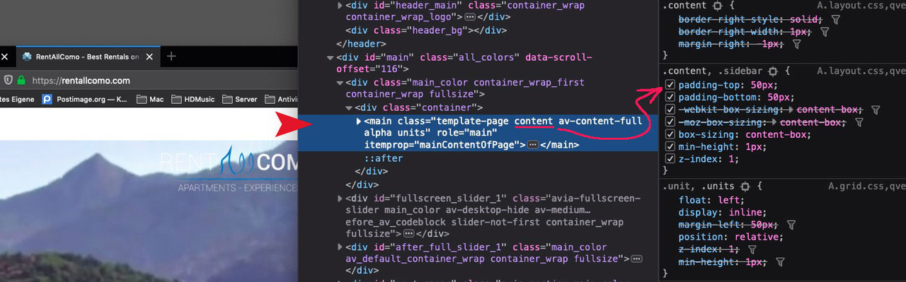
.page-id-4393 .content, .page-id-4393 .sidebar { padding-top: 0; }hm: click to enlarge the image : overwrite – maybe only for that page ( page-id-4393 ) this padding-top.
-
This reply was modified 6 years, 10 months ago by
And see what happens if flex is set to allowed to grow items and flex-wrap is on wrap. etc. pp – see example page
Edit : and if you like to have 9, 10 or what ever you like adjust %value or set the absolute width ( for those columns allowed to wrap
place a color-section and with custom class like: eight-columns
put in your color-section 8 columns ( maybe 5th one) – put in those columns your content ( images)
place this to your quick css:
.eight-columns .entry-content-wrapper.clearfix {
  display: flex !important;
  flex-direction: row;
  flex-wrap: nowrap;
  justify-content: space-between;
  align-items: flex-start;
}

.eight-columns .entry-content-wrapper .flex_column {
  flex: 0 1 10%;
  margin: 0 !important;
}
see here for info: https://css-tricks.com/snippets/css/a-guide-to-flexbox/
see a working example: https://webers-testseite.de/8col-flex/
best way is to use CF7 – they have it implemented and you can set up different restrictions ( file type and file size etc.
the acceptance key is also usefull – because it blocks the whole submit button til it is marked. ( For DSGVO / GDPR ) Reasonsok – so we have to live with the exclusion by css. Or is there a way to do it via $settings[‘excluded_terms’]
you have a padding-top of 50px on content:
.content, .sidebar { padding-top: 0; }thanks – now i know how to do it – but more flexible is the way i use – because i can have on the first slide a h1 tag on the next a h2
I think that this is a sensible attitude. – Iconboxes besides on one page could be styled separately etc. ppgerne – wie gesagt ich käme auch mit dem css hin, aber sauberer ist diese lösung.
-
This reply was modified 6 years, 11 months ago by
Edit: mittlerweile weiss ich das die zeitlich letzte Seite dort als Link erscheint – nicht die oberste Position
siehe hier die zugangsdaten: https://kriesi.at/support/topic/is-it-possible-to-loop-the-post-navigation/#post-1095052
die css Korrektur nehme ich raus damit du direkt siehst, was gemeint ist.
In der Page Liste steht diese Seite “partner und lieferanten” ganz oben. Die wird wenn man die Seiten aufruft immer wieder als links navigation angezeigt – selbst auf der verlinkten Seite !Alle Plugins deaktiviert und alle functions.php einträge hatte ich auch gelöscht. ( damit luden dann auch die edited ALB Elemente natürlich nicht)
Everything is OK !!! it was one of the plugins!
so excuse me for being so impatient and suspecting a mistake on your part._________
Can you look why only one page is in that side navigation when i open a Page?
Edit : it is only the page link of the first page in list-view – this link is on all other pages as sidenavigation.these are my settings:
add_filter('avf_post_nav_settings','enfold_customization_postnav', 10, 1);
function enfold_customization_postnav($settings){
	$settings['skip_output'] = false;
	$settings['same_category'] = true;
	$settings['is_fullwidth'] = false;
	return $settings;
}
maybe you can reproduce it on your test environment too.
can i exclude it manually ( i just did it with css )
.avia-post-nav[href*="partner-und-lieferanten"] { display: none; }-
This reply was modified 6 years, 11 months ago by
ich teste es gerade noch selber, es muss wohl ein Plugin sein. Meine Edited ALB Elements und die Scripte in der child-theme functions.php waren es nicht.
Ich aktiviere jetzt ein Plugin nach dem anderen um zu sehen, was es sein könnte.New – better Solution for it since 4.5.6:
https://kriesi.at/support/topic/is-it-possible-to-loop-the-post-navigation/#post-1094924na Klar – Danke fürs Nachschauen
PS Ihr habt bei den Demos noch keine dabei, die auf 4.5.6 ist! oder?hier gibt es eine schöne Erklärung: https://css-tricks.com/snippets/css/a-guide-to-flexbox/
wichtig ist die Eigenschaften bei dem direkten Parent zu setzen, und dann bei den Items darunter.
Sieh mal was passiert , wenn du diesen Code hier anstatt benutzt:
.page-id-2 #av_section_2 .avia-content-slider-inner .slide-entry-wrap {
    display: flex !important;
    align-items: center !important;
    flex-direction: row;
    justify-content: space-around !important;
    flex-wrap: wrap;
}

.page-id-2 #av_section_2 .avia-content-slider-inner .slide-entry-wrap .slide-entry.flex_column.no_margin {
    flex: 0 1 150px;
}
Flex Box Modell ist echt mächtig.
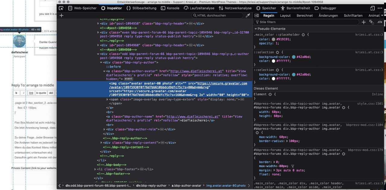
Die letzt Anweisung besagt, dass die items nicht wachsen dürfen, aber shrinken ja.Zu deiner Frage. Jeder Browser hat mittlerweile Developer Tools implementiert. Bei Safari muss man das in den Einstellungen freischalten.
Die Anderen haben es jederzeit bereit.
Wenn du das Kontext Menu mittels deiner Maus über einer Stelle auslöst, kannst du bei den Browsern sowas wie “untersuche das” finden (Element untersuchen; untersuchen etc)
Daraufhin geht ein Fenster mit dem DOM auf und die Eigenschaften (css) werden auch angezeigt.
Bei Body (#top) befindet sich die page-id- bzw postid- etc. ppSie mal was dein Avatar hier on Board hergibt:
please try this:
.page-id-2 #av_section_2 .avia-content-slider-inner .slide-entry-wrap {
    display: inline-flex;
    align-items: center;
}
you see it is always best to have the real site ;) to give advice.
Jetzt mal abgesehen von dem Vertauschen, du siehst schon , was dort ( sieh private content area ) passiert wenn die gleiche Category und loop gewählt wird – versuche doch mal nach rechts zu gehen!
Das Vertauschen der Richtung wäre jetzt auch gegangen via:
add_filter( 'avf_post_nav_entries', 'enfold_change_direction_postnav', 10, 2);
function enfold_change_direction_postnav($entries, $settings) {
    $entries['prev'] = get_next_post($settings['same_category'], $settings['excluded_terms'], $settings['taxonomy']);
    $entries['next'] = get_previous_post($settings['same_category'], $settings['excluded_terms'], $settings['taxonomy']);
    return $entries;
}
aber wichtiger ist das innerhalb der same Categorie geloopt werden kann.
April 27, 2019 at 3:26 pm in reply to: issue with previous and next navigation in the porfolio #1094913Edit: with that new loop function – you have to look again to it. It would be nice to loop in same category !
And on activating both: same category and loop option the page got post_nav toothe filter name has changed on 4.5.6 ( avia – is deprected ):
add_filter( 'avf_post_nav_entries', 'enfold_change_direction_postnav', 10, 2);
function enfold_change_direction_postnav($entries, $settings) {
    $entries['prev'] = get_next_post($settings['same_category'], $settings['excluded_terms'], $settings['taxonomy']);
    $entries['next'] = get_previous_post($settings['same_category'], $settings['excluded_terms'], $settings['taxonomy']);
    return $entries;
}
if you like it only for portfolio you can edit your code above with the new filter name.
By the way : how to change on that new Version 4.5.6 the direction of prev next ?
what if you disable jQuery Migrate on Enfold – Performance ? refresh all cachings after that and regenerate the merged files on Enfold too.
-
This reply was modified 6 years, 10 months ago by
-
AuthorPosts