Forum Replies Created
-
AuthorPosts
-
could you make your page link public here?
and please take only that rule here to have it only for main-menu not for hamburger aswell.
#avia-menu .twoliner > a { line-height: 20px !important; padding-top: 63px !important; }well i think you mean the image used for transparency options – it is indeed under subtext class the image – but the image itself has a unique class : alternate – so you can use that too for select the right image.
i noticed that little snippet to influence both logo img and logo alternate img . On most of my installations it is not necessary to have to wait for dom loading finished. But it will be the right way to do it exactly.function custom_logo_attriubtes(){ ?> <script> (function($){ $('.logo img').attr({ title:"custom_title", alt:"custom_alt" }); $('.logo img.alternate').attr({ title:"transparent Logo", alt:"Alt Transparent" }); })(jQuery); </script> <?php } add_action('wp_footer', 'custom_logo_attriubtes');i guess you can use both prop or attr to have this set.
can you give us a link ? i can see itemprop : headlines , urls , text etc. but on my website no empty ones.
there is a little plugin which will do that : https://wordpress.org/plugins/page-scroll-to-id/
you have to mark that setting: “Scroll from/to different pages (i.e. scroll to target when page loads)”
Then it will first load the #top anchor and then after a delay scroll to given anchor position. You can determine the delay and if necessary add a scroll-offset.
Look here in action: https://webers-testseite.de/8-columns/#defJune 2, 2019 at 5:37 pm in reply to: Adding ids to buttons so that events can be tracked in Analytics #1106381Edited ALB Elements: they are – as the name says – edited elements, which are extended by input fields. For example, I always missed the fact that I couldn’t determine the heading tag for iconboxes. All those ALB (advanced layout builder) Elements are all in the enfold/config-templatebuilder/avia-shortcodes folder and could be replaced by child-theme pendents.
You can read here how to use them via child-theme: https://webers-testseite.de/edited-enfold-alb-elements/if you have more than one mega-div and you want different background-images on them you have to select them by there menu-item-id
which comes as an id in front of those rules:#top #wrap_all .avia_mega_div { background-image: url(https://your-image-url.jpg); background-repeat: no-repeat; background-size: cover; } #top #wrap_all .avia_mega_div * { background: transparent !important; } #top #wrap_all .avia_mega_div ul li > a:hover { background-color: #900 !important; color: #fff }the last rule is only to have a hover state for the sub-menu items
__________________________________________________________________
as mentioned above if you want different images on more than one mega-div this will be a specific example with menu-item-id:
#top #wrap_all #menu-item-3529 .avia_mega_div {
  background-image: url(https://your-image-url.jpg);
  background-repeat: no-repeat;
  background-size: cover;
}
or i see now that the top-level menus got an index on the menu-items f.e.: menu-item-top-level-5
so specific rule could be:#top #wrap_all .menu-item-top-level-5 .avia_mega_div { background-image: url(https://your-image-url.jpg); background-repeat: no-repeat; background-size: cover; }you can see the result here on “testpages” Menuitem : https://webers-testseite.de/
-
This reply was modified 6 years, 10 months ago by
Guenni007.
by the way i see in your code: not the a tag gets a title – the menu-item itself gets a custom-class – see post above
with that code in htaccess file – every link to a pdf will end in a download. https://kriesi.at/support/topic/adding-a-pdf-download-to-store-products/#post-1105357
read this carefully – i tried to make it as precise as i could. https://kriesi.at/support/topic/two-line-name-on-main-menu-tab/#post-1105386
remove the code from ismael.
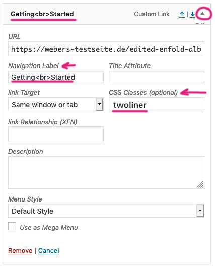
first do it with your <br> like you did it at the beginning.
second : give those menu-items a custom-class (as described above ( twoliner )
click to enlarge to see the dashboard/menu screen:
On that slide-out you can mark a lot of additional things for the menu-settings !
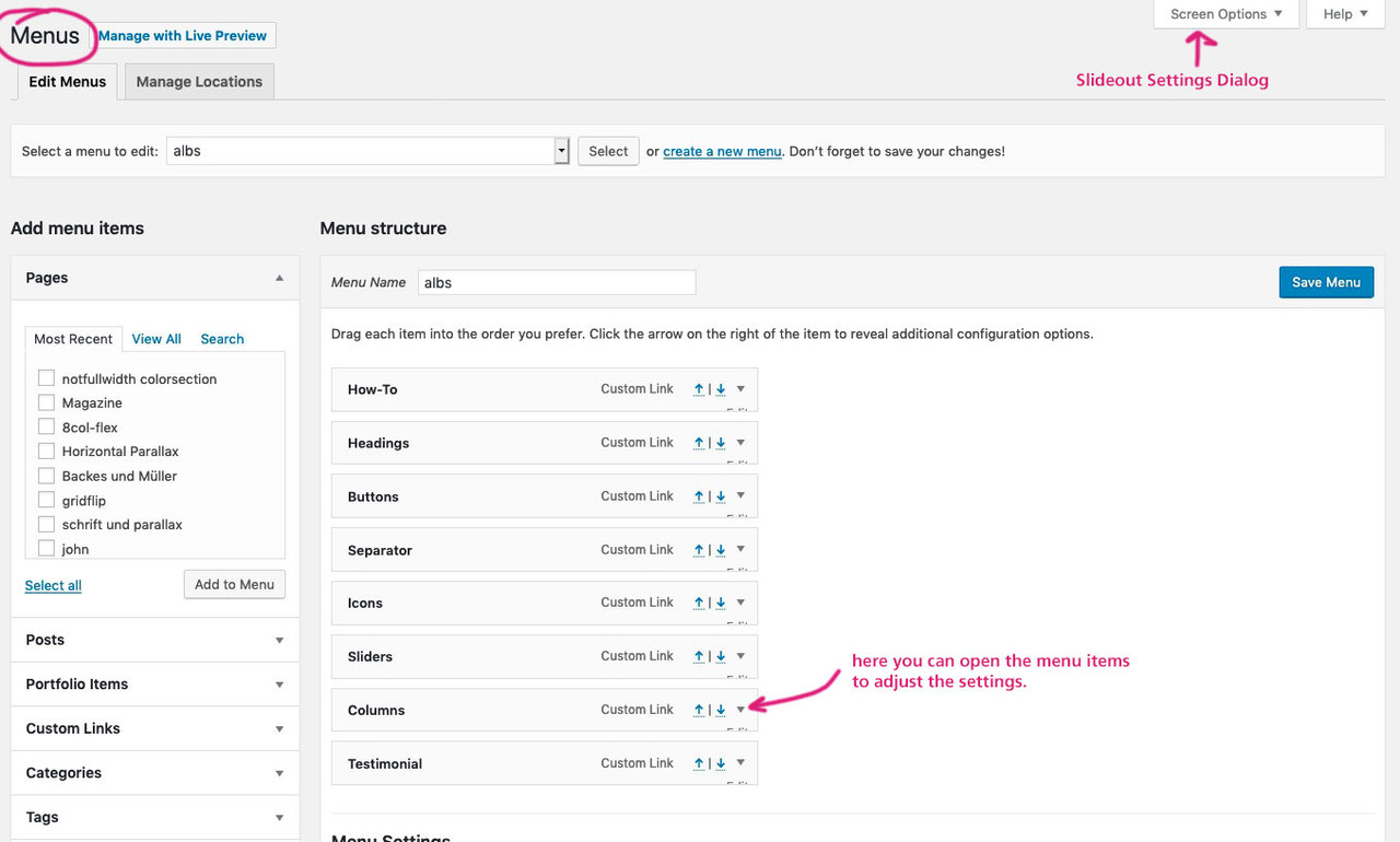
after mark classes – you can open each menu-item on that little arrow on the right. You can then see:
third: this to quick css#avia-menu .twoliner > a { line-height: 20px !important; padding-top: 63px !important; }thats it
well this is no competition but if you will take my code you only have to make it specific to menu :
#avia-menu .twoliner > a { line-height: 20px !important; padding-top: 63px !important; }and again – what if the second line has a word longer than the first line ? f.e.
Project
Photo Gallery__________
btw: maybe you got that Cross-Origin Resource Sharing (CORS) error with the entypo-fontello icons.
you can find some solutions to that by searching CORS or look to documentation:
https://kriesi.at/documentation/enfold/icon/#troubleshootMost – there will be an apache Server- i have that solution for htaccess file
by the way – it will work with three lines too!
and your burger button on small screens is white on white. and some of your menu items in burger menu too !As long as the second word isnt much longer than the first one – this will work!
if you leave the header at non-shrinking it could be done this way too:
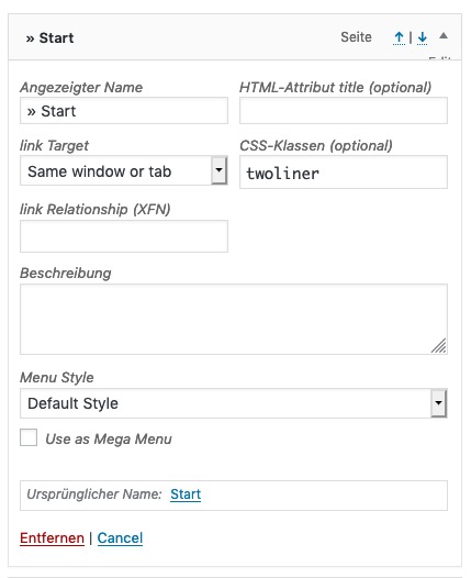
- Give a custom class to that menu item f.e. : twoliner
- insert item label – as you does with linebreak
.twoliner > a {
    line-height: 20px !important;
    padding-top: 63px !important;
    text-align: center;
}
Advantage of that method is that the menu-item width grows with the inserted words.

______________________________
By the way : if you don’t know how to set a custom class to menu-items:
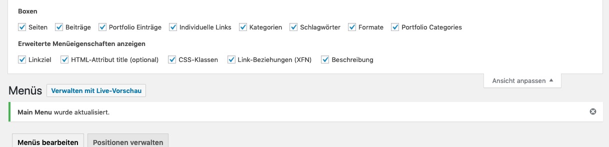
on the top of the menu settings page – there is on top right a slide out settings tab. There you can mark additional fields for the menu settings.
Click to enlarge the image
After activation of class the items look like this:
there you arei would try only this ( and get rid of the rest )
@media only screen and (max-width:550px) {
	.copyright {
		width: 100%;
		text-align: center;
	}

	.responsive #socket .sub_menu_socket {
	    margin: 0;
	}

	#socket .sub_menu_socket .menu {
	    position: relative;
	    display: block;
	    margin-left: 0 !important;
	    text-align: center;
	}
}
for some pages it might be necessary to have instead the last rule :
#socket .sub_menu_socket .menu {
    position: relative;
    left: 50%;
    transform: translateX(-50%);
    display: inline-block;
    margin-left: 0 !important;
}
the best would be to see your site!
by the way: why not 768px breakpoint (max-width:767px) – the point where all the other things break?
Then you will have on ipad portrait the normal socket and centered belowsometimes it is like magic if you try both one after the other.
so go to icomoon upload your svgs – download them – unpack that zip file and look for the svg font file.
This svg font file you can drag and drop to fontello icons. –
Download the font files from fontello and upload that fontello.zip file to enfold.
Don’t ask why – sometimes this helped me to get it work.PS
give the fontello files a different name than that you have used allready.First: why an updated version? it still works on Enfold 4.5.7 and WP 5.2.1
you can influence it same as the top navigation area with quick css:
#top .socialbookmarks-widget .social_bookmarks {
  display: inline;
}

#top .socialbookmarks-widget .social_bookmarks li {
  border-right-width: 0;
  width: 50px;
}

#top .socialbookmarks-widget .social_bookmarks li a {
  width: 50px;
  line-height: 50px;
  min-height: 50px;
}

#top .socialbookmarks-widget .social_bookmarks li a:before{
  font-size:30px
}
Result with 50px : https://webers-testseite.de/#footer
That widget area in the middle: Social Bookmarks Widget-
This reply was modified 6 years, 11 months ago by
you can force download by different methods.
One globaly – put this into your htaccess file in the root directory:<FilesMatch "\.(?i:pdf)$"> <IfModule mod_headers.c> ForceType application/octet-stream Header set Content-Disposition attachment </IfModule> </FilesMatch>or f.e. place the download in this way:
<a href="https://domain.de/xyz.pdf" download="Aufsatz_ueber_Nettiquette.pdf">Nettiquette</a>for better adivce it would be necessary to see your site.
i would have expected a svg file now, because chrome needs a lot of information, but a png should not cause any problems. I can’t confirm that either; I can see your logo on my Chrome/Mac.
after your logo img there is a noscript tag, which definitely does not originate from Enfold. So there already seems to be a third party script interfering.
So – if javascript is deactivated on your chrom – you will see that fallback.May 29, 2019 at 6:52 am in reply to: Adding ids to buttons so that events can be tracked in Analytics #1105069i’m Participant as you – so i do not see any private content data.
That field is there if you are using my edited alb element of the button.No relation to it – just the reason why i was a bit longer offline that i wanted – can be closed
May 28, 2019 at 11:02 pm in reply to: Adding ids to buttons so that events can be tracked in Analytics #1104980read carefully even on top of that : https://webers-testseite.de/edited-enfold-alb-elements/#buttons
for better advice i had to see a link and your two buttons you are talking about.
yes – but please try to internalize what cg said. That was your syntax error.
you can write it asletter-spacing: 12px!important;as well but the space if is there had to be after the valuesorry – i’m participant as you are – so i could not see your private content.
You had to wait til mods are here.May 28, 2019 at 2:45 pm in reply to: is it possible to load reCAPTCHA v3 only on needed Pages #1104849Sorry – can be closed now – i forgot to tell you that i changed the regex code to:
$regex = "!\[contact-form-7|\[av_contact!";Well i think you had to first register an icon as a theme icon – then you can define it as a social icon:
// Register a new icon as a theme icon
function avia_add_custom_icon($icons) {
  $icons['tel']  = array( 'font' =>'entypo-fontello', 'icon' => 'ue854');
  return $icons;
}
add_filter('avf_default_icons','avia_add_custom_icon', 10, 1);

// Add new icon as an option for social icons
function avia_add_custom_social_icon($icons) {
  $icons['tel'] = 'tel';
  return $icons;
}
add_filter('avf_social_icons_options','avia_add_custom_social_icon', 10, 1);
and think of to set the css styles for hover state too!
all icons get the class : av-social-link-xxxso f.e. with example above: tel
#top #wrap_all .av-social-link-tel:hover a { color: #fff; background-color: #006567; }thats it
i can not reproduce your troubles – but it would be anyway a nice idea that the ( #avia_builder .inside ) container stays fixed on top when scrolling.
Unfortunately, this is simply about the German language. There is no superlative too current in analogy to only/unique.
Either something is up to date or not. Something cannot be more than up to date.
big – bigger – biggest that is ok. ;)by the way: translation on German “Du” – (not formal) is: “Blog – Beiträge”
-
This reply was modified 6 years, 11 months ago by
Sorry Ismael – answering late to your reply.
I had some troubles with a nice page.
-
This reply was modified 6 years, 11 months ago by
i installed 4.5.7 and there are some changings on that alb element.
So if you have a child-theme menu.php uploaded – this will come into conflict with the new settings.
in that case it maybe enough to delete that file. ( Save it first on your desktop) -
This reply was modified 6 years, 10 months ago by
-
AuthorPosts