Forum Replies Created
-
AuthorPosts
-
But how to influence ( hook to ) the enfold lightboxes – not the inline popups.
by the way – you see the link in private content. This is no gallery from the start. There are on that page different media files which have all a lightbox link.
The default enfold way on the alb to have lightbox.
I want to avoid that all media files are part of the “gallery” in the lightbox by clicking the next (or prev.) Button. On default Enfold behavior it is different Media files in different color-section are not part of one lightbox gallery.So is there a way to split in a layout without color-sections f.e. videos in one lightbox – images in the other?
so for that i had to create a plugin/shortcodes folder ?
Wouldn’t it be better to work with the mostly already existing one in child-themes/shortcodes folder ?July 5, 2019 at 10:21 am in reply to: Can I just add Google Fonts code instead of upload the entire set of font? #1116001after the code Rikard gave to you – the font could be used on quick css this way:
font-family: 'Russo One', sans-serif;to register it for enfold options you can place this to child-theme functions.php :
add_filter( 'avf_google_heading_font',  'avia_add_custom_font');
add_filter( 'avf_available_google_fonts',  'avia_add_custom_font');
function avia_add_custom_font($fonts)
{
$fonts['Russo One'] = 'Russo+One&display=swap';
return $fonts;
}
The Font is at the bottom of the list!
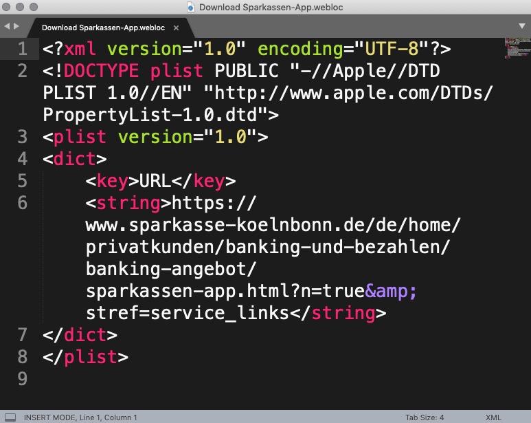
July 3, 2019 at 9:56 pm in reply to: Texte von Teilen der Website wirken wie in den Hintergrund eingebunden #1115591look for example : https://www.sparkasse-koelnbonn.de/de/home.html
in the footer area – same here – no enfold – this is a matter of browser behavior.If you will pick up a link – then a webloc file is copy pasted and look like this f.e.
A Link should work as a link. But if you place the cursor next to a link so that not the hand but the cursor (selector) is visible, you can also copy a link textually if you don’t have a tremor.
If you select text with links in it – only the text will be copied.
July 3, 2019 at 5:42 pm in reply to: Texte von Teilen der Website wirken wie in den Hintergrund eingebunden #1115531Click what i mean. here: Link
July 3, 2019 at 5:29 pm in reply to: Texte von Teilen der Website wirken wie in den Hintergrund eingebunden #1115528you can see the selection color on the white pages :
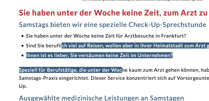
this is exactly the background-color of the footer / socket and the font color is white.
So if you “select” text it will not be seen.!Please enter first my css code then we can discuss if it is a bug or a feature-
because if you drag that onto your desktop besides the browser – it will create a text copy of that selected and draged part ( on mac it does)sorry – wrong answer.
hi mike can you describe where i have to place the files
related_posts.php goes to : ( i tried child-themes/shortcodes )
enfold-related-posts-element goes to ( i tried plugins folder ) but activation of plugin leads to fatal error.the GitHub is a little underdocumented
July 2, 2019 at 9:59 pm in reply to: Problem on Post with “Do not allow duplicate posts in the entire page” #1115284can you try this in your child-theme functions.php:
function ava_exclude_current_post($query) {
  if (is_singular('post')) {
    $exclude = avia_get_the_ID();
    $query->set( 'post__not_in', array($exclude) );
  }
}
add_action('pre_get_posts', 'ava_exclude_current_post');
thanks ismael: https://kriesi.at/support/topic/how-to-change-related-post-style-to-grid/#post-1084541
i have no page to see ?
If you could make it public – just let me see.i do not see the page you are concerning to- but
visibility:hidden means that unlike display:none, the tag is not visible, but space is allocated for it on the page.
The tag is rendered, it just isn’t seen on the page.
So maybe you can set it to display none.can you make your site public here?
It is always easier to help for the site in question.PS : you realy mean for mobile devices only – or for small screens too?
What is your code you are trying to include.
( Please use code-tag here on board for that to post)July 1, 2019 at 10:30 pm in reply to: Code Block Element doesn't handle shortcodes properly #1114973you have an example where these filters now work in conjunction with Borlabs cookies and videos.
I like to use this plugin myself – and would like to upgrade from my 1.9.9 Agency license to 2.0 soon, so it would be interesting for me to know if everything works fine with Enfold.The plugin still works well – you only had to set a rule for the class that will wrap the searched terms.
f.e..hilite { background: #fff67a !important; color: #000 !important; }June 30, 2019 at 8:54 am in reply to: Adding a custom scripts to the head section in my wordpress #1114571PS : please always use here on board for code the code-block tag – it is easier to test for us by copy paste the codes inside – as you can do now with the code above.
June 30, 2019 at 8:50 am in reply to: Adding a custom scripts to the head section in my wordpress #1114570in head section you can try this in child-theme functions.php:
add_action( 'wp_head', 'custom_tracking_script' );
function custom_tracking_script() {
  ?>
<!– Hotjar Tracking Code for http://www.digitalsuccessguide.com –>
  <script>
	(function(h,o,t,j,a,r){
	h.hj=h.hj||function(){(h.hj.q=h.hj.q||[]).push(arguments)};
	h._hjSettings={hjid:1383965,hjsv:6};
	a=o.getElementsByTagName('head')[0];
	r=o.createElement('script');r.async=1;
	r.src=t+h._hjSettings.hjid+j+h._hjSettings.hjsv;
	a.appendChild(r);
	})(window,document,'https://static.hotjar.com/c/hotjar-','.js?sv=');
  </script>
  <?php
}
this is definitly the right way to embed but if the script isn’t loaded with warnings – you have to check the the code from hotjar
June 30, 2019 at 8:30 am in reply to: Texte von Teilen der Website wirken wie in den Hintergrund eingebunden #1114569vielleicht nehmt ihr das jameda blau mit Schatten:
/***** Textauswahlfarben****/
::selection {
    background: #3cb8dd !important;
    color: #fff !important;
    text-shadow: 1px 1px 1px #333
}
::-moz-selection {
    background: #3cb8dd !important;
    color: #fff !important;
    text-shadow: 1px 1px 1px #333
}
June 30, 2019 at 8:22 am in reply to: Texte von Teilen der Website wirken wie in den Hintergrund eingebunden #1114565Die sind schon ausgewählt, nur habt ihr die gleichen Farben dafür wie die Hintergrundfarbe gewählt.
Ich denke, dass es auch über das Enfold Optionen Menu geht, ich setze hierfür meist dies in die Quick css ein:/***** Textauswahlfarben****/ ::selection { background: #E3212F !important; color: #fff !important; text-shadow: none ; } ::-moz-selection { background: #E3212F !important; color: #fff !important; text-shadow: none }wählt dann euer Farben selbst aus
(PS : ihr müsst denke ich nach dem Einsetzen des Codes die gemergeten Files löschen : Enfold-Child / Performance / Delete old CSS and JS files? )so Aleo is not in the set of Enfold implemented choice.
Go to the aleo page: https://fonts.google.com/specimen/Aleoif you click on “select this font” on top right position there will be on the bottom a slide out window.
Click on that little dark gray slide out window. Now you see the implementing options.
You can customize the import options f.e. if you like to have the bold (700) font-style.Standard:
<link href="https://fonts.googleapis.com/css?family=Aleo&display=swap" rel="stylesheet">
@import rule:
@import url('https://fonts.googleapis.com/css?family=Aleo&display=swap');
or with bold font style:
@import url('https://fonts.googleapis.com/css?family=Aleo:400,700&display=swap');
the last rule could be placed f.e. on your child-theme style.css. ( Dashboard / Appearance / Theme Editor )after that you can use the font for definitions in quick css as:
font-family: 'Aleo', serif;
so f.e.:h1 { font-family: 'Aleo', serif; }On GDPR Reasons it might be better to load the font locally.
Enfold got some Options for that:
All is said on f.e.: https://kriesi.at/documentation/enfold/typography/#register-additional-google-fonts-for-theme-optionsif you like to have the newly added font in Enfold Font Choice you can do that via a littel snippet for child-theme functions.php:
add_filter( 'avf_google_heading_font',  'avia_add_heading_font');
function avia_add_heading_font($fonts)
{
$fonts['Aleo'] = 'Aleo:400,700&display=swap';
return $fonts;
}

add_filter( 'avf_available_google_fonts',  'avia_add_content_font');
function avia_add_content_font($fonts)
{
$fonts['Aleo'] = 'Aleo:400,700&display=swap';
return $fonts;
}
the font will be on the font list on the bottom of the lists.
let the break when it changes to show the hamburger menu start earlier. more than 1024px
June 26, 2019 at 10:17 pm in reply to: Blank Strip at the top of page and Favicon isn't what I've set it as #1113724And Ipad is 768px wide on portrait !
so the media query code can’t grip.And the meaning of : Almost all of those Icons can be selected is now clear enough.
in mathematics means almost : all but a finite number. ;)with the help of icomoon app i generated a enfold entypo demo :
these are all used (implemented) icons from enfold.
https://webers-testseite.de/enfold-entypo/
a usefull thing is to know the code the icon has.Please Mods correct me if I’m wrong there, but this site is not a demo site of Enfold!
The demos concerning Enfold can all be found at: http://kriesi.at/themes/enfold-overview/
However, you can upload your own set using the Enfold options. The best way to do this is to go to the Fontello page.Very popular there is Font Awesome’s set, which via Fontello is not quite complete either, but can be used freely.
on default the filter had to work –
you can try this – maybe it works better:
for your child-theme functions.php
don’t see your site so you had to know your selector by yourself : but guess it is right:// Excerpt length function custom_grid_excerpt(){ ?> <script> (function($){ $(window).load(function(){ $('.grid-entry').each(function() { $(".entry-content").text(function(index, currentText) { return currentText.substr(0, 20); }); }); }); })(jQuery); </script> <?php } add_action('wp_head', 'custom_grid_excerpt');for blog the part in the middle of that function will be:
    $('.post-entry').each(function() {
        $(".entry-content > p").text(function(index, currentText) {
            return currentText.substr(0, 20);
        });
    });
June 22, 2019 at 5:05 pm in reply to: Issue with uploaded font disappearing when SSL certificate is applied. #1112590I don’t see the page you’re referring to – but here in this code you can see in the comments what the font files are for:
/* allerta-stencil-regular - latin */
@font-face {
  font-family: 'Allerta Stencil';
  font-style: normal;
  font-weight: 400;
  src: url('../fonts/allerta-stencil-v9-latin-regular.eot'); /* IE9 Compat Modes */
  src: local('Allerta Stencil Regular'), local('AllertaStencil-Regular'),
       url('../fonts/allerta-stencil-v9-latin-regular.eot?#iefix') format('embedded-opentype'), /* IE6-IE8 */
       url('../fonts/allerta-stencil-v9-latin-regular.woff2') format('woff2'), /* Super Modern Browsers */
       url('../fonts/allerta-stencil-v9-latin-regular.woff') format('woff'), /* Modern Browsers */
       url('../fonts/allerta-stencil-v9-latin-regular.ttf') format('truetype'), /* Safari, Android, iOS */
       url('../fonts/allerta-stencil-v9-latin-regular.svg#AllertaStencil') format('svg'); /* Legacy iOS */
}
this will be the highest compatiblitiy .
If you are only using : woff – supported devices are lower.best would be to see your site to give advice.
i do not see your site but a box-shadow is always out of the box. So the containers have to have overflow : visible on that case
Have a look if a parent-container got overflow: hidden.PS: didn’t the columns got that alb option on Border Tab: Column Box-Shadow
PPS: if you got the custom-class on the flex-column: it is on that container itself so:
.flex_column.amg-box-shadow {
    box-shadow: 0px 10px 40px -15px rgba(0,0,0,0.65);
}
if you gave the custom-class to the surrounding container ( on most cases a color-section) so all columns inside will get the box-shadow:
.amg-box-shadow .flex_column {
    box-shadow: 0px 10px 40px -15px rgba(0,0,0,0.65);
}
try it first without !important
-
AuthorPosts