Forum Replies Created
-
AuthorPosts
-
September 20, 2019 at 11:49 am in reply to: Unable to remove default meu subtext from demo after import #1140190
so how can you state this:
… but when I look at my menu settings after loading the theme the subtext fields are empty
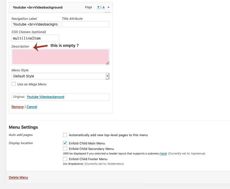
click to enlarge the image:
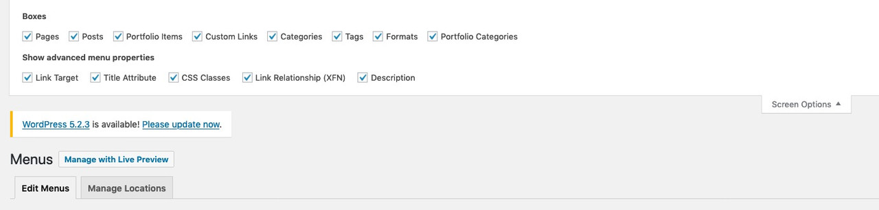
on top right of your menu options page there is a little flyout ( ps it is on many pages on wordpress sites)
press that button – the flyout does what it says. Mark the description field !
now your menu-items got this extra field.September 20, 2019 at 10:10 am in reply to: Unable to remove default meu subtext from demo after import #1140160can you make a screenshot of your menu options page.
something like this:
Sorry Ismael it is solved with the is not sticky conditional.
There is only one sticky post – and if i have this sticky post open – i do not want to see it in the post slider.
Can be closedif you don’t like this header styling on my testpage we can have both logos left and navigation on the right – but you had to decide what happens to the navigation when it touches your second logo.
Because only “Railings” got a subnavigation – you can have a multiline menu.
see here: https://kriesi.at/documentation/enfold/menu/#multiline-menu
you can have that floating right and …See here a two logo left with multiline menu on the right: https://webers-testseite.de/cynthia/railings/ – see what happens to the menu on shrinking screen width.
Think that this would be the best for your constallation.
But – now i had to earn some money – maybe tomorrow i will tell you how to.PS: that’s not quite styled yet, on this test page almost every page has its own header installation. There are a lot of things that interfere with each other.
Wouldn’t it be better to have the navigation below logos?
You have a very extensive navigation.
See here: https://webers-testseite.de/cynthia/mille-deco/______________
PS : first find an error – maybe on functions.php
how did you implement your ls-slider?
it is just after the slider – so guess it must be an error there. Look on scrolling you can see the content scrolling under the header but a little bit visible on top.
i just select it on your homepage to see it better :
now to the side issue.
Here it’s actually ok everywhere, except for the Sticky Post.
Homepage, All “non-sticky” Posts and the “Blog” Page are ok. But on that Sticky-Post you can see this Sticky Post in the Postslider too. That would be perfect if it didn’t show up down there.Edit : i did it this way:
	if ( !is_sticky() ) {
		$include = array_merge($sticky, $include);
	};
can be closed now – thanks for your help
September 19, 2019 at 9:28 am in reply to: Need help in editing functions.php in child theme #1139815First of all – why dont you use the prestyled child-theme from Enfold? https://kriesi.at/documentation/enfold/child-theme/
you don’t need to include the parent style via functions.php if the style.css of the child-theme is well set up.
This is the content of the style.css of the child-theme:/* Theme Name: Enfold Child Description: A <a href='http://codex.wordpress.org/Child_Themes'>Child Theme</a> for the Enfold WordPress Theme. If you plan to do a lot of file modifications we recommend to use this Theme instead of the original Theme. Updating wil be much easier then. Version: 1.0 Author: Kriesi Author URI: http://kriesi.at Template: enfold */ /*Add your own styles here:*/The template ( is the name of the parent folder ) that is important
The download includes a functions.php file ( empty at the beginning )
on that you can see that there is no closing tag (?>)September 19, 2019 at 9:10 am in reply to: Need help in editing functions.php in child theme #1139810can you please use the code tag here on board when presenting code.
to prove if there are errors it is important to see if all signs are right ( Brackets, Quotes and Doublequotes etc)your line-height on that is very small – in general one takes so approx. 1.5-fold the font-size- try:
.avia-testimonial-name {
    line-height: 36px;
}
if you don’t like that space 30px will be enough too.
PS: if you select the text on the left side you see why the “y” are cut-off:

on google Maps API did you enter your domain as : *standrewsstreetsville.ca/*
so the key is for all subdomains too and for all subpages!
have a look what happens if you place a google map on home (landing page) -then you will know.Clear the cache of Safari. ⌥ ⌘ E
Guess it is only a Problem of that.by the way – in your case i find it nice to have a non shrinking logo on mobile!
you like to have a shrinking logo aswell on mobile devices?
enfold ▸ js ▸ avia-snippet-sticky-header.js
find:
if(shrinking && !isMobile)
replace with:
if(shrinking)now the shrinking should be there on mobile devices.
To not loose this changing you can have a child-theme : avia-snippet-sticky-header.js
make a copy of that edited js file and – upload it to your child-theme/js folder – because there is on default no js folder – create one.
put this to your child-theme functions.phpadd_action( 'wp_enqueue_scripts', 'wp_change_sticky_header_script', 100 ); function wp_change_sticky_header_script() { wp_deregister_script( 'avia-sticky-header' ); wp_enqueue_script( 'avia-sticky-header-child', get_stylesheet_directory_uri().'/js/avia-snippet-sticky-header.js', array('avia-default'), $vn, true); }do you think it is a good idea to have on general a semitransparent header with this option?
if not:.header_color .header_bg { background-color: rgba(255,255,255,1); }in addition to Ismaels Code
for the Rest you had to adjust the main padding:
(because you had defined the header height und 990px to 90px plus the header_meta height of 30px)
(on screens smaller than 768px the header_main height is set to 80px)@media only screen and (min-width: 768px) and (max-width: 989px) { .responsive.html_mobile_menu_tablet.html_header_top #top #main { padding-top: 120px !important; } } @media only screen and (max-width: 768px) { .responsive.html_mobile_menu_tablet.html_header_top #top #main { padding-top: 110px !important; } }Can i see your site too?
think of – that i’m participant as you – so i can not see private content area.Well do not ask Enfold Team for that – ask WordPress Team.
I do really like the usage of svg – WordPress should finally react to the use of svgs.it works fine, unless I call the sticky post, it will be listed in the slider.
Can I still exclude it if that single post is displayed?add_filter('avia_post_slide_query','avia_order_by_random', 10, 2); function avia_order_by_random($query, $params) { $include = array(); $exclude = avia_get_the_ID(); $sticky = get_option( 'sticky_posts' ); $args = array( 'taxonomy' => $params['taxonomy'], 'post__not_in' => $sticky, // 'post__not_in' => $exclude, 'orderby' => 'rand', ); $posts = get_posts( $args ); foreach($posts as $post) { $include[] = $post->ID; } $include = array_merge($sticky, $include); $query['post__in'] = $include; $query['orderby'] = 'post__in'; return $query; }so i managed it an analog way on that link with:
add_filter('avia_post_slide_query','avia_order_by_random', 10, 2);
function avia_order_by_random($query, $params) {

	$include = array();
	$sticky = get_option( 'sticky_posts' );

	$args = array(
	'taxonomy' => $params['taxonomy'],
	'post__not_in' => $sticky,
	'orderby' => 'rand',
	);
	$posts = get_posts( $args );

	foreach($posts as $post) {
	$include[] = $post->ID;
	}

	$include = array_merge($sticky, $include);

	$query['post__in'] = $include;
	$query['orderby'] = 'post__in';

return $query;
}
i had that extra code
function ava_exclude_current_post($query) {
  if (is_singular('post')) {
    $exclude = avia_get_the_ID();
    $query->set( 'post__not_in', array($exclude) );
  }
}
add_action('pre_get_posts', 'ava_exclude_current_post');
but now my exclusion of the current single post id is ignored by that above. How to include that in the code?
thanks Ismael
and sorry for late reply.-
This reply was modified 6 years, 6 months ago by
Guenni007.
by the way if you could live with a manual setting of a shortcode:
this to child-theme functions.php:
function social_bookmarks_shortcode() {
$social_args = array('outside'=>'ul', 'inside'=>'li', 'append' => '');
$social = avia_social_media_icons($social_args, false);
return $social;
}
add_shortcode('social-bookmarks', 'social_bookmarks_shortcode');
to see the ul list items besides each other this
to quick css:.widget ul.social_bookmarks { display: inline-flex; }the shortcode is: [social-bookmarks]
open the first column in your color-section
that column on church template is a 1/1 container – you see :
click to enlarge the image:
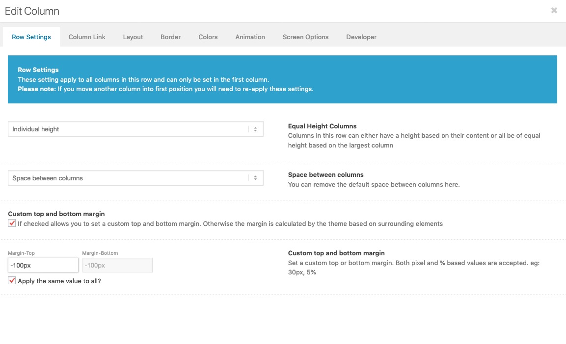
mark that field: “Custom Top and Bottom Margin”
then there will be new input fields – you can have negative Margins on top – thats itahs – now i know why i didn’t see it i only have those dotted lines on your site on firefox.
On chrome there are realy button like active states. Same on Safari
So we had to look for a browser specific part. : Focus Rings calledBut: well from wai aria point of view it will be nice to have for people how navigates only with tab key – because they could not handle it with a mouse.
Try this:
:focus { outline: 0 !important; }or without that functions.php stuff –
custom link in menu – and give to it the class noMobile menu-item-avia-special
noMobile ( not to be seen in Mobile Menu List)
menu-item-avia-special ( visible on hamburger but on top besides hamburger icon )may i see your header now? A screenshot would be ok.
by the way there is a hook to the main navigation to insert different things – if you add another list item point.- with this in child-theme functions.php
add_filter( 'wp_nav_menu_items', 'avia_append_main_nav_item', 10, 2 );
function avia_append_main_nav_item ( $items, $args )
{
    if ((is_object($args) && $args->theme_location == 'avia') || (is_string($args) && $args = "fallback_menu")){
        $items .= '<li id="telephone_number" class="noMobile menu-item  menu-item-avia-special">
                 <a href="tel:+49221123456">0221 / 123456</a>
               </li>';
      }
      return $items;
}
you will have a phone number which is visible on opend hamburger but on top next to search icon and hamburger icon.
if you insert it without the class: menu-item-avia-special then it is hidden on opend hamburger-
This reply was modified 6 years, 6 months ago by
the burger nav is not identical to the main-nav. Look to your DOM with some Developer Tools of your browser:
click to enlarge:
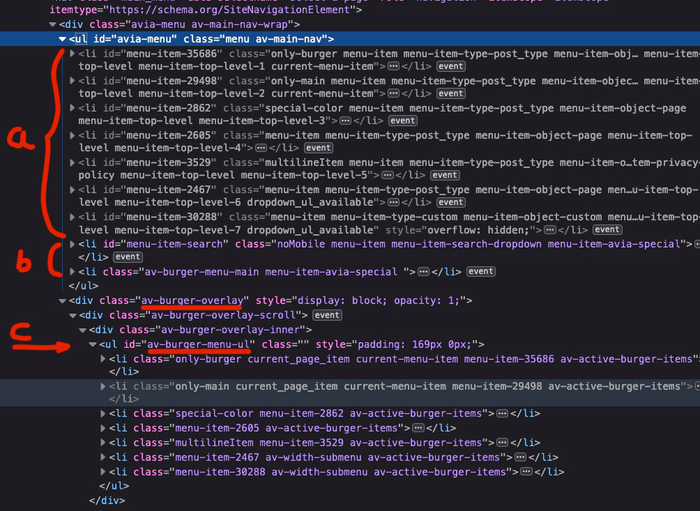
this is what happens if you have the hamburger opended.
that hamburger icon and the search icons are part of the main-nav. (b) an are still visible.
the rest fo main-nav is set to display none and the hamburger-menu is now visible.
You see that the list-items are different and have different selectors.
so you can select specific your telefonnumber not to show here: f.e.#av-burger-menu-ul li.menu-item-30288 { display: none }if you look closely, you will see that with the new enfold (don’t know how long it is now) the main menu items have IDs and the analog hamburger menu items then have the appropriate class.
September 13, 2019 at 11:29 pm in reply to: Removal and/or edit of text in Enfold Theme Footer #1138230put in that field:
©2011-2019 St. Andrew’s Presbyterian Church Streetsville [nolink]why don’t you add the phone-number as custom-link to your menu-items.
Dashboard – Appearance – Menus.
Just add a custom-link to your menu and insert .
As Link you put in your: tel:+490654311234567
As Navigation Label what you like f.e. Telephone 06543 – 11234567SyberKnight – thats what i just wanted to post. but my list is a bit smaller – thanks for the update.
postiing from 2016 . https://kriesi.at/support/topic/font-list-for-enfold/#post-649394September 13, 2019 at 11:15 pm in reply to: Different Logo for different websites (subpages) #1138227but if you like you can do it manually too over an array ( if the amount of pages isn’t so big)
you can use all conditonal tags you know – the tree solution is above – for categories there ar is_category, in_category or has_category etc. pp)add_filter('avf_logo','av_change_logo'); function av_change_logo($logo){ if( is_page(21) ) { $logo = "http://www.domain.com/wp-content/uploads/logoforpage21.jpg"; } elseif ( is_page( array( 42, 54, 6 ) ) ) { $logo = "http://www.domain.com/wp-content/uploads/logoforpage22.jpg"; } elseif ( is_page() && !is_page(1307) ) { $logo = "http://www.domain.com/wp-content/uploads/logoforpage23.jpg"; } return $logo; }September 13, 2019 at 11:10 pm in reply to: Different Logo for different websites (subpages) #1138226the last one should work – but as i can read your topic the right way you look also for a solution to change the logo for a whole tree.
So to speak for page-id-9 f.e and all subpages.this here is to define the tree function:
function is_tree($pid)
{
global $post;

   $ancestors = get_post_ancestors($post->$pid);
   $root = count($ancestors) - 1;
   $parent = $ancestors[$root];

   if(is_page() && (is_page($pid) || $post->post_parent == $pid || in_array($pid, $ancestors))){
     return true;
    }
   else
   {
     return false;
    }
};
after that you can change logo for page and subpages.
add_filter('avf_logo','av_change_logo');
function av_change_logo($logo){

      if (is_tree(515)) { $logo = "[logo url]";}
  elseif (is_tree(509)) { $logo = "[logo url]";}
  elseif (is_tree(530)) { $logo = "[logo url]";}

   return $logo;
}
change that:
[logo url]the whole expression with your link to your logo url (including brackets) -
This reply was modified 6 years, 6 months ago by
-
AuthorPosts